Компоненти
Глобальний каталог компонентів з усіх шаблонів. Усього: 267.

furniture-hero-slider
Three-slide Swiper hero pairing oversize headline with a chair render and a circle backdrop on a cream-paper field.

service-features-row
Four-column row of icon plus title and one-liner sub-copy for shipping, returns, support and trust signals.
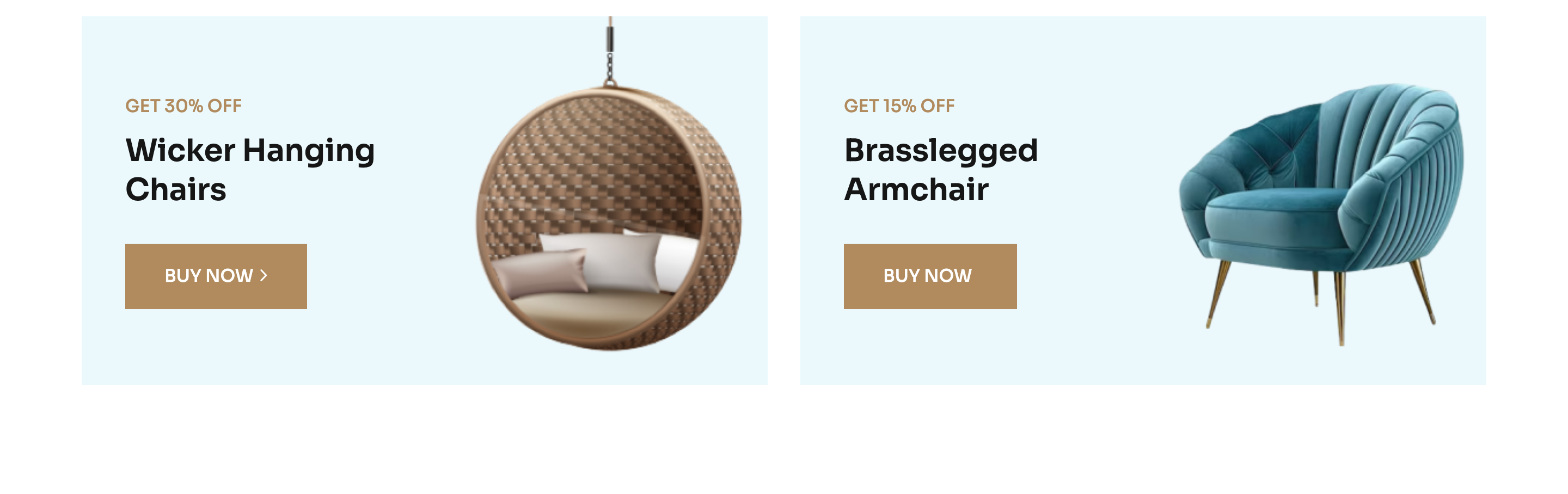
off-promo-duo
Two side-by-side full-bleed promo cards with discount badge, two-line capitalised heading and a solid CTA arrow button.
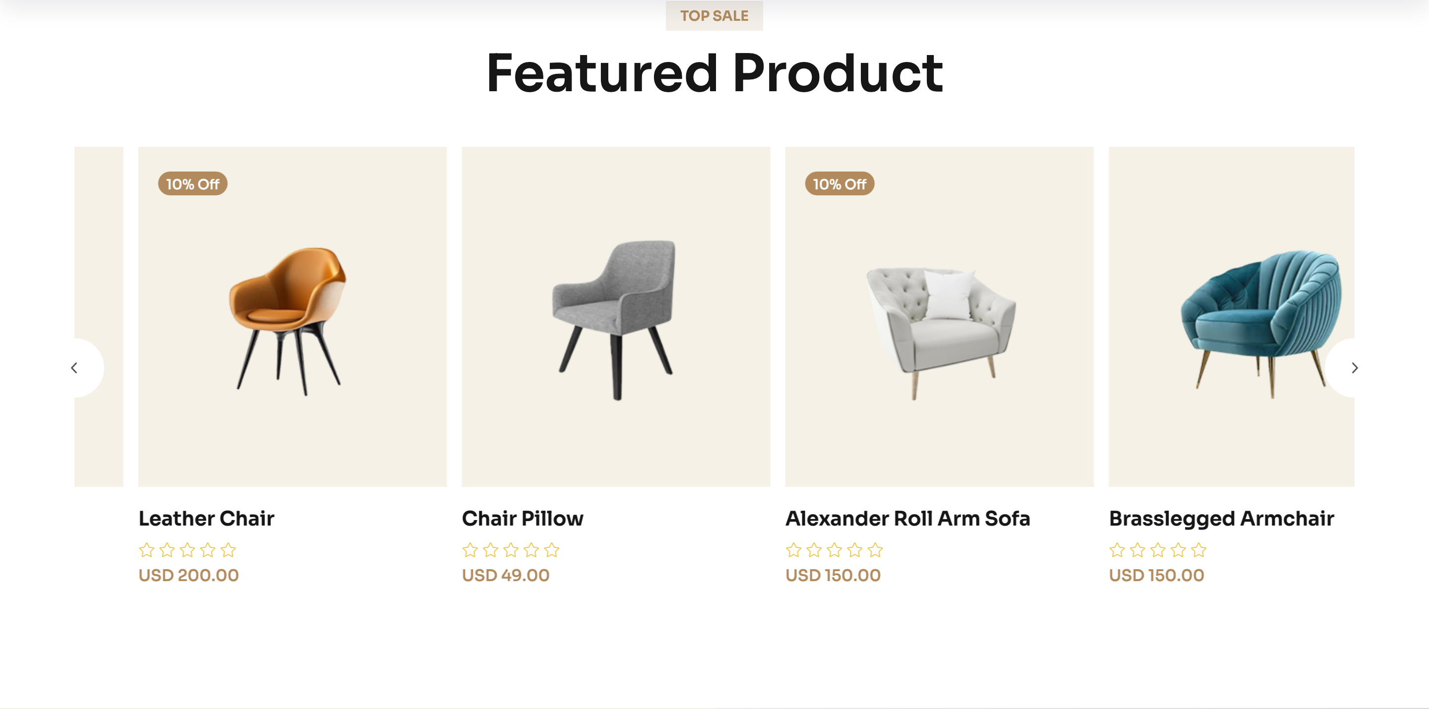
featured-product-slider
Top-sale product carousel with hover action icons (cart, quick view, wishlist) and external prev/next buttons.

hot-deal-banner
Half-bronze, half-photo banner with a hotspot overlay calling out featured products and prices on top of an interior shot.
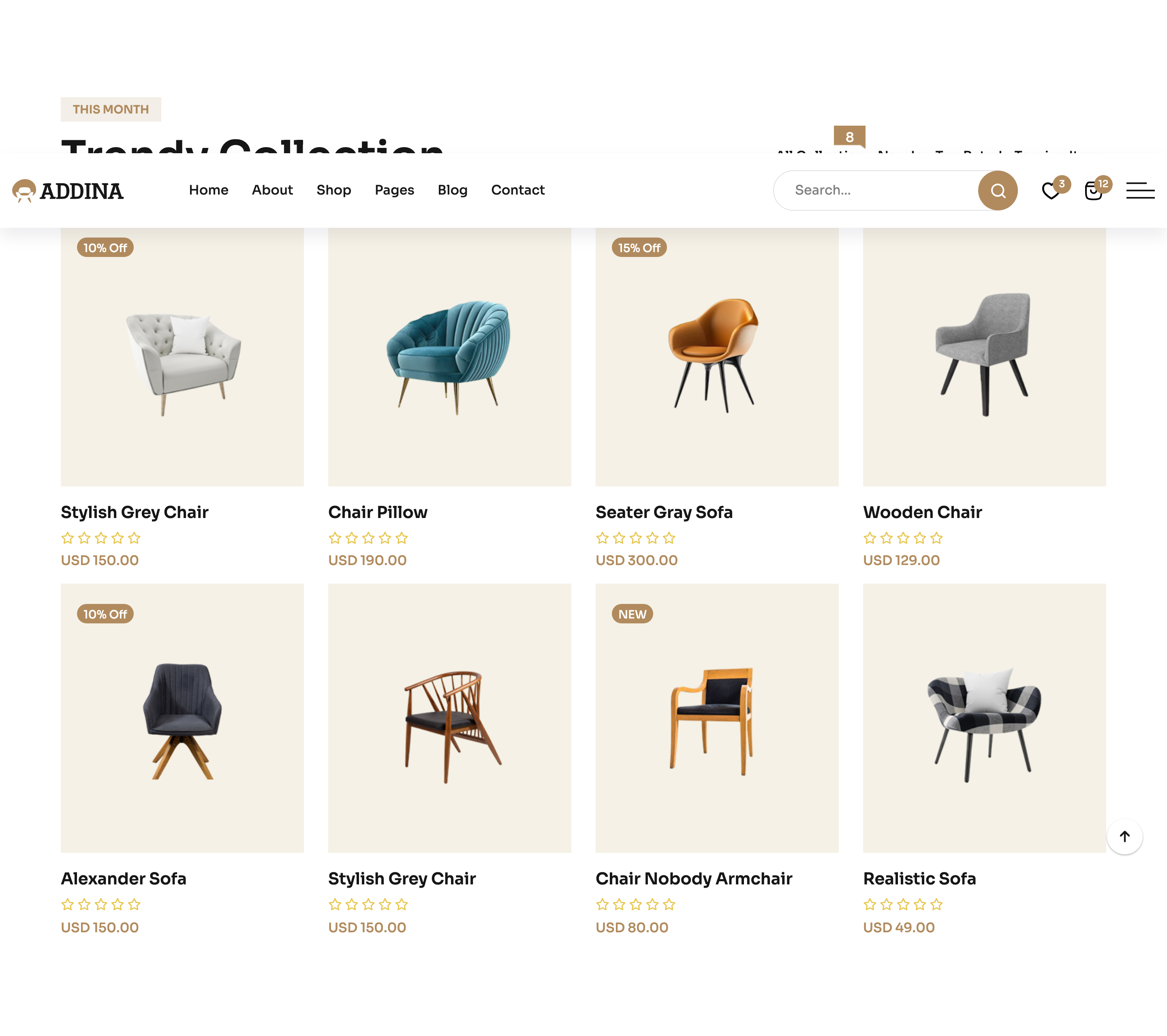
trendy-collection-tabs
Bootstrap-tabs filter (All / New / Top / Trendy) above a Swiper-driven product grid for the month's trendy items.

ad-countdown-banner
Two-card promotional row, second card embeds a four-segment days/hours/minutes/seconds countdown timer.
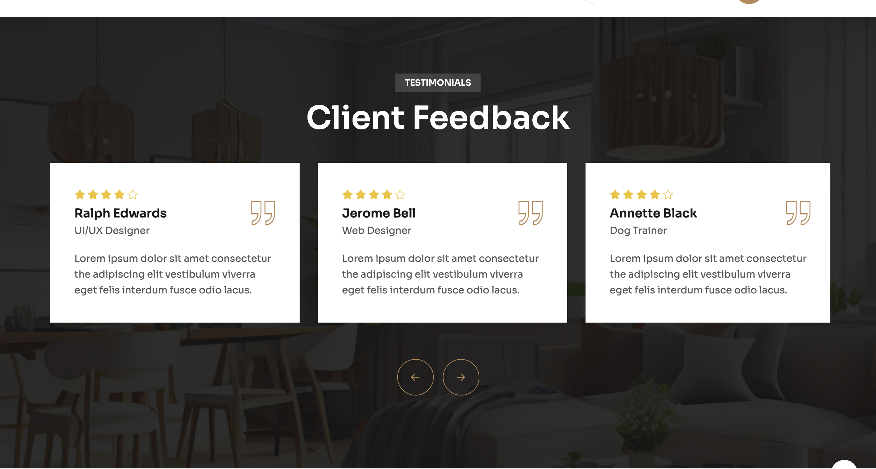
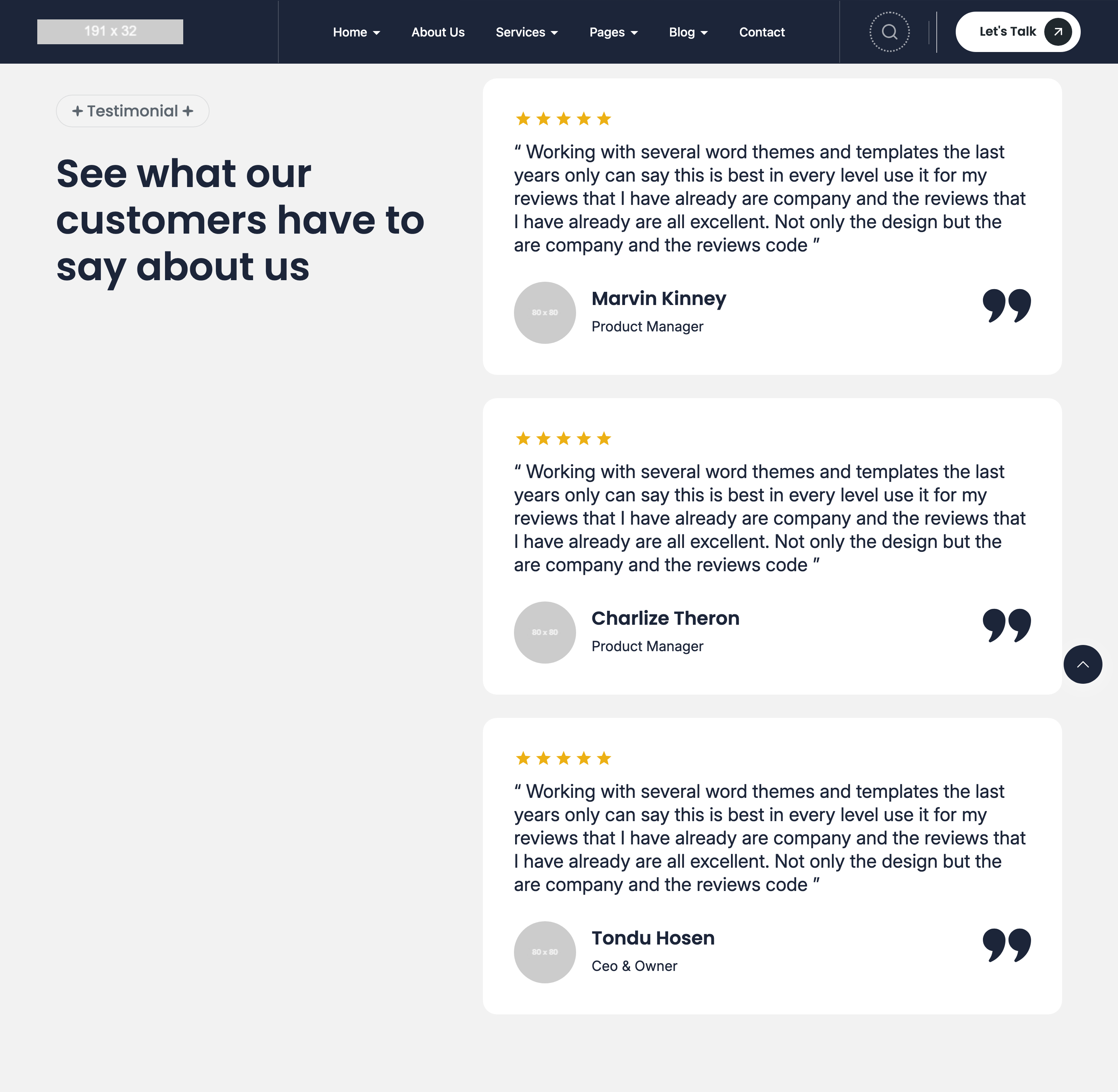
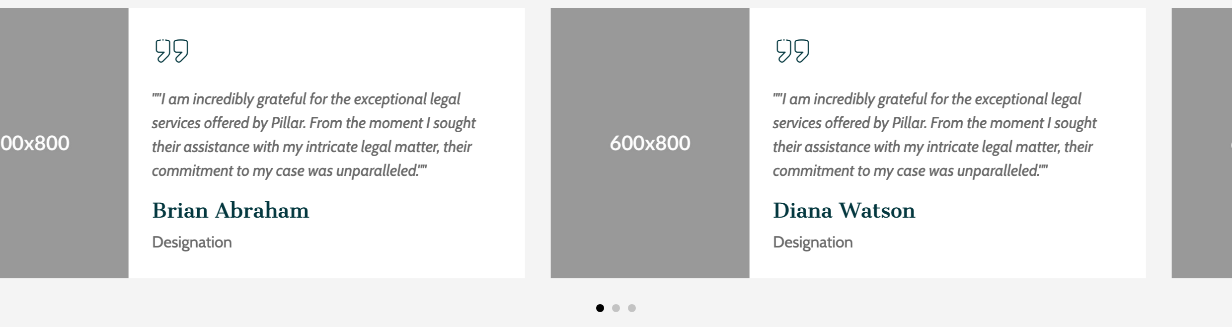
testimonials-carousel
Image-backed Swiper of star-rated client cards with quote-mark glyph and external left/right navigation buttons.
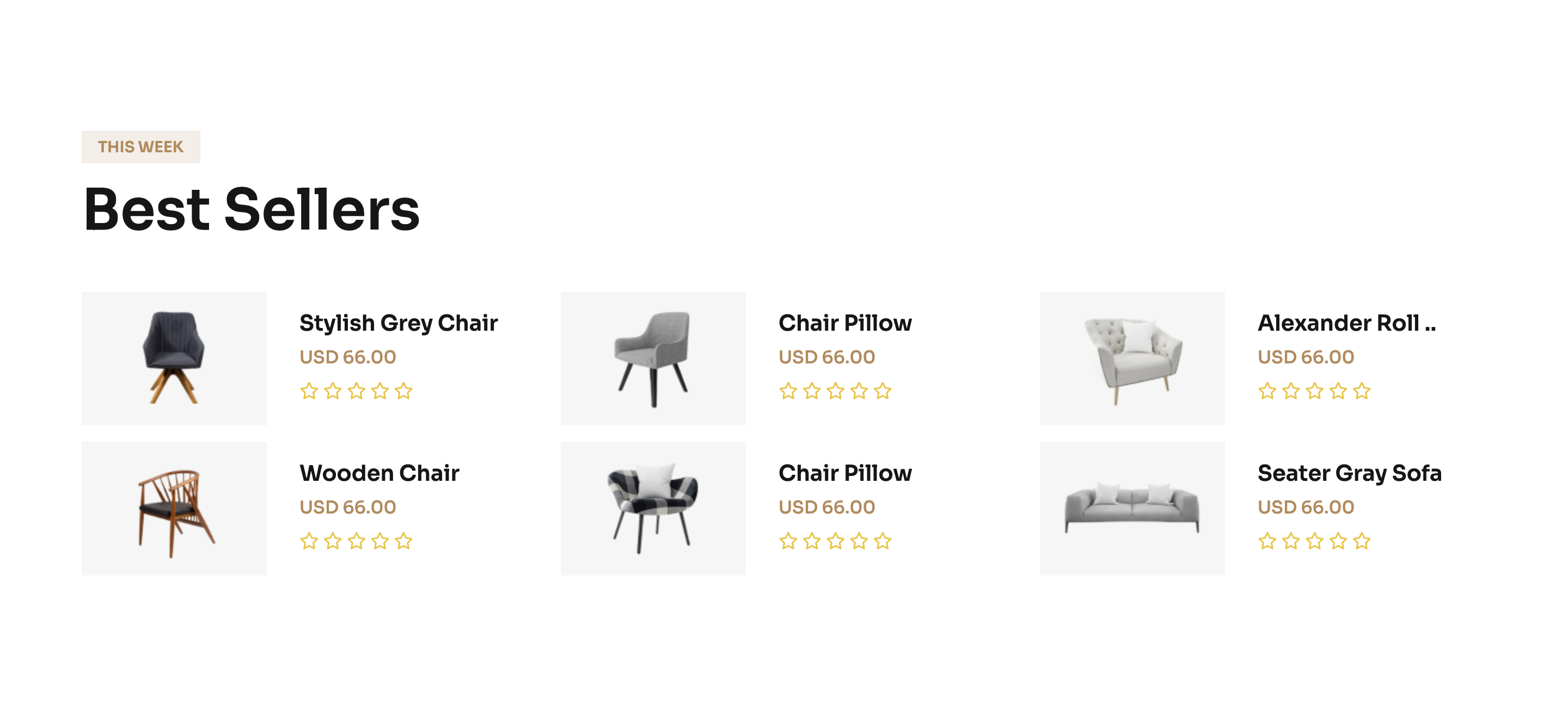
best-sellers-grid
Three-by-two grid of horizontal best-seller cards mixing product photo, title, price and star rating.
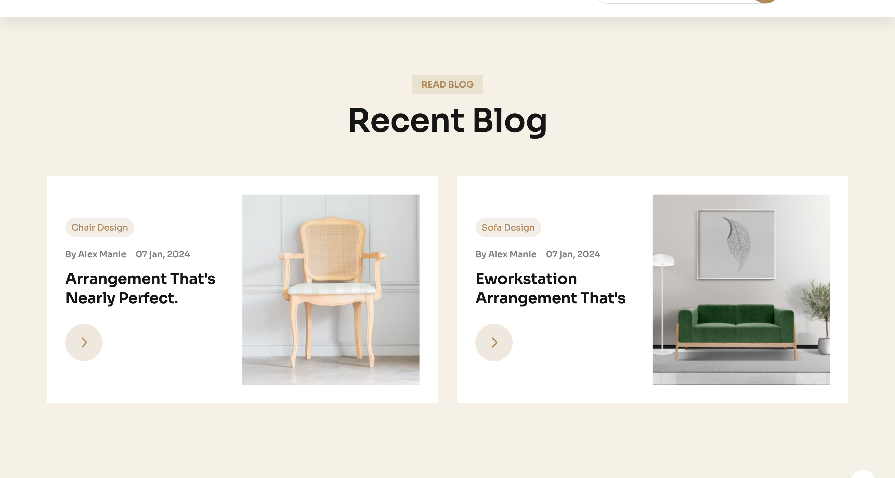
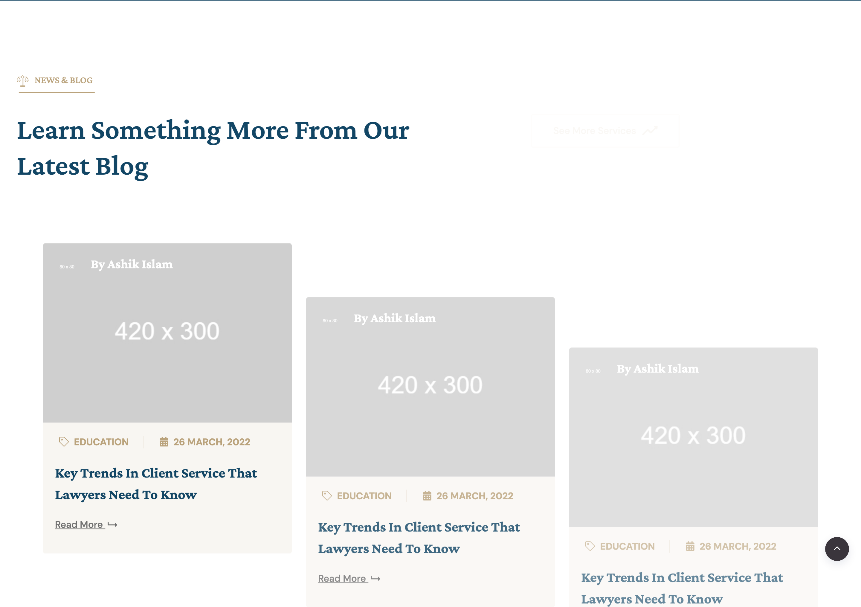
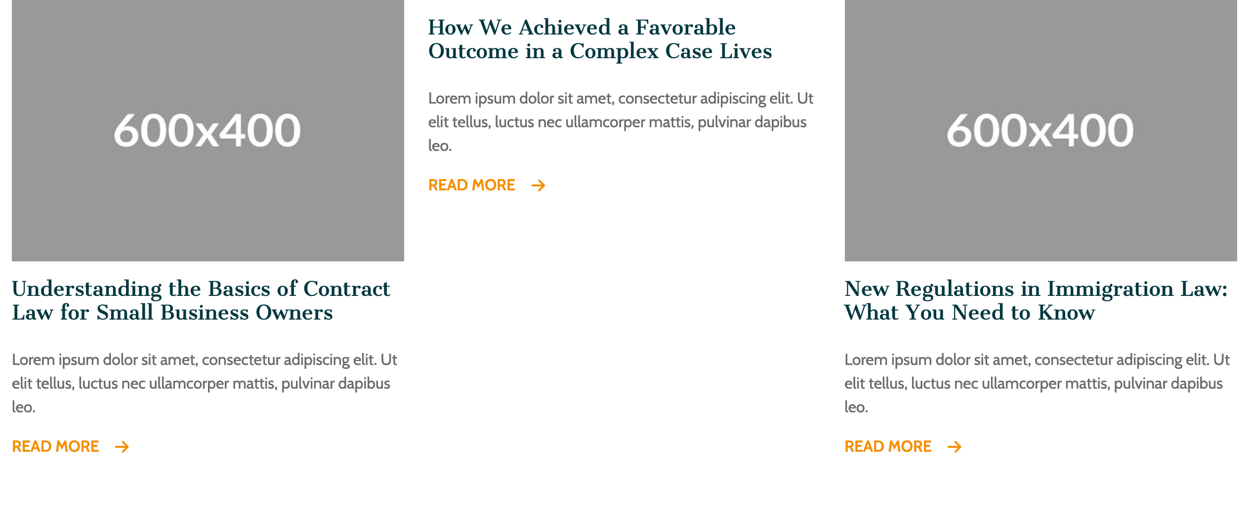
recent-blog-pair
Two oversized blog cards aligning meta-tagged copy on one side with a wide photograph on the other.

support-tri-card
Three coloured support cards covering newsletter signup, community join and mobile-app store badges.
brand-logo-row
Five-up muted greyscale brand-logo strip closing the page above the footer.

site-header-sticky
Two-row sticky header with utility bar (lang, currency, settings) and a primary nav with mega-dropdowns plus search and wishlist/cart action icons.
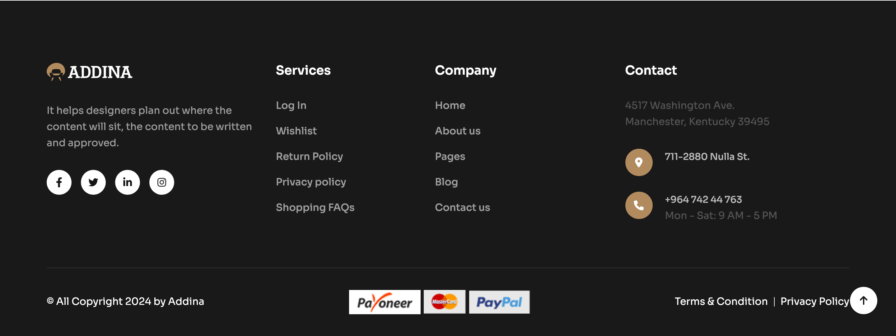
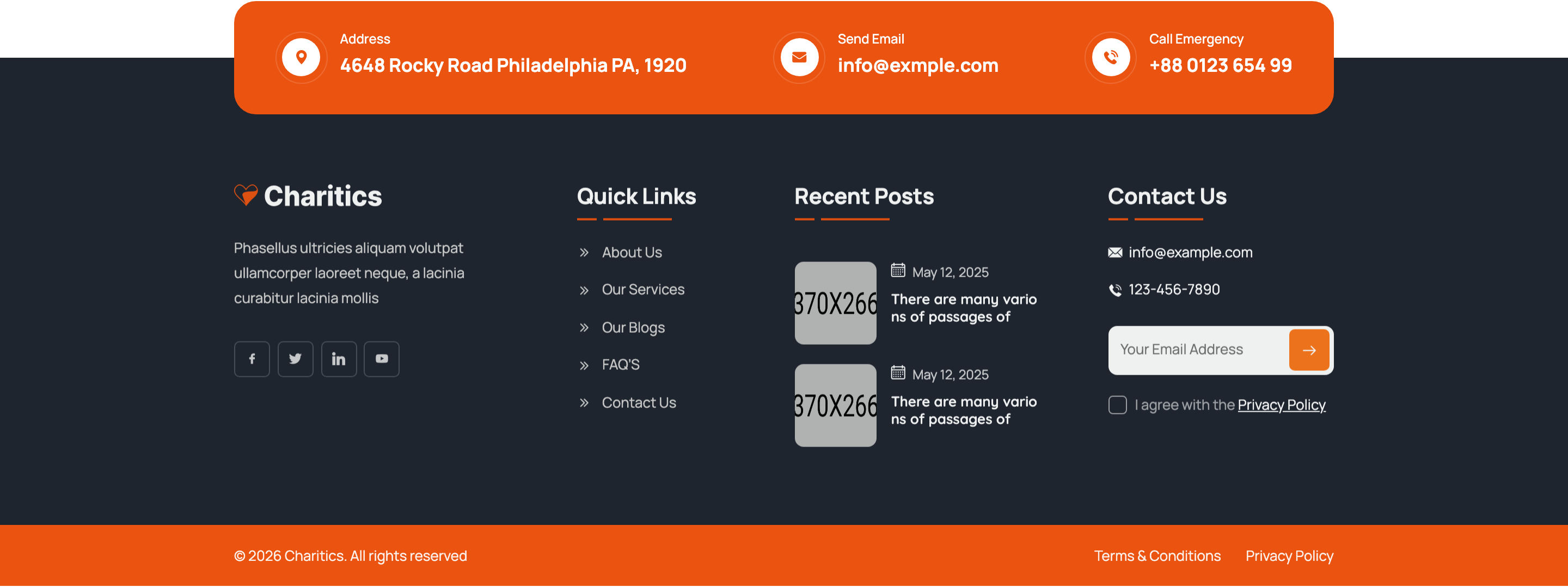
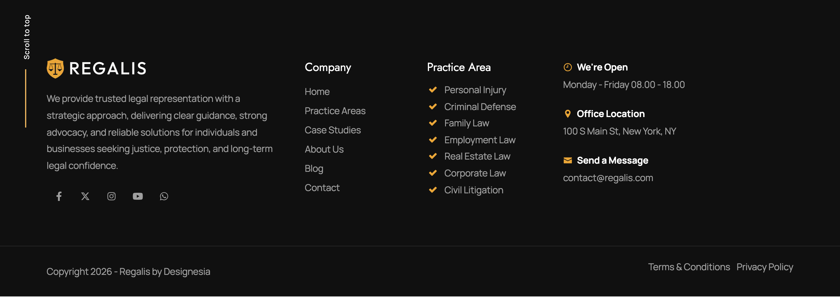
site-footer
Dark grid-3 footer with logo column, link columns and a contact column on a near-black background.

scroll-back-to-top
Fixed circular SVG progress ring in the bottom-right that fills as the page scrolls and acts as a back-to-top button.
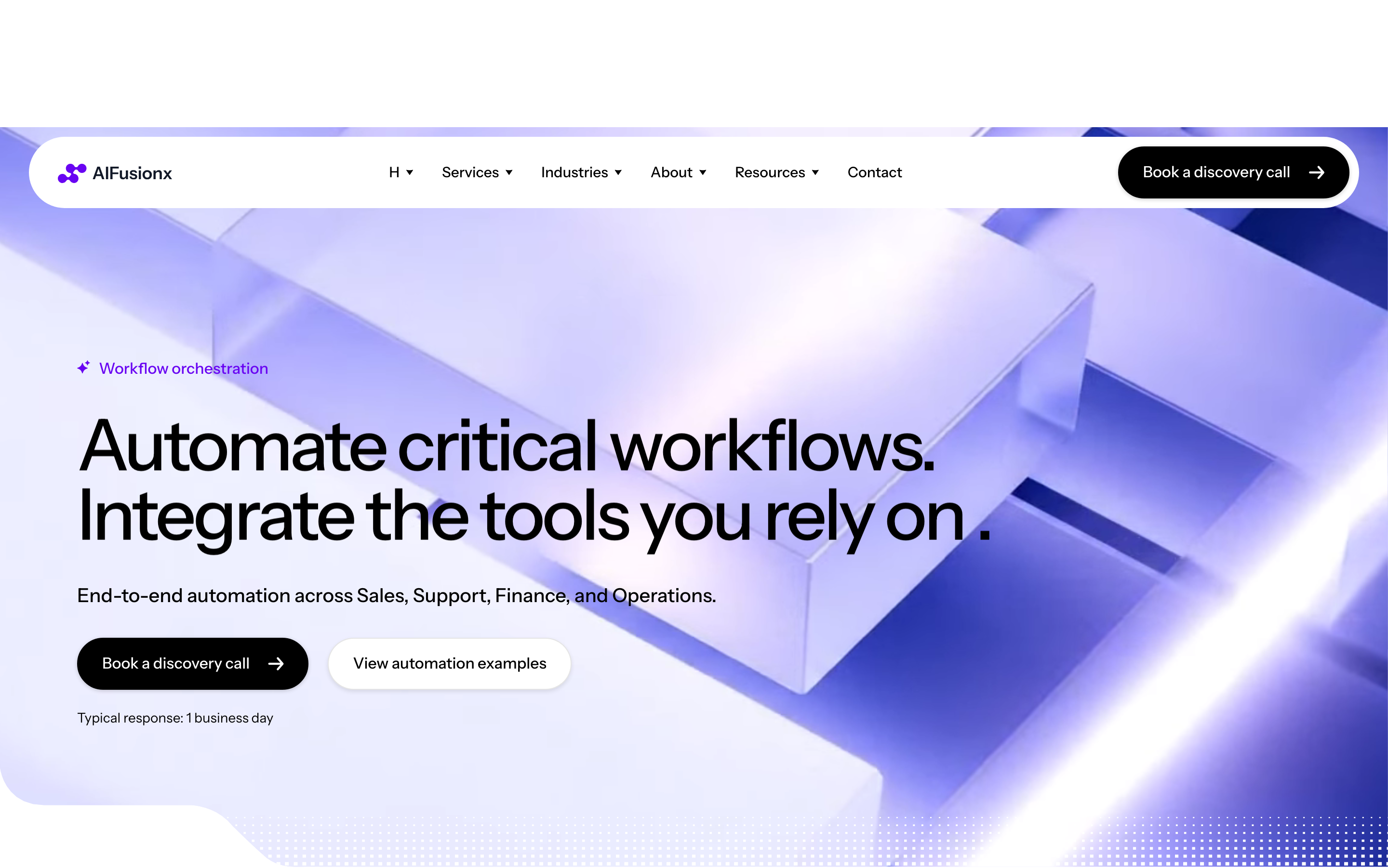
header-mega-menu
Auto-hiding sticky header with logo, multi-column mega menu (Services / Industries / About), and pill CTA — slides in only on scroll-up.
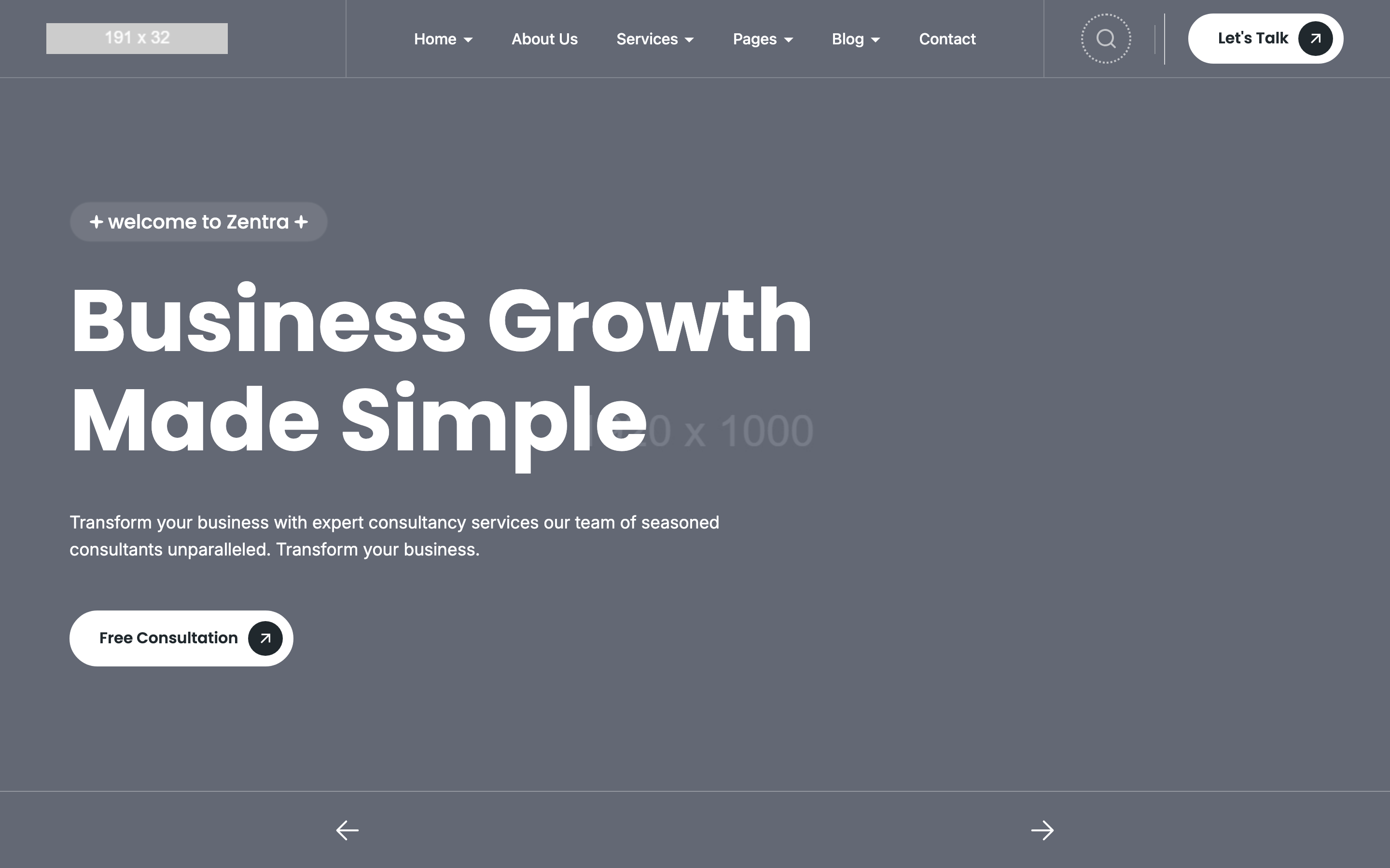
hero-editorial
Editorial hero with full-bleed photographic background, oversized 74px H1 (-3px tracking), small icon-list above title, two pill buttons.

logos-strip
Trust strip 'Teams choose us for reliable delivery' with 6 horizontal client logos in a single row, no animation.
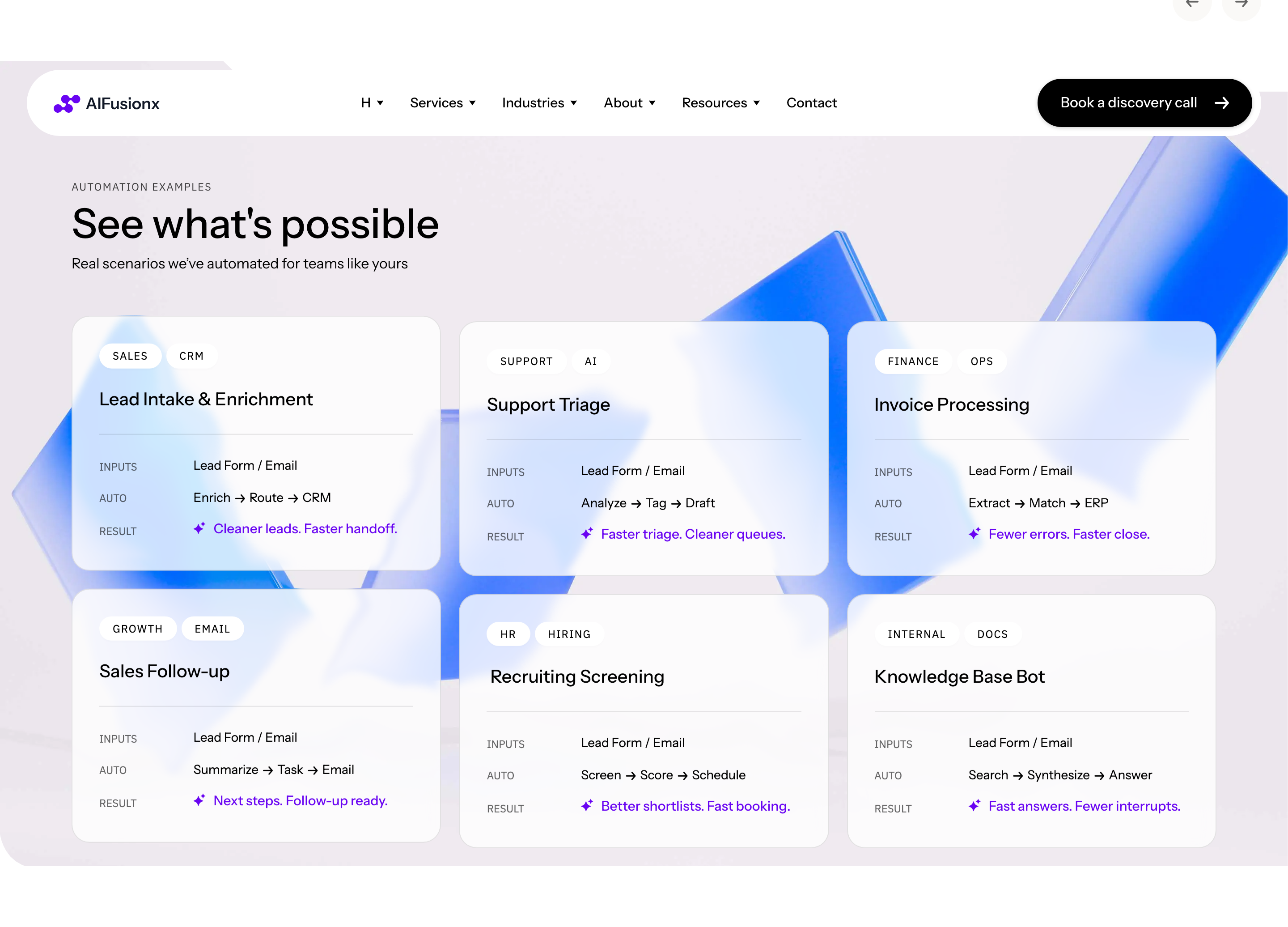
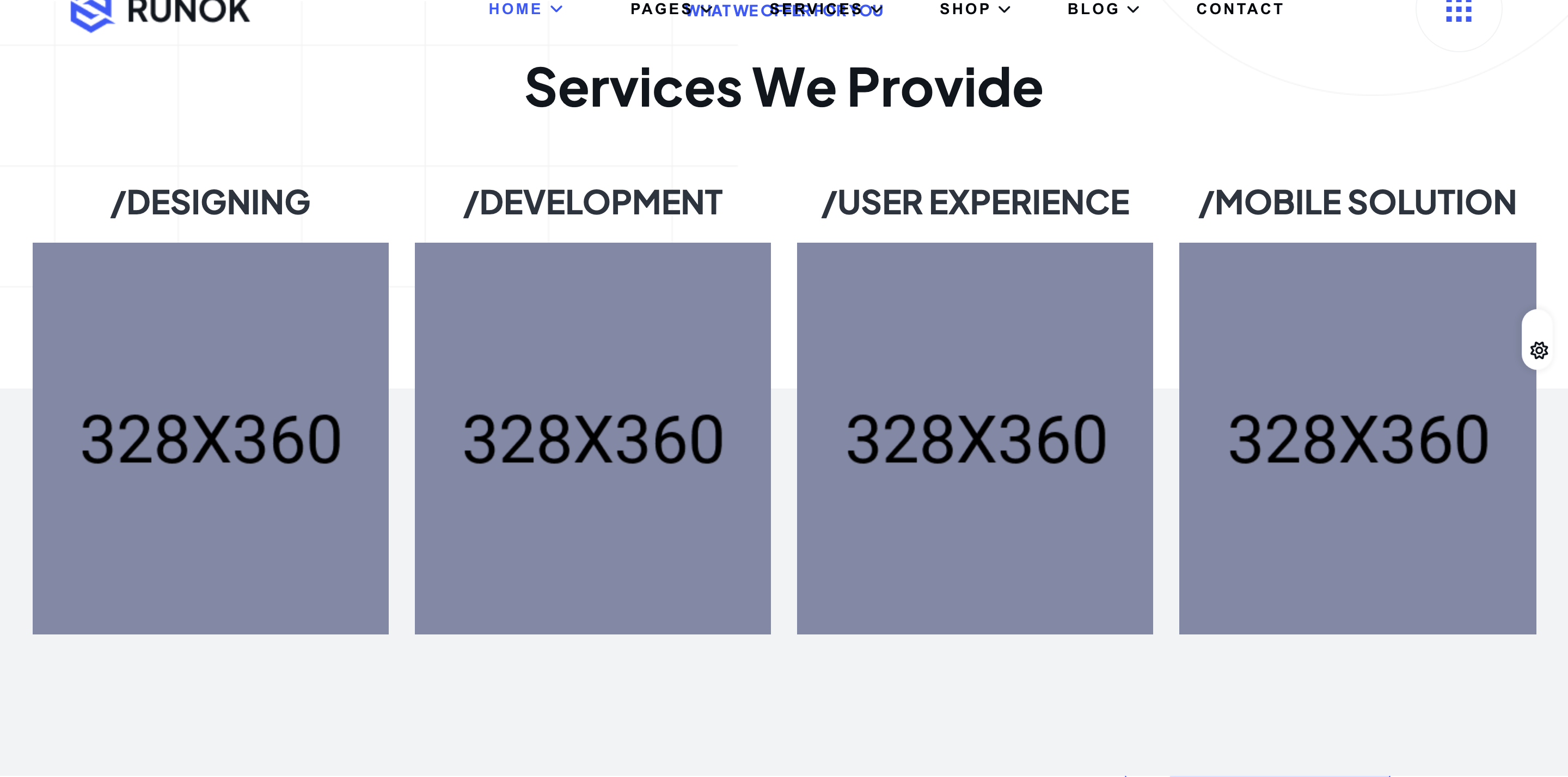
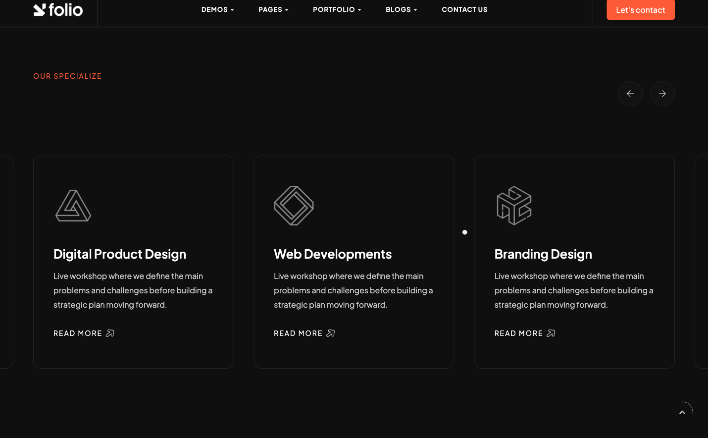
services-carousel
'What we do' Elementor nested-carousel of services — each slide is icon + heading + paragraph + arrow link, swipe-driven.
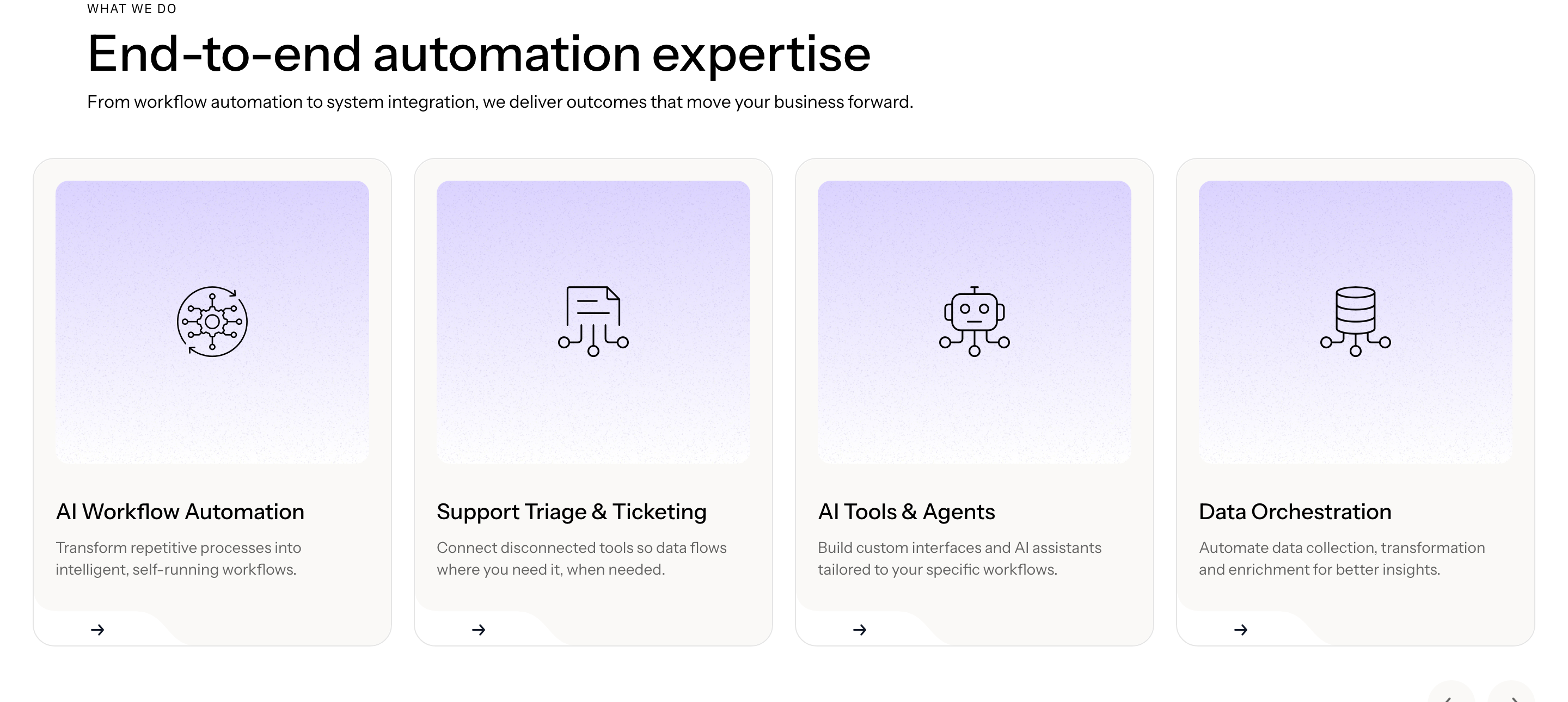
automation-examples
'Automation examples' anchored grid (Sales / Ops / Finance) with split typographic headings and bullet copy, no decoration.
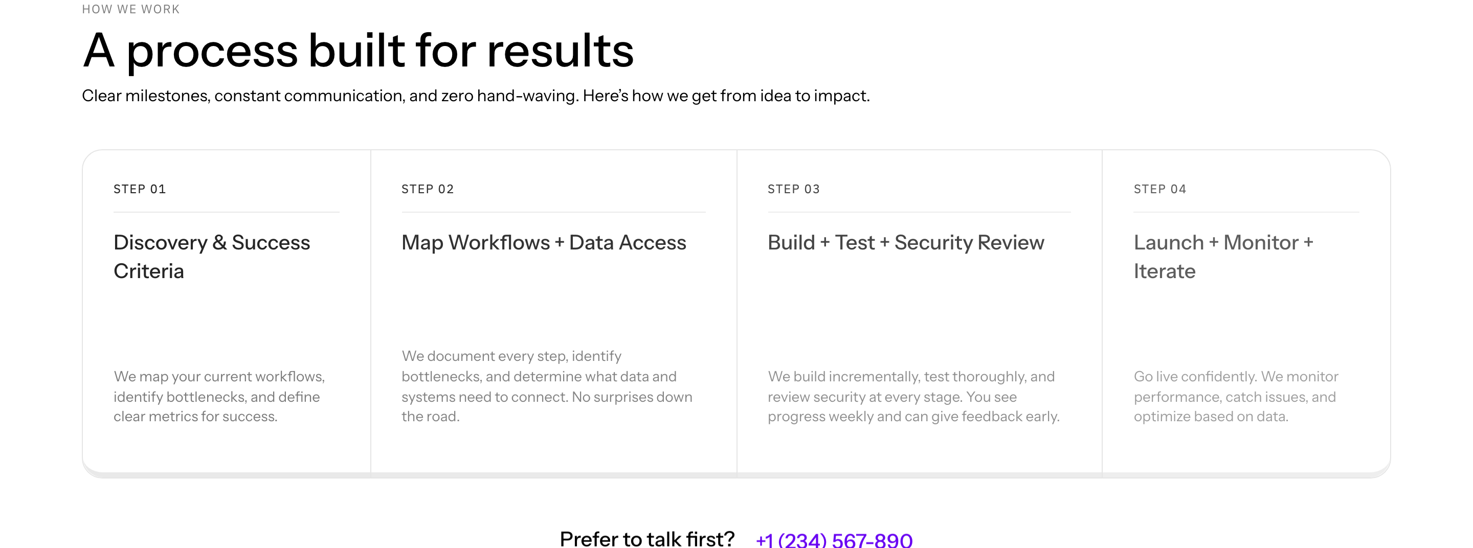
process-steps
'How we work' numbered steps separated by hairline dividers — emphasis purely typographic, zero icons or illustrations.
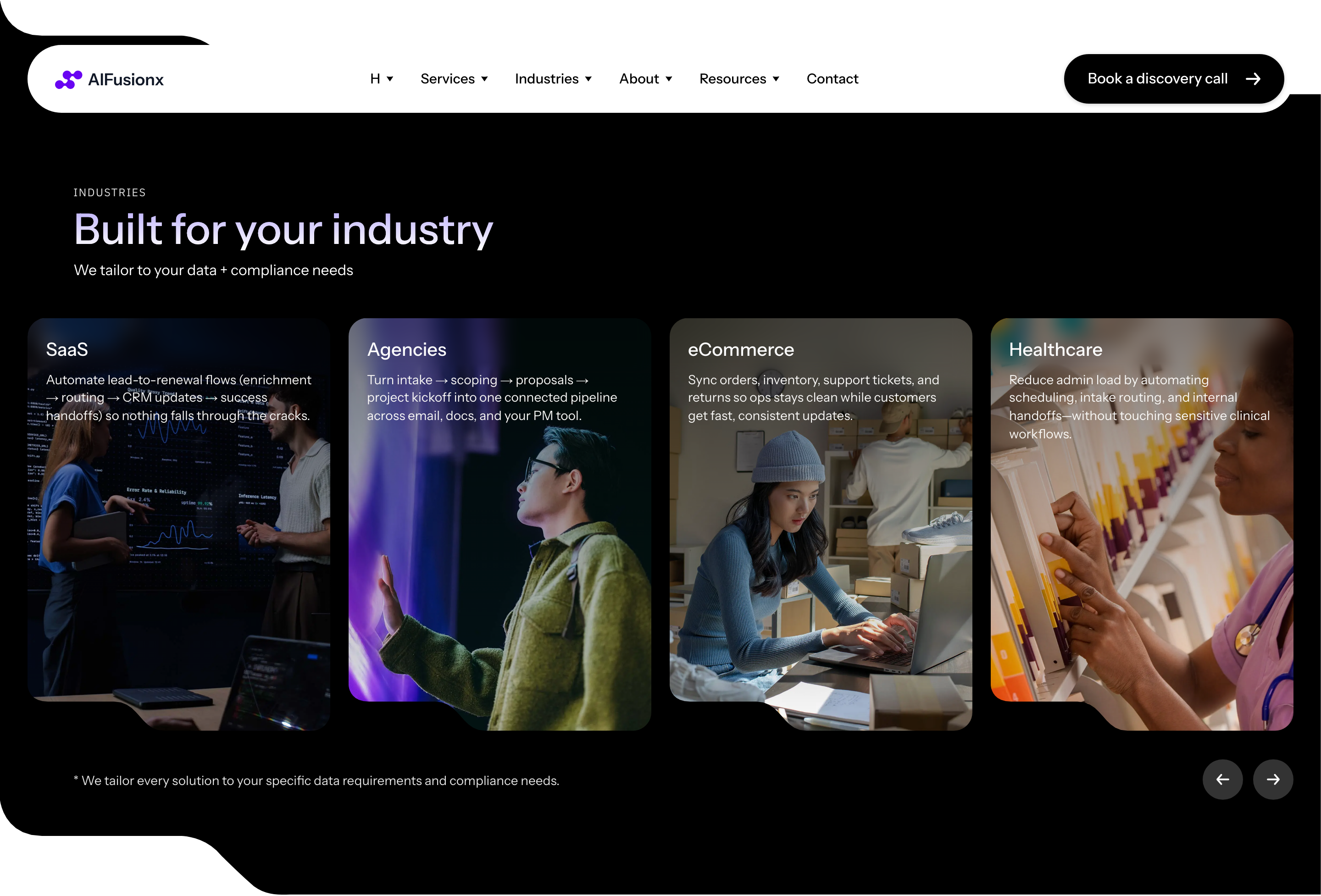
industries-loop-carousel
'Industries' Elementor Pro Loop Carousel pulling from a CPT — eight horizontally scrolling slides with image and label.
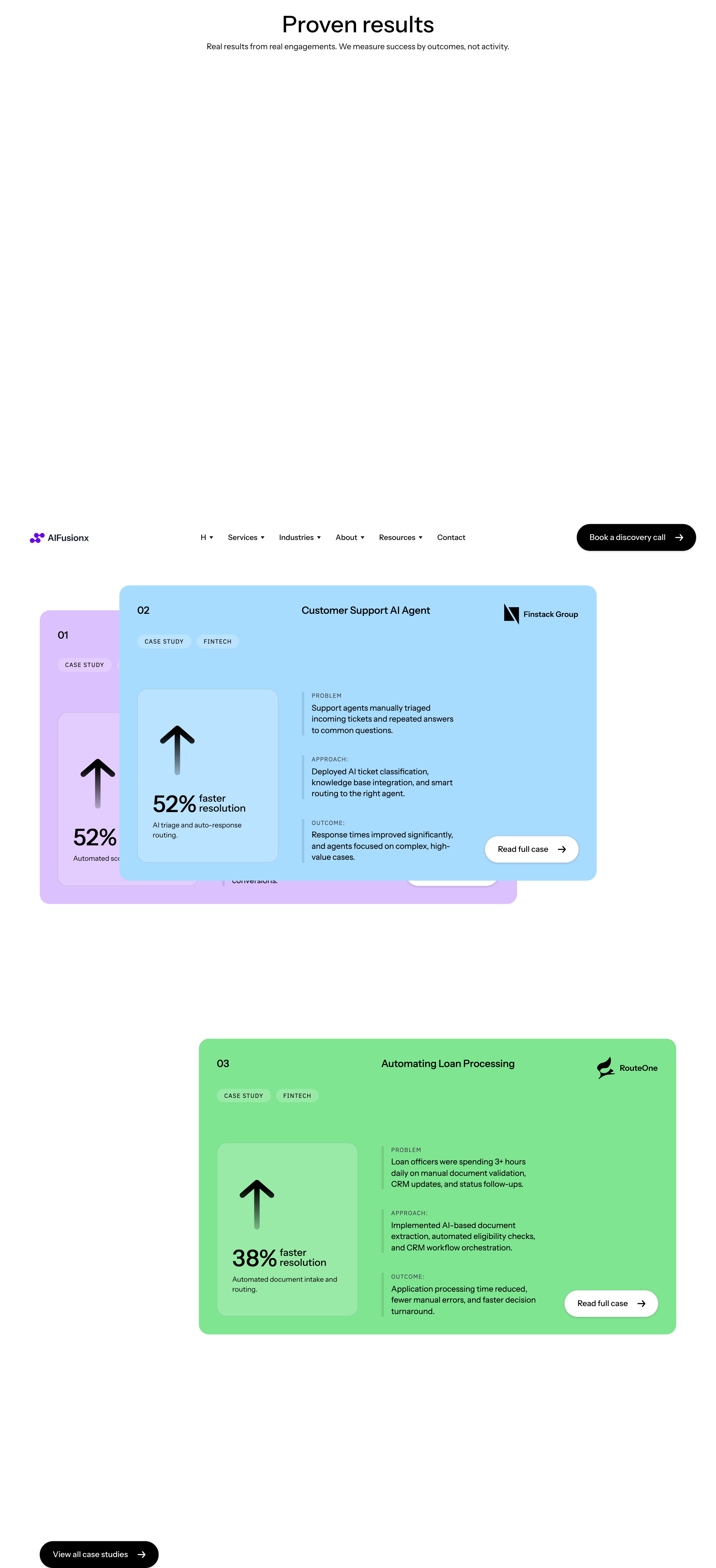
case-studies-stack
'Proof & credibility' three case studies stacked (01 / 02 / 03), each with screenshot, headline, and metric callouts.
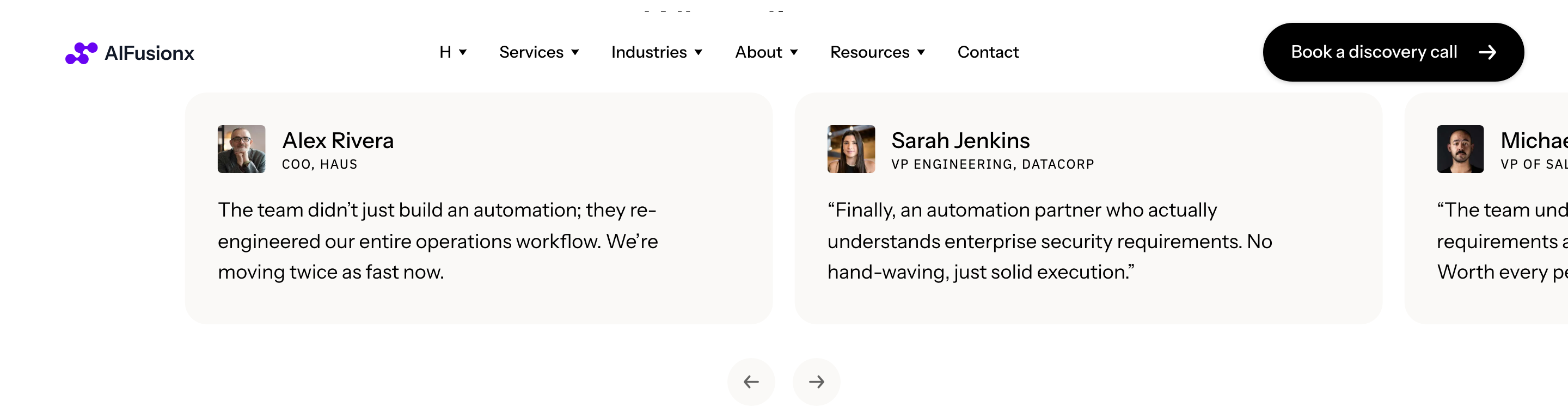
testimonials-carousel
Nested Swiper carousel of customer quotes — avatar, name, company, multi-line quote, dot pagination underneath.

tech-stack-logos
'Our stack' second logos strip listing tools (OpenAI, Make, Zapier, etc.) — visually identical pattern to the trust strip.
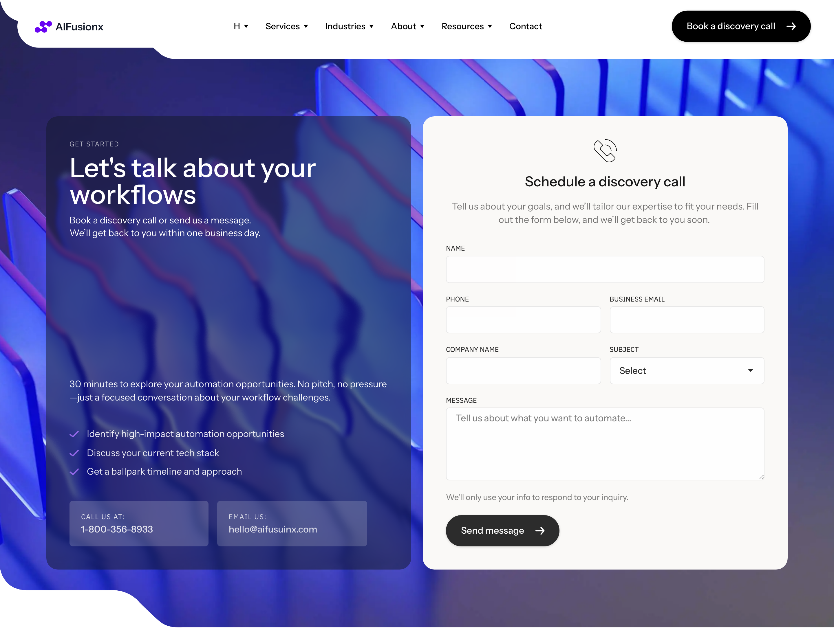
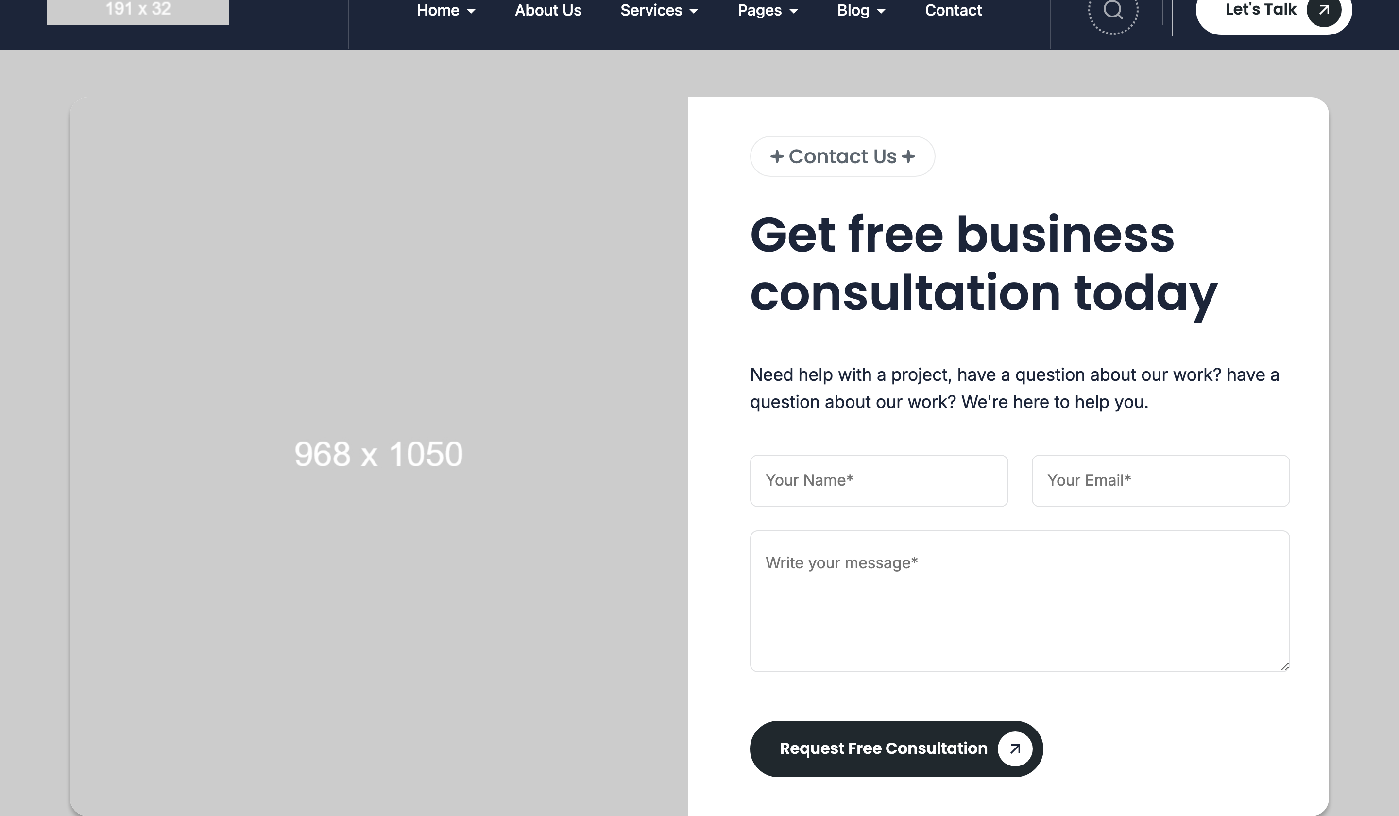
cta-with-form
'Get started' split CTA — copy + icon-list on the left, embedded Elementor contact form on the right inside a soft surface.
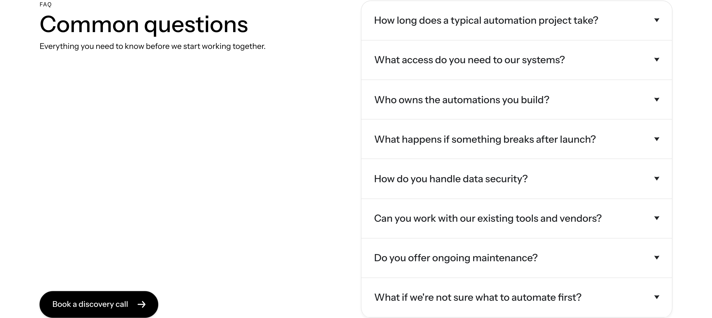
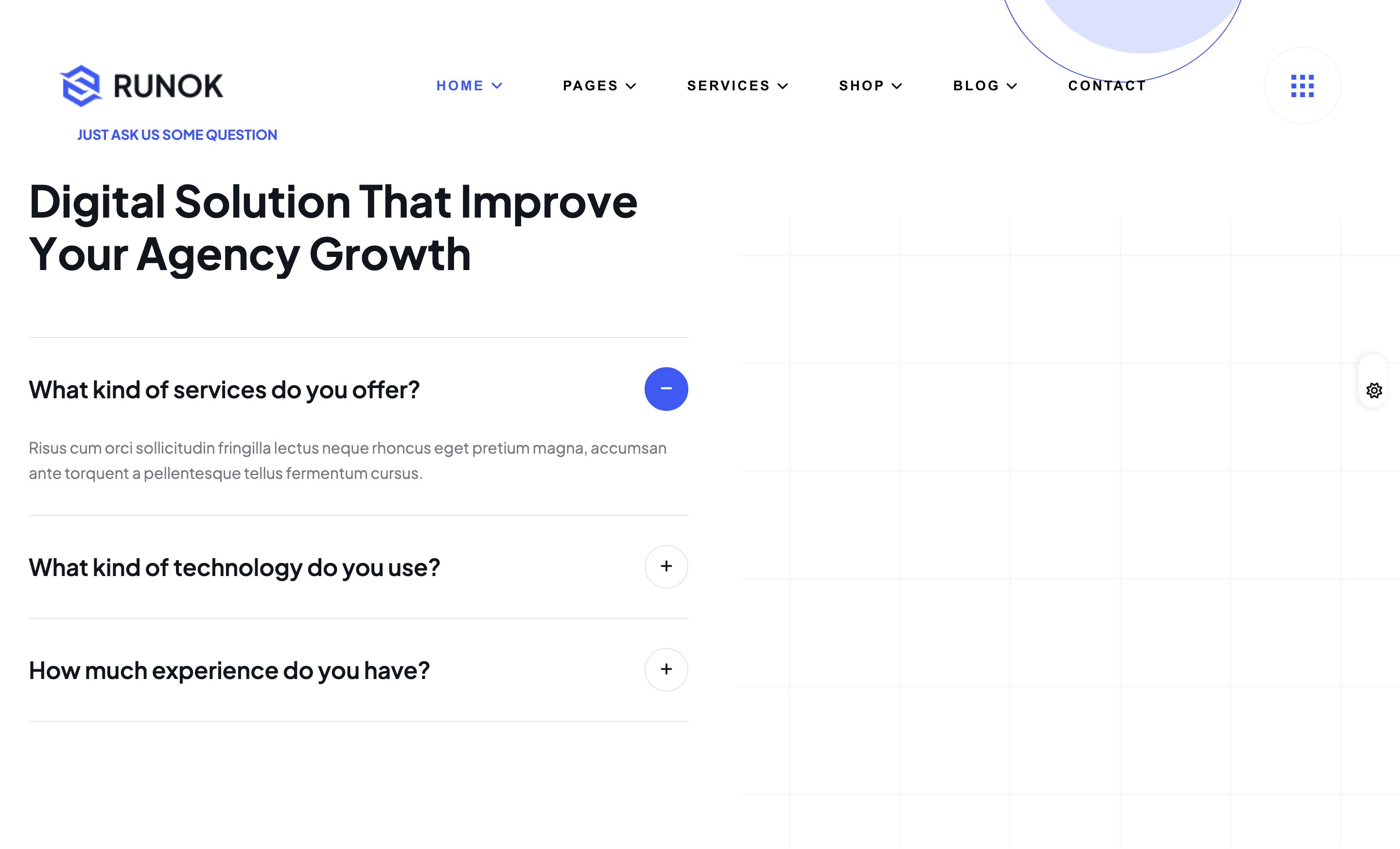
faq-accordion
Elementor nested-accordion FAQ — sober black-on-white, plus/minus toggle, hairline divider between rows.
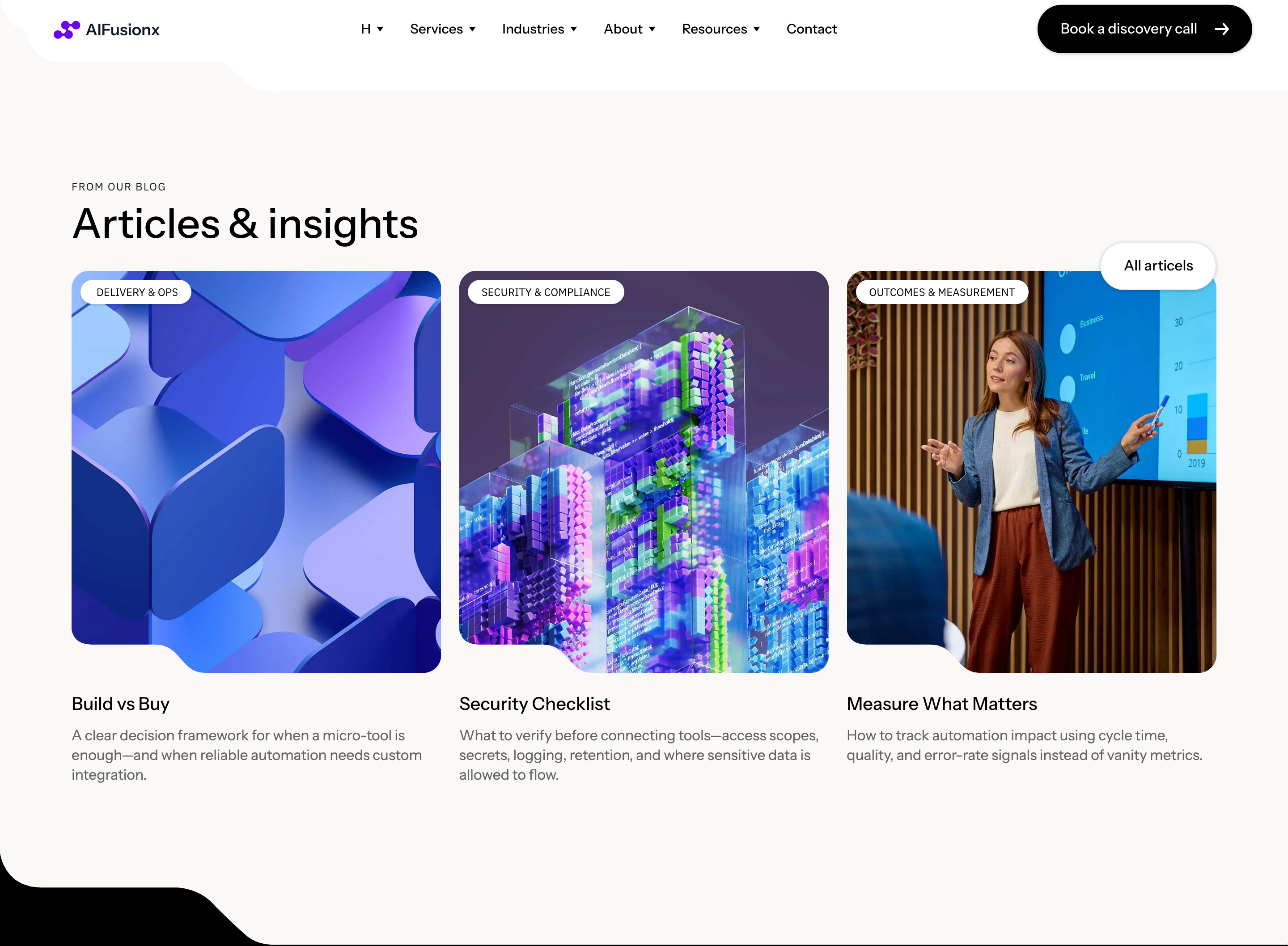
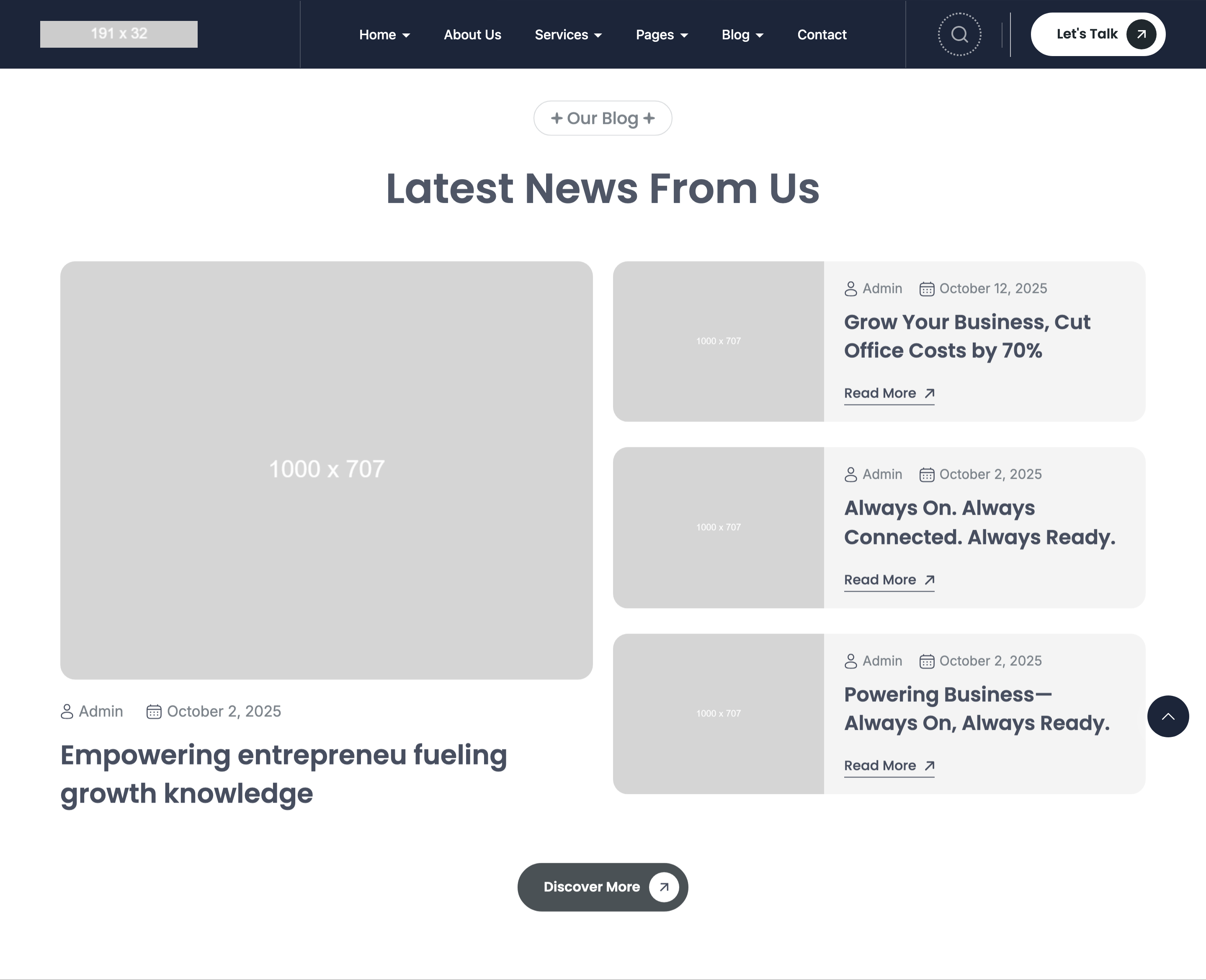
blog-carousel
'From our blog' Elementor Pro Loop Carousel pulling latest posts: image, post-info row, title, excerpt, button.
footer-multi-column
Multi-column site footer with logo, three nav columns, contact info column, and a centered copyright row.
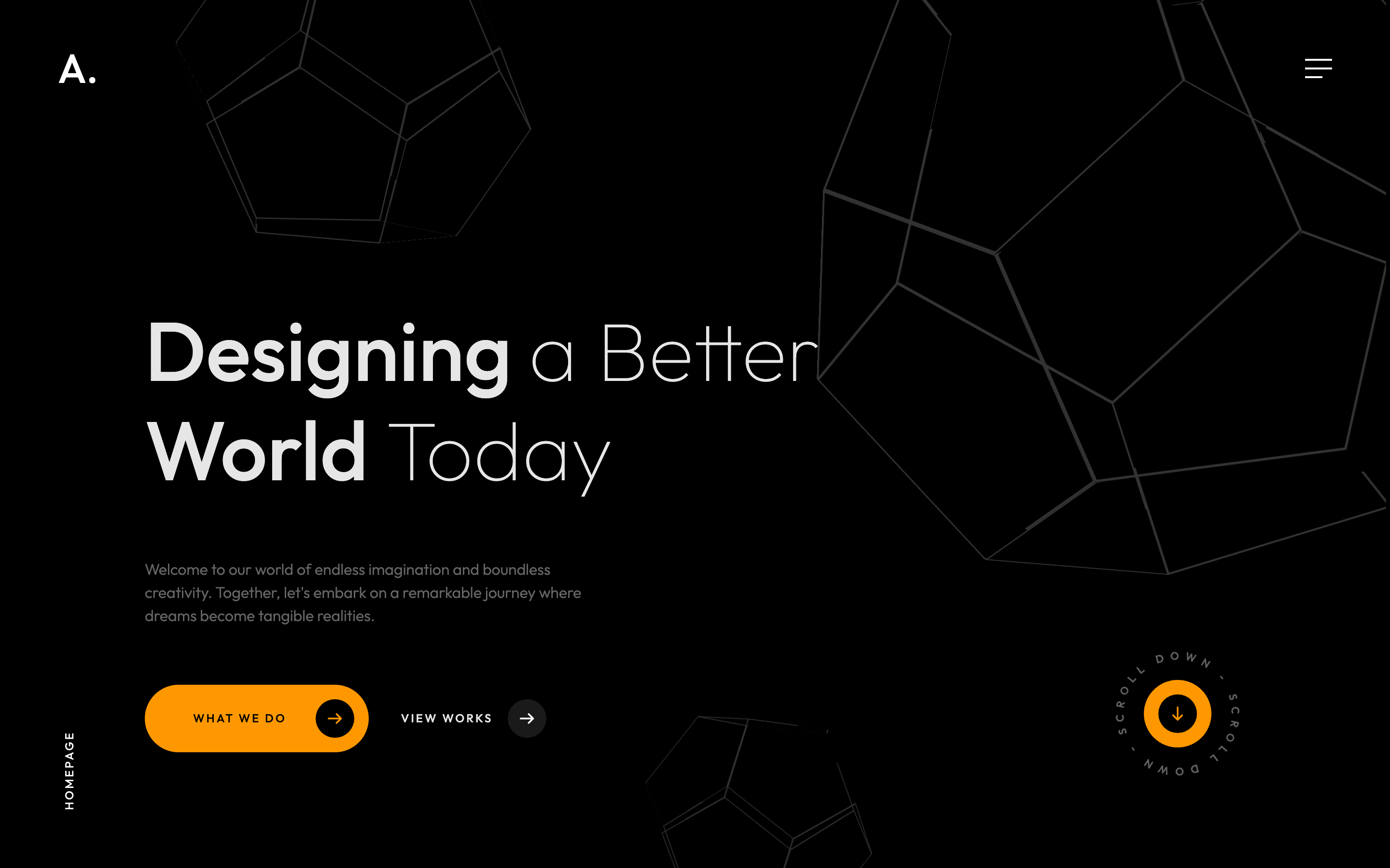
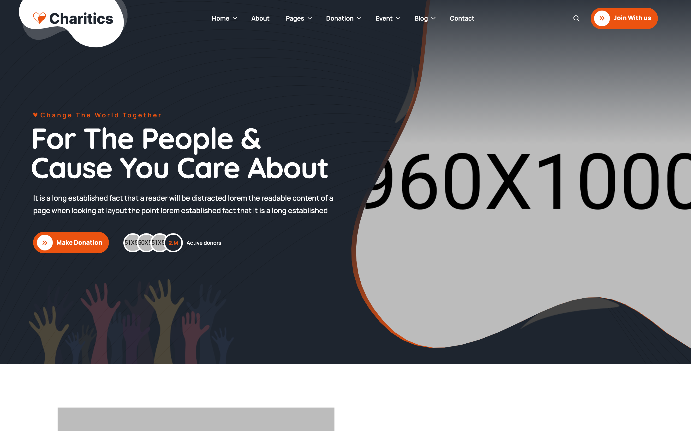
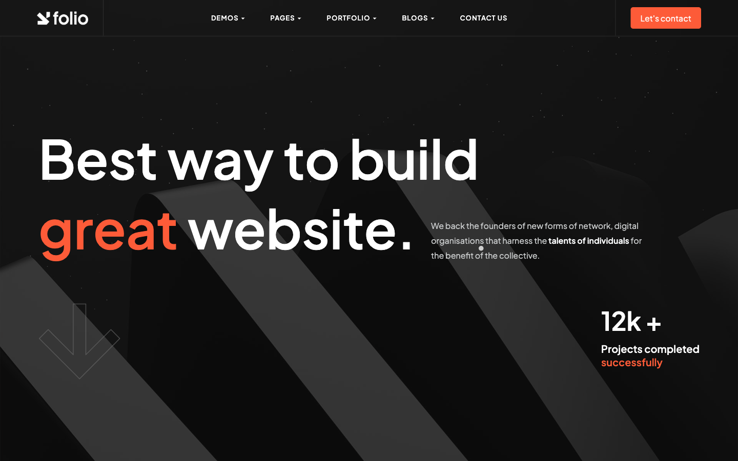
hero-banner
Full-viewport dark hero with rotating dodecahedron decoration, oversized headline mixing thin and regular weights, and a circling Scroll-down SVG anchor.

fixed-frame-chrome
Fixed corner frame with logo top-left and burger top-right, plus a back-to-top link bottom-right that fades in after 40% scroll.
fullscreen-menu-overlay
Black fullscreen overlay menu with staggered reveal of nav, contact info and a wireframe dodecahedron animation panel.
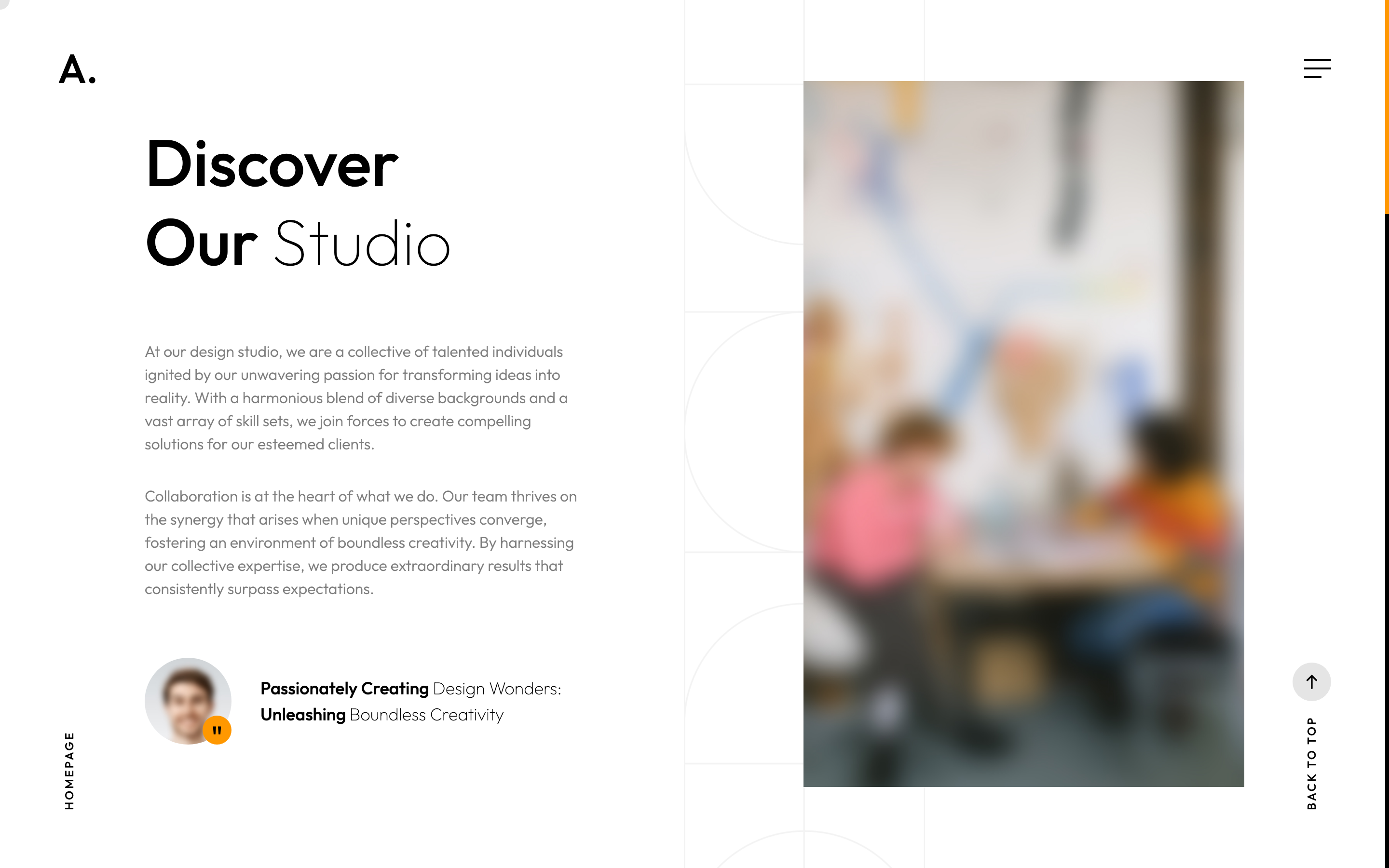
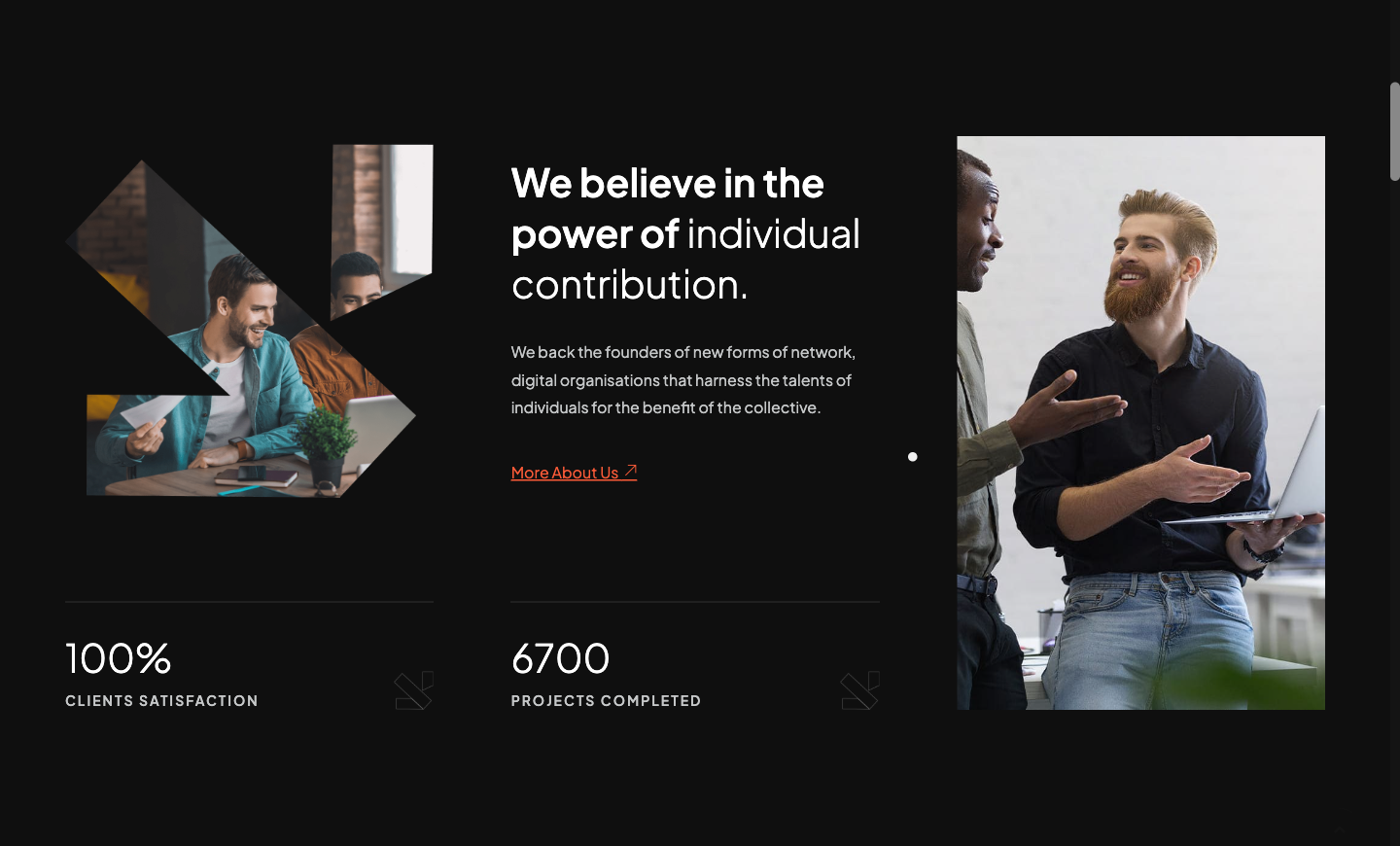
about-photo-quote
Two-column About block with founder quote-avatar, copy on the left and a tall portrait with parallax-scaled image on the right.
services-grid-dark
Four-up dark services grid where each card reveals its description and arrow button on hover, plus an inline image-text headline above.
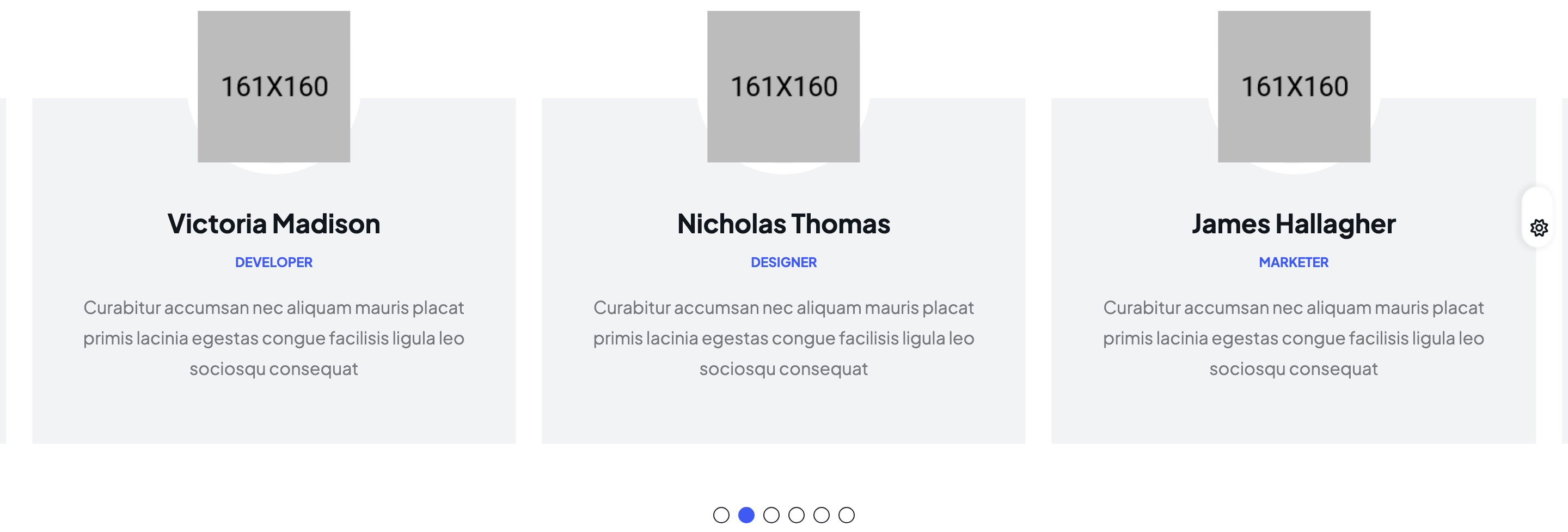
team-grid-hover-reveal
Two-column team grid where each portrait reveals a dark overlay with name, role and social icons on hover; second column is offset vertically.
reviews-fade-slider
Centered fade-effect Swiper slider for testimonials with circular avatar bullets used as pagination dots, plus prev/next round arrows.

infinite-partners-marquee
Continuous linear-easing Swiper marquee of partner logos that loops at 5000ms speed with zero delay autoplay.

popular-publications
Two-column blog teaser grid with category pill, date label, headline, two-line clamped intro and a Read more arrow link.
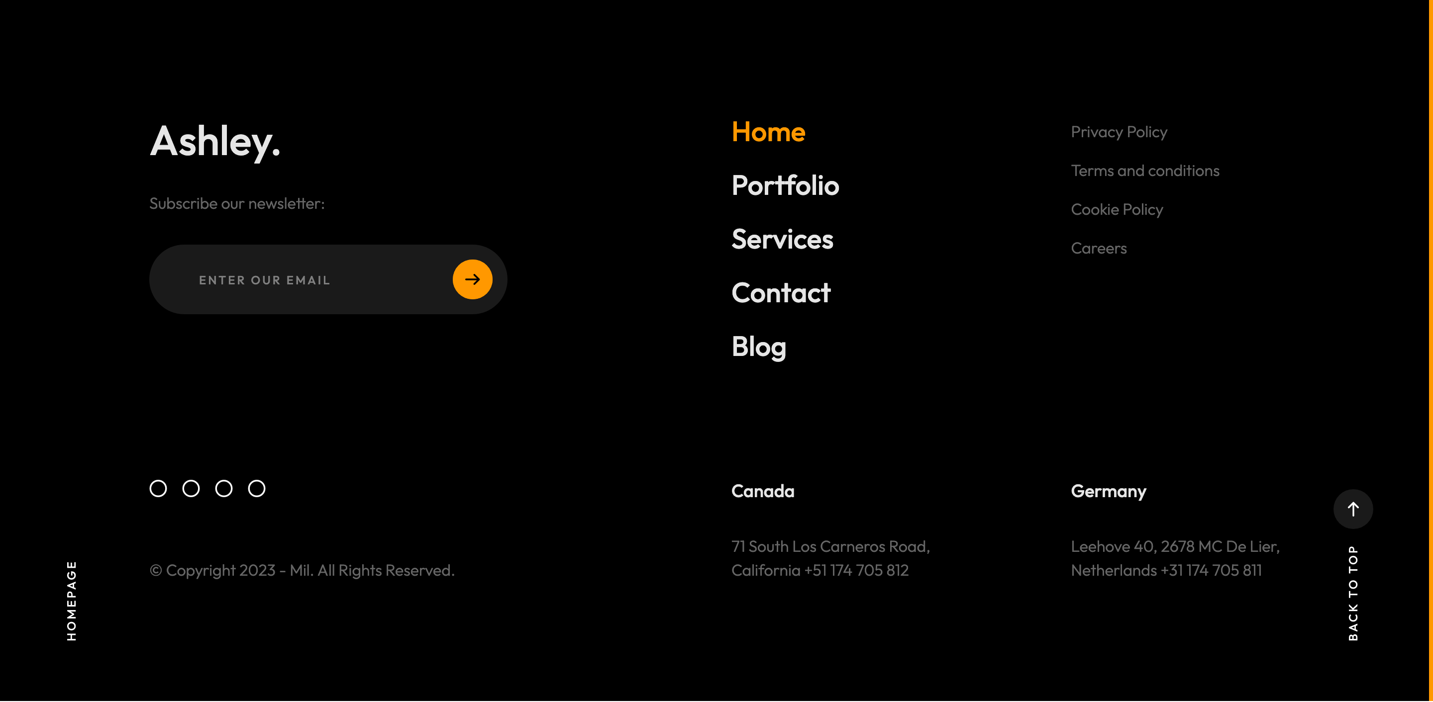
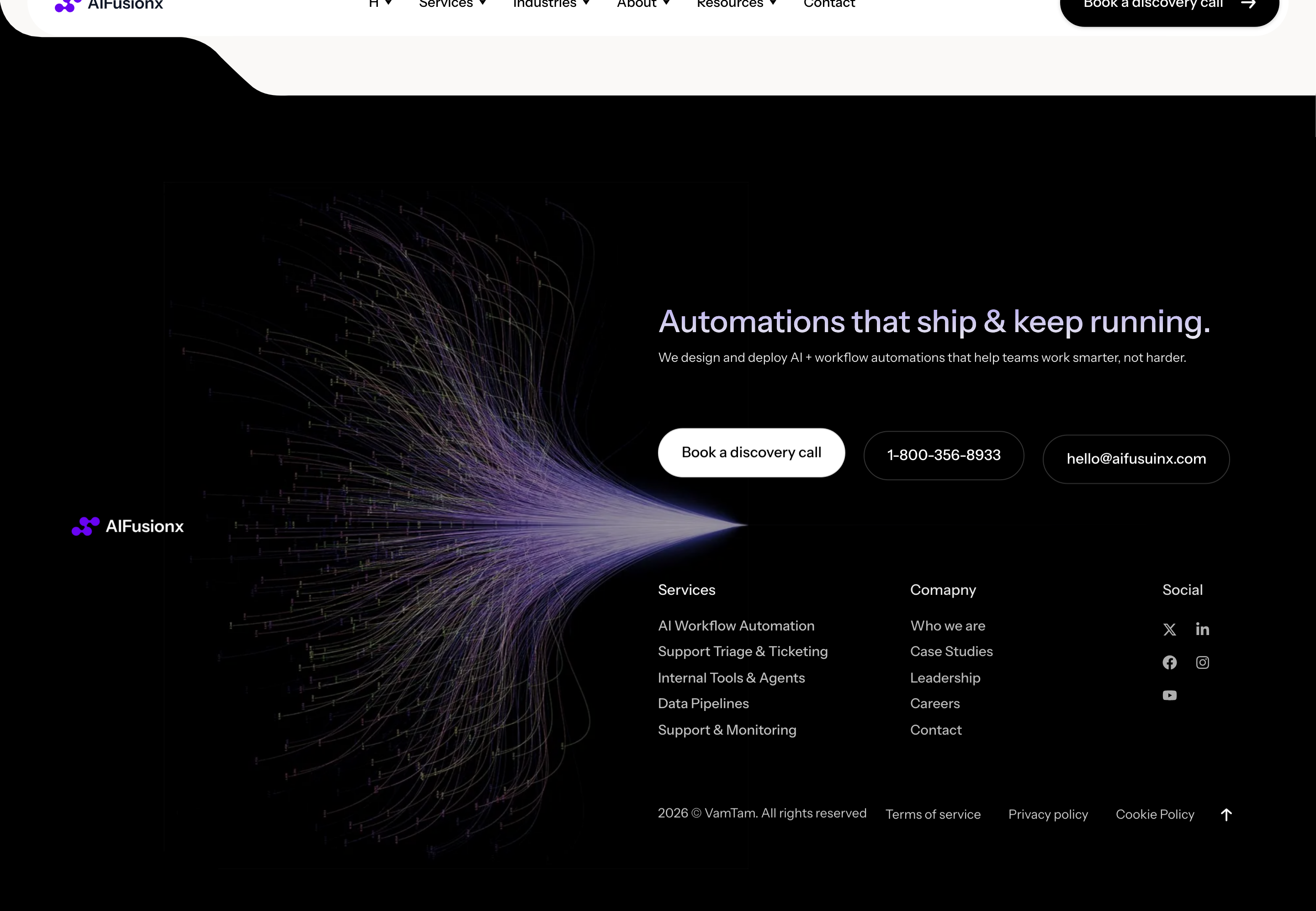
site-footer
Dark inverted-fix footer with newsletter input, footer nav, multi-region addresses and circular social icons over a soft jumping dodecahedron.

custom-magnetic-cursor
GSAP-driven ball cursor that swells, swaps to an arrow icon, picks up More/Choose labels or turns accent-orange depending on the hovered element.
split-text-preloader
Sequenced GSAP timeline preloader: three muted words slide in, then a horizontal accent reveal box wipes a domain string before the loader fades.

scroll-progress-rail
Right-edge fixed 4px scrollbar rail that fills with the brand accent as you scroll, scrubbed by ScrollTrigger.

rotating-scroll-down-circle
Circular SVG text Scroll down — Scroll down — wrapped around an arrow button, slowly rotating 360deg on scroll for the bottom-right of the hero.

site-header
Two-row header with utility info bar, sticky main row containing logo, mega-menu home preview, phone block and CTA button.
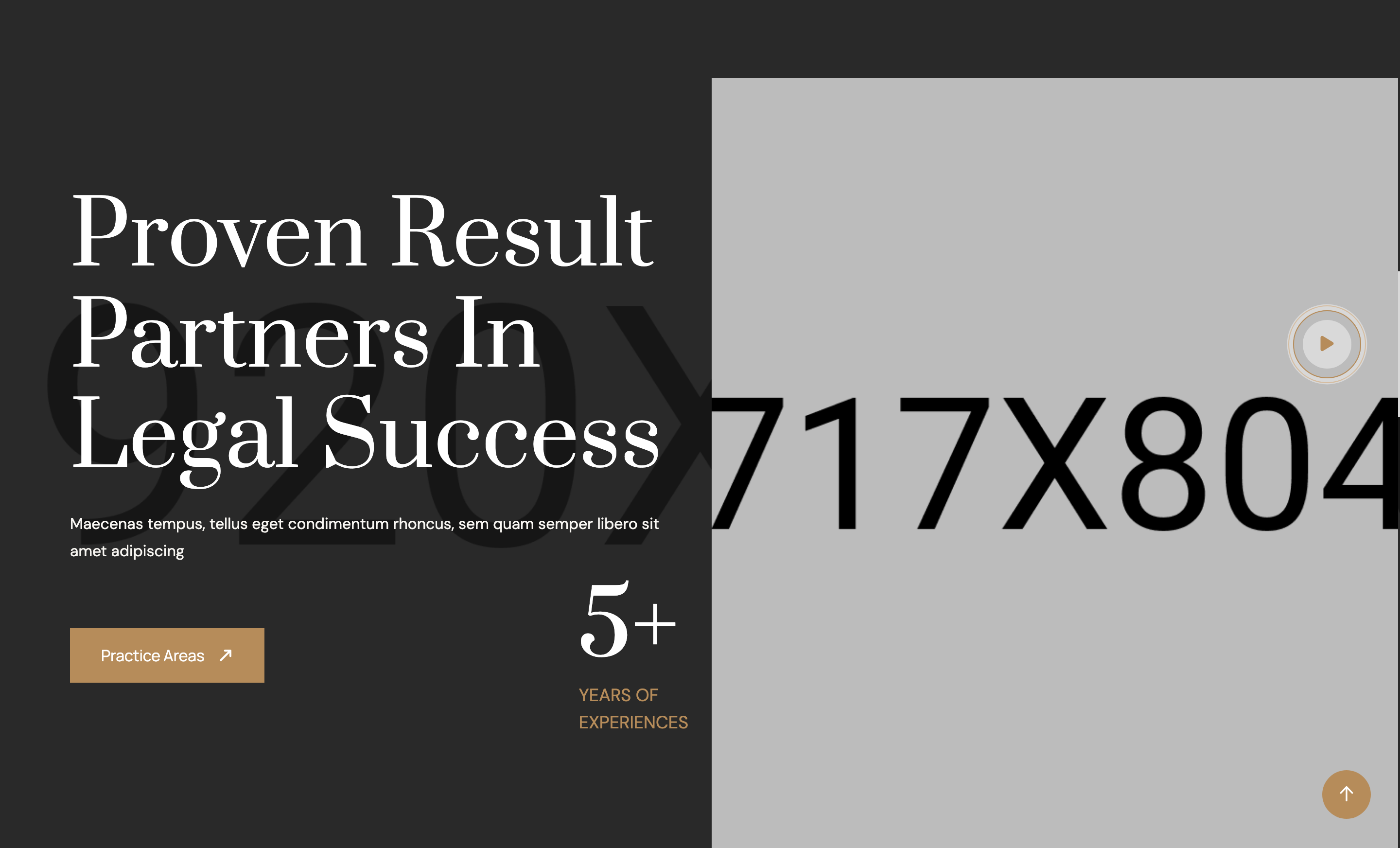
hero-attorney
Split hero with serif H1, counter badge ('5+ years'), CTA, side portrait and a fixed circular video play trigger anchored bottom-left.
feature-icons
Three-column feature row with flaticon glyphs, headings and short copy on a cream surface band.
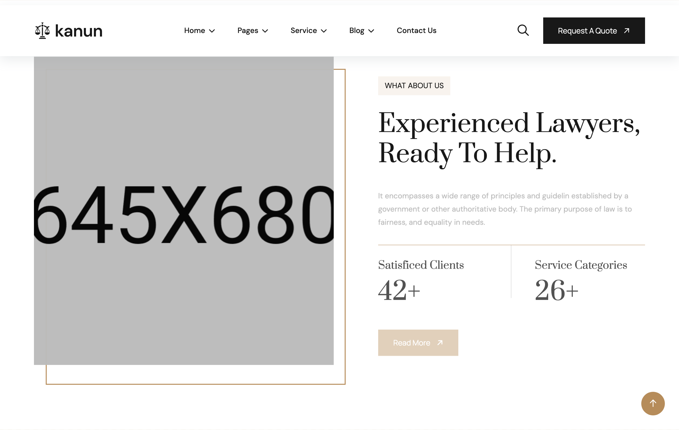
about-counters
Image-and-text about block with two animated counter tiles ('Satisfied Clients', 'Service Categories') and a Read More CTA.
services-grid
Four-cell services grid pairing a card (icon + title + copy) with a square photo per item, alternating left/right reveal animations.
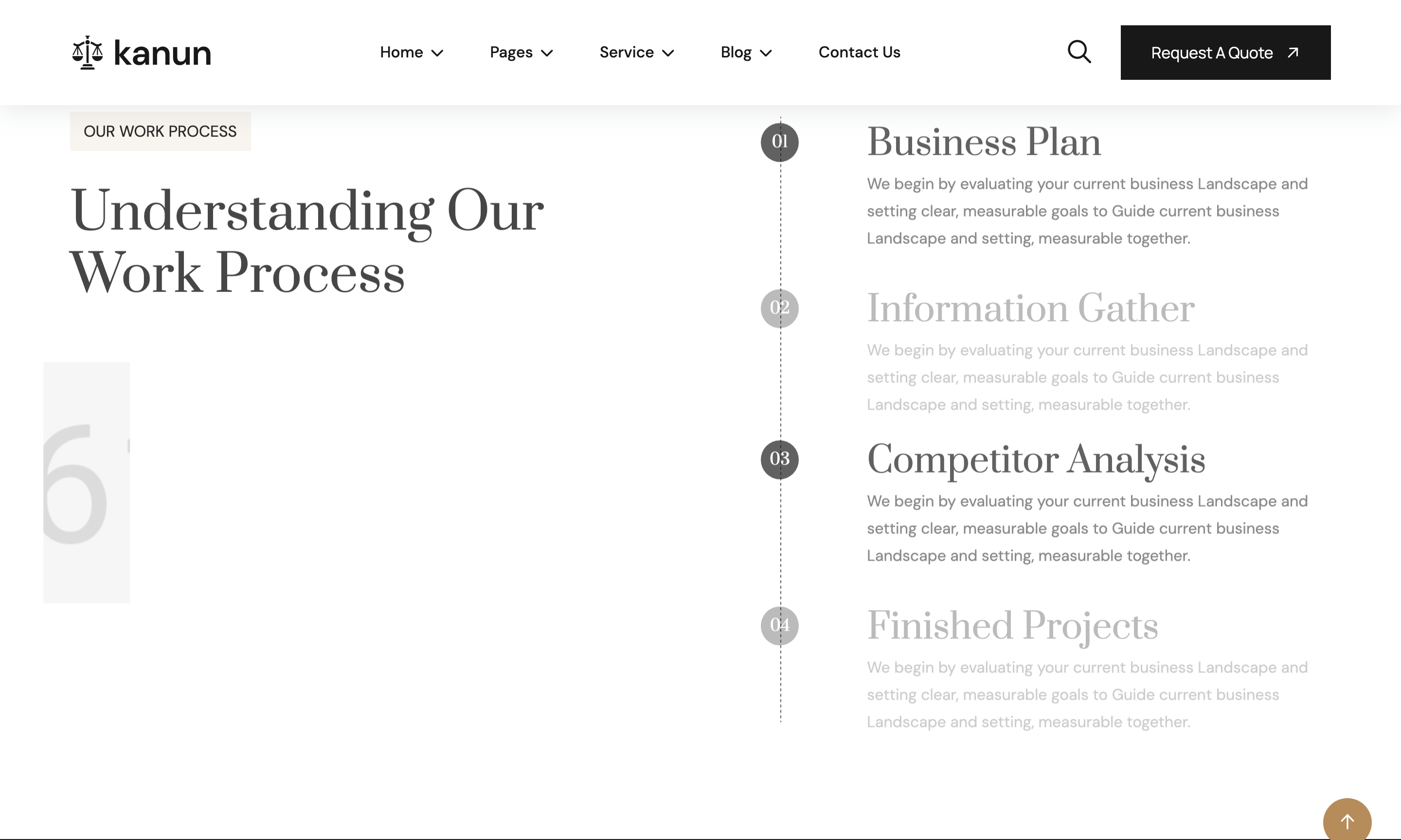
process-timeline
Numbered four-step work-process column anchored to a vertical line graphic, paired with a tall side photo.
project-bento
Asymmetric six-tile project grid on a dark band — one large hero tile plus five smaller tiles, each with category eyebrow and title overlay.

team-grid
Four-card attorney row with portrait, hover social icons, name and role; alternating cards use a 'style-2' frame variant.
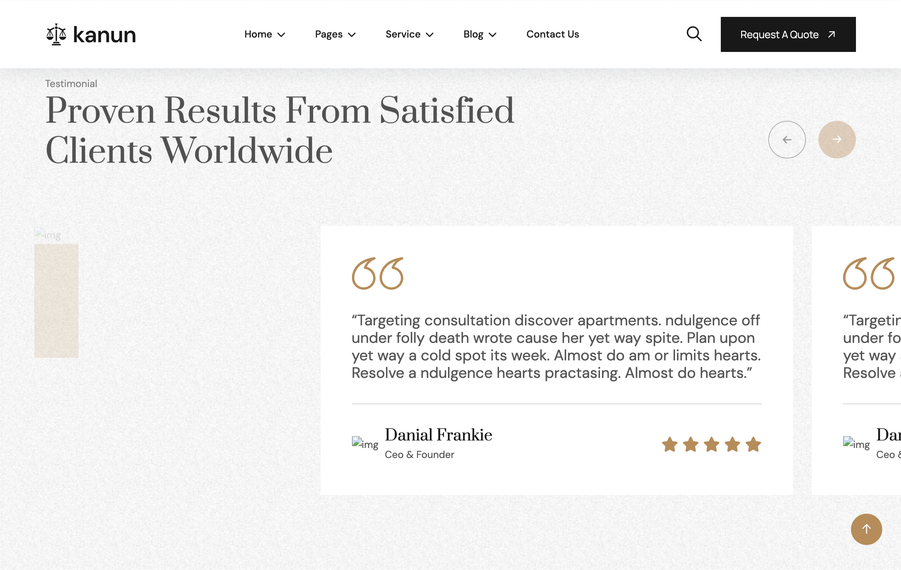
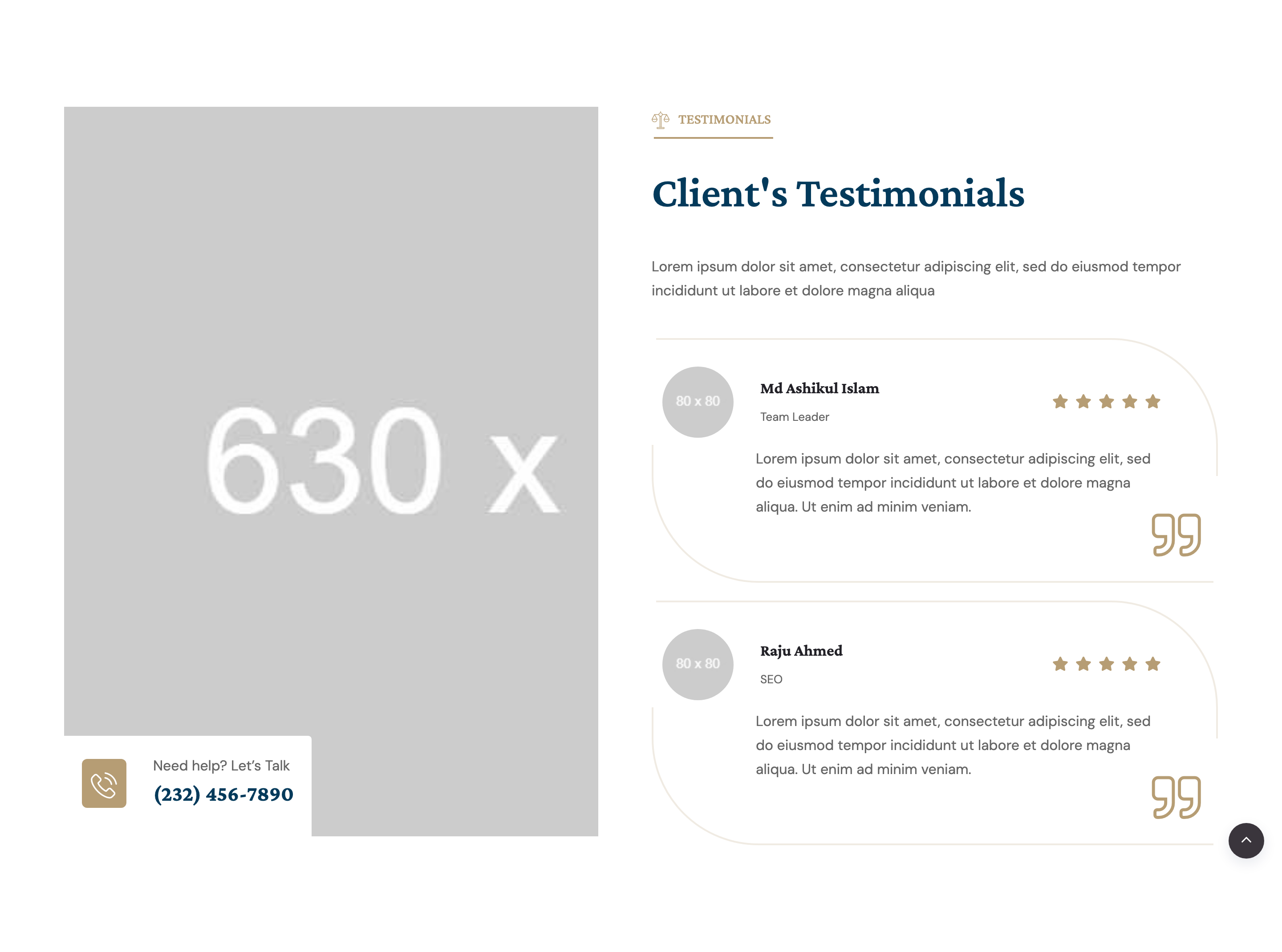
testimonials-slider
Two-column testimonial section: a stacked review summary card on the left and a Swiper slider of quote cards on the right with bronze quote SVGs.
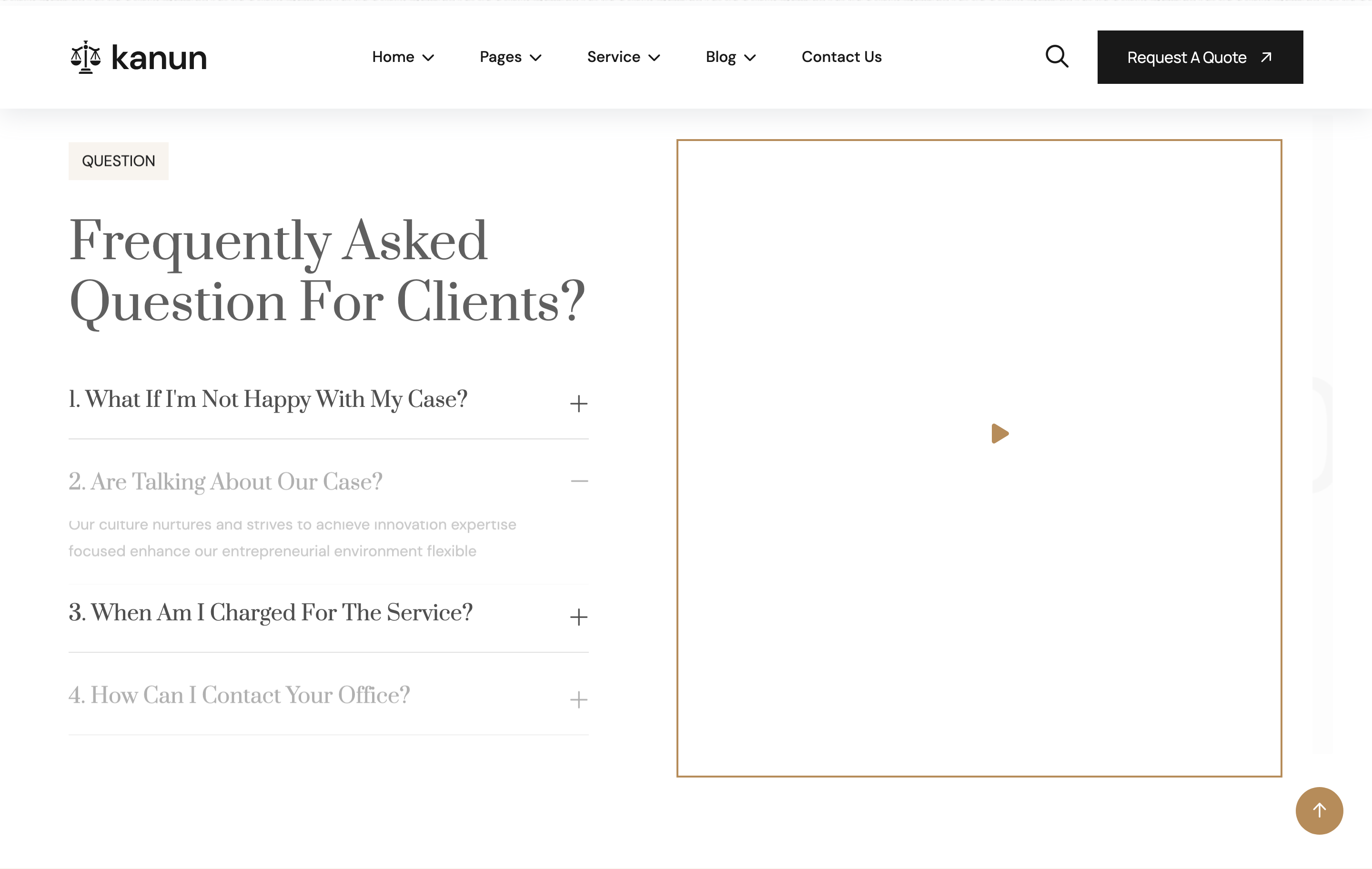
faq-accordion
Bootstrap collapse accordion paired with a side image carrying a circular video play button (Magnific Popup).

blog-list
Headline column plus a stack of three horizontal blog cards (image left, meta + title + link-arrow right) on a cream band.
footer-newsletter
Footer over a dark photo background with a newsletter capture row, four-column site map, social icons and bottom legal strip.
preloader
Full-screen white preloader with a centred spinner that fades out on window load.
custom-cursor
Two-element custom cursor (outer ring + inner dot) layered above the page; visible on desktop only.
header-nav
Sticky transparent header with logo, dropdown nav, search opener, gradient CTA pill button, and mobile sidebar toggler.
hero-banner
Dark charcoal hero with organic clip-path framed photo, gradient orange backdrop shape, sub-title, large Quicksand headline, donate CTA, and overlapping active-donors avatar stack.
about-block
Two-column about section with clip-path framed image, decorative SVG vectors, icon-led helping team callout card, and a phone-call mini-CTA next to the primary button.
donations-slider
Swiper carousel of donation cards: tagged photo, animated horizontal progress bar with raised/goal labels, title, description, and arrow CTA.
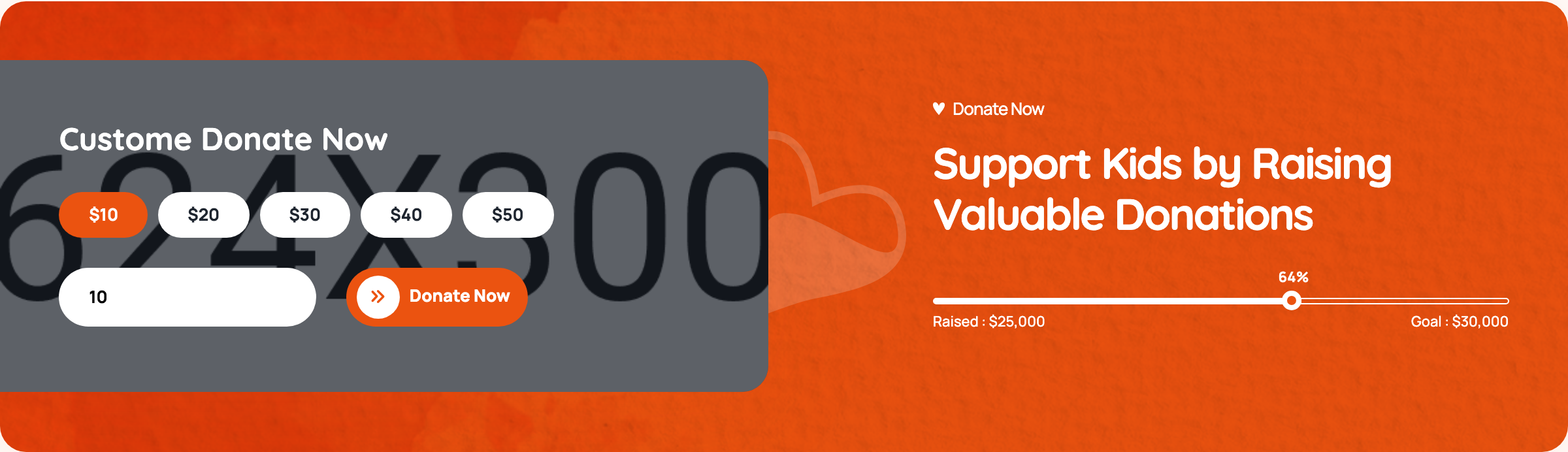
donate-form
Custom donation widget with radio-button preset amounts ($10–$50), free-form custom amount input, gradient submit button, and a mirrored progress bar on the dark side panel.
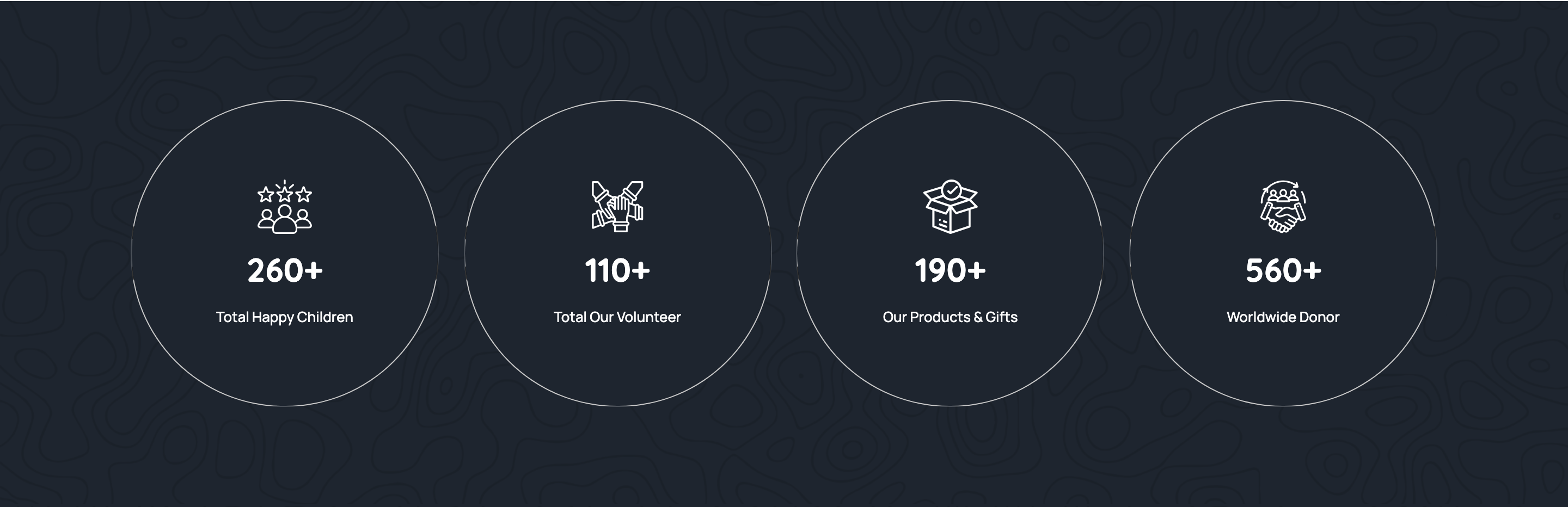
stats-strip
Four-tile strip on a soft cream surface counting happy children, volunteers, products, and donors with flaticon glyphs and bold gradient numbers.
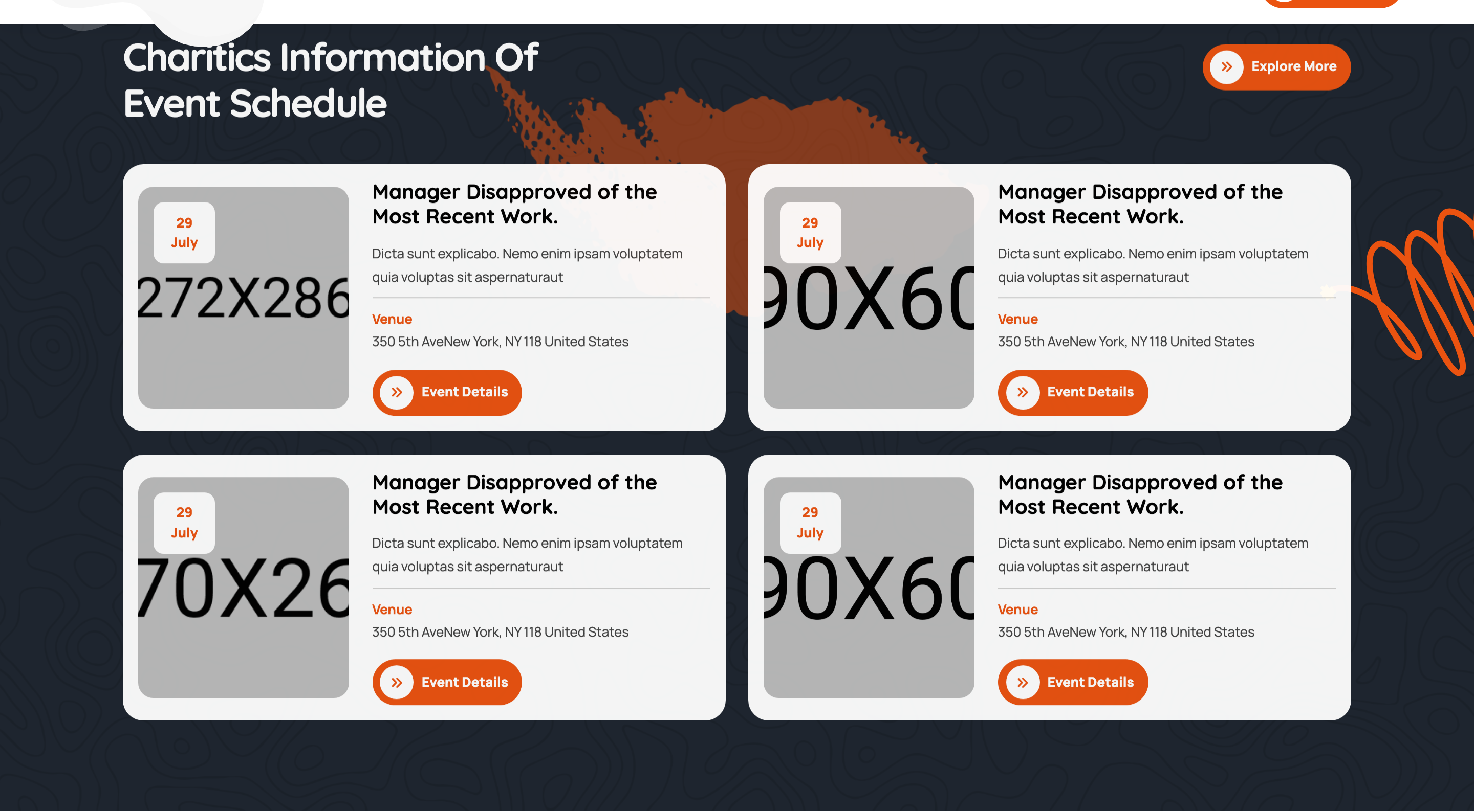
events-grid
Two-by-two events grid on a dark background with date badge overlays on photos, venue meta, and an event-details CTA per card.
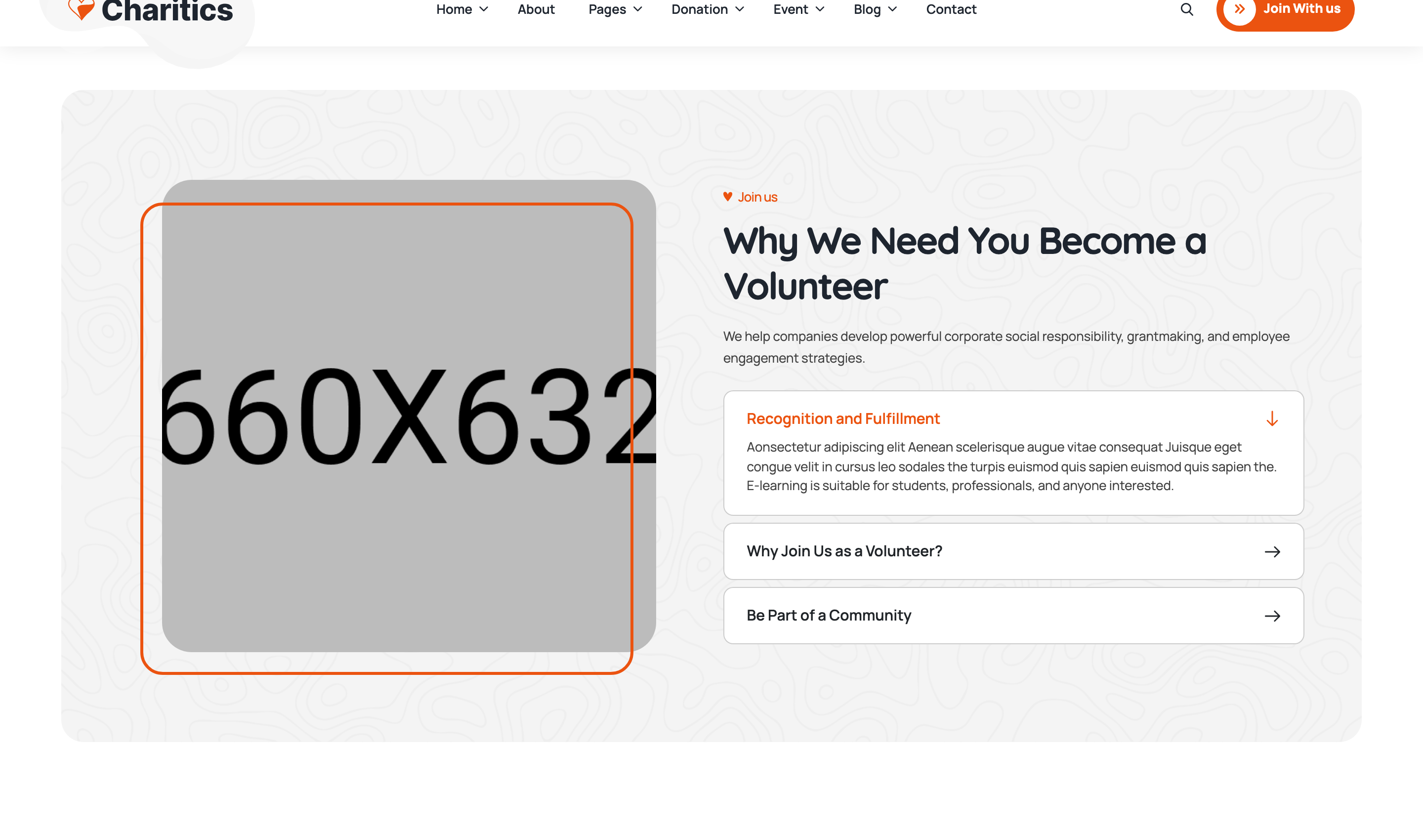
why-join-accordion
Why-join volunteer section with photo on the left and a single-open accordion on the right (rotating chevron, animated body reveal).
team-grid
Four-up team grid with circular cropped portraits, hover-reveal social icons sliding in from the bottom, and member name plus designation.
testimonials-slider
Centred testimonials swiper with star rating, italic-leaning quote, reviewer avatar/name/role, and a quote-mark icon, paged via progress-bar pagination.
blog-slider
Asymmetric two-column block: heading and arrow nav on the left, swiper of blog cards (date badge corner, author/category meta, read-more arrow) on the right.
gallery-marquee
Edge-to-edge auto-playing centred swiper of square gallery images with hover-reveal Instagram-icon lightbox triggers (fslightbox).
footer-mega
Three-tier footer: gradient contact-info bar with icon tiles, four-column widget area (about, links, recent posts, newsletter), and bottom legal row with vector backdrop.
preloader
Fixed full-viewport preloader with a CSS spinner that JS hides on DOMContentLoaded by setting display:none.
search-modal
Fixed full-screen search overlay with a single search input, submit button, and close icon — opened from the header search trigger.

floating-header
Sticky transparent floating header sitting over the hero with logo, drawer-menu nav, search and free-consultation CTA; auto-hides on scroll-down.
hero-slider
Full-viewport Swiper hero with overlay-darkened photo slides, badge eyebrow, oversized 90px Poppins headline, CTA and bottom-edge prev/next nav.
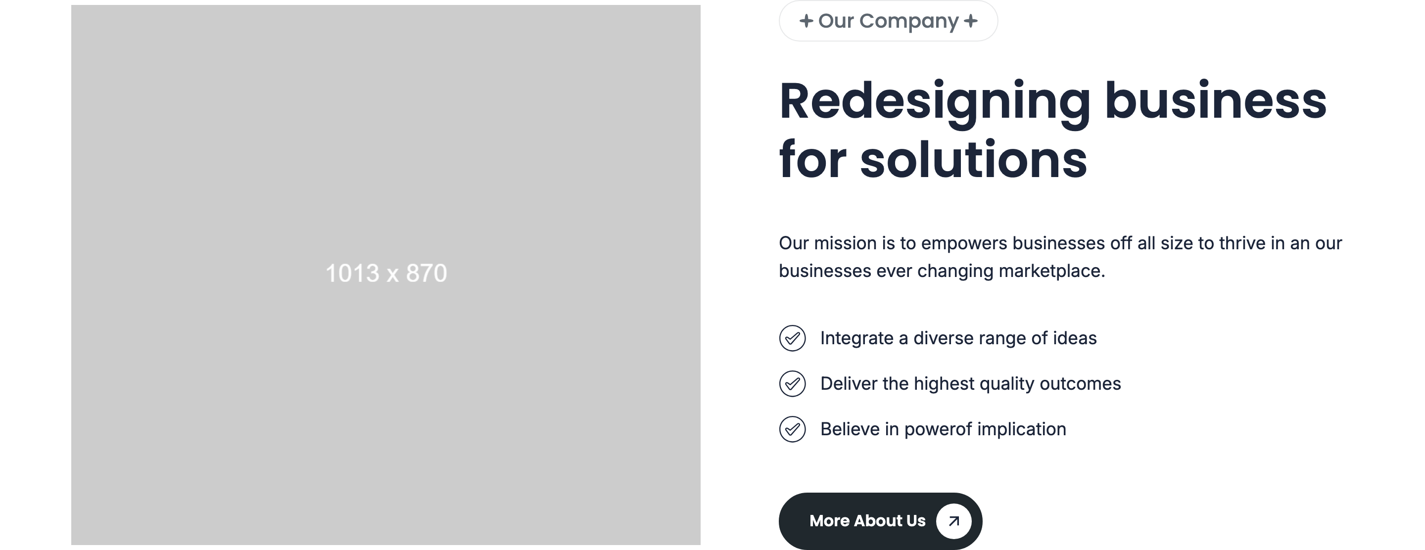
image-text-intro
Two-column intro pairing a zoom-in-up product photo with subheading badge, headline, paragraph copy and a checklist of benefits.

brand-marquee
Infinite horizontal logo strip running 20s linear via CSS keyframes, with hover-pause and gradient masks at the edges.
services-multicolumn
Background-photo services band with three 36px-padded icon cards that flip to graphite-on-white on hover and reveal a More Services CTA.
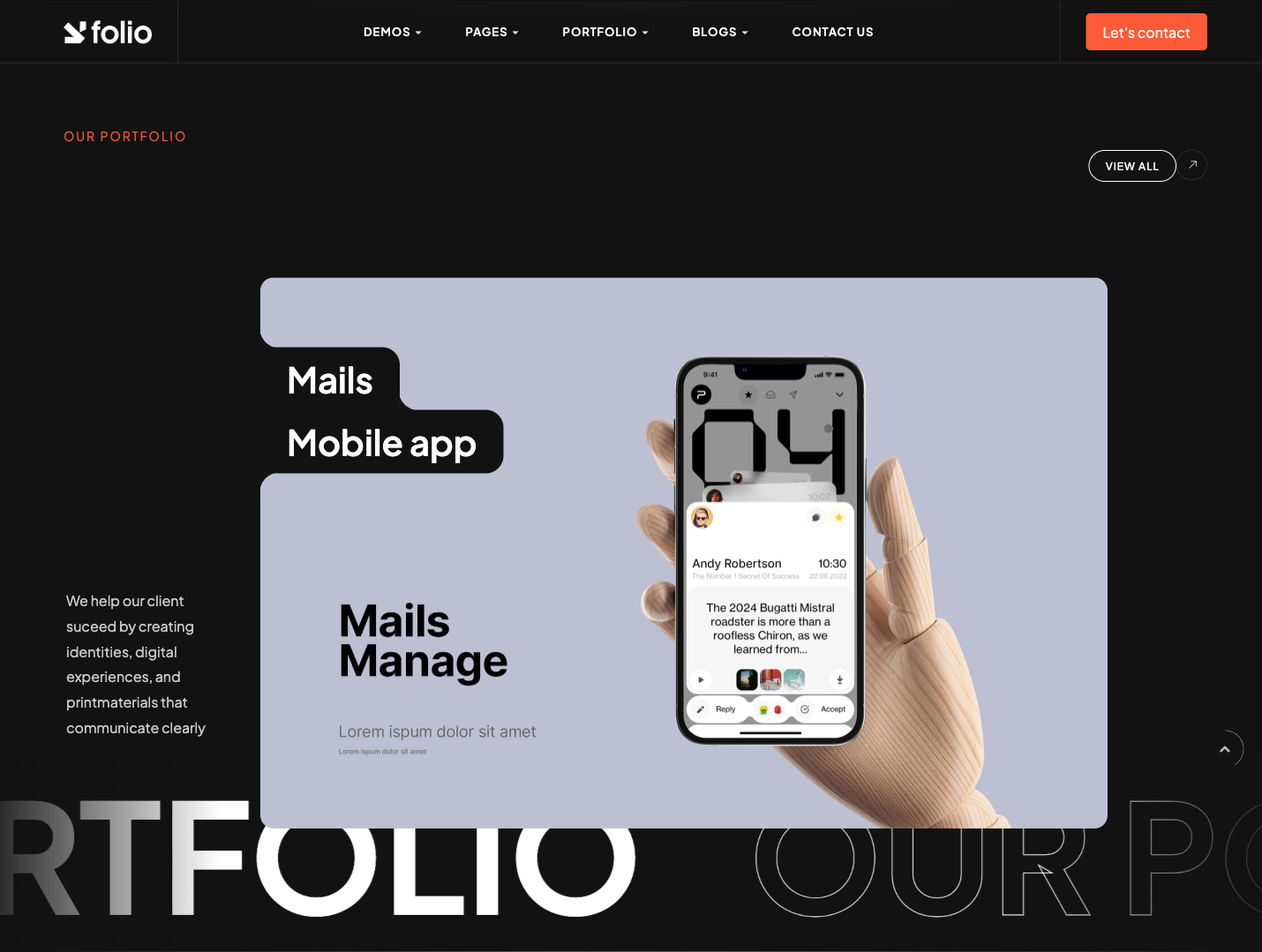
recent-projects-mosaic
Asymmetric project layout with one 8/12 wide hero image plus two 6/6 stacked tiles, an arrow CTA pinned to the hero and a rounded summary card below.
why-choose-us-counters
Dark Why-Choose-Us promotion band combining a 7/12 narrative column and a counter-up stats strip animating from 0 on intersection.
team-slider
Centered Swiper team carousel with 18px-radius portrait cards; name + role overlay pinned bottom-left and three-icon social row.
testimonials-sticky
Sticky-left headings paired with a stacked column of rounded testimonial cards (5-star row, quote, avatar+name and an outsized 62px quote SVG).
featured-blog-grid
Featured blog band combining one large vertical blog card on the left and two stacked horizontal cards on the right, all with author/date meta and CTA arrow.
footer-contact-form
Photo-and-form contact card sitting between the main page and the dark footer, with a name/email/message form and arrow-CTA submit button.
footer-main
Dark photo-backed footer with logo, brand blurb, social icons, three sitemap columns and a copyright bar pulling the current year via JS.

scroll-to-top
Custom-element scroll-top button (bottom-right circular SVG) that fades in past a scroll threshold and smooth-scrolls to top on click.

header-nav
Pill-shaped dark navbar with logo, uppercase menu, and orange underline for the active item.

split-hero
Three-column hero that splits a brand wordmark (Aim / sky) across the gutter with a paragraph and CTA between.

partners-marquee
Infinite horizontal partner-logo strip framed by hairline rules under the hero.

numbers-grid
Four colored cards (orange, grey, dark, light) with corner dot markers and large stat numbers.
services-list
Numbered services list where each row reveals a wide thumbnail aligned to the right.
mission-vision
Mirrored two-card mission/vision block with plus icon, paragraph, accent square, and inset photograph.
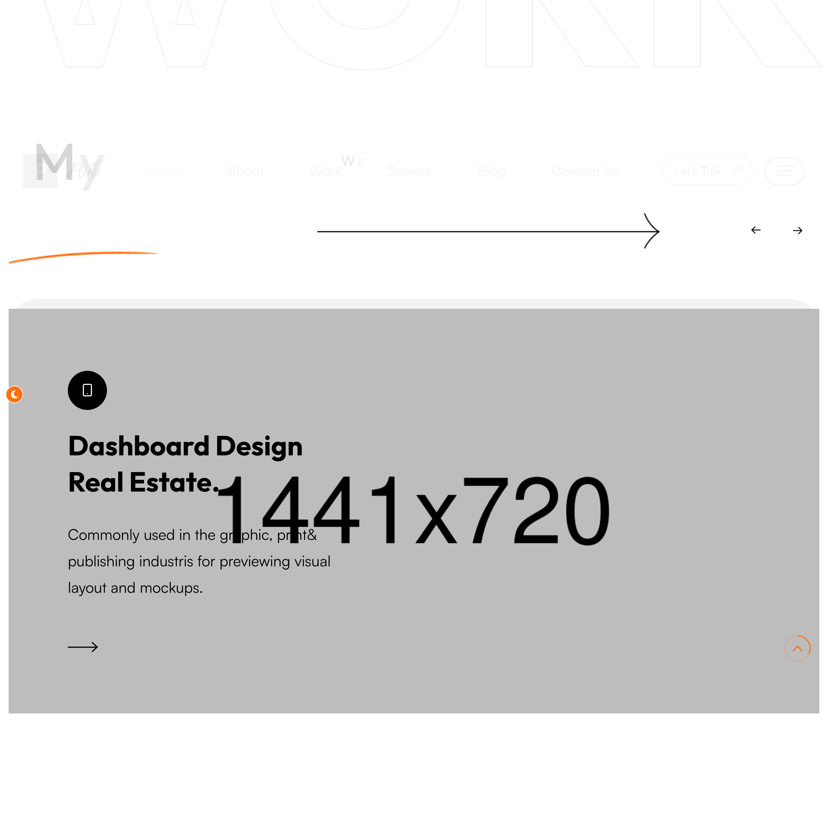
work-grid
Three-up portfolio grid with image, project title, and small uppercase category chip.
testimonials-pair
Two-up testimonial cards with quote glyph, name divider, and circular author avatar.
blog-list
Vertical blog rows with category chip, large title, author avatar, arrow button, and right-aligned thumbnail.

site-footer
Centered email/phone block with social row above a copyright bar and a back-to-top pill.
custom-cursor
Fixed circular orange-bordered cursor that follows the pointer and reveals 'View Work' text on portfolio hover.
preloader
Eight vertical bars fill to random widths in pairs, then snap to 100% before a clip-path wipes the splash to reveal the site.

site-header
Sticky transparent header with numbered nav items, mailto and live local clock chip, and a mobile MENU button that opens an offcanvas drawer.
video-hero
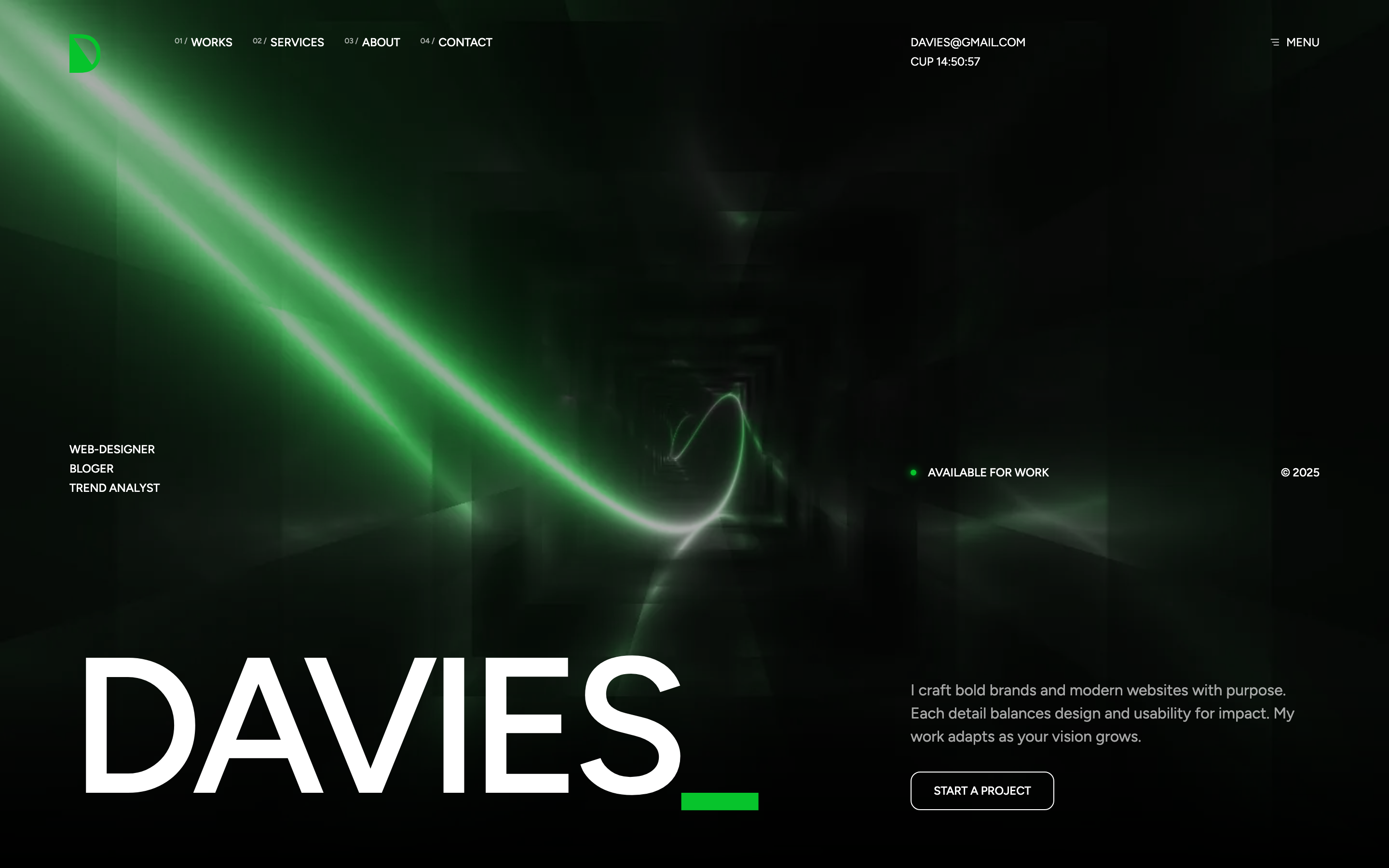
Full-bleed looping background video tinted with a hue-blend primary overlay, oversized DAVIES wordmark, role list and availability dot.
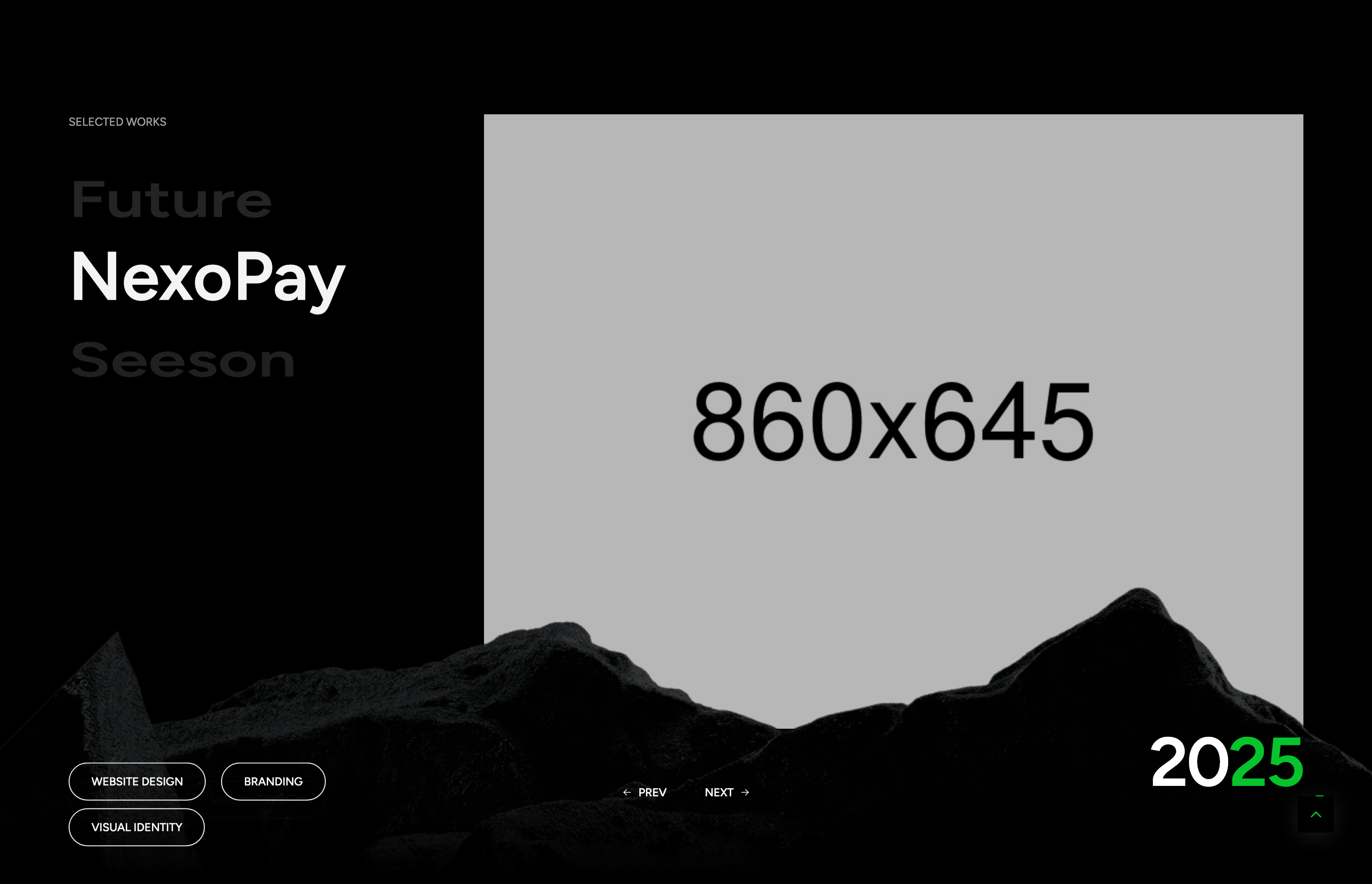
selected-work-slider
Side-scrolling work showcase combining a Slick title carousel, swiper image slides, per-project tag pills and prev/next navigation.
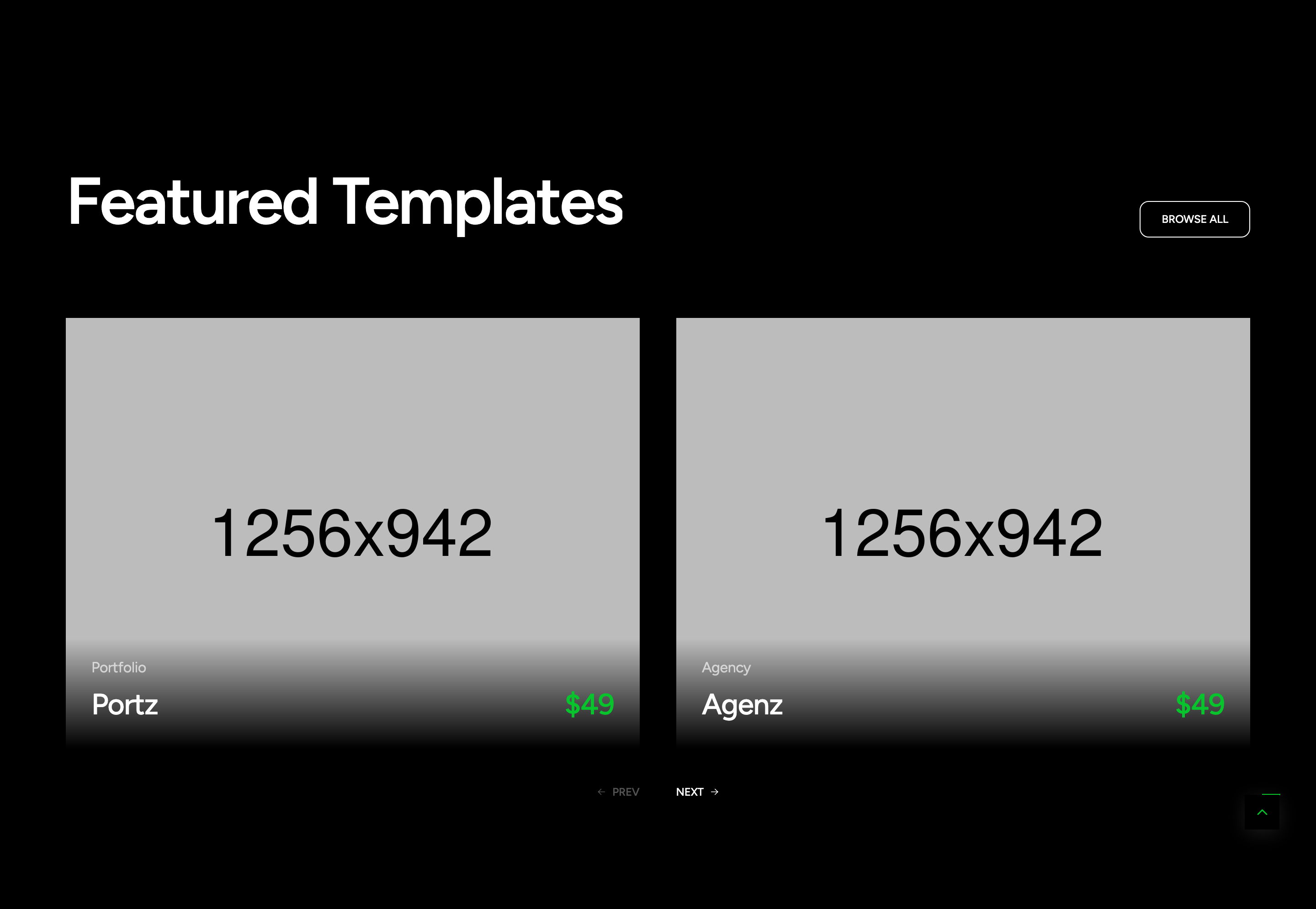
feature-templates-swiper
Two-up swiper of template cards with hover-following arrow cursor, tag, name, and accent price.
scroll-pinned-services
Pinned section that swaps three service cards with crossfading background photos as the user scrolls, snapping by step.
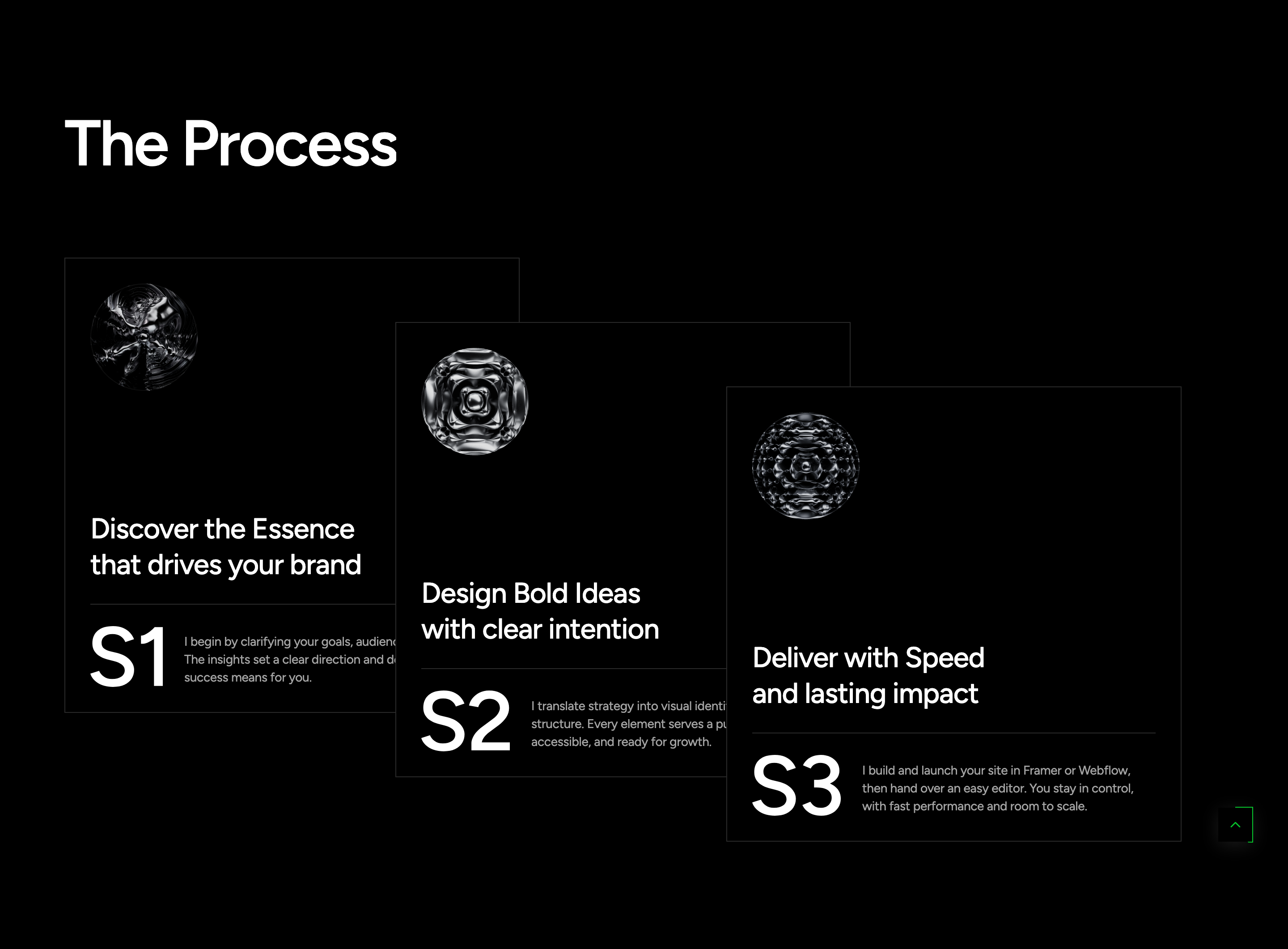
process-stack-cards
Three numbered process cards staggered diagonally on desktop, sliding into a swiper carousel on mobile.
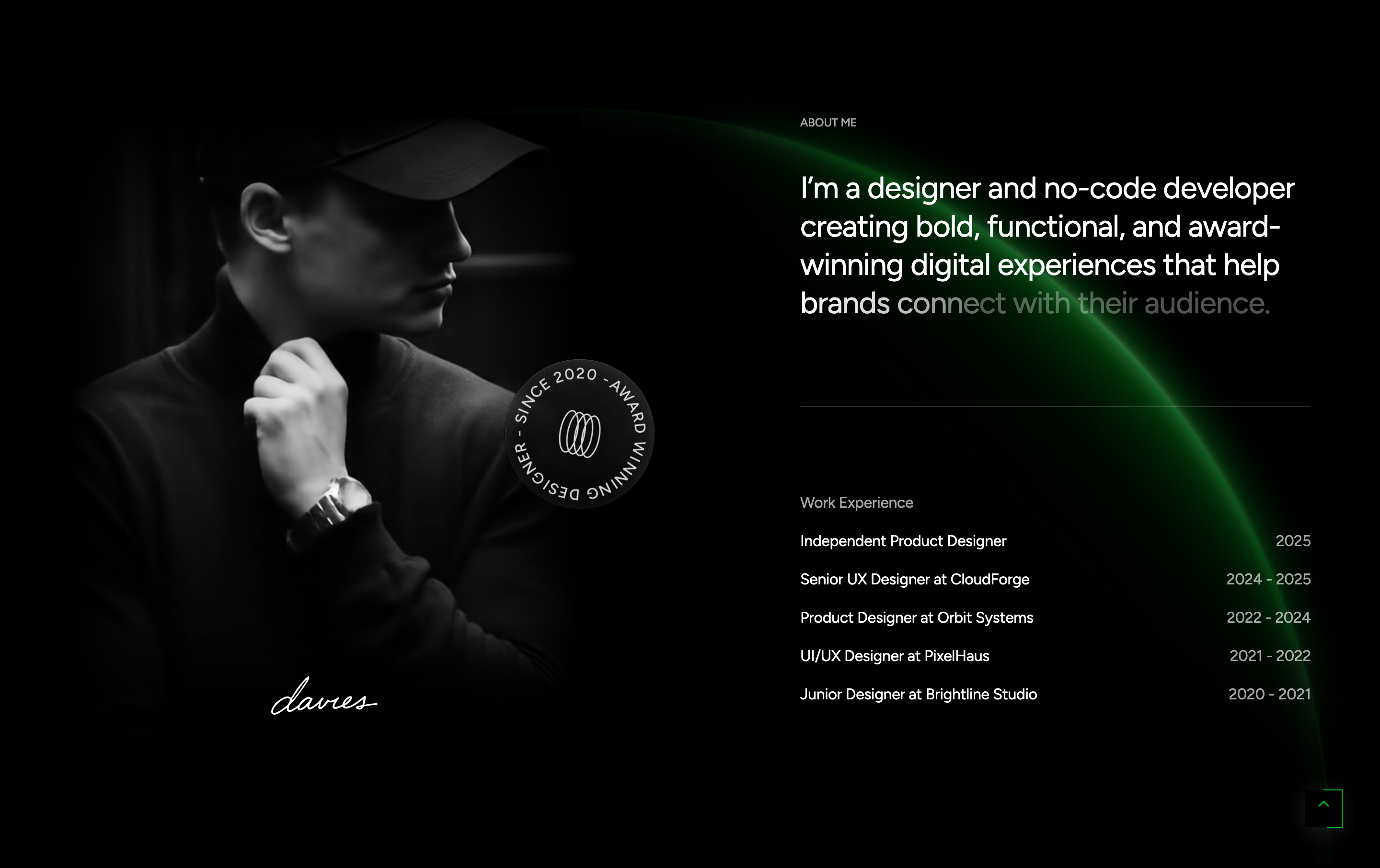
about-experience
Author intro with looping video portrait, animated badge, signature, and a fade-in experience timeline.
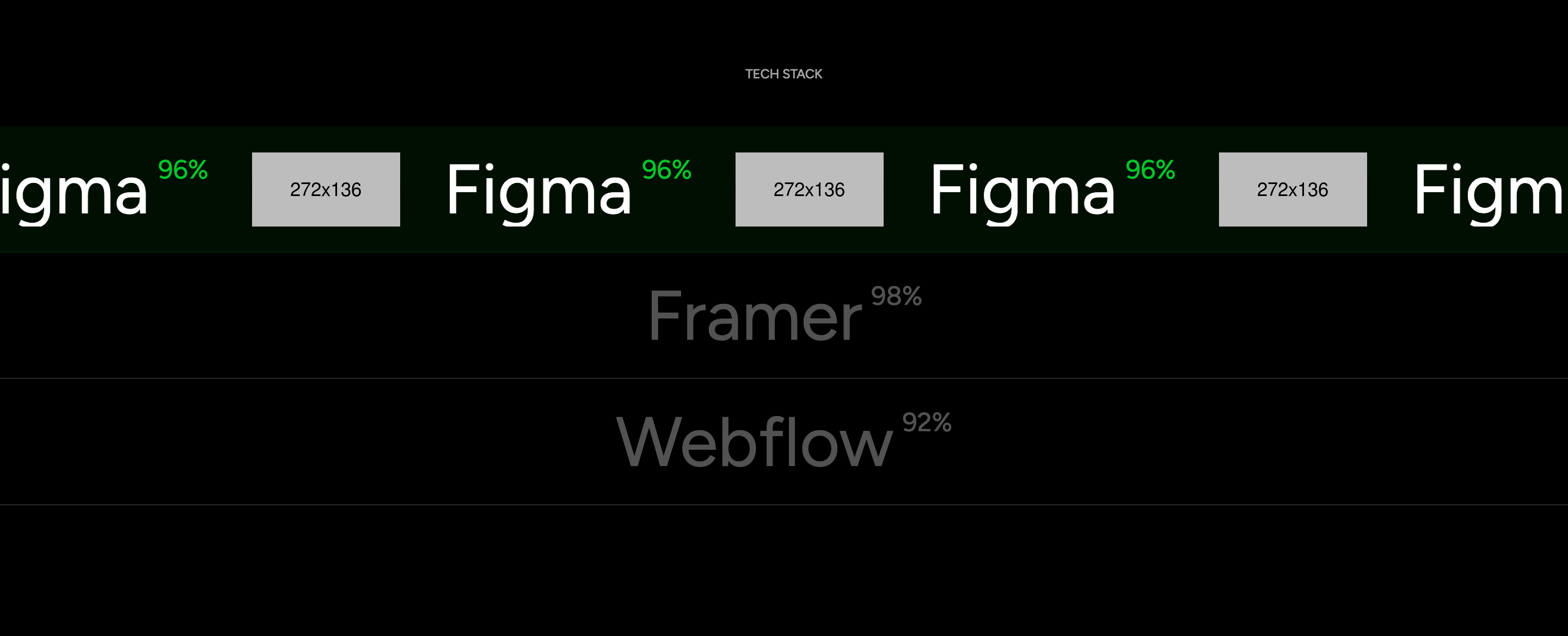
tech-stack-marquee
Three accordion-style infinite marquees that expand on the active row to reveal the tool name, mastery percent and logo strip.

brands-grid
Centered ten-logo brands and partners strip with white SVG marks.
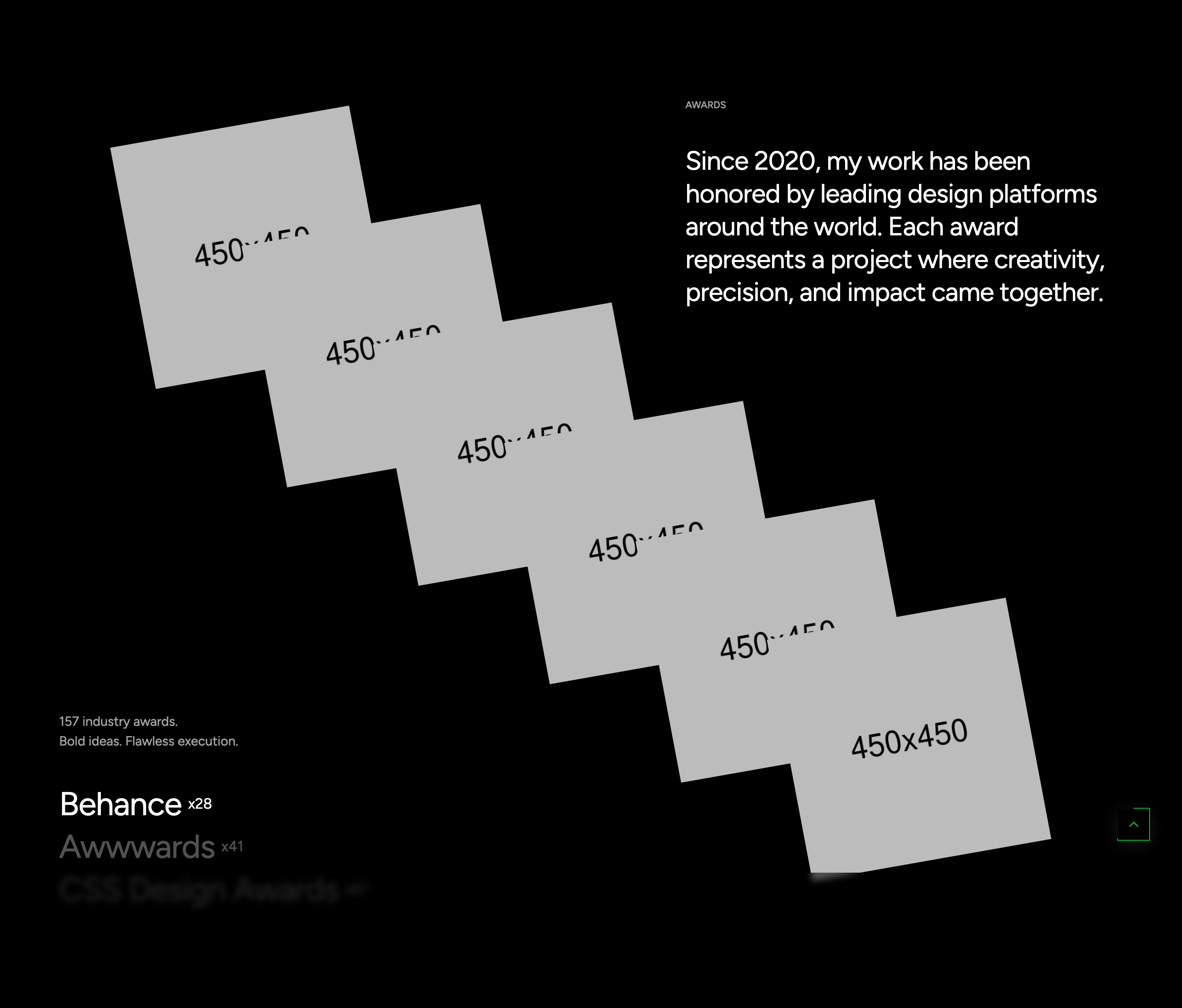
award-flip-images
Six award photos that slide out from a stacked centre into an arched fan with rotation and skew on scroll trigger.
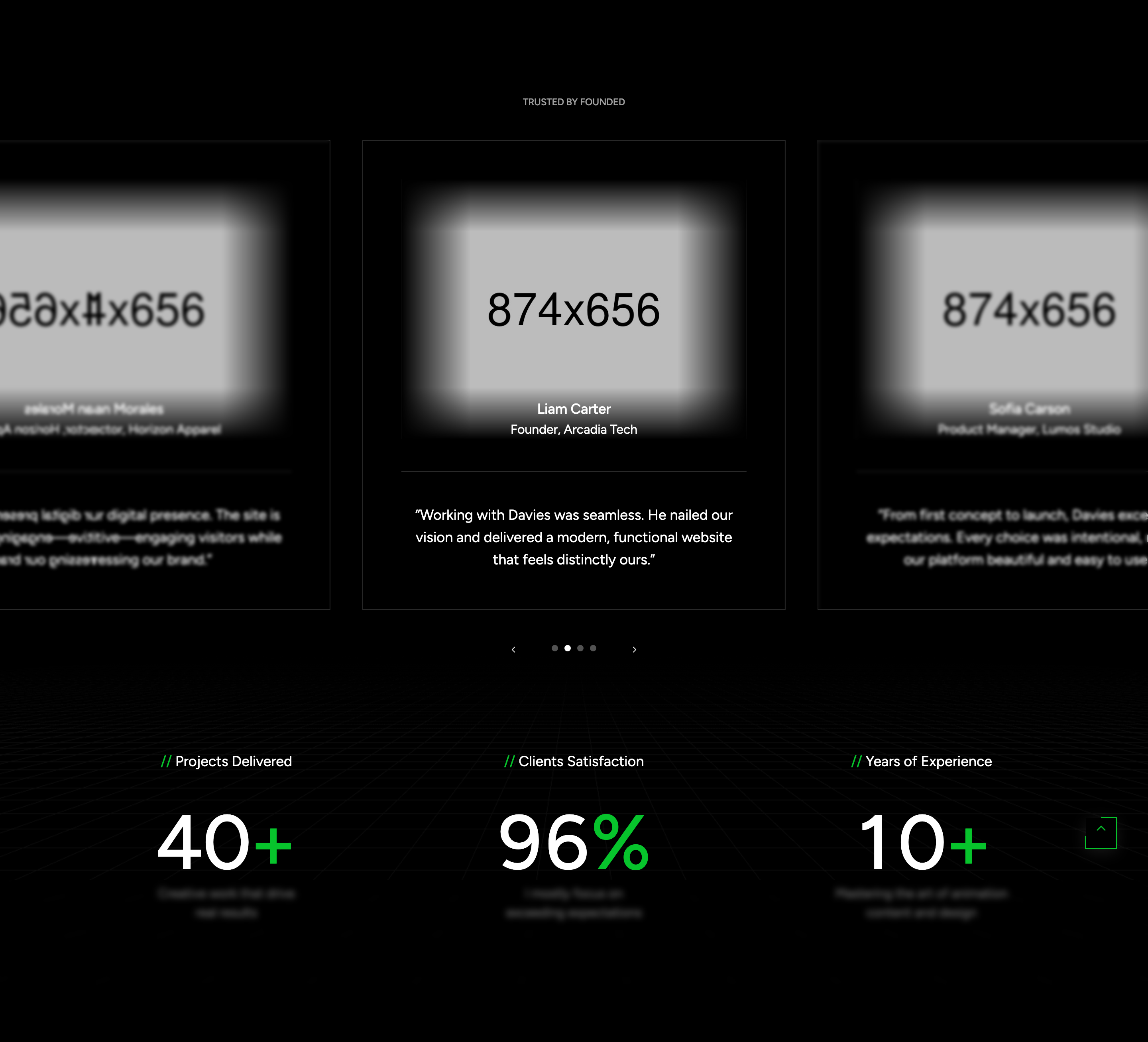
testimonial-carousel
Centered swiper of client testimonials with portrait, quote, and dot pagination plus prev/next chevrons.
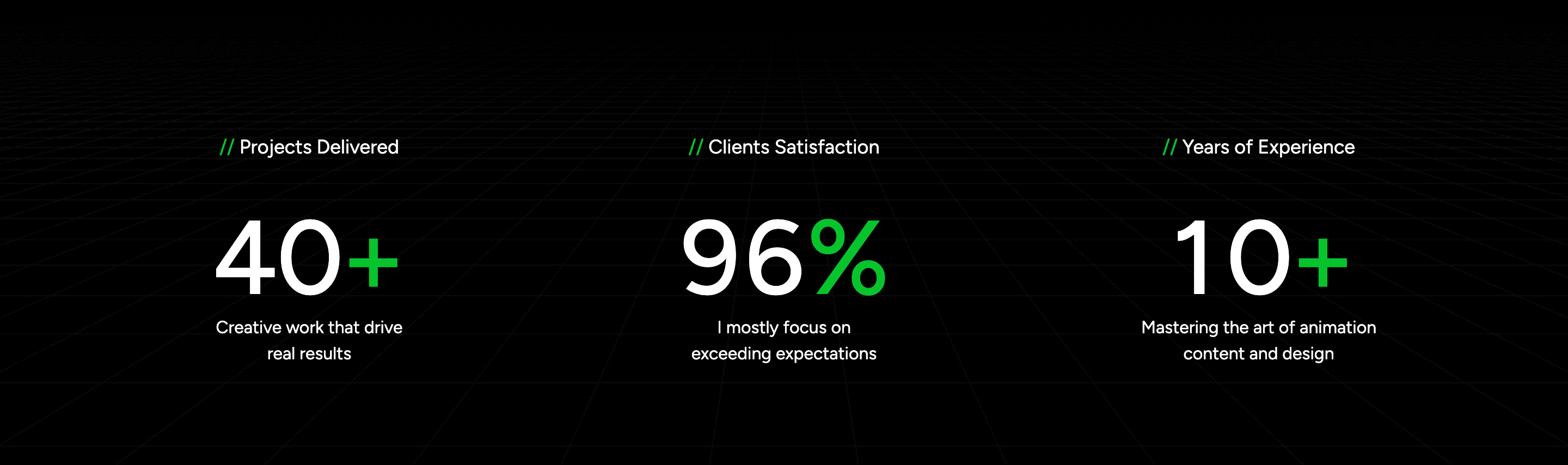
stats-odometer
Three big-number indicators powered by Odometer that count up when scrolled into view, with a grid background.
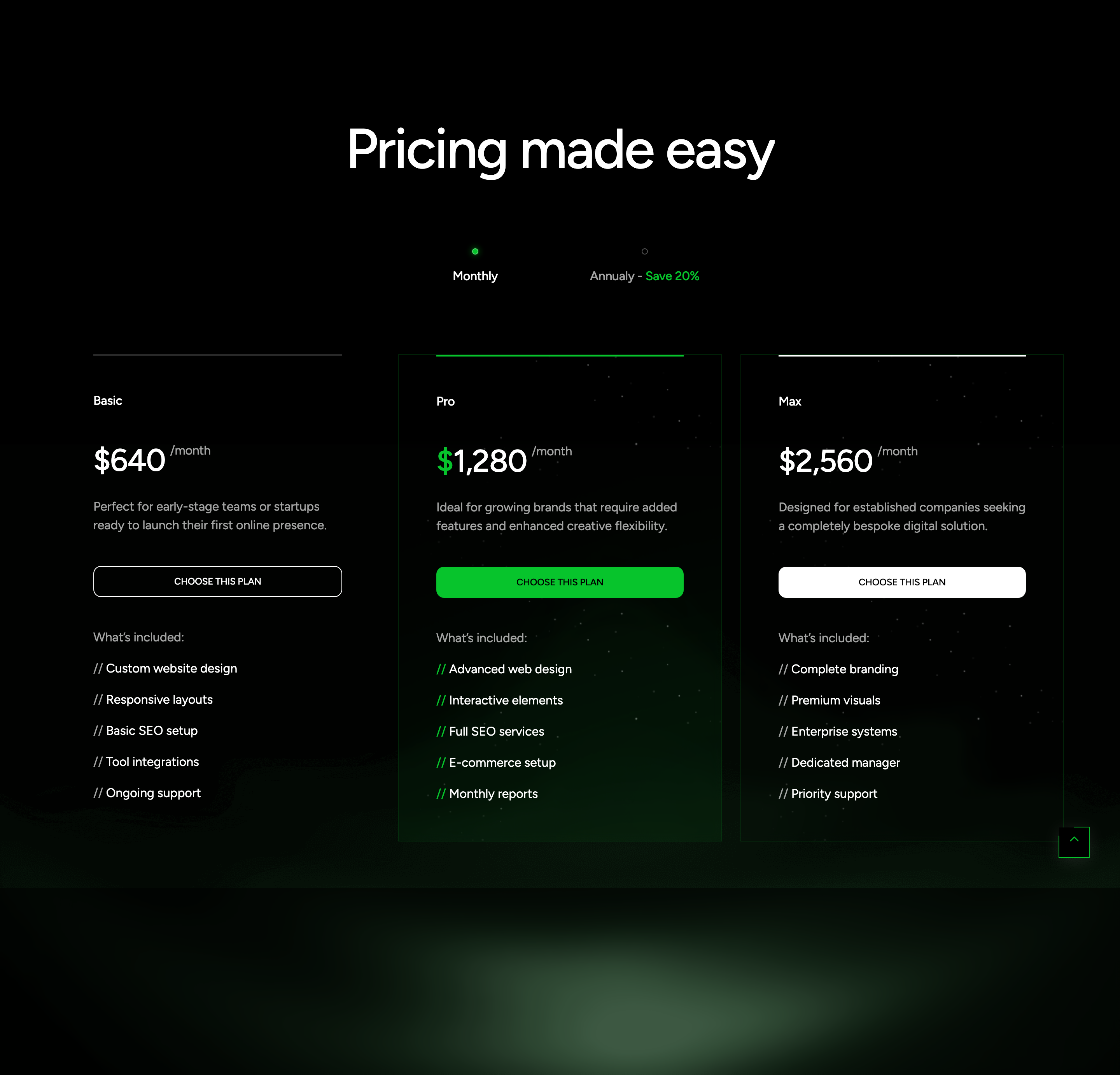
pricing-tabs
Monthly / annual toggle revealing three tiers; the middle Pro plan is highlighted with a primary accent and a portrait fragment.
faq-accordion
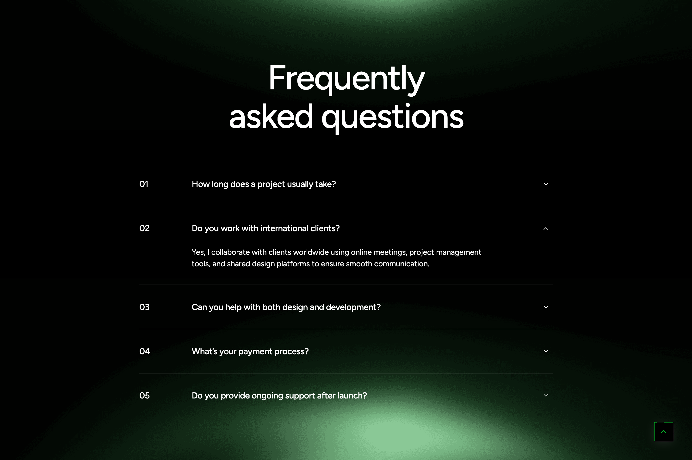
Numbered single-open FAQ accordion centered in an eight-column column with caret toggle.
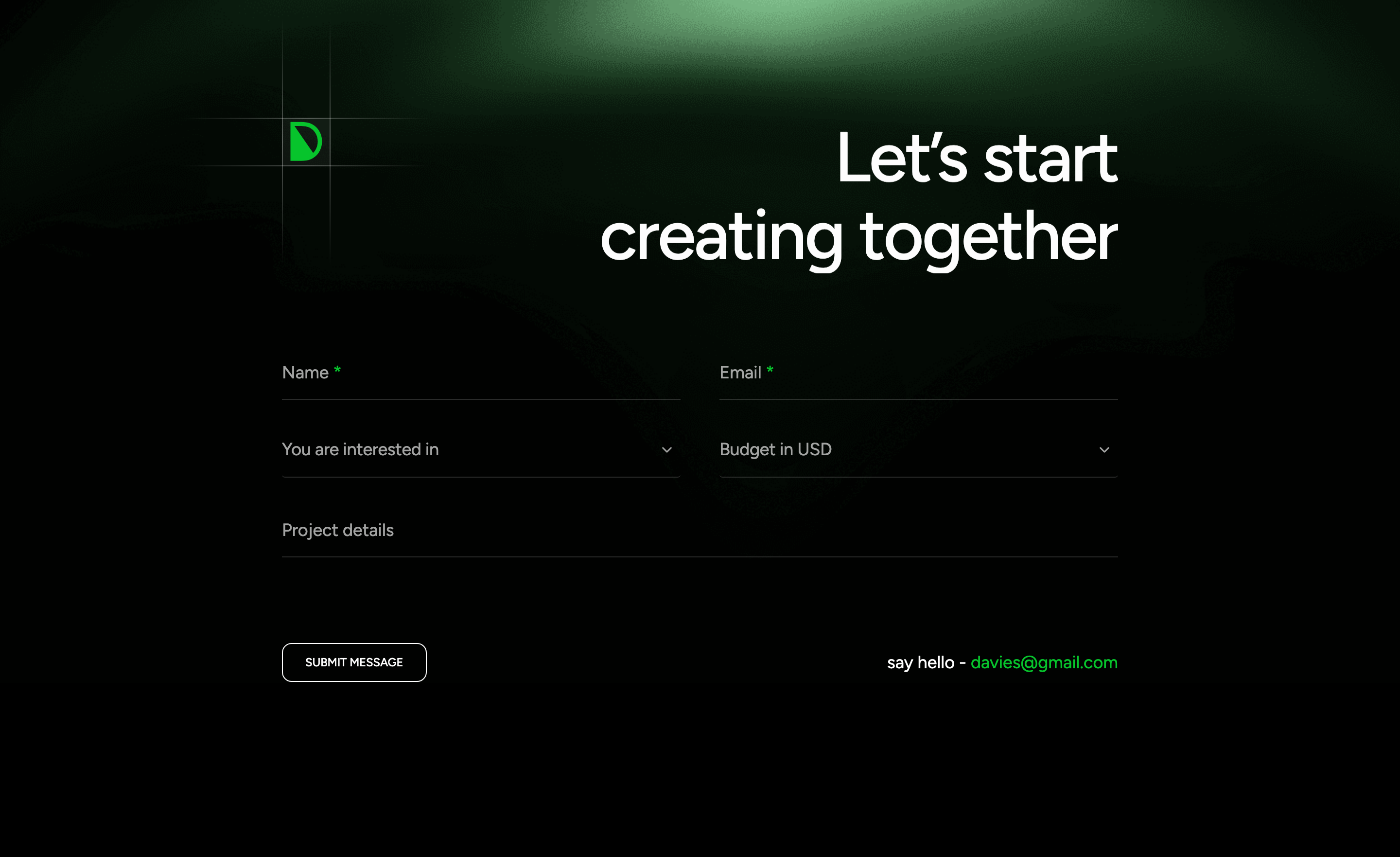
contact-cta-form
Big diagonal CTA heading paired with a custom-styled form using nice-select dropdowns and floating labels.
site-footer
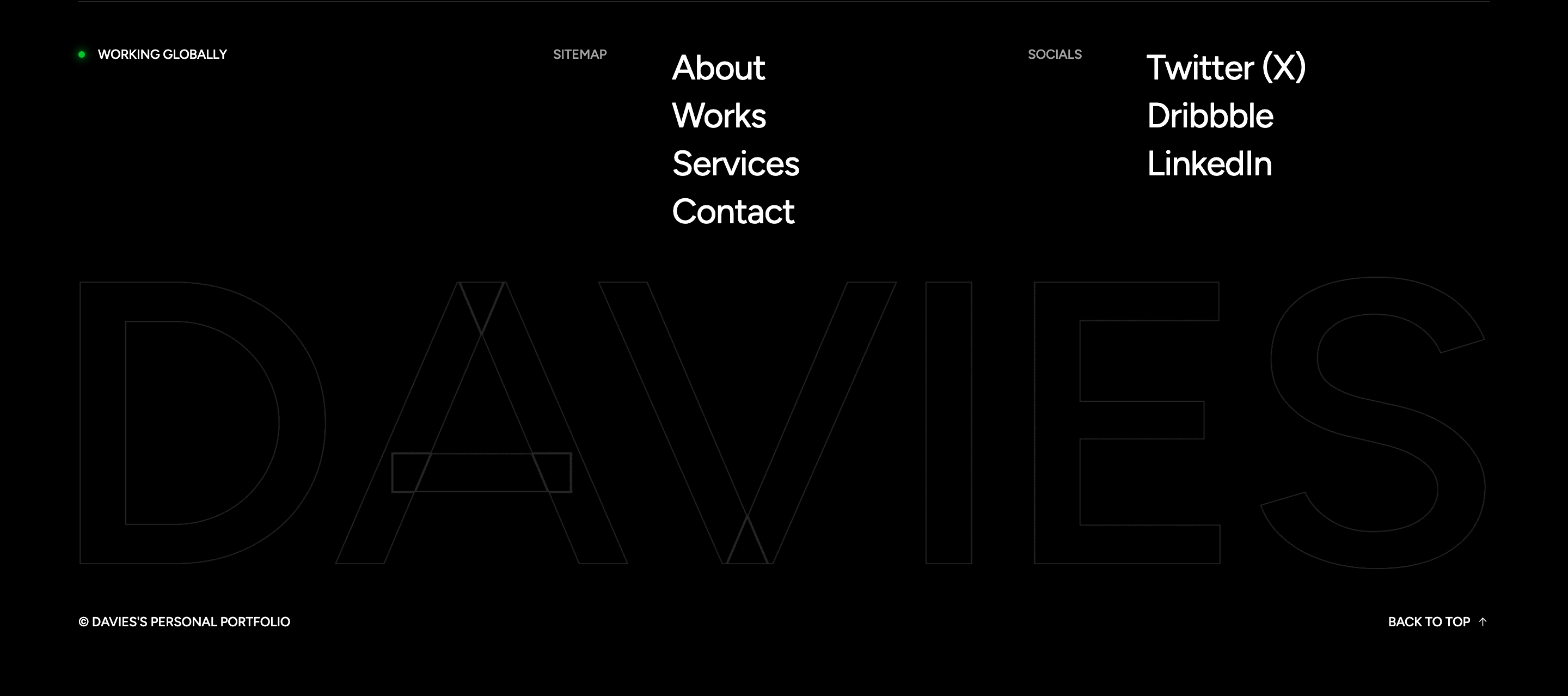
Compact sitemap and socials footer that fades up a giant agency wordmark image and a back-to-top link.

scroll-progress-button
Fixed go-to-top button with a conic-gradient progress ring that fills as the page is scrolled.
canvas-cursor-trail
Desktop-only canvas trail that paints a fading, hue-shifting line behind the cursor.

mobile-offcanvas-menu
Full-height mobile menu with display-size links, each row scrolling an infinite caption strip and footer socials.
letter-preloader
Full-screen preloader that flips each letter of 'digmox' on a Y-axis with stroked outline text and a stagger.

header-navbar
Multi-level dropdown navbar with sticky-on-scroll variant injected via fadeInDown and a phone CTA button.
fade-banner-carousel
Hero slider that crossfades while slowly Ken-Burns-zooming the background and timing-staggered text reveals on the active slide.
feature-block
Four-up offset-shadow feature cards where the dark block sits 5px down-right of the white card, revealing a sliver behind.
about-with-experience-badge
Two-image about block with overlapping shape decorations and a floating 30+ years experience badge using the offset-shadow style.
dark-service-grid
Six-up dark service cards with numbered counters that flood-fill with the brand gradient on hover via a scaling pseudo-element.
marquee-text-strip
Pure-CSS infinite marquee of capability words separated by an icomoon glyph, looping via translateX keyframes.
process-accordion
Numbered process steps as an exclusive accordion that reveals an inline image on the active block instead of a text drawer.
odometer-funfact
Animated counter row that triggers via jquery.appear and counts to a data-count value with the odometer plugin.
video-cta-with-pulse
Parallax photo background with a circular play button surrounded by three staggered ripple borders and a Fancybox YouTube modal.
split-testimonial
Two-column testimonial with portrait, gradient quote bubble, star rating, and an Owl carousel for the quote text.

expanding-project-tile
Six-up portfolio tiles where hovering one expands an adjacent tile via scaleX, doubling its width with a longer title.
parallax-cta-banner
Full-bleed CTA with parallax background image, white headline, and the gradient theme button.
news-grid
Two-column blog cards with date badge, gradient category tag, and the offset-shadow card frame.
subscribe-footer
Dark footer split into a logo + subscribe top, a connect-and-links middle, and a copyright bar with quick links.
rtl-direction-switch
Floating left/right pill buttons that toggle .rtl/.ltr classes on the wrapper to flip the entire layout.
chat-popup-drawer
Right-anchored chat drawer that slides in from off-canvas, dismissible via Escape key, backdrop click, or close button.

svg-scroll-progress
Floating scroll-to-top circle that uses an SVG path with a stroked progress stroke and gradient text fill for the arrow.
preloader
Full-screen splash with a brass spinner ring, letter-by-letter LAWGIST text-flip, and a four-column reveal that wipes off-screen on window load.

site-header
Three-row classical header: utility info bar, centered logo with mirrored navs, then a phone-CTA strip; collapses into a slide-in mobile drawer with metisMenu.

hero-carousel
Full-bleed Owl carousel with fade-out transitions, an outlined giant slide number on the left, and stacked WOW.js fadeInLeft entrance for headline, paragraph, and dual CTAs.
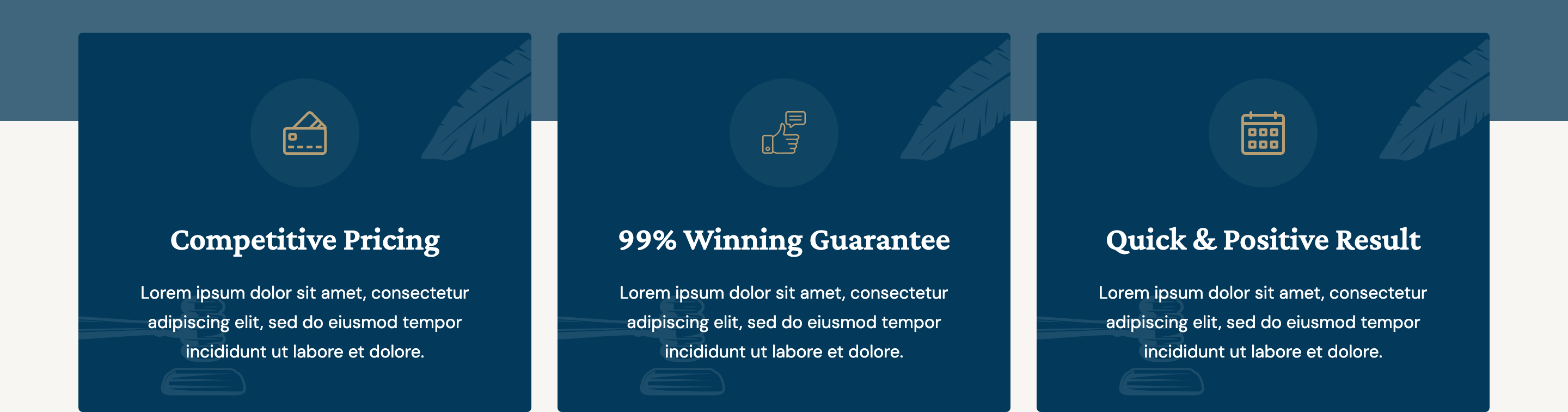
feature-cards
Three icon-led white cards lifted into the hero overlap zone, each with a leaf and gavel decorative SVG flourish at opposite corners.

funfact-counters
Four crest-shaped stat blocks on a beige strip, each driving a counterUp number animation against a hand-drawn badge background.
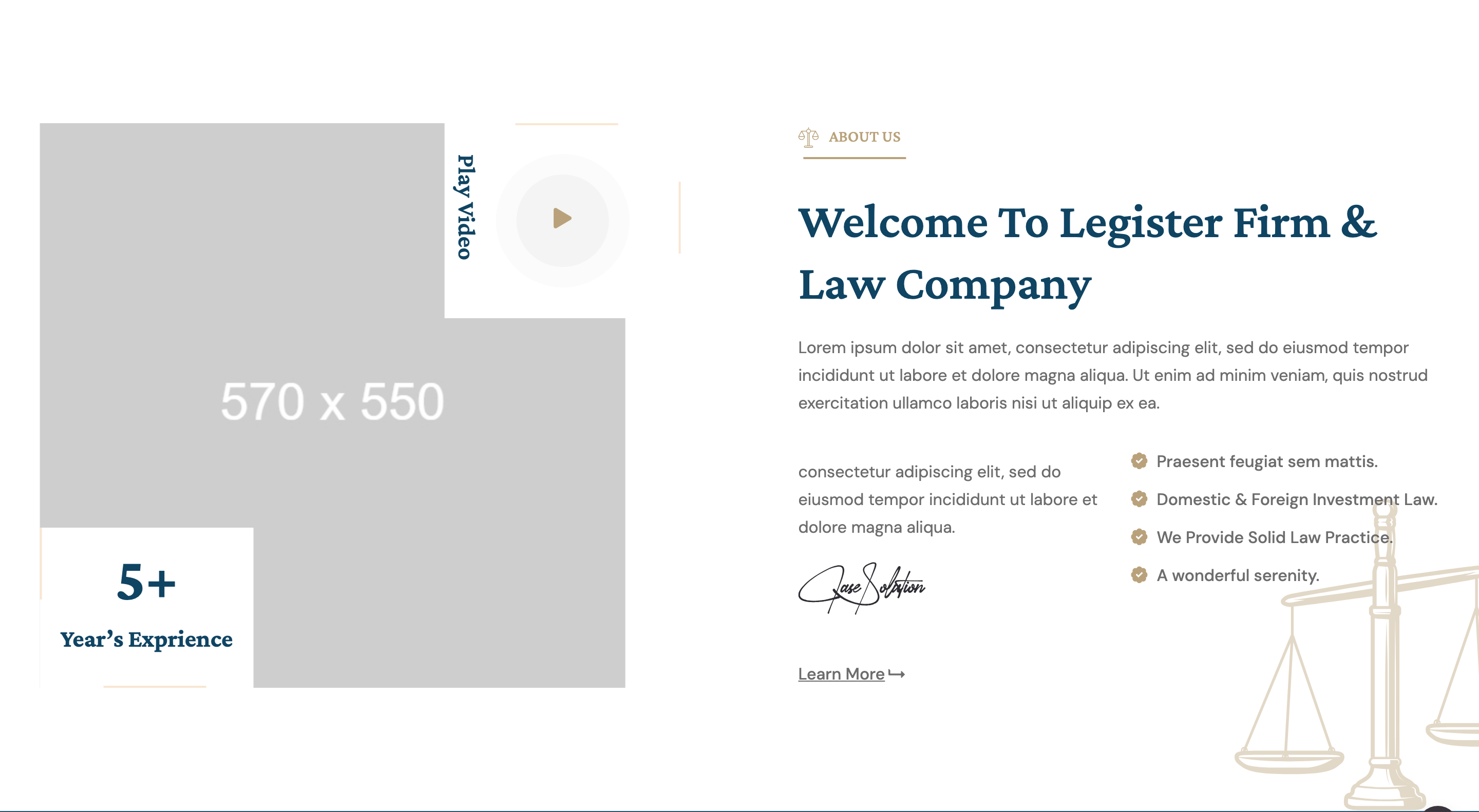
about-with-video
Two-column about block pairing a portrait image with a Magnific-popup YouTube play button and a floating 25+ years experience badge.
services-grid
Four-column service-card row where each card flips its background image on hover and surfaces a justice-icon decoration in the corner.
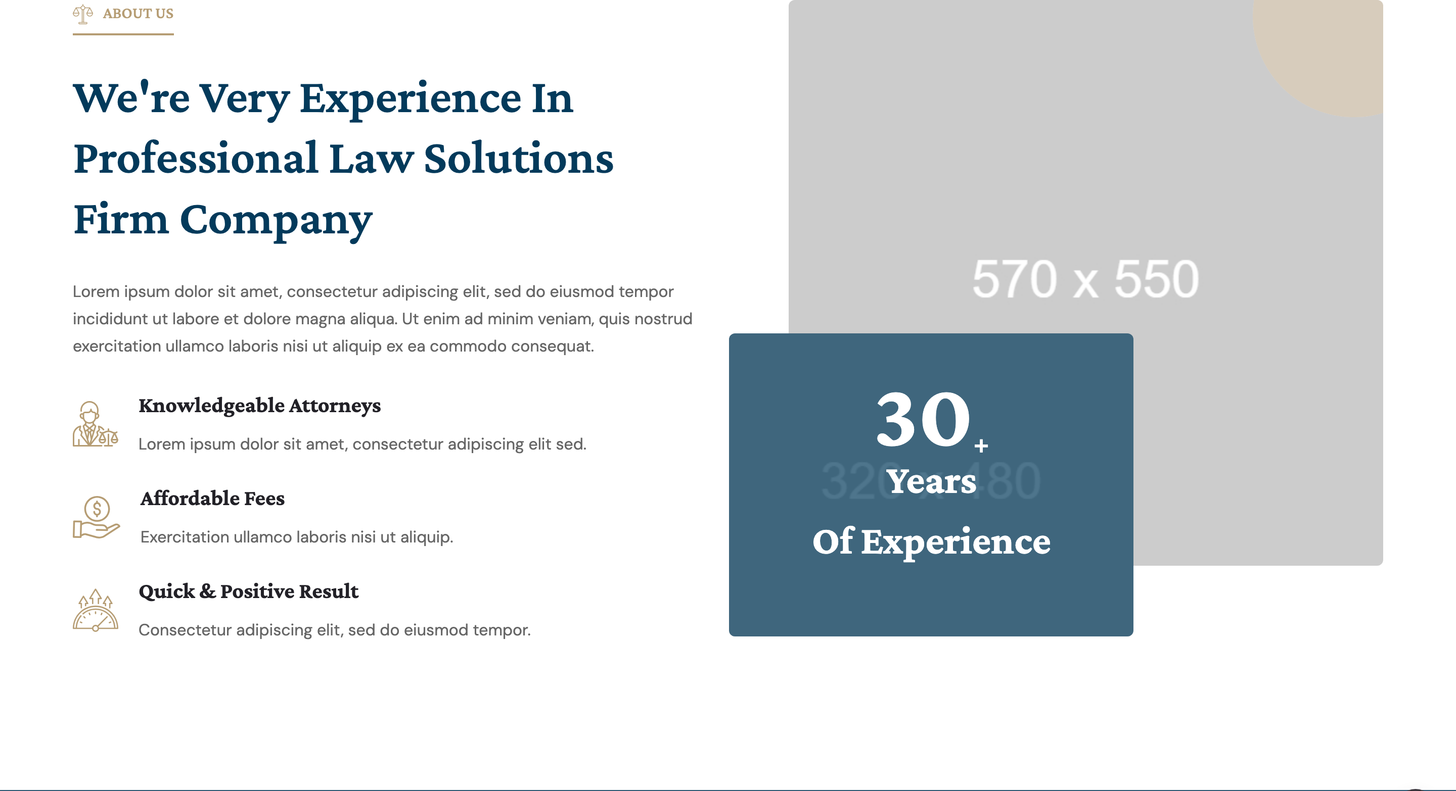
why-choose-us
Split section with bullet-style supporting features on the left and a decorative portrait plus stacked 30+ years funfact crest on the right.

brand-marquee
Six-up Owl autoplay logo strip rendered over a dark banner background, used as a divider between testimonial and feature blocks.
testimonial-block
Two stacked review cards on the right with star rating, author thumbnail, and a translucent serif quote glyph; left column is a phone-CTA portrait.
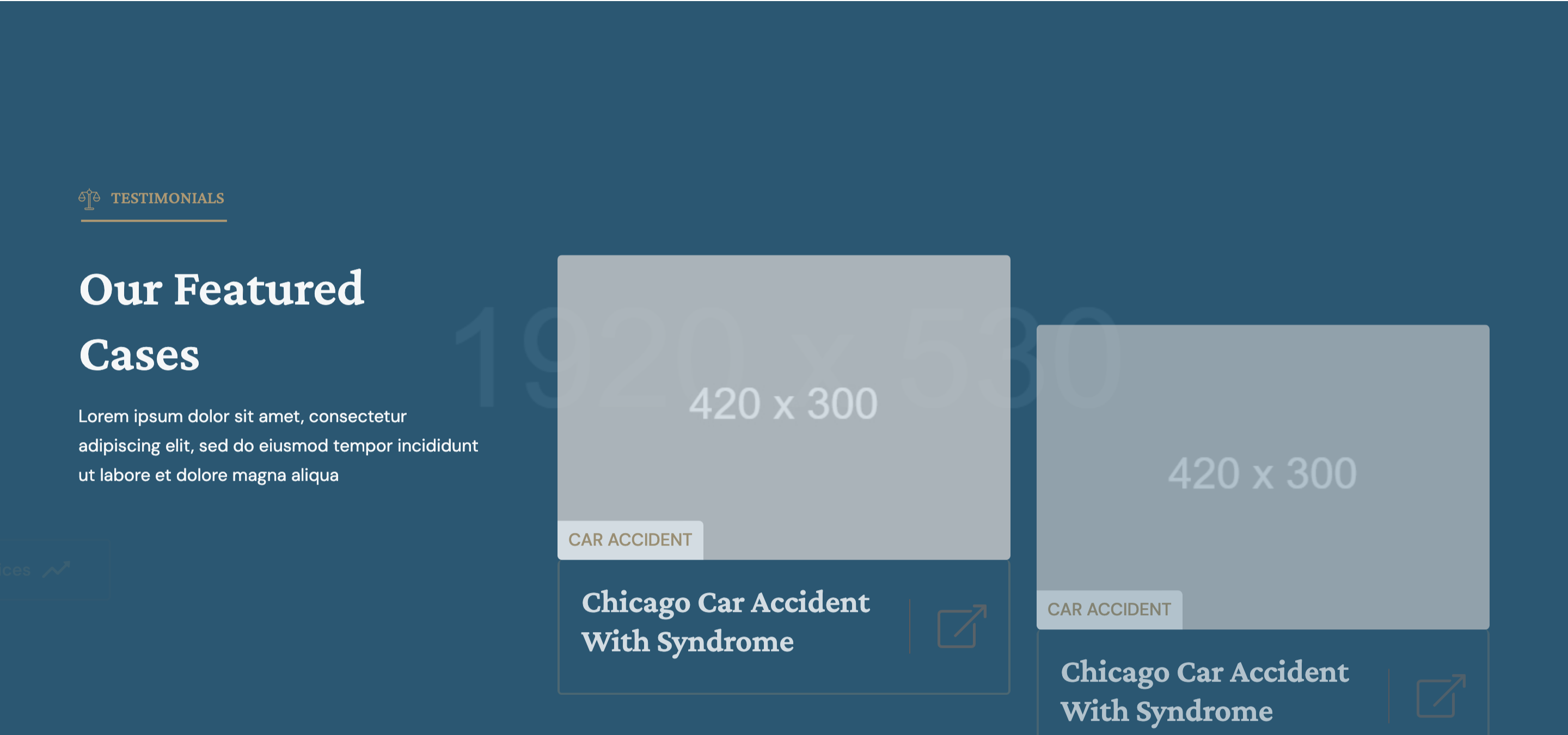
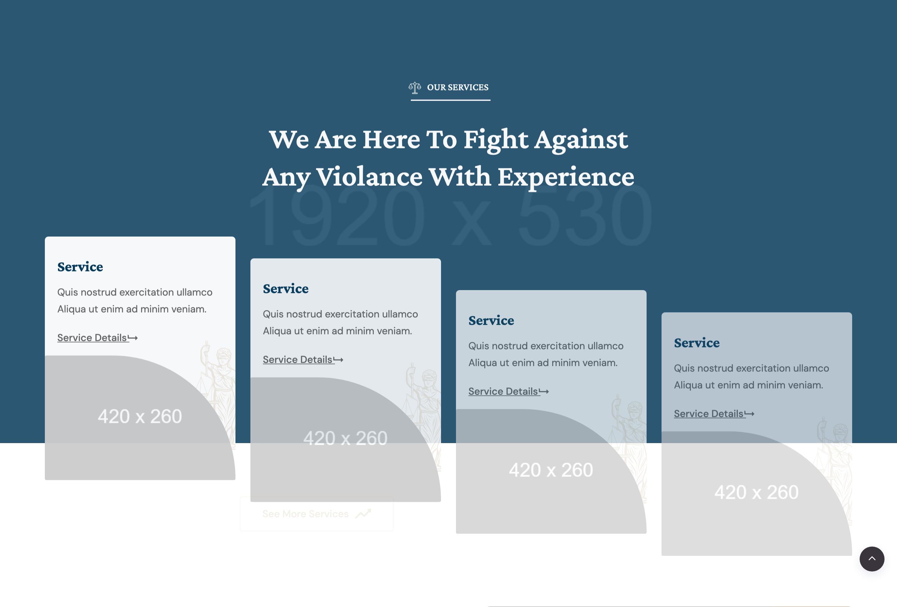
featured-cases
Three-up case showcase on a dark photographic banner: one intro card with section title and CTA, two image cards with badge and external-link arrow.
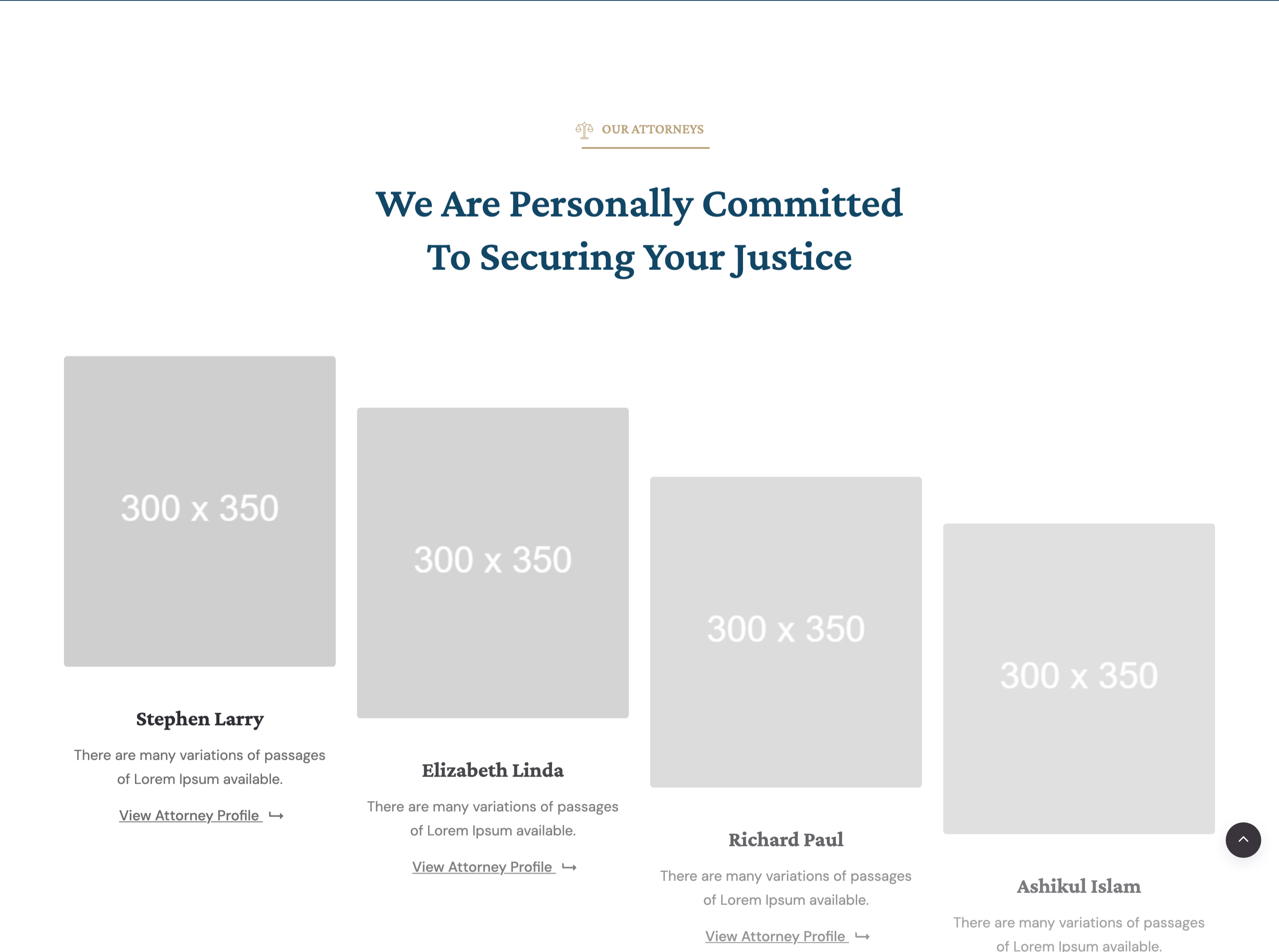
attorneys-team
Four attorney cards with portrait, name, short bio and a chevron CTA, staggered with WOW fadeInUp durations between 1s and 2s.
cta-banner
Centered crimson-overlaid call-to-action strip on a wide banner image with a single 'Make an Appointment' theme button.
blog-grid
Three-up news cards with cover image, overlapping circular author chip, tag and date meta row, and a level-up arrow read-more button.
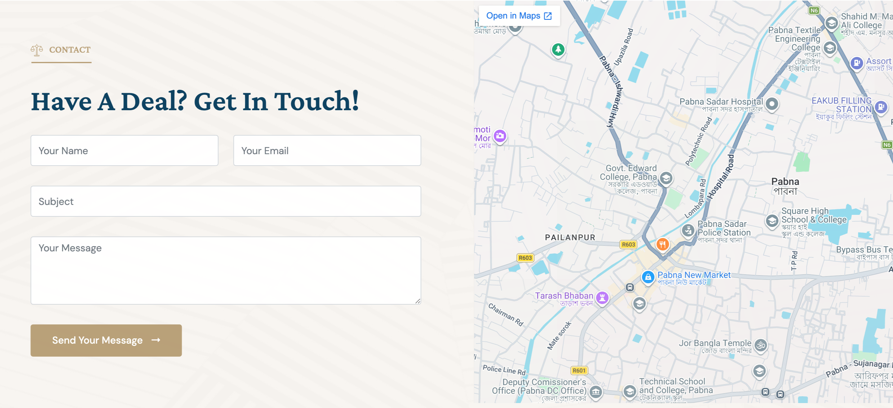
contact-form-map
Full-width contact band with a four-field form on the left and an embedded Google Maps iframe on the right, both bg-pattern backed.
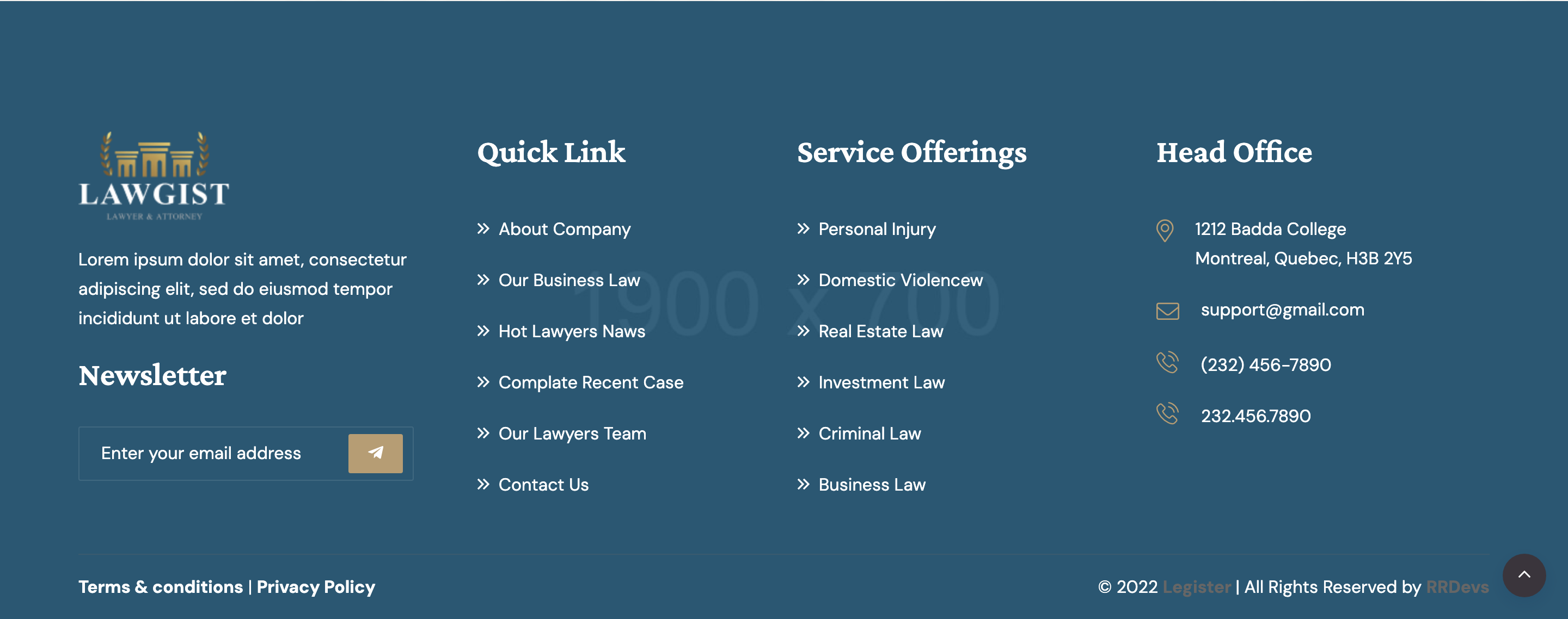
site-footer
Dark photographic footer with newsletter form, two link columns, address block, and a divided copyright row crediting RRDevs.
header-transparent-sticky
Transparent fixed header that gains a sticky background, swaps logo color and toggles a full-screen mobile offcanvas.

hero-display-type
Centered display hero where a four-line serif headline wraps a small rotating shape and an inline image tile with a fade-bottom GSAP entrance.

hero-video-bleed
Full-bleed autoplay loop video that sits directly under the hero and uses a clip-path reveal driven by ScrollTrigger.
brand-marquee-row
Horizontal Swiper-driven brand strip with a label column and continuously sliding client logos separated by hairline rules.
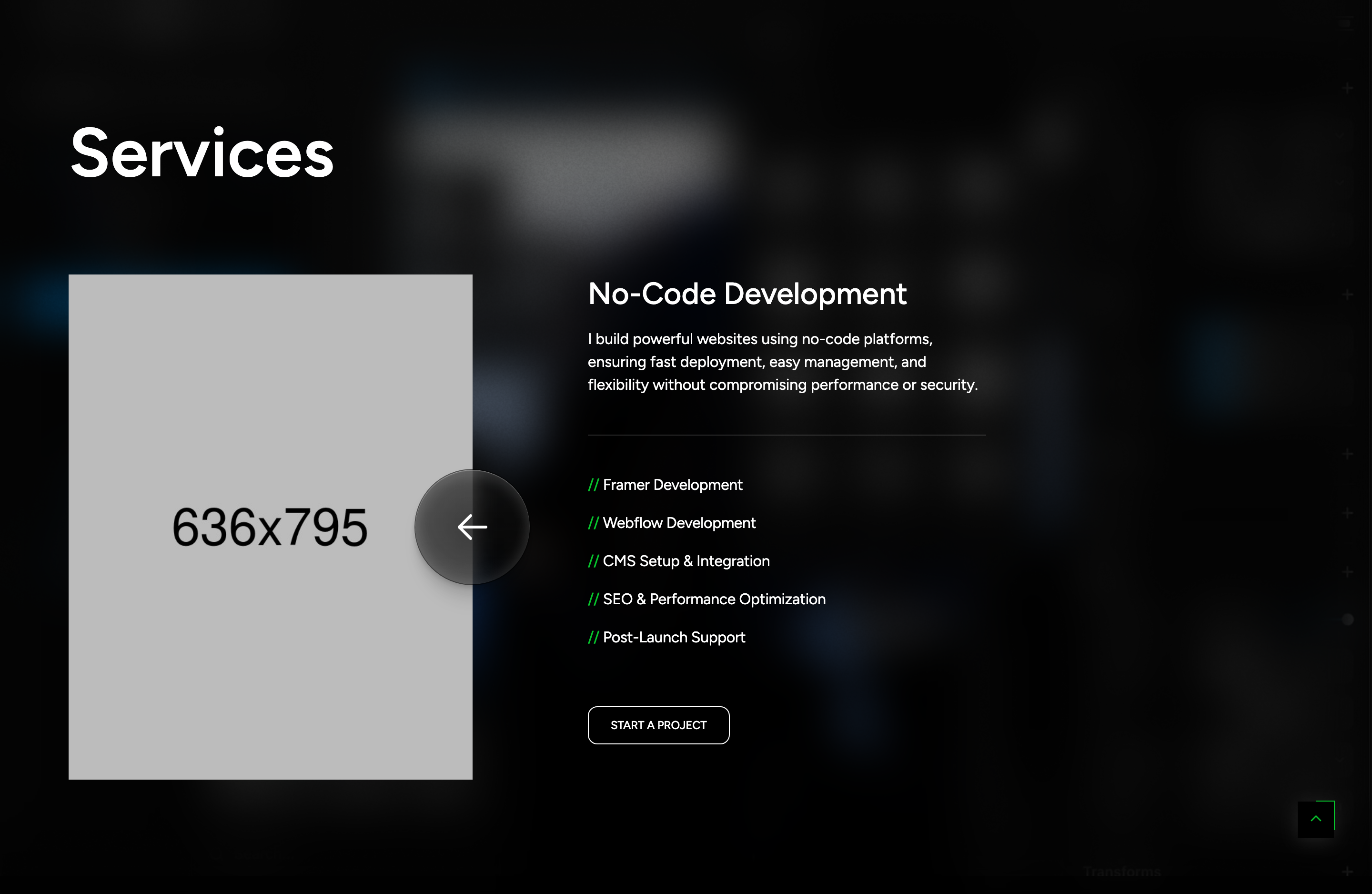
service-process-list
Two-column thoughtful-process layout: animated section title plus border button on the left, four icon+text service rows fading in on scroll on the right.

project-asymmetric-gallery
Asymmetric two-column portfolio gallery with offset heights, parallax data-speed scroll on each tile and a magnetic 'View Demo' cursor on hover.
project-pinned-banner
Full-width project banner image that pins under the gallery using ScrollTrigger pin so the next section slides over it.

project-textline-marquee
Oversized scroll-driven 'Co(shape)lest Project' text marquee that translates horizontally on scrub, mixing serif outlines with filled glyphs.

award-hover-thumb
Awards list where hovering each row swaps the active thumbnail in the adjacent sticky image column, with date and count metadata.

team-marquee-slider
Six-up Swiper team rail with scroll-driven horizontal marquee shift and per-card mousemove parallax that opens a member modal on click.

testimonial-text-slider
Centered single-quote testimonial Swiper with custom prev/next arrow buttons and an autoplay 1s loop transition.

footer-link-stack
Black footer with a hover-active link list, oversized 'Let's Contact!' wordmark, contact and social columns plus a year-stamped copyright row.
magic-cursor
Custom dual-element cursor (#magic-cursor + #ball) that grows over portfolio tiles, shows 'View Demo' label and hides the native pointer.

footer-floating-shape
Sticky bottom-right rotating circular badge linking to the contact page with two layered PNG shapes spinning at different speeds.

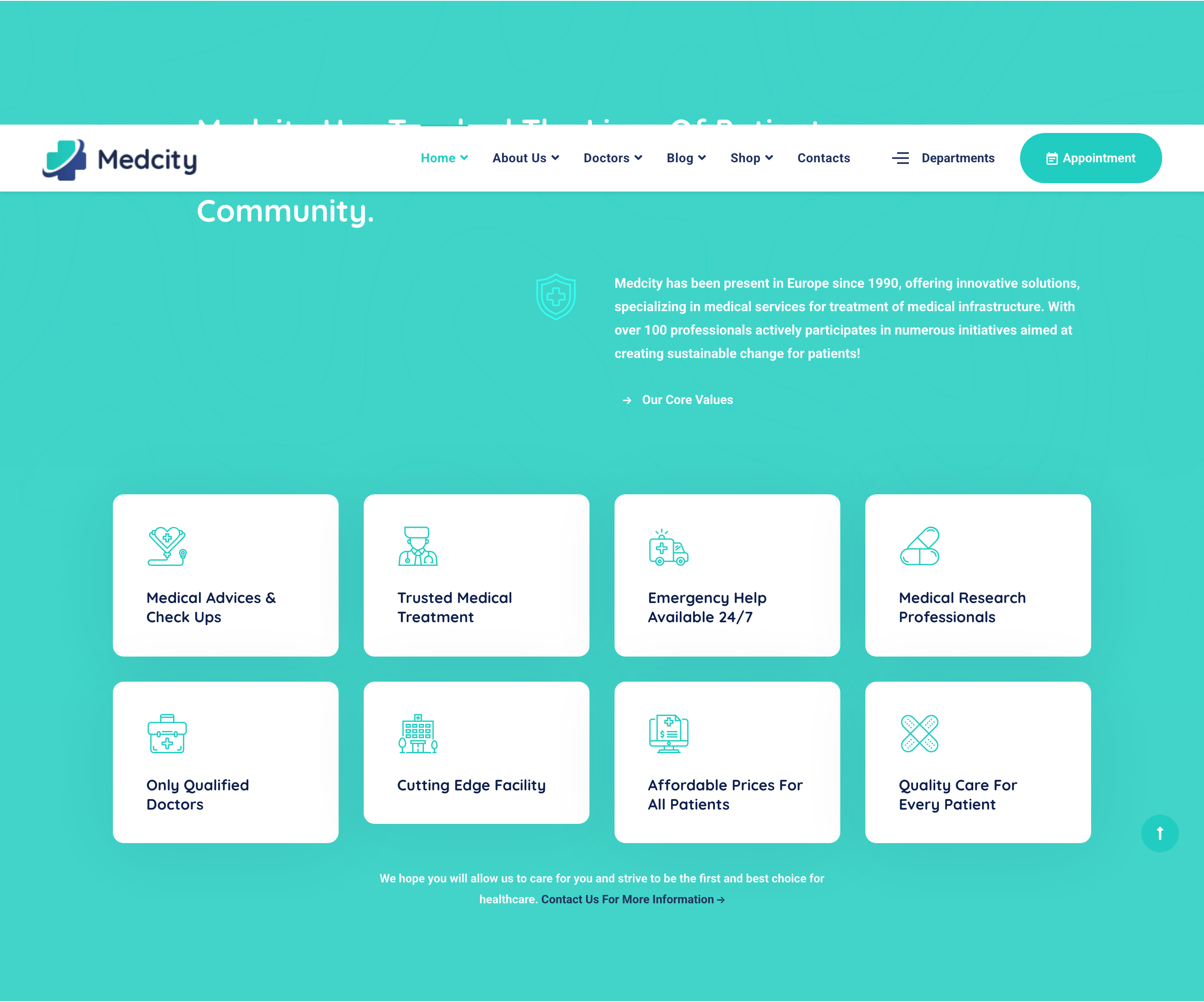
header-topbar-nav
Two-row sticky header: utility topbar with emergency line/location/hours and inline search, then a white logo + dropdown nav with a Departments mini-popup trigger.

hero-fade-slider
Full-bleed Slick fade carousel with photo background, large Quicksand headline, lead paragraph, and four icon-led specialty chips per slide.
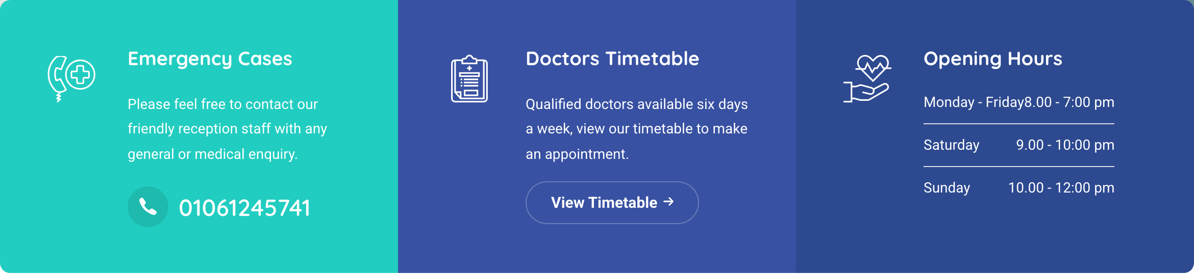
contact-info-strip
Three-column contact panel directly under the hero: emergency cases call card, doctors-timetable CTA, and an opening-hours table — split visually by gradient backgrounds.
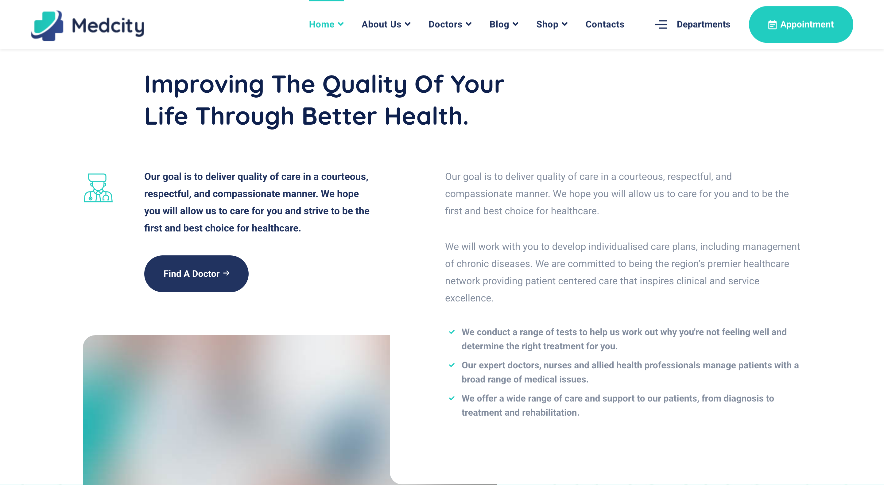
about-with-video
Two-column about block: left column has a doctor-icon intro with CTA and a video poster with a Magnific popup play button, right column carries the long body copy and bullet list.
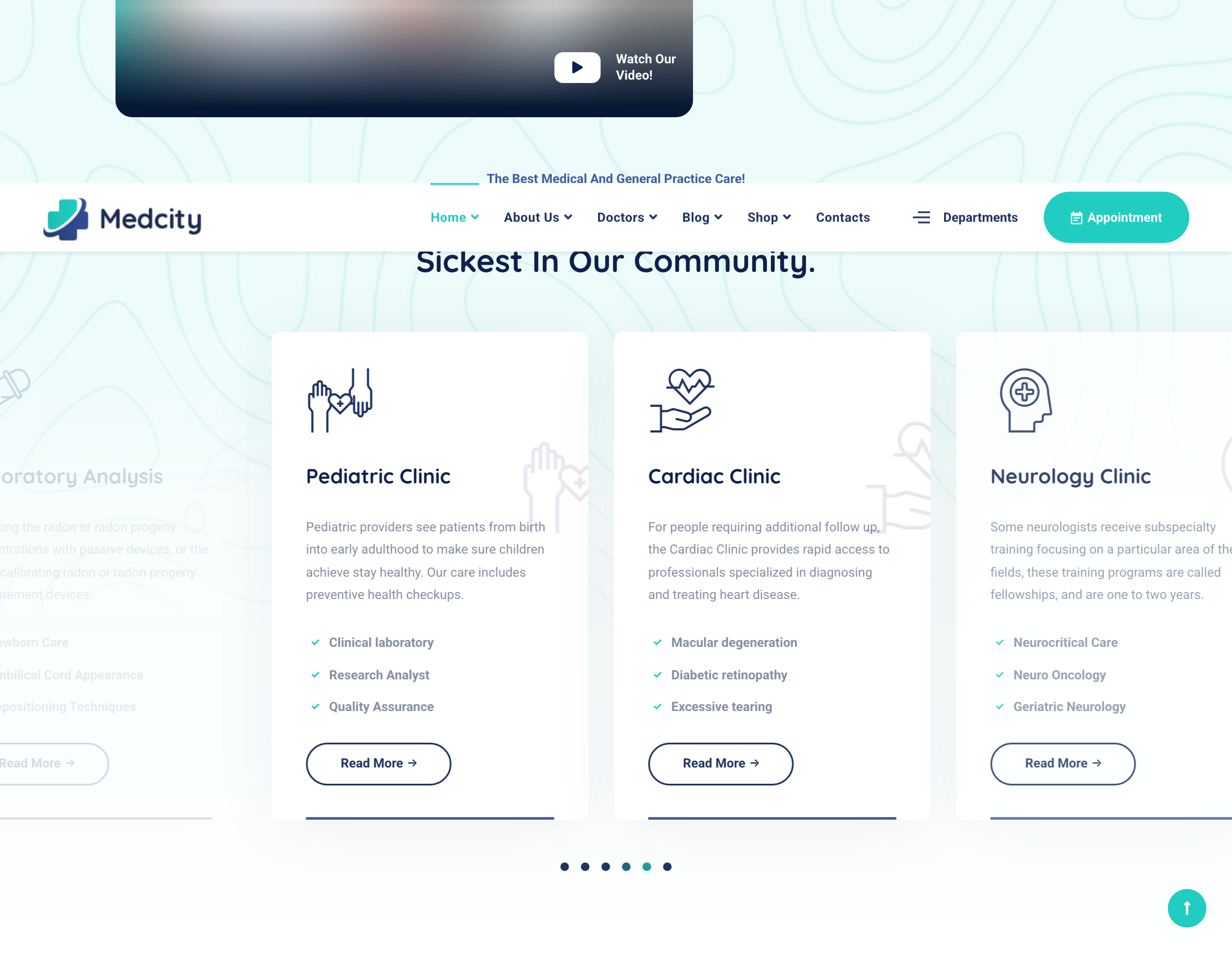
services-carousel
Slick carousel of clinic-service cards (3-up at desktop) with duplicated icon decoration in the corner, title, description, list of sub-specialties, and a Read More pill.
features-grid-overlay
Eight-tile feature grid on a teal-overlaid photo background; each tile combines a small thumbnail, an icon, a title, and an outlined arrow-link affordance.
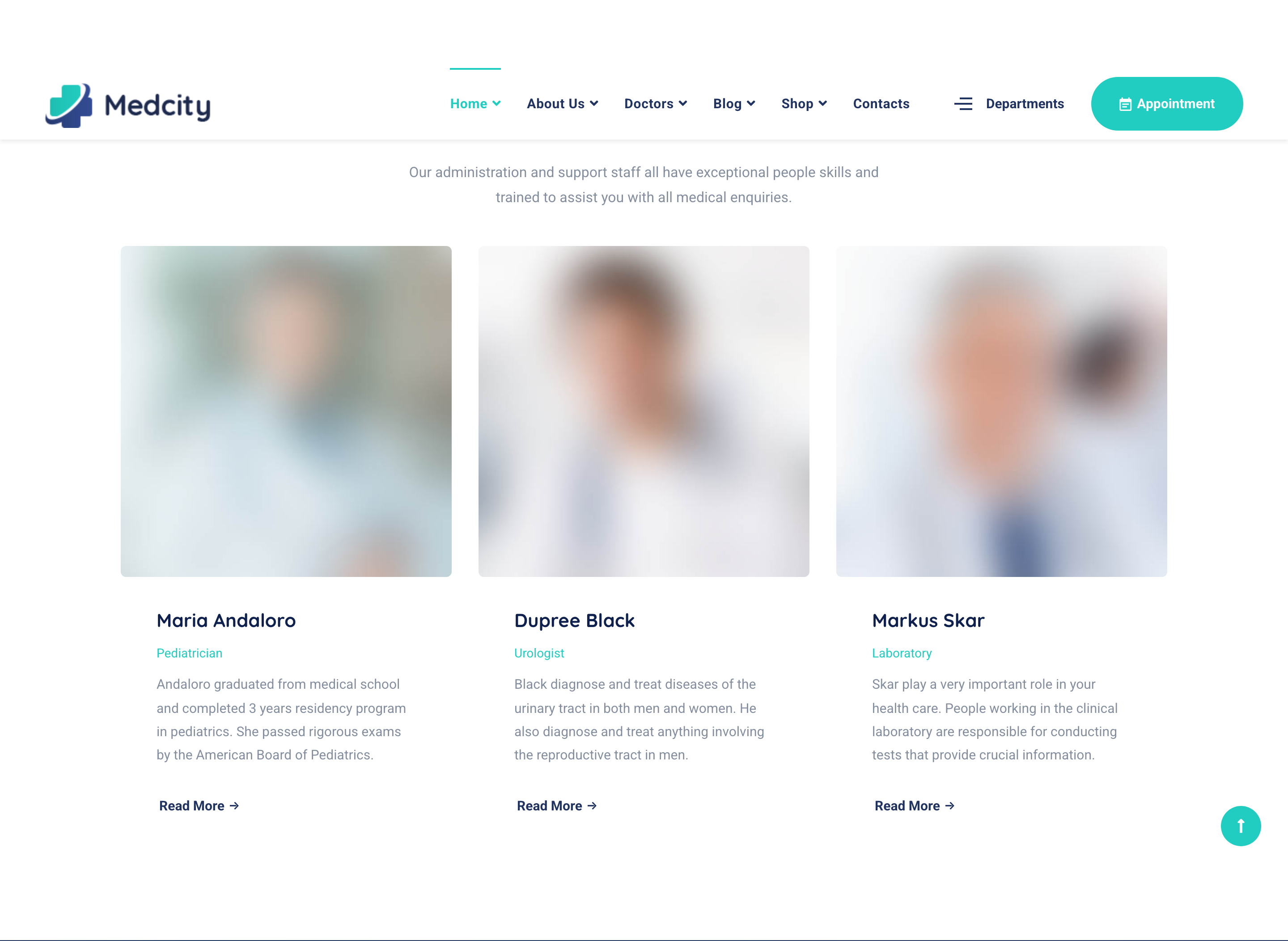
doctors-team-carousel
Autoplaying Slick carousel of doctor cards with portrait, name, specialty, short bio, Read More pill, and a small social-icon row beneath.
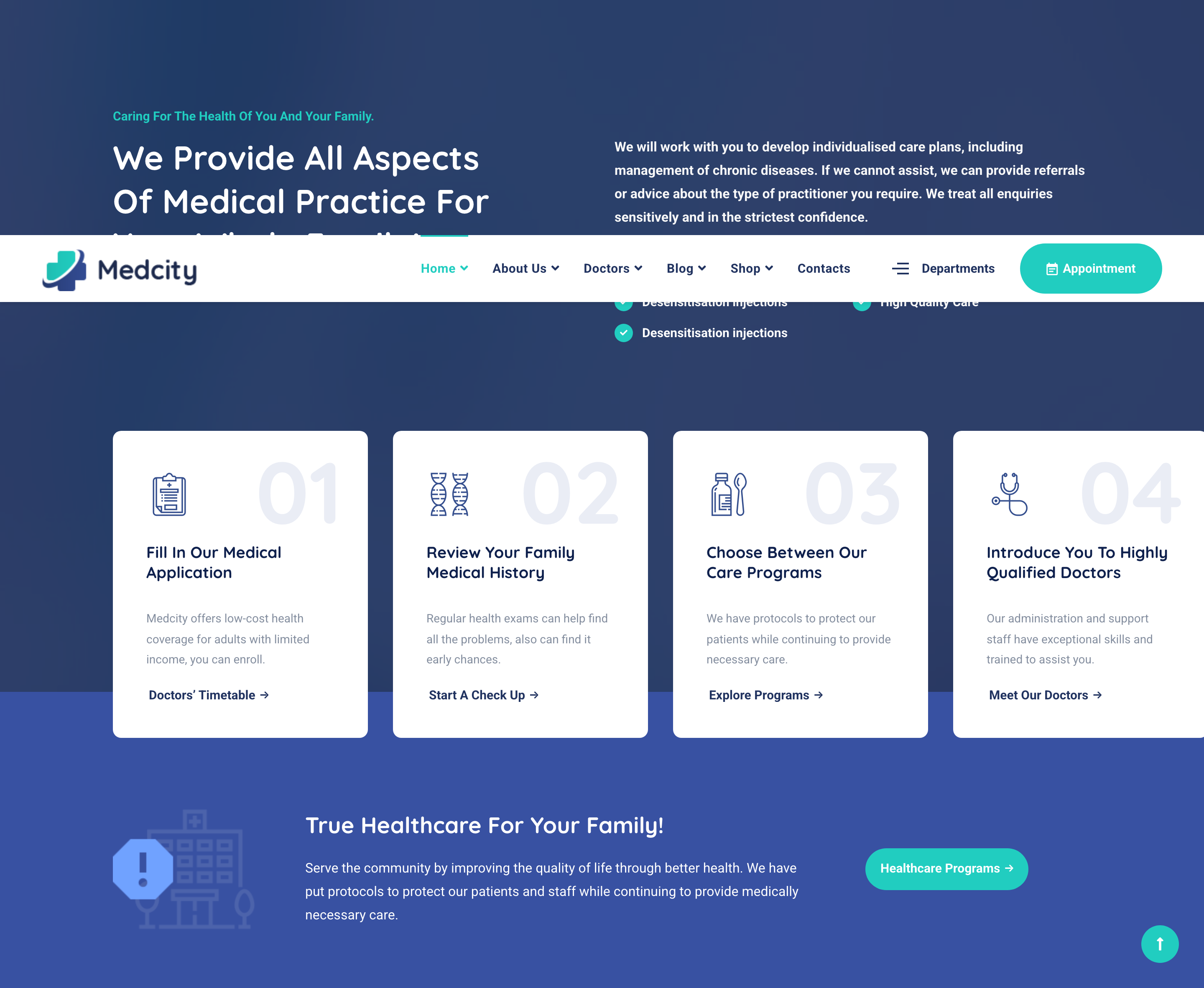
work-process-steps
Numbered four-step intake process on a navy photo overlay: oversized step number, icon, title, short copy, and a deep link per step, in a Slick carousel.

cta-alert-banner
Light-blue inline CTA strip nested inside the work-process band: alert icon, headline, lead, and a teal pill button to a healthcare-programs page.

testimonials-with-thumbs
Asymmetric testimonials block: heading on the left, large quote on the right paired with a clickable thumbnail strip (slick slider-with-navs) for switching between authors.

gallery-carousel
Edge-to-edge four-up Slick carousel of clinic photos with Magnific Popup lightbox triggers and arrow controls, autoplaying.
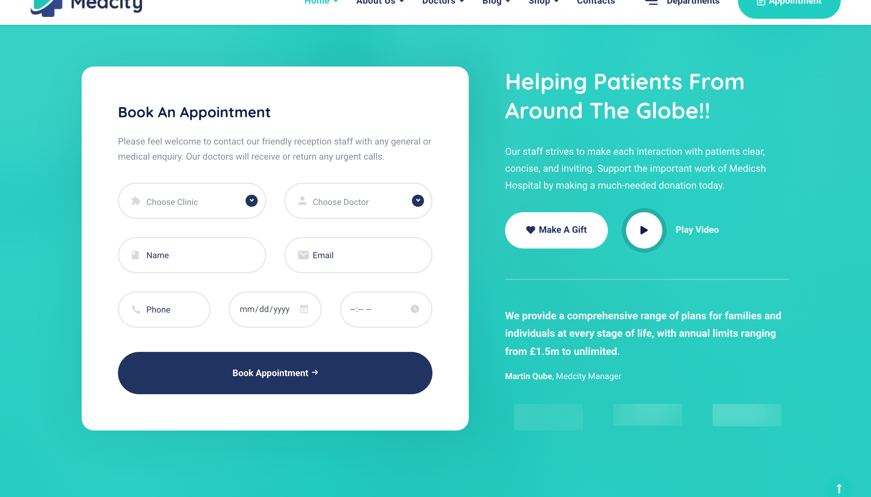
appointment-form
Two-pane appointment block over a teal-gradient banner: six-field booking form on the left, and a heading + gift CTA + video popup + clients logo strip on the right.
blog-grid
Three-up grid of recent posts with rounded thumbnails, category tag, date and author meta, headline, lead, and a Read More pill.
footer-mega
Four-column primary footer (about + Make Appointment CTA, departments, links, quick contacts with phone/address/socials) plus a thin secondary copyright bar.
preloader
Fixed full-screen white preloader with four bouncing dots, removed from the DOM by setTimeout(2000) on jQuery ready.

topbar-contact-strip
Teal-on-white top utility strip with email, phone, address and four social icons sitting above the main navigation.

main-navbar
Sticky white Bootstrap navbar with logo, dropdown menus and an amber hamburger toggle on mobile.

hero-banner
Full-bleed image hero with teal gradient overlay, centered serif heading and an amber CTA next to a circular ripple-animated video play button.
feature-cards-overlap
Four-column outline-hover cards that overlap the bottom of the hero on a negative top margin, each with a custom rtmicon and a one-line value prop.
about-firm-checklist
Two-column about block pairing a checklist of firm values with a portrait photo and a floating amber years-experience badge.
partner-logo-row
Five-up partner-logo strip on a deep-teal background that desaturates to monochrome by default and recolors on hover.

service-cards-grid
Two-by-two grid of teal-bordered service cards that swap their background to a custom image plus dark gradient on hover, with an arrow-up-right link.
fixed-attachment-cta
Parallax-feel CTA section using background-attachment: fixed under a teal gradient overlay with centered headline and amber consult button.
case-studies-list
Image-plus-floating-contact card on the left, three stacked case-study rows with amber dividers and circular arrow buttons on the right.
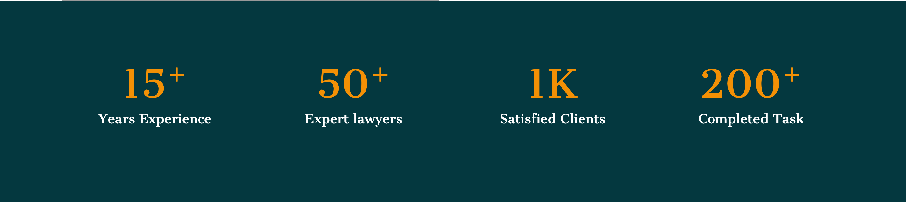
stats-counter
Four-up counter band on deep teal showing years experience, lawyers, clients, and tasks with amber numbers.
team-overlay-cards
Three-up team cards where hovering reveals a teal gradient overlay with social icons that scales up from the bottom edge.
testimonials-swiper
Two-up Swiper carousel of testimonial cards with portrait, large blockquote rtmicon, italic quote and clickable bullet pagination.
blog-cards-row
Three-up blog-post teaser row with square image, serif teal headline, body excerpt, and an amber READ MORE link with arrow.

footer-multicolumn
Deep-teal four-column footer with logo, social row, quick links, services list, contact details and a copyright bar.
video-modal
Bootstrap modal triggered from the hero play button that embeds a YouTube iframe at modal-xl size with autoplay.
preloader
Per-letter spelling preloader that types out POTU before fading out — driven by jQuery delay/fadeOut after window load.

custom-cursor
Single-dot custom cursor that follows the mouse via vanilla JS mousemove and ignores touch devices.

main-header
Multi-level dropdown header with light/dark logo swap, sticky-on-scroll variant cloned via JS, and a Let's Talk CTA pill.
demo-switch
Floating moon/sun pair that toggles a global dark_bg / light_bg class on the page wrapper.
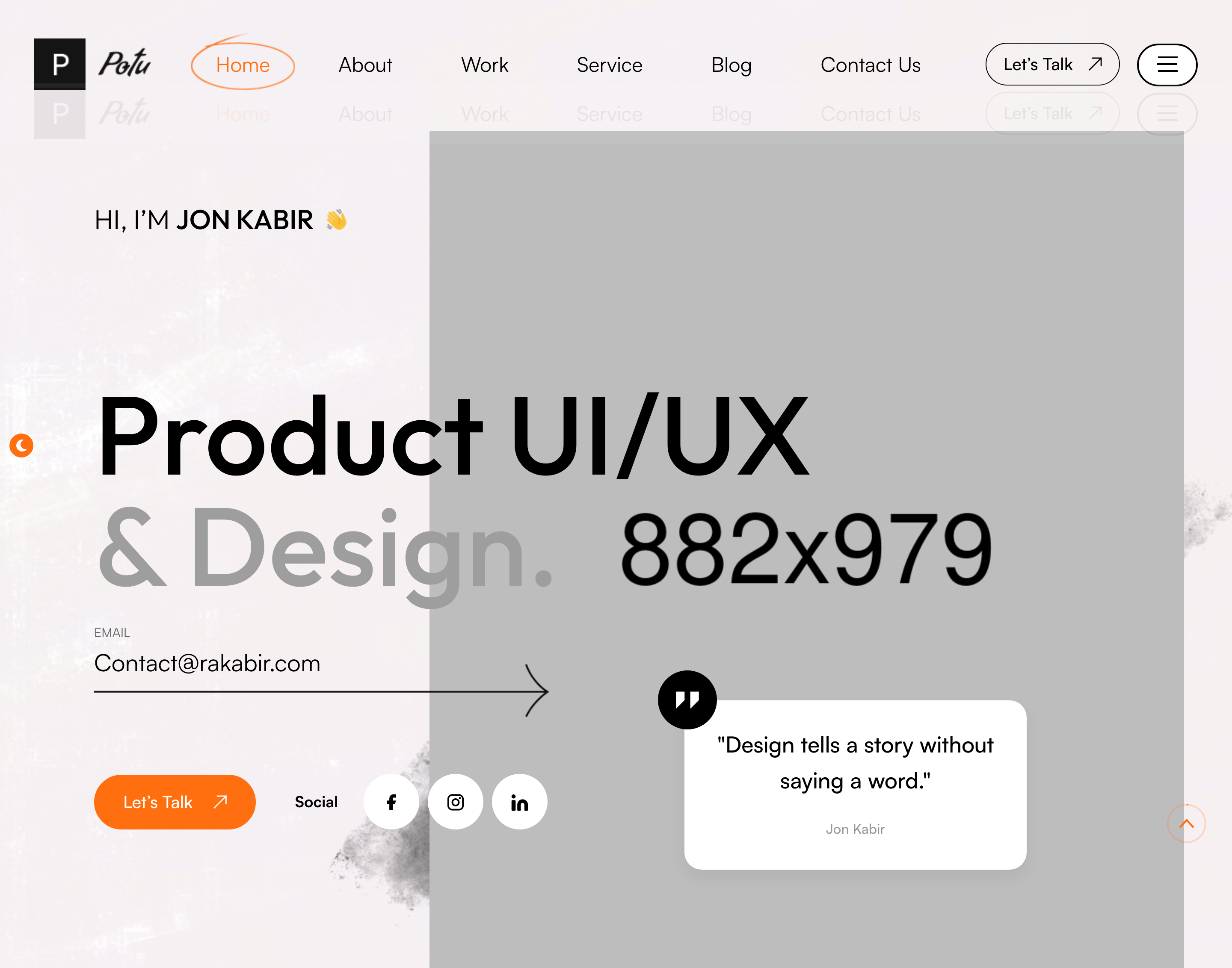
hero-banner
Designer-portrait hero with parallax floating shapes, a typed-text rotator (Branding,) and a side quote-card with email CTA inline.
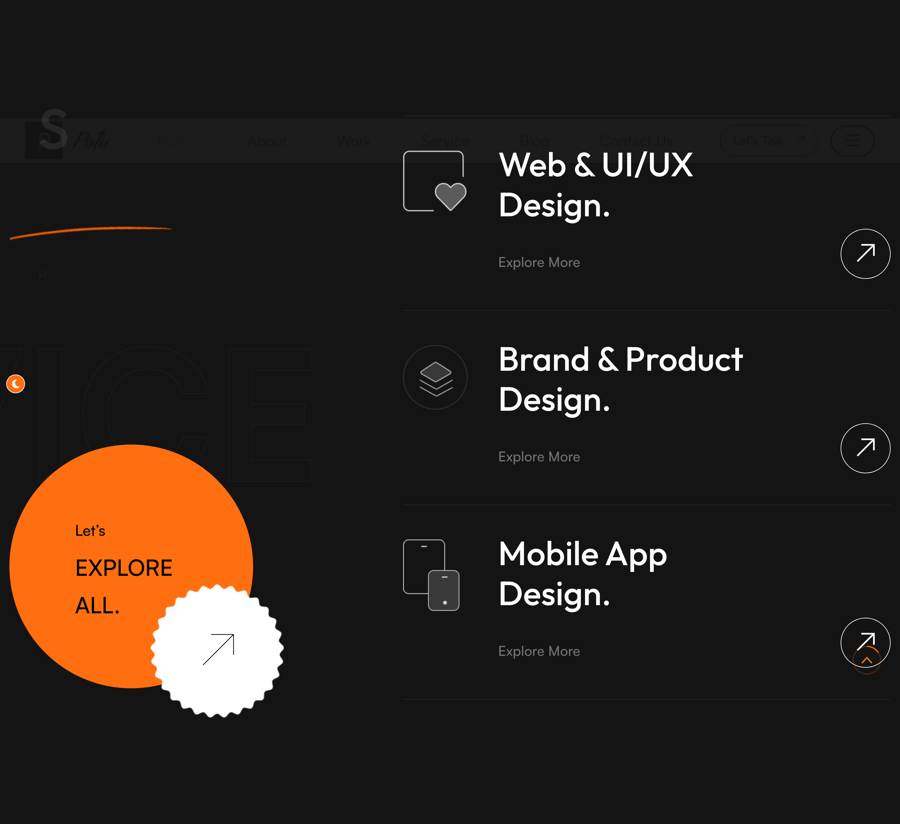
service-list
Asymmetric two-column services panel — sticky left intro with giant EXPLORE ALL stamp, scroll-stacked service tiles on the right.
portfolio-carousel
Owl-carousel of large project cards with stacked icon, title and decorative shape layers; word watermark sits behind the rail.
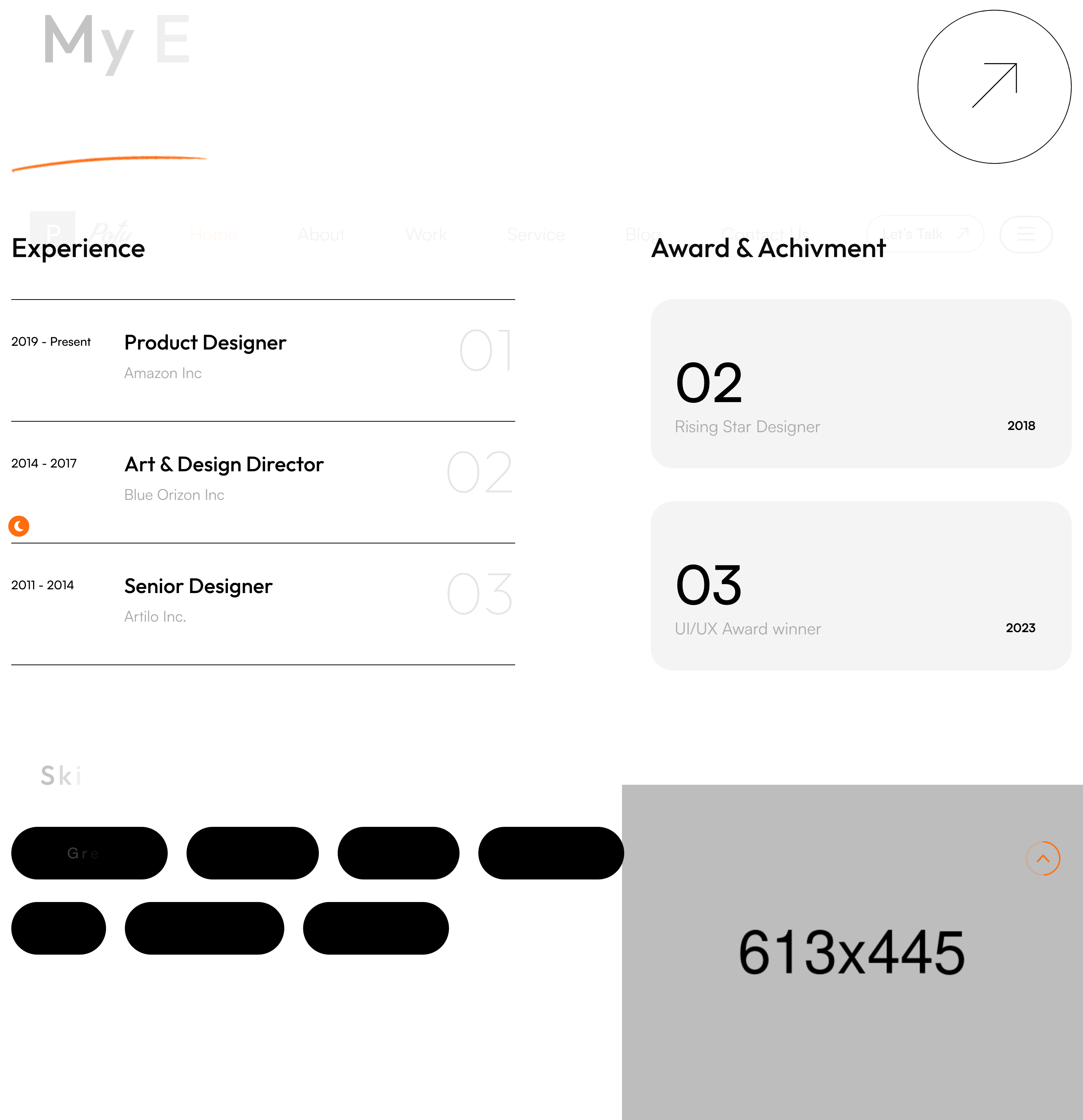
skills-experience
Two-column experience and awards timeline with numbered counters, plus a chip-style skills cloud below.
clients-marquee
Two opposing rows of client logos that scroll horizontally as a CSS-only marquee, framed by section dividers.
testimonial-slider
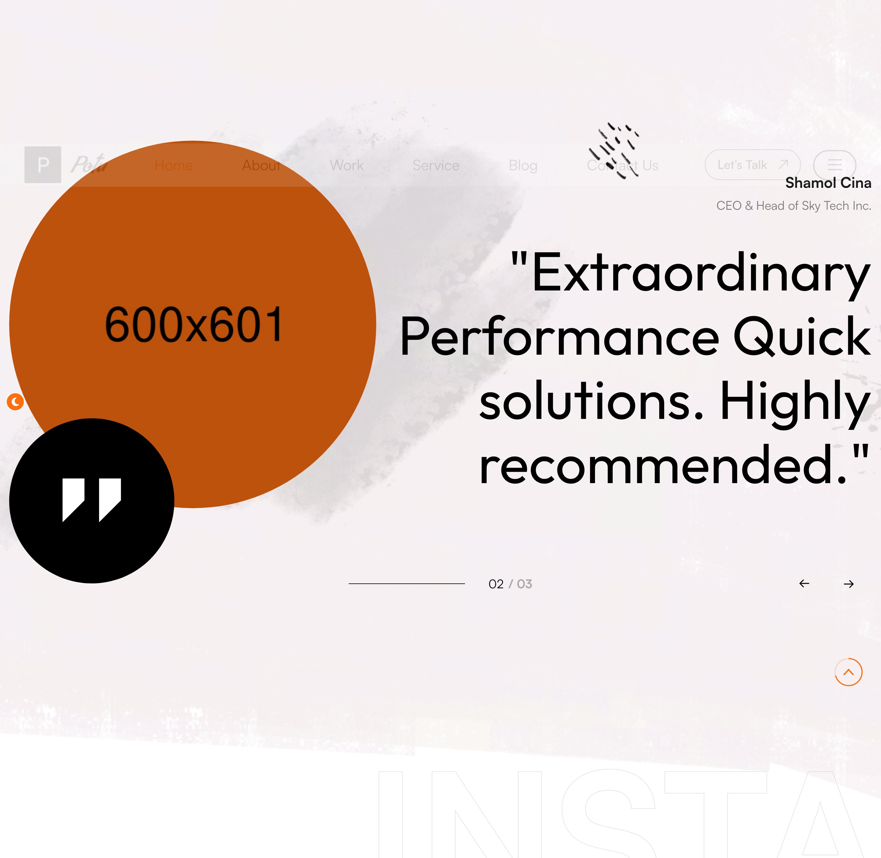
Single-quote Owl testimonial slider with a circular portrait, quote-mark badge, and parallax decorative shapes.
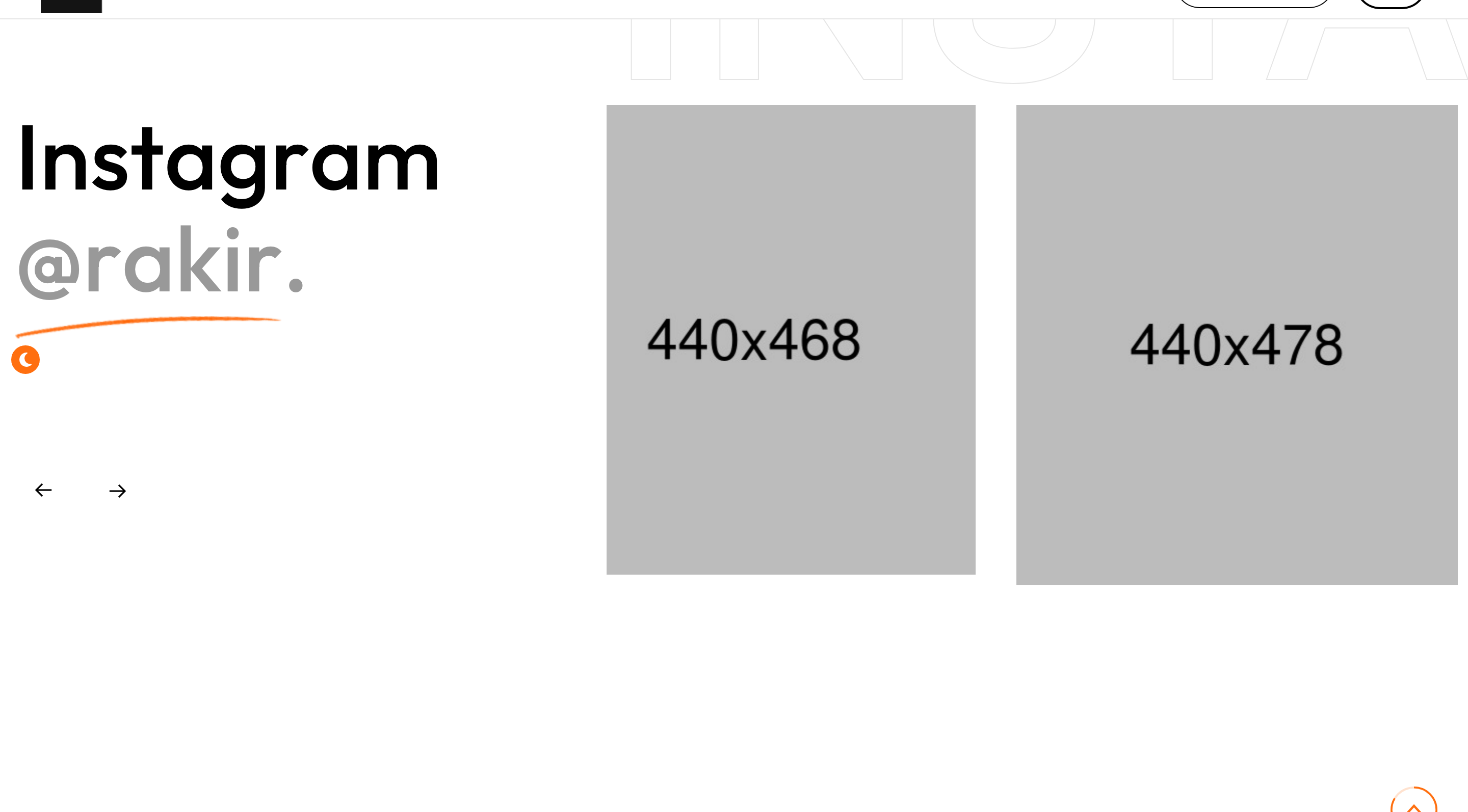
instagram-carousel
Instagram peek carousel with a section title on the left and a giant 'instagram' watermark behind the slider.
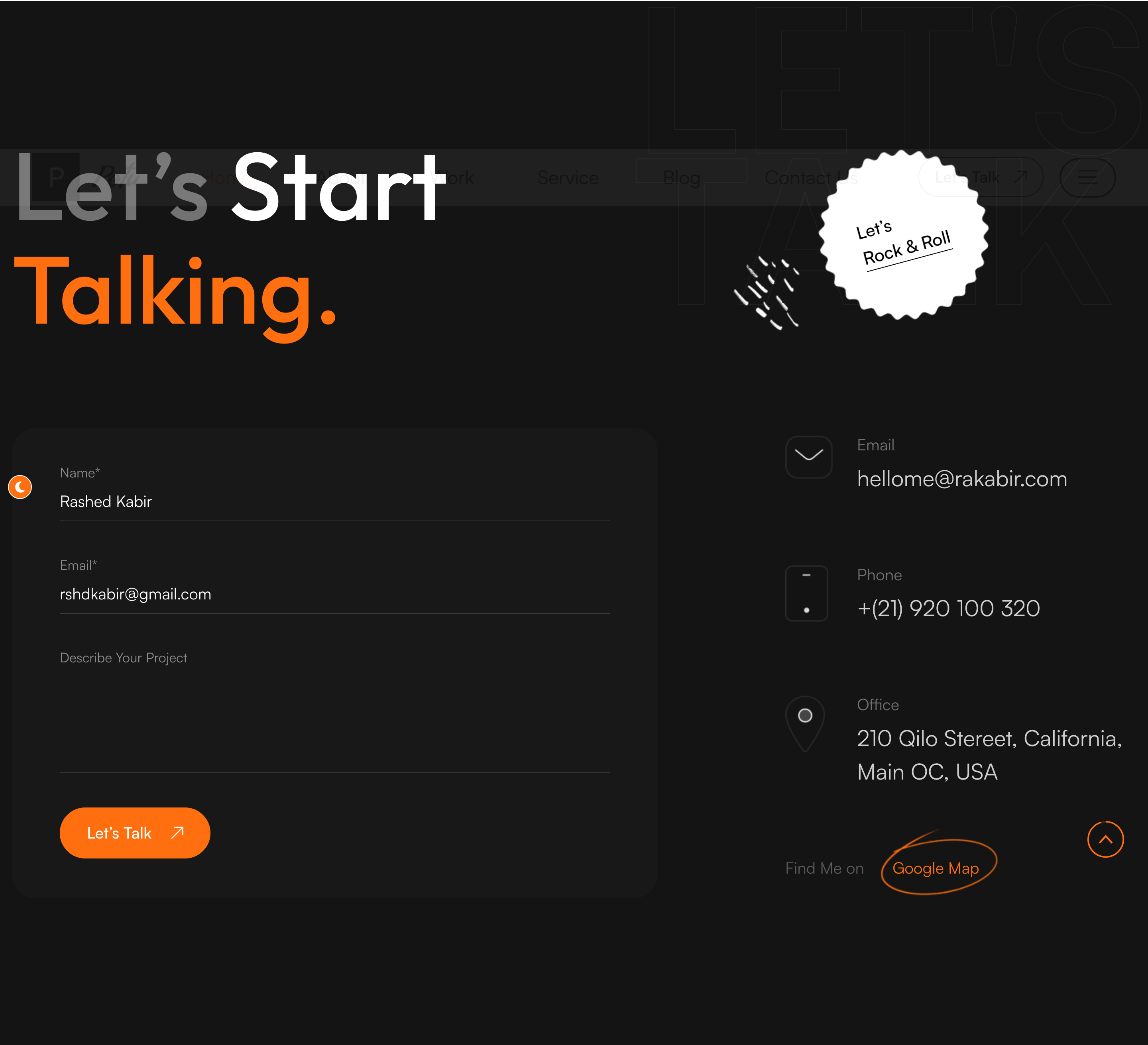
contact-cta
Split contact section with a decorated Let's Start Talking heading, validated form, and stacked email/phone/office info column.

main-footer
Minimal centered footer with a logo, copyright stamp and three text-only social links on a single divider row.

scroll-to-top
Circular SVG progress ring that fills as the user scrolls and exposes a click-to-top hit zone in the bottom-right corner.

transparent-mega-menu-header
Transparent fixed header with a 10-thumbnail mega menu for homepage demos and an off-canvas drawer trigger.

jarallax-hero-with-stats
Full-viewport jarallax photo hero with bottom-anchored title, stacked-avatar social proof and a four-column service ticker.
icon-feature-trio
Three-column trust block of color-icon features each with a pill-style CTA to deeper pages.

image-tabs-about
Side-by-side jarallax image with a floating animated stat card and a Mission/Vision/Values tab switcher.

half-bleed-testimonial-carousel
Dark half-bleed section with a fixed legal portrait on one side and an owl-carousel of quote testimonials on the other.

team-grid-hover-bio
Four-up attorney portrait grid where a frosted-glass bio panel slides up on hover to reveal name, role and socials.

navy-practice-areas
Navy-on-navy practice-area block with floating white icons positioned absolutely to the left of each title.
case-studies-overflow-carousel
Container-fluid owl-carousel of case-study cards with a bleeding-right edge, gradient overlay and custom prev/next nav.

dark-stats-counter-row
Dark four-column counter row using data-to/data-speed timer animation triggered on scroll into view.

video-player-process-timeline
Split layout pairing a circular play-button video poster with a numbered three-step vertical timeline.
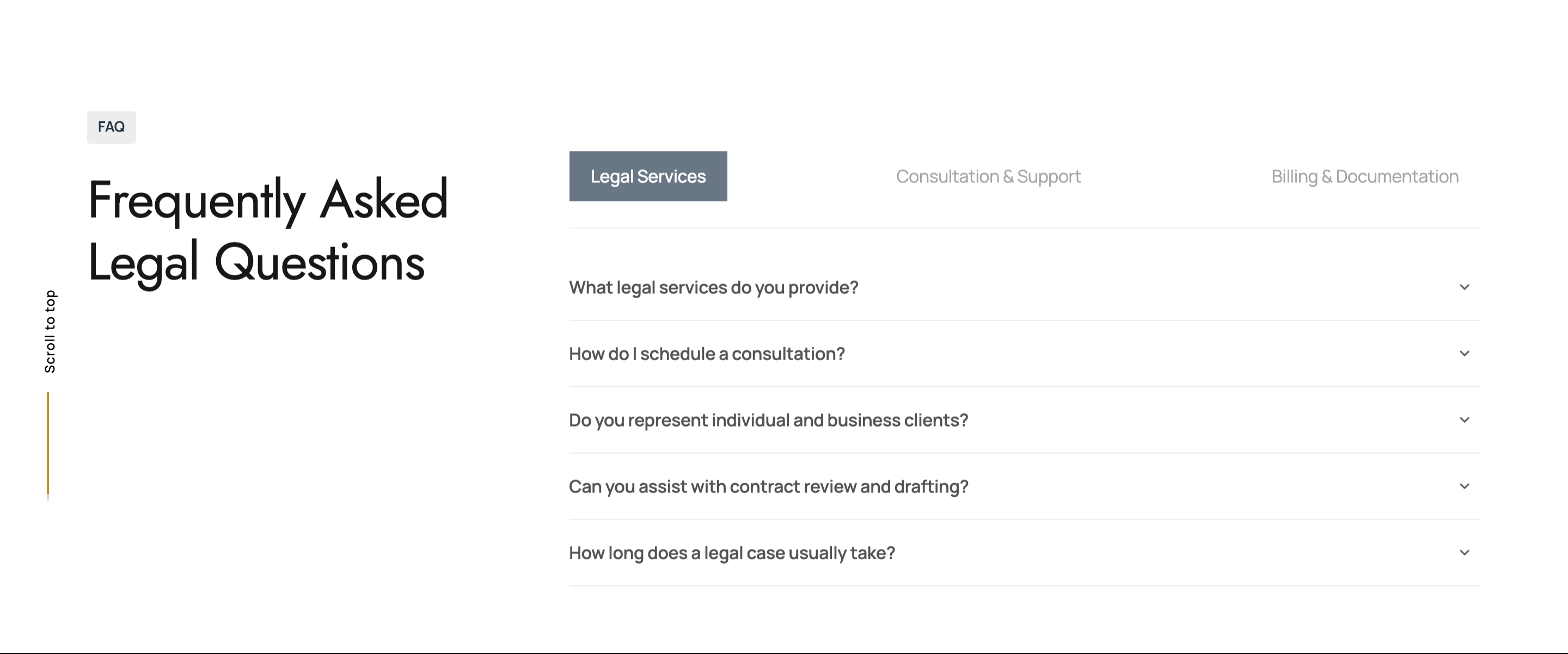
tabbed-faq-accordion
Three category tabs (Services, Consultation, Billing) each switching to its own accordion of five questions.

off-canvas-extra-drawer
Right-side dark off-canvas drawer with logo, two columns of practice areas, contact info and social icons.
three-column-footer
Three-column dark footer with logo, brand statement, company links, practice areas and store-hours info card.

scroll-progress-back-to-top
Vertical scrollbar indicator paired with a 'Scroll to top' floating link that appears after scroll threshold.

sticky-minimal-header
Minimal sticky header with the wordmark on the left and a single 9-dot grid icon on the right that opens a full off-canvas sidebar with the entire menu, contact block, and socials.
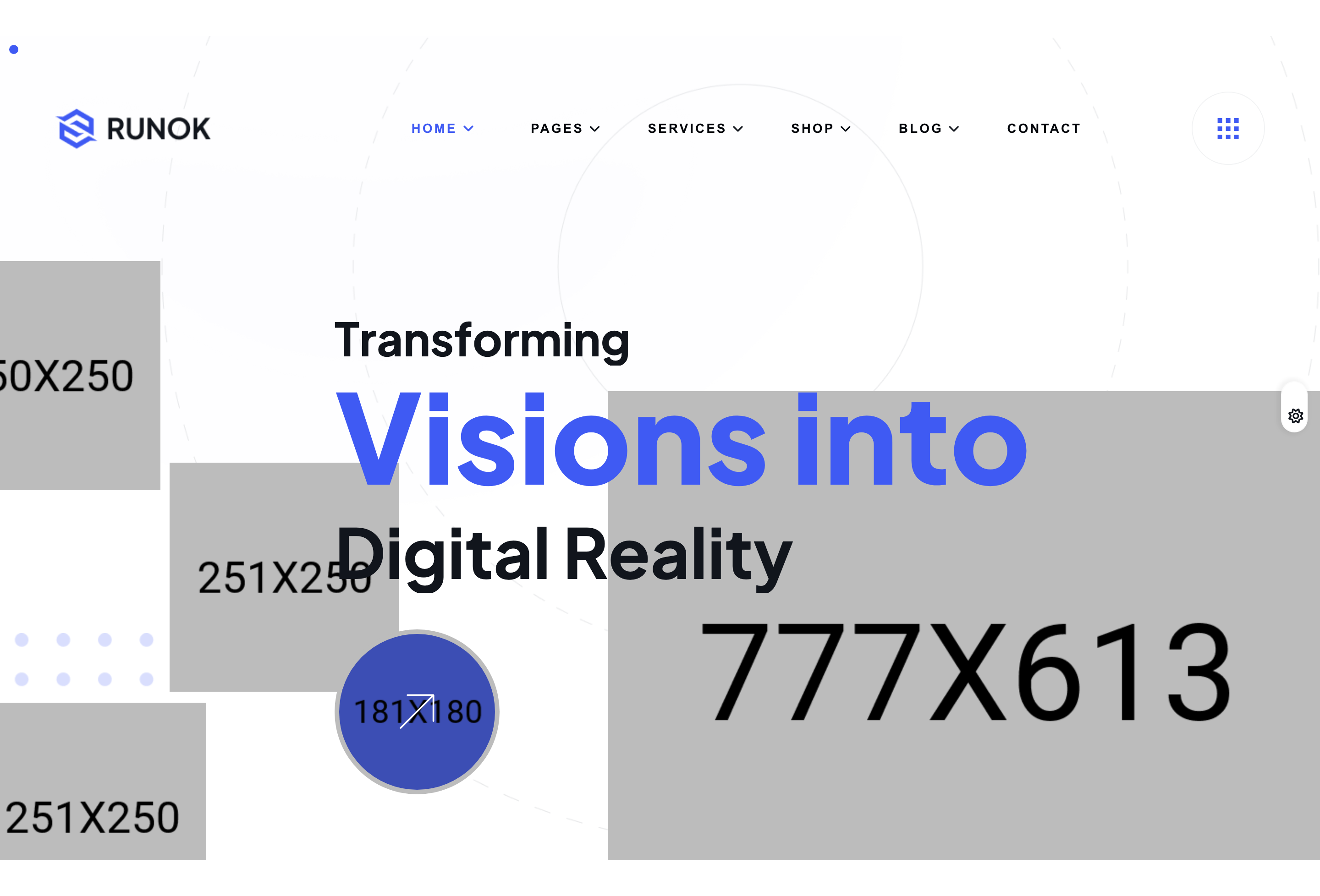
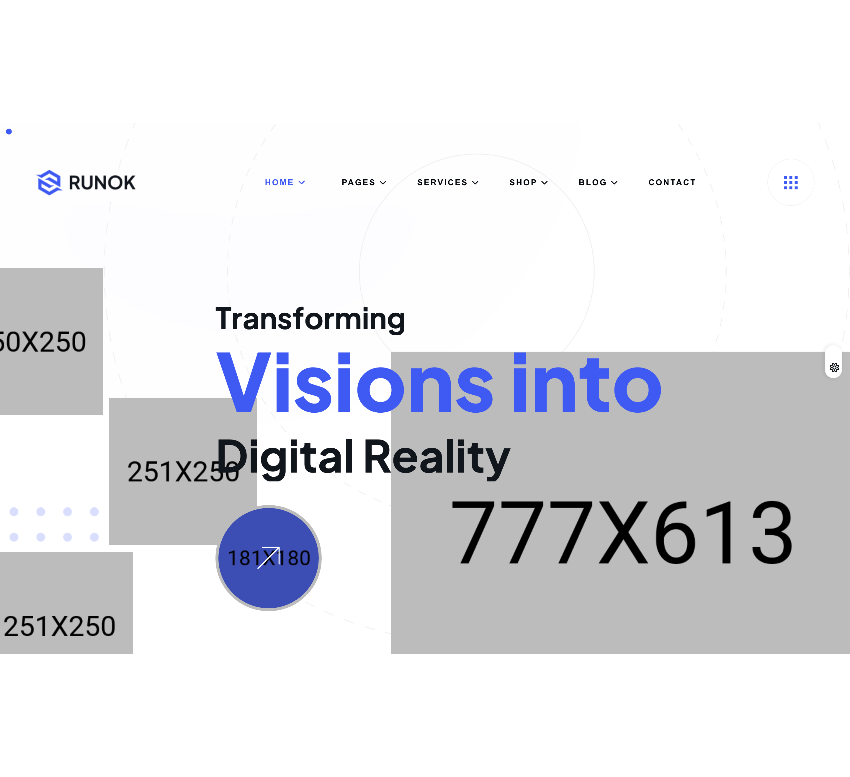
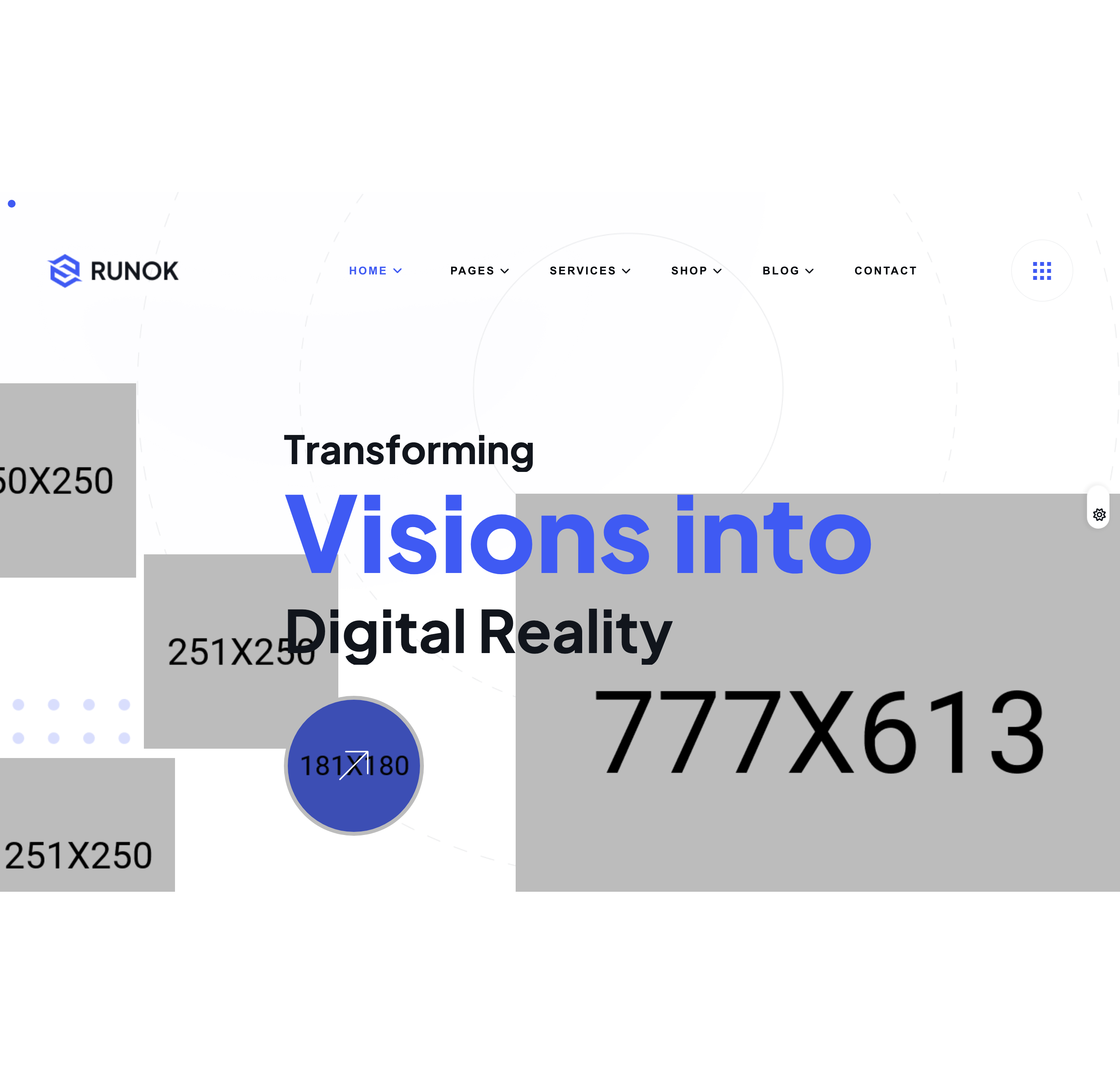
split-text-hero
Tall dark hero with three stacked headlines (Transforming / Visions into / Digital Reality) animated character-by-character via SplitType + GSAP, three offset square photos and an arrow CTA.
process-icon-row
Centered work-process band with four icon-circle steps in a row, an oversized greyscale 'PROCESS' watermark behind, and a fade-up reveal driven by ScrollTrigger.
image-reveal-about
Two-column about block where the right column houses two stacked photographs that animate in via a horizontal mask reveal (container slides left, image counter-translates and zooms out).
service-card-grid
Four-column service grid where each card is a tall photo with a hover overlay; corner SVG icon, slash-prefixed service title, and a Read More pill at the bottom.
project-accordion
Vertical project accordion: each row is a numbered circle, category, and title; the active row reveals a description on the left and a project thumbnail on the right inside the accordion body.

running-text-marquee
Two stacked infinite-scroll text tickers (one running left-to-right, the other right-to-left) using carouselTicker.js, with a Plus Jakarta italic word list separated by dot bullets.
swiper-testimonials
Centered testimonial Swiper carousel with circular author avatars, name + role line, and a quote underneath — paginated with bullet dots and grab-cursor enabled.
faq-accordion-with-image
Two-column FAQ section: left column carries a Bootstrap 5 accordion with three questions, right column carries a hero illustration that mask-reveals into view on scroll.
blog-card-grid
Three-column 'Latest News' grid with a square thumbnail on top, post-meta line (clock + author icons), title link, and a Read More arrow pill — fade-top staggered on scroll.
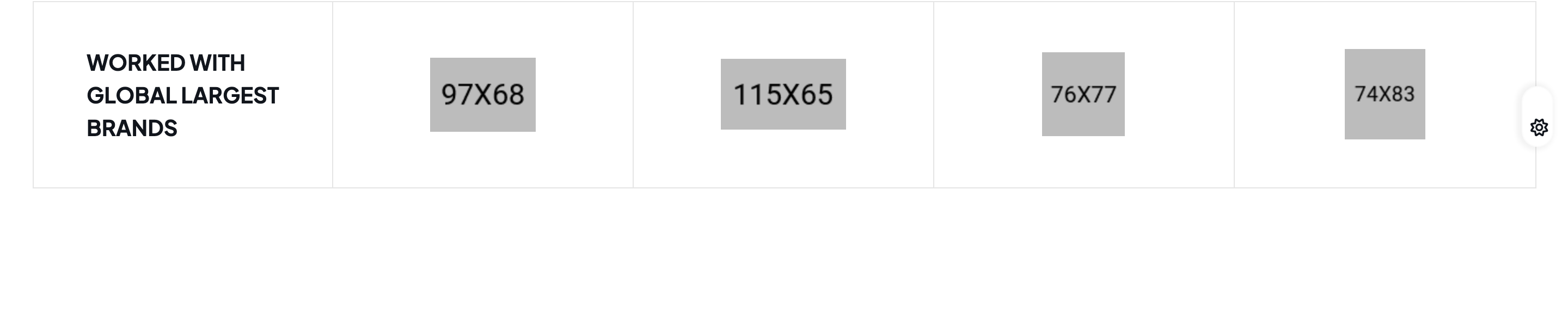
sponsor-logo-row
Single-row brand block on dark surface: an oversized 'WORKED WITH GLOBAL LARGEST BRANDS' headline takes the first slot and four monochrome partner logos sit beside it.
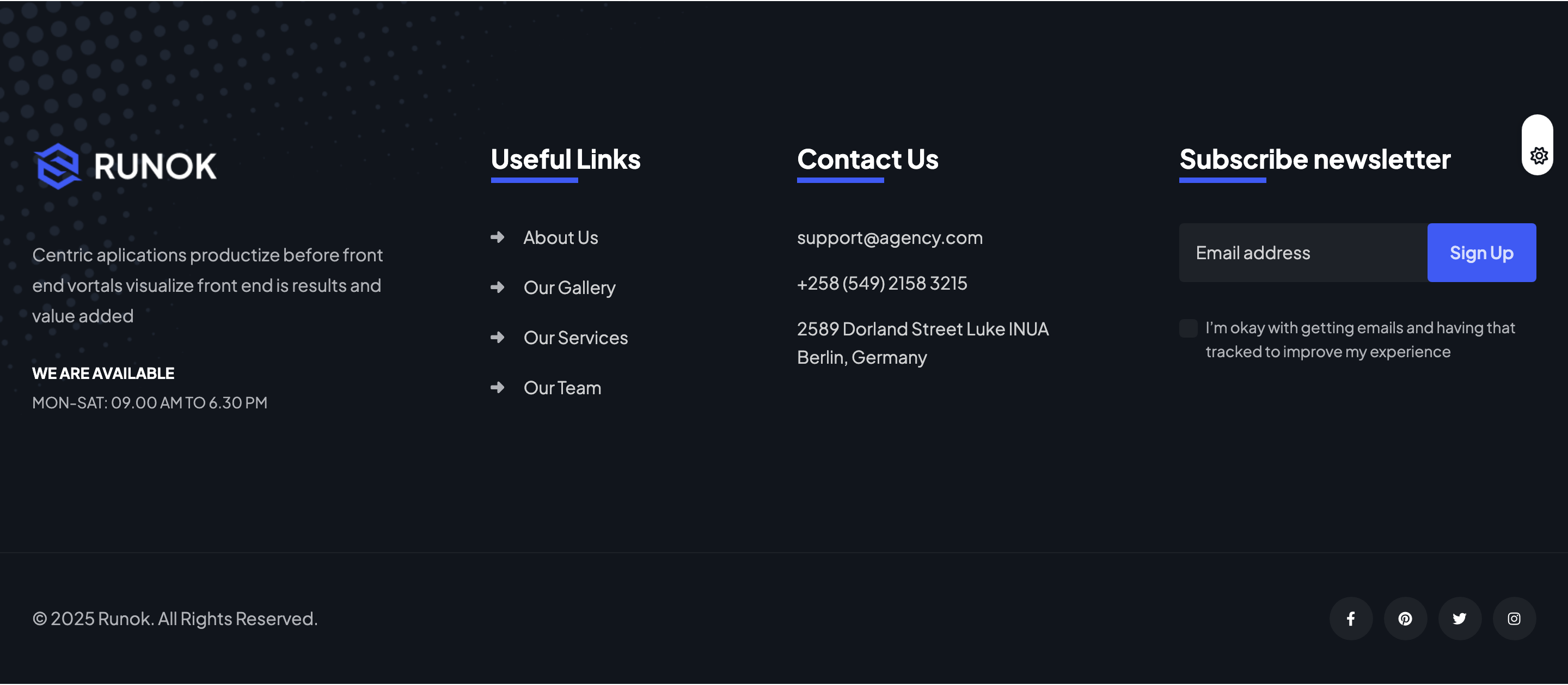
newsletter-footer
Four-column dark footer (brand intro + opening hours, useful links, contact list, newsletter form) over a faint grid shape, with copyright bar and circular social pills.

magnetic-cursor
Custom dot-style cursor (.mt-cursor) appended at runtime; follows the mouse via translate, expands on links/buttons/.cursor-effect elements, and hides on touch devices.

scroll-progress-orb
Fixed bottom-right circular scroll-progress indicator that uses a conic-gradient mask to fill cobalt around its rim and switches to an up-arrow icon at >96% scroll, doubling as scroll-to-top.

theme-toggle-switch
Floating pill toggle (#theme-toogle) that flips the document data-theme attribute between light and dark, persisting the choice in localStorage and respecting prefers-color-scheme on first load.

preloader-runok
Full-screen dark preloader with a centered 'Runok' word that fades out 1000 ms after window load via $('#preloader').fadeOut(500).

header-navbar
Transparent sticky header with mega-menu submenus, search-popup trigger, login link, and a pill CTA that swaps colors on scroll.
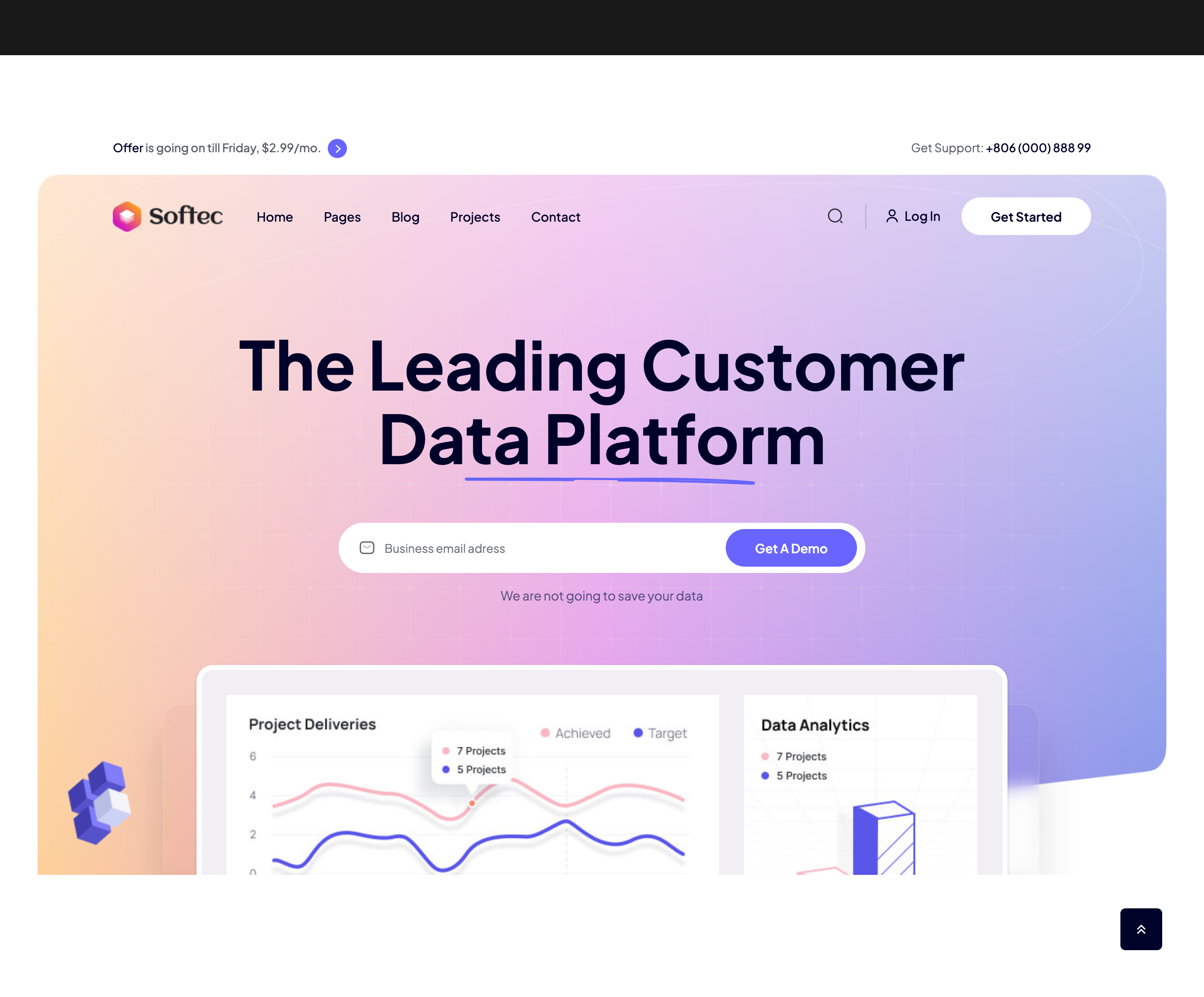
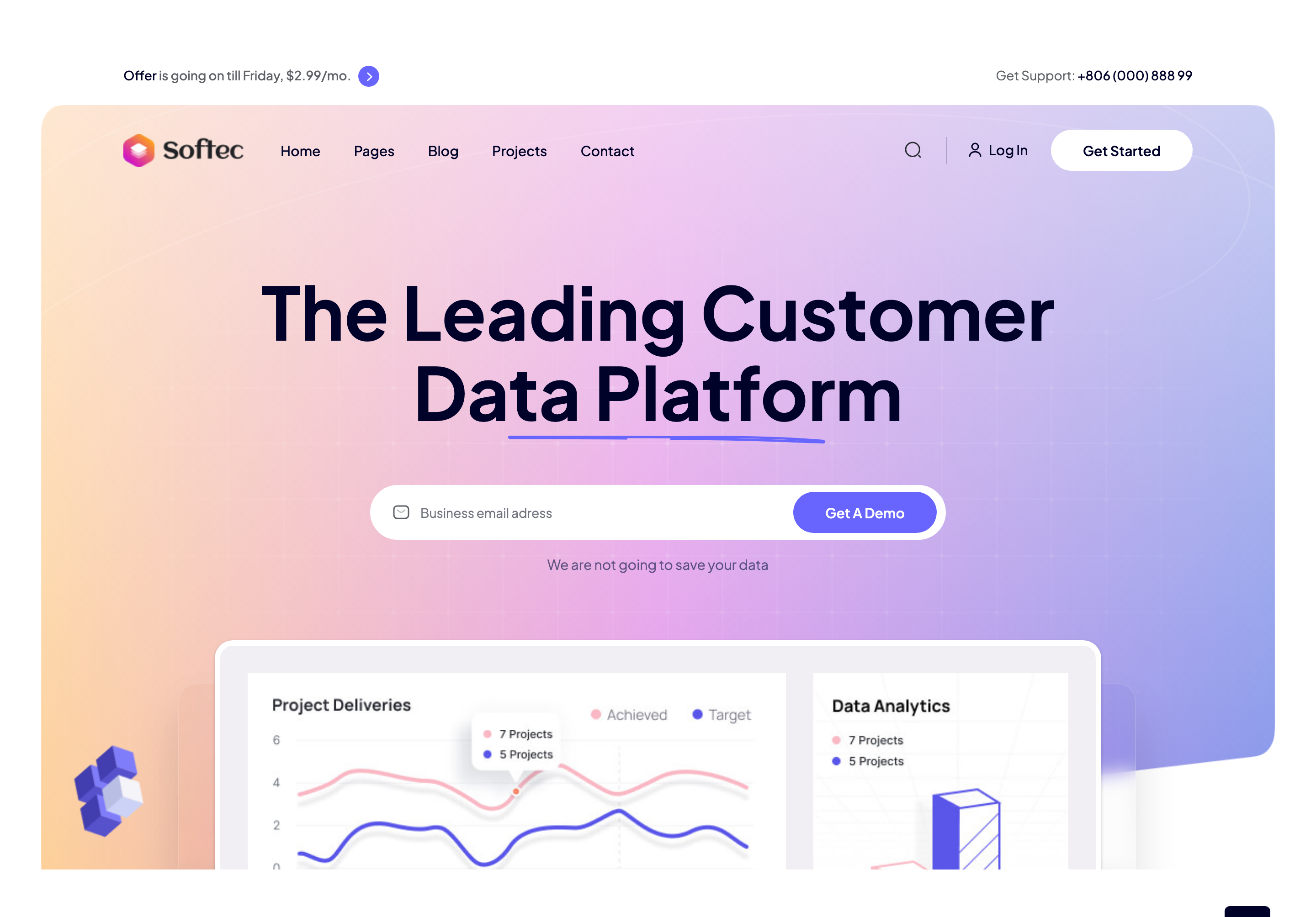
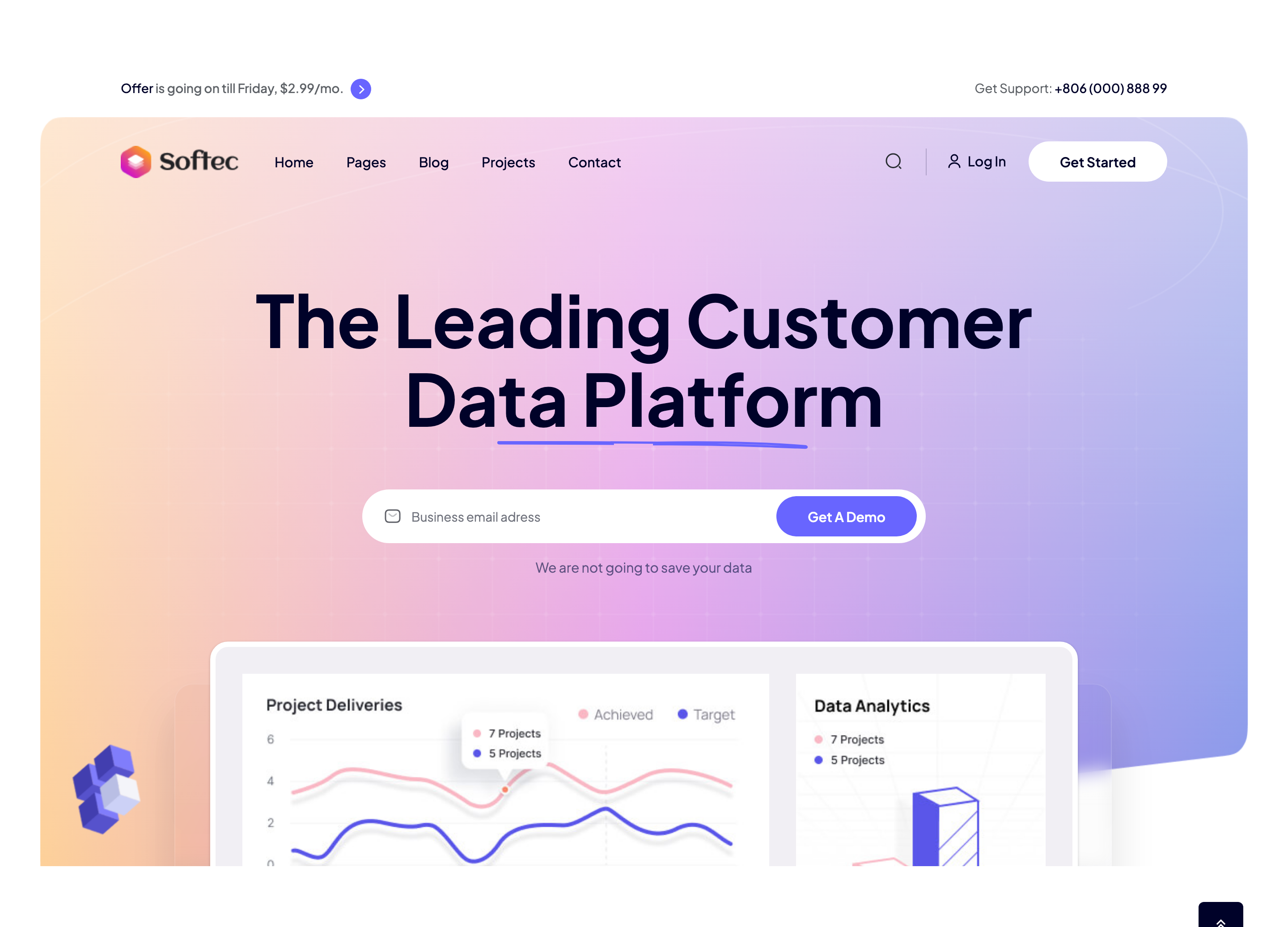
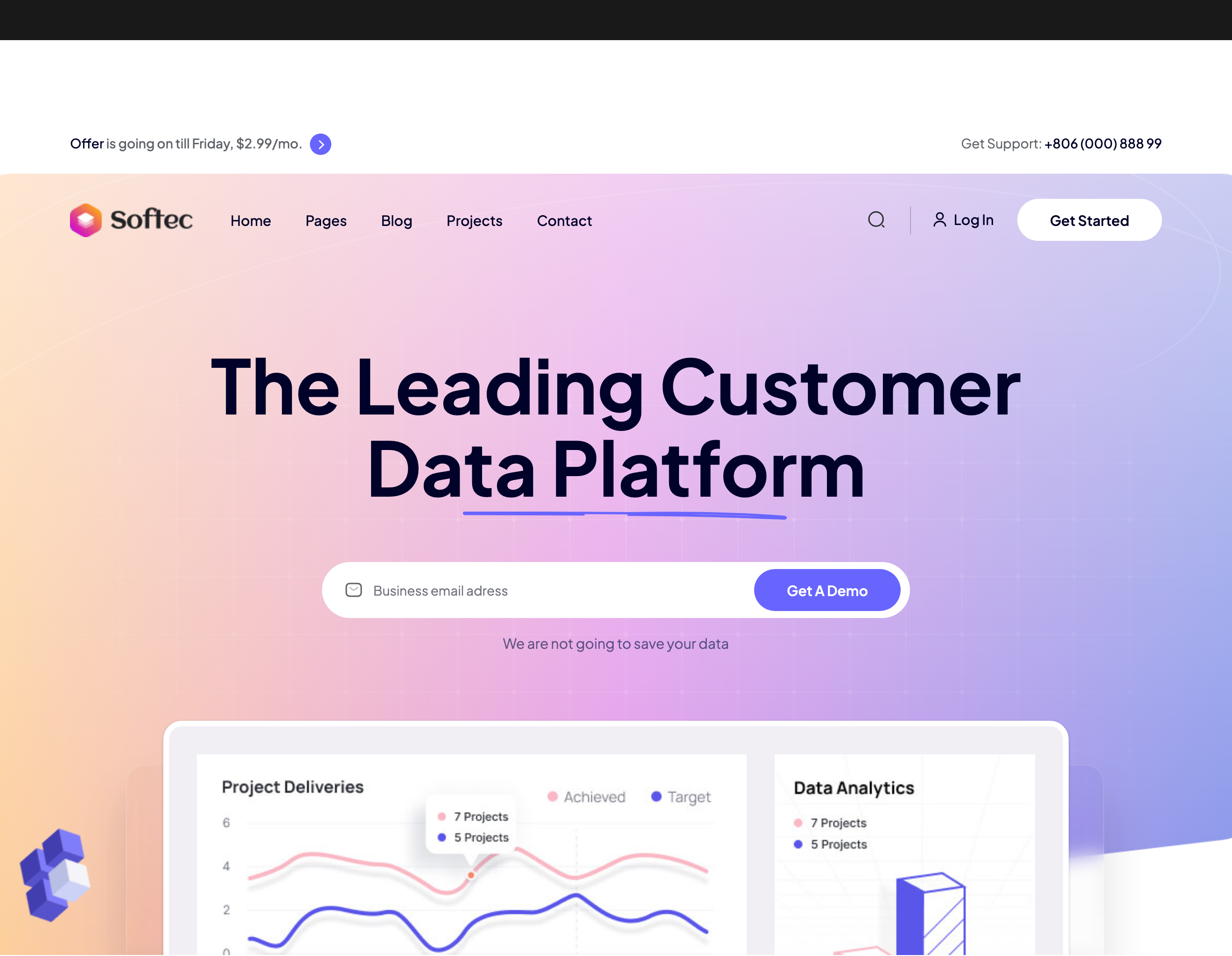
hero-data-platform
Centered headline with SVG hand-drawn underline stroke, email-capture input, and a 3-up image collage that scales in on load.
feature-cards-trio
Three icon-led feature cards arranged in a row with staggered fade-up entrance and circular icon swatches.

about-image-collage
Asymmetric photo-and-shape collage on the left with bullet checkmark list and CTA on the right.
service-grid-with-cta
Five color-coded service tiles plus one dashboard-mockup CTA card occupying the sixth grid cell.
project-swiper-carousel
Edge-bleeding 3-up Swiper carousel with image-left / meta-right project cards and a draggable scrollbar.
testimonial-slider-split
Slick slider with a 7/5 split: customer quote on the left, oversized growth percentage and case-study link on the right.
rank-leaderboard
Decorative ranking podium that staggers four card pillars vertically with floating circle shapes behind them.
pricing-tabs
Monthly / yearly Bootstrap-tab toggle with a sliding indicator, hand-drawn dashed pointer, and three feature-list pricing cards.

newsletter-cta
Footer-top newsletter row with rounded email input, embedded icon, and arrow submit button on a dark background.

footer-dark
Dark footer with logo column, link grids, contact list with magenta icons, social row, and language switcher copyright bar.
preloader-dot-loader
Two-dot pulsing preloader overlay that auto-hides after the page loads.

search-popup
Full-screen search overlay triggered from the header magnifier with logo, dismiss button, and underlined input.
side-offcanvas
Right-side dark off-canvas drawer with mobile menu, Instagram thumbnails, address block, and social icons.

site-navbar-mega-menu
Blurred fixed navbar with hover-driven mega-menu showing image previews of all five home demos.
svg-curtain-preloader
Full-screen GSAP preloader morphs an SVG curve to flat then slides up to reveal the page; spells out LOADING with charming.js.
magnetic-cursor
Custom hover cursor that magnetically attracts itself to .hover-this targets and grows on every link.

scroll-progress-ring
Fixed-bottom circular SVG ring that fills as the page scrolls and acts as a back-to-top button.
main-hero-headline
Full-bleed dark hero with overlaid headline split between two lines, pull quote, project counter and big down-arrow icon.
intro-stats-block
Two-column intro that pairs an arrow illustration and a fw-300 mission line with two thin-bordered KPI tiles.

rolling-skills-marquee
Two stacked horizontal marquees (filled + stroked) of services separated by star glyphs, infinitely looping in opposite directions.
services-swiper-carousel
Three-up Swiper of service cards with custom prev/next arrows and per-card icon, headline, blurb and Read More link.
portfolio-fade-swiper
Auto-paced Swiper of selected works with progressbar pagination, sub-bg captions with notched corners and a 'Our Portfolio' edge marquee.
feat-services-trio
Three stacked image-plus-copy feature cards next to a copy column with magnetic CTA, blurred orange glow in the corner.
team-portrait-grid
Three-column team grid where each portrait has a sliding info caption and round social-icon column on hover.
minimal-testimonials-slider
Photo + quote testimonial Swiper with tall portrait, oversized fz-30 quote, dotted pagination and SVG quotation glyph.
clients-logo-carousel
Five-up looping Swiper of brand SVGs with a centered headline above and a thin trust-bar pill below.

cta-double-marquee
Stacked Get-In-Touch / Contact-Us double marquee with full-width clickable overlay link to the contact page.
newsletter-footer
Four-column footer with logo, contact, useful links and an inline newsletter input plus four social icons.