site-footer
Футер·Шаблон: Addina - Multipurpose eCommerce HTML Template·Складність анімації: none·Адаптивний: Так
Файли-джерела
- index.html
footer.footer-bg
Summary
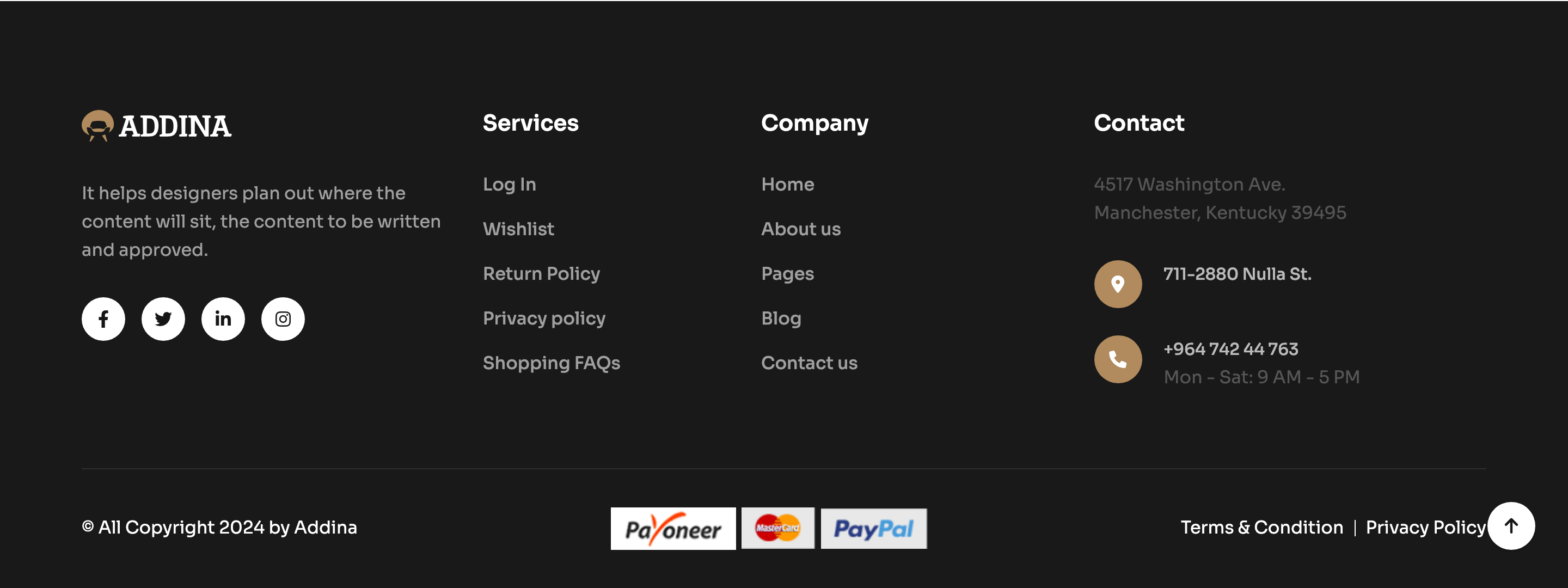
A near-black footer broken into a three-column grid (logo + about + social on the left, two link columns in the middle, contact column on the right) sitting on the same #191919 plate that anchors the rest of the dark sections.
HTML structure (minimal)
<footer class="footer-bg">
  <div class="footer-area pt-100 pb-20">
    <div class="footer-style-4">
      <div class="container">
        <div class="footer-grid-3">
          <div class="footer-widget-4">
            <div class="footer-logo mb-35">
              <a href="#"><img src="logo-light.svg" alt=""></a>
            </div>
            <p>It helps designers plan out where the content will sit…</p>
            <div class="theme-social">
              <a class="furniture-bg-hover" href="#"><i class="fa-brands fa-facebook-f"></i></a>
              <a class="furniture-bg-hover" href="#"><i class="fa-brands fa-twitter"></i></a>
              <a class="furniture-bg-hover" href="#"><i class="fa-brands fa-linkedin-in"></i></a>
              <a class="furniture-bg-hover" href="#"><i class="fa-brands fa-instagram"></i></a>
            </div>
          </div>
          <div class="footer-widget-4">
            <h4 class="footer-widget__title">Useful Links</h4>
            <ul class="footer-list">
              <li><a href="#">About Us</a></li>
              <!-- … -->
            </ul>
          </div>
          <div class="footer-widget-4">
            <h4 class="footer-widget__title">Information</h4>
            <ul class="footer-list">…</ul>
          </div>
          <div class="footer-widget-4">
            <h4 class="footer-widget__title">Contact Us</h4>
            <ul class="footer-list">…</ul>
          </div>
        </div>
      </div>
    </div>
  </div>
</footer>
Key SCSS tokens
.footer-bg {
  background-color: var(--clr-bg-2); /* near-black */
  color: rgba(255,255,255,0.7);
}
.footer-grid-3 {
  display: grid;
  grid-template-columns: 1.4fr 1fr 1fr 1fr;
  gap: 40px;
}
.footer-widget__title {
  color: #fff;
  font-size: 18px;
  font-weight: 600;
  margin-bottom: 24px;
}
.footer-list a {
  color: rgba(255,255,255,0.7);
  &:hover { color: var(--clr-theme-primary); }
}
.theme-social a {
  width: 36px; height: 36px;
  display: inline-grid; place-items: center;
  border: 1px solid rgba(255,255,255,0.15);
  border-radius: 50%;
  color: #fff;
  margin-right: 8px;
  &.furniture-bg-hover:hover {
    background: var(--clr-theme-primary);
    border-color: var(--clr-theme-primary);
  }
}
Notable details
- The first column is wider (1.4fr) than the others, giving the brand block visual weight without breaking grid alignment.
- Hover states on social pills swap to bronze instantly — the same pattern is used in the testimonial / blog sections, keeping interaction language consistent.
- Link rows inherit muted white (
rgba(255,255,255,0.7)) which is enough contrast on#191919without feeling stark.
Use when
- Standard 3-column dark footer for any storefront that already uses a black band elsewhere.
- Multi-link sites that need a grouped mega-footer rather than a thin contact strip.
- Vertical-store templates where the footer must work for furniture, grocery and pharmacy without retheming.
Caveats
- No newsletter input here — the template handles that earlier in
support-tri-card. If you want to consolidate, lift one of the support cards into the footer. - 1.4fr / 1fr / 1fr / 1fr collapses awkwardly below 992px; add a media query that drops to 2 columns for tablets.