services-grid
Картка послуги·Шаблон: Lawgist – Attorney & Lawyers HTML Template·Складність анімації: subtle·Адаптивний: Так
Файли-джерела
- index.html
section.service_wrapper.service-1
Бібліотеки
bootstrapjquery
Summary
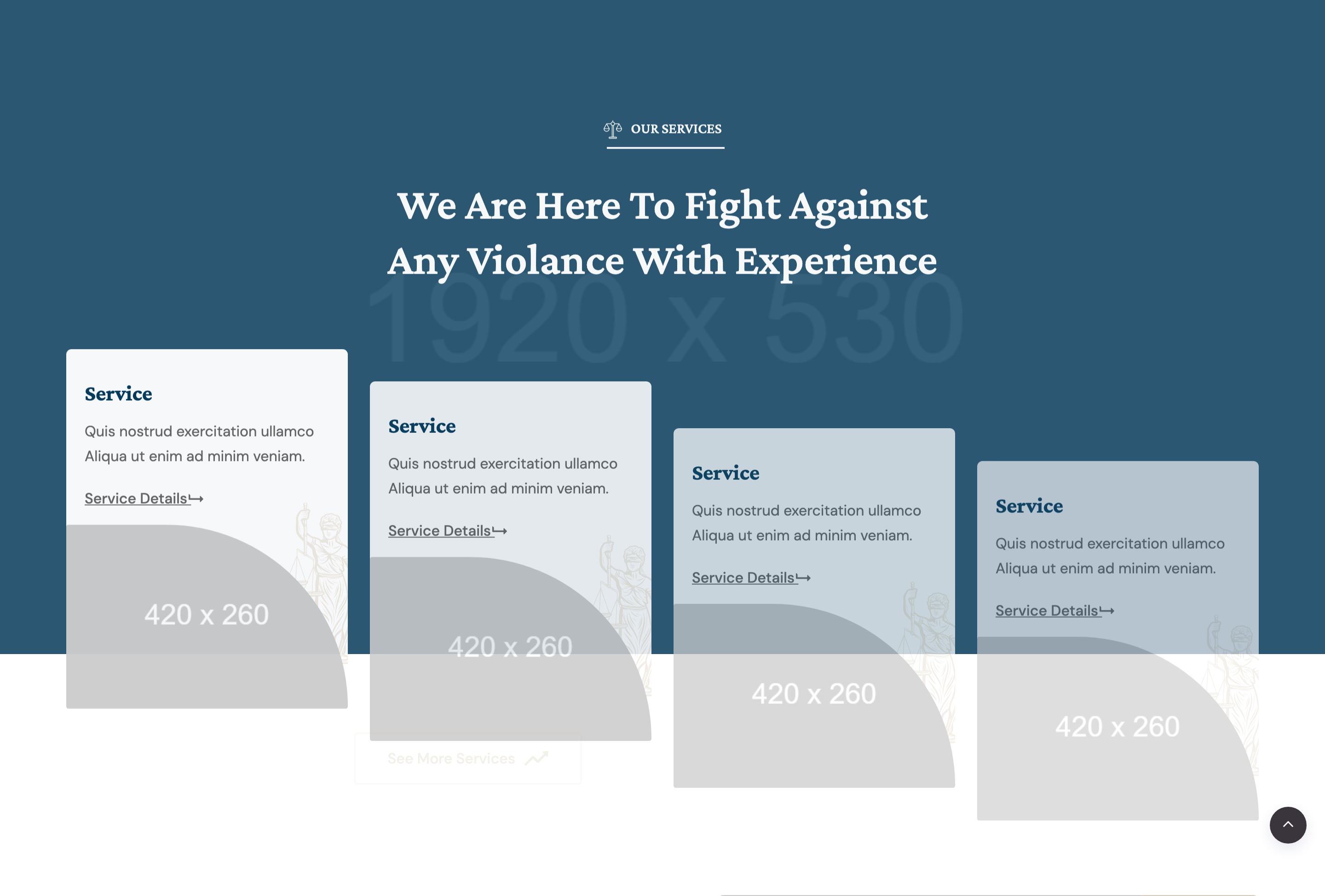
Four-up service-card row centered under a section title and finished with a "See More Services" outline button. Each card combines a service heading, short blurb, image thumbnail, decorative justice icon, and a level-up arrow CTA.
HTML structure (minimal)
<section class="service_wrapper service-1 section-padding">
  <div class="container">
    <div class="row">
      <div class="col-12 col-md-6 offset-md-3">
        <div class="section-title section_2 text-center mb-30 wow fadeInUp" data-wow-duration="1s">
          <h6><img src="bage_head_2.svg" alt="">Our Services</h6>
          <h2>We are here to fight against any violance with experience</h2>
        </div>
      </div>
    </div>
    <div class="row">
      <div class="col-lg-3 col-md-4 col-sm-6 mt-30">
        <div class="single_service_card wow fadeInUp" data-wow-duration="1s">
          <h4>Service</h4>
          <p>Quis nostrud exercitation ullamco aliqua…</p>
          <a href="#" class="btnd">Service Details <i class="far fa-level-up-alt"></i></a>
          <div class="single_img"><img src="card_420x260.jpg" alt=""></div>
          <div class="jus_element"><img src="justice.svg" alt=""></div>
        </div>
      </div>
      <!-- 3 more cards with durations 1.3s, 1.7s, 2s -->
      <div class="col-12">
        <div class="text-center mt-40">
          <a href="#" class="theme-btn theme-border">See More Services<i class="icon-arrow-right-2"></i></a>
        </div>
      </div>
    </div>
  </div>
</section>
Key SCSS tokens
.service_wrapper.service-1 .single_service_card {
  position: relative;
  background: #fff;
  border: 1px solid rgba(34,33,39,0.08);
  padding: 28px 24px 40px;
  overflow: hidden;
  transition: 0.3s ease;

  h4 { font-family: 'Crimson Pro', serif; color: #222127; text-transform: uppercase; }
  .single_img img { width: 100%; height: auto; margin-top: 18px; }
  .jus_element {
    position: absolute; right: 16px; top: 16px;
    opacity: .15;
    img { width: 60px; }
  }
  .btnd { color: #c8242f; font-weight: 500; }

  &:hover {
    transform: translateY(-6px);
    box-shadow: 0 18px 40px rgba(34,33,39,0.10);
    .jus_element { opacity: .35; }
  }
}
Animation logic
new WOW().init();
// Per-card data-wow-duration: 1s, 1.3s, 1.7s, 2s creates a wave
Notable details
- Card layout puts the heading and CTA above the image — inverts the usual "image-first" service card and forces the eye to the link.
- Faint corner
jus_elementicon brightens slightly on hover, a small but rare interaction detail. - Section uses an outline
theme-btn theme-borderbutton below the row — useful pattern when the primary CTA shouldn't compete with the per-card links.
Use when
- Service catalogues where you need 4 columns at desktop and 2 at tablet.
- Teaser sections that link out to a dedicated service-details page.
- Designs that want a soft hover lift instead of a full-card image swap.
Caveats
- All four cards in source share placeholder
card_420x260.jpgand identical body copy — replace. service.htmlseparately ships a fuller services page; mirror your content updates there.