newsletter-footer
Футер·Шаблон: Webfolio - Creative Agency & Portfolio Next.js Template·Складність анімації: subtle·Адаптивний: Так
Файли-джерела
- out/home-main/index.html
footer.clean-footer
Summary
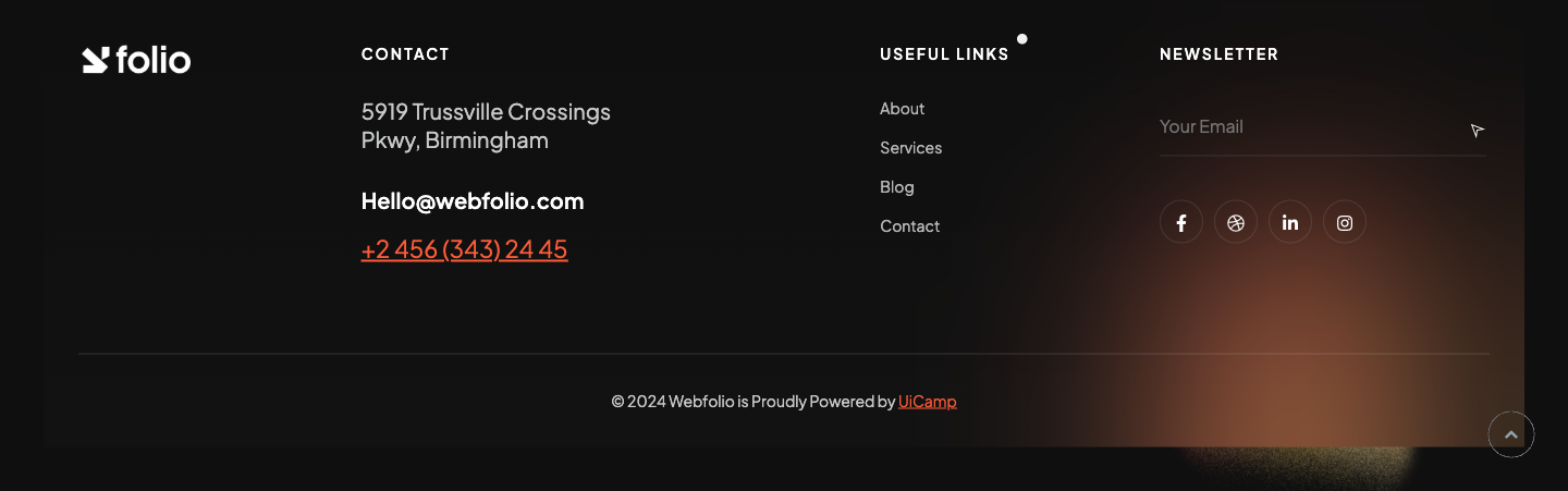
Four-column footer. From left: brand logo (logo-light.png), Contact column (address + email + phone with the phone underlined in main-color), Useful Links column (4 anchors), and a Newsletter column with a single inline email input + send button plus a row of four magnetic-cursor social icons. Bottom row is a bord-thin-top divider with the copyright line. A faint orange .circle-blur glow sits in the corner.
HTML structure (minimal)
<footer class="clean-footer crev">
  <div class="container pb-40 pt-40 ontop">
    <div class="row justify-content-between">
      <div class="col-lg-2"><div class="logo icon-img-100"><img src="/assets/imgs/logo-light.png" alt="" /></div></div>
      <div class="col-lg-4">
        <div class="column">
          <h6 class="sub-title mb-30">Contact</h6>
          <h6 class="p-color fw-400">5919 Trussville Crossings <br /> Pkwy, Birmingham</h6>
          <h6 class="mt-30 mb-15"><a href="#0">Hello@webfolio.com</a></h6>
          <a href="#0" class="underline"><span class="fz-22 main-color">+2 456 (343) 24 45</span></a>
        </div>
      </div>
      <div class="col-lg-2">
        <div class="column">
          <h6 class="sub-title mb-30">Useful Links</h6>
          <ul class="rest fz-14 opacity-7">
            <li class="mb-15"><a href="/page-about">About</a></li>
            <li class="mb-15"><a href="/page-services">Services</a></li>
            <li class="mb-15"><a href="/blog-grid-sidebar">Blog</a></li>
            <li><a href="/page-contact">Contact</a></li>
          </ul>
        </div>
      </div>
      <div class="col-lg-3">
        <div class="column subscribe-minimal">
          <h6 class="sub-title mb-30">Newsletter</h6>
          <div class="form-group mb-40">
            <input type="text" name="subscrib" placeholder="Your Email" />
            <button><span class="ti-location-arrow"></span></button>
          </div>
          <ul class="rest social-icon d-flex align-items-center">
            <li class="hover-this cursor-pointer"><a href="#0" class="hover-anim"><i class="fab fa-facebook-f"></i></a></li>
            <li class="hover-this cursor-pointer ml-10"><a href="#0" class="hover-anim"><i class="fab fa-dribbble"></i></a></li>
            <li class="hover-this cursor-pointer ml-10"><a href="#0" class="hover-anim"><i class="fab fa-linkedin-in"></i></a></li>
            <li class="hover-this cursor-pointer ml-10"><a href="#0" class="hover-anim"><i class="fab fa-instagram"></i></a></li>
          </ul>
        </div>
      </div>
    </div>
    <div class="pt-30 pb-30 mt-80 bord-thin-top">
      <div class="text-center">
        <p class="fz-14">© 2024 Webfolio is Proudly Powered by <span class="underline main-color"><a href="https://themeforest.net/user/UiCamp" target="_blank">UiCamp</a></span></p>
      </div>
    </div>
  </div>
  <div class="circle-blur"><img src="/assets/imgs/patterns/blur1.png" alt="" /></div>
</footer>
Key SCSS tokens
.clean-footer {
  position: relative;
  background: $main_bg;
  .subscribe-minimal .form-group {
    position: relative;
    border-bottom: 1px solid rgba(255, 255, 255, .15);
    padding-bottom: 12px;
    input {
      width: 100%;
      background: transparent;
      border: 0;
      color: #fff;
      padding-right: 40px;
    }
    button {
      position: absolute;
      right: 0; top: 50%;
      transform: translateY(-50%);
      background: transparent;
      border: 0;
      color: $main_color;
      font-size: 20px;
    }
  }
  .social-icon a {
    width: 42px; height: 42px;
    line-height: 42px;
    text-align: center;
    border: 1px solid rgba(255, 255, 255, .1);
    border-radius: 50%;
  }
}
Notable details
- Email input is borderless with only a bottom rule — paired with an arrow button gives the "newsletter signup" the same visual weight as a paragraph, not a form.
- Social icons are wrapped in
.hover-thisso they pick up the magnetic-cursor effect for free;.hover-animis the inner<a>. - Phone number is the only fz-22 main-color element — small details like this are how the footer earns the "clean" descriptor.
Use when
- Footers that need a primary contact column and a low-friction newsletter signup without a full form.
- Sites already using the magnetic-cursor pattern.
Caveats
- Newsletter form has no submit handler — it's a UI shell. Wire to your provider (Mailchimp / Buttondown / etc.) before launch.
- Phone link target is
href="#0"placeholder — replace withtel:URL for click-to-call.