feature-cards-overlap
Файли-джерела
- index.html
main > div.section.overflow-visible[style*="-17rem"]
Бібліотеки
bootstrap
Summary
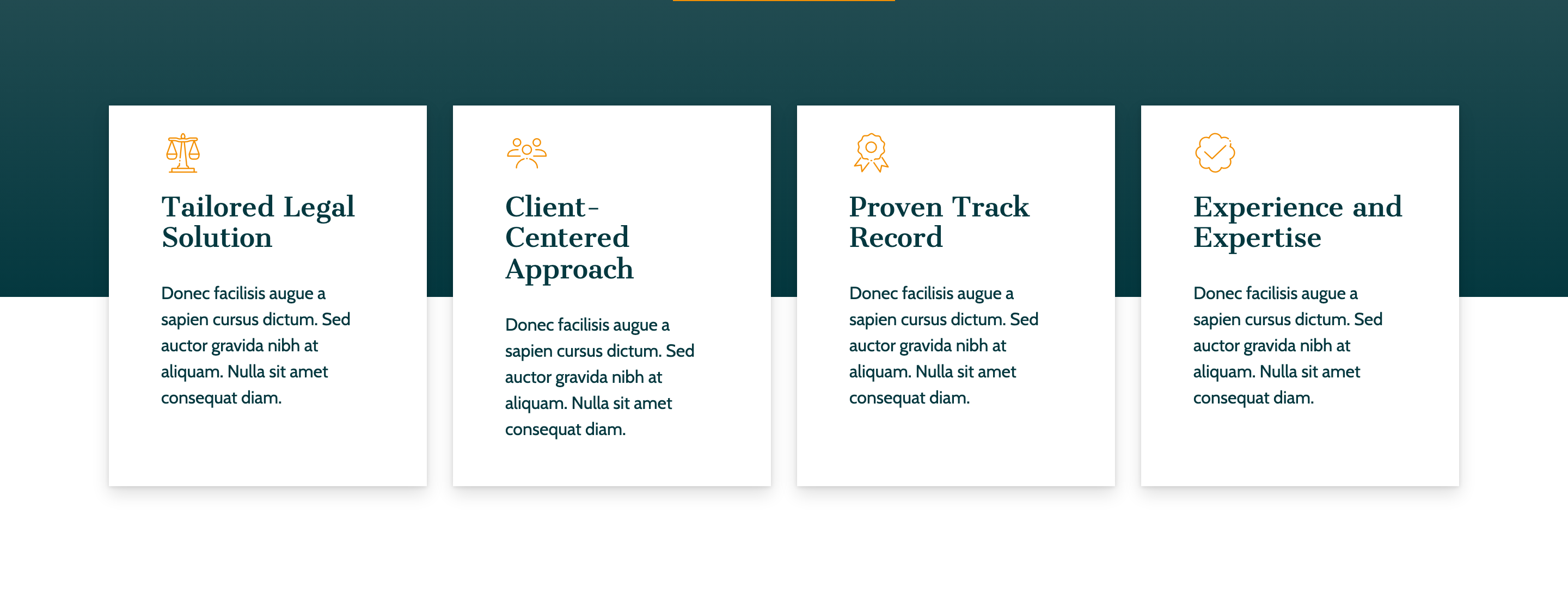
Four equal-width white cards (icon + title + paragraph) that overlap the bottom of the hero by margin-top: -17rem on the section. Each card is card-outline-hover: a soft drop-shadow at rest, a teal solid background and white text on hover.
HTML structure (minimal)
<div class="section overflow-visible" style="margin-top: -17rem;">
  <div class="r-container">
    <div class="row row-cols-xl-4 row-cols-1">
      <div class="col mb-3">
        <div class="card card-outline-hover rounded-0 h-100">
          <div class="d-flex flex-column gap-3 py-4 px-5">
            <i class="rtmicon rtmicon-balance accent-color-2 fs-1"></i>
            <h4>Tailored Legal Solution</h4>
            <p>Donec facilisis augue a sapien cursus dictum…</p>
          </div>
        </div>
      </div>
      <!-- 3 more cards: rtmicon-user-group, rtmicon-awards, rtmicon-cloud-check-145 -->
    </div>
  </div>
</div>
Key SCSS tokens
.card.card-outline-hover {
  box-shadow: 0 7px 15px rgba(0,0,0,.13), 0 1px 4px rgba(0,0,0,.11);
  color: var(--accent-color);
  transition: all .5s;
}
.card.card-outline-hover:hover {
  box-shadow: 0 0 0 2px var(--accent-color);
  background: var(--accent-color);
  color: var(--primary);
}
.card:hover { transform: translateY(-5px); }
Notable details
- The overlap trick is just
padding-bottom: 17remon the hero plusmargin-top: -17remhere, withoverflow-visibleon the wrapper. No absolute positioning, no JS — it survives any column-count change cleanly. - Icons come from a custom
rtmiconsicon font shipped with the template (font/rtmicon/), not FontAwesome — so the same<i>syntax works but the glyphs are unique to the pack. rounded-0overrides Bootstrap's default.cardradius — Pillar consistently uses sharp corners for a more legalistic feel.
Use when
- Any "core values" / "why us" row that should sit atop a photographic hero.
- Service introductions where each card has one icon, one short heading, and one paragraph.
Caveats
- The 17rem overlap is set in inline styles in two places — change one without the other and the cards either swallow the hero or float into empty space.
rtmiconsis a locally-bundled icon font; if you copy this component without the font directory the icons will render as boxes.