case-studies-list
Файли-джерела
- index.html
main div.section.pb-0:nth-child(7)
Бібліотеки
bootstrap
Summary
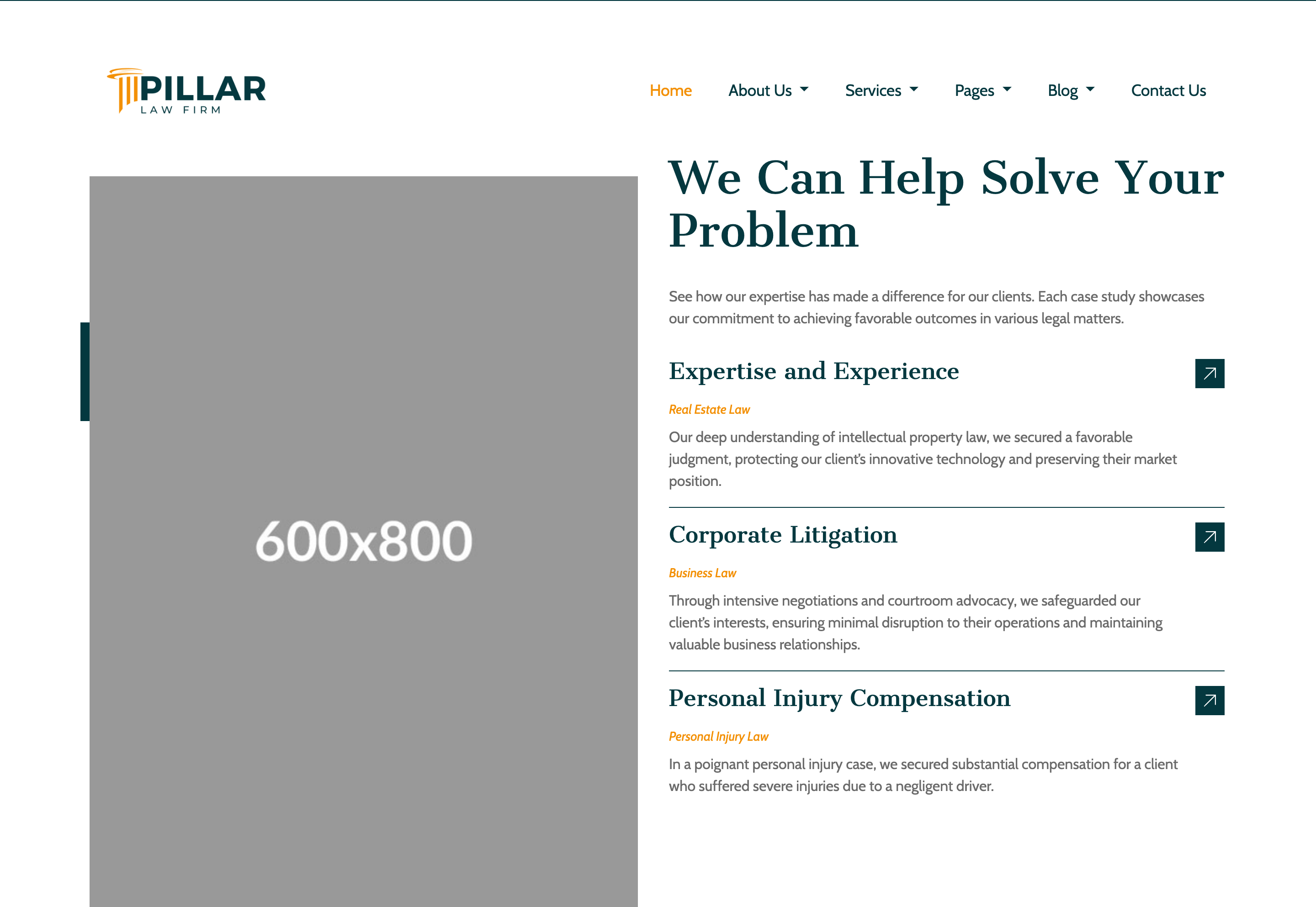
Two-column section. Left: a portrait image with a floating amber-bordered "Contact Us" phone tile (floating-top). Right: kicker + headline + intro, then three stacked case rows (title, italic practice-area tag, paragraph) separated by amber bottom borders, each with a small teal arrow-button on the right.
HTML structure (minimal)
<div class="section pb-0">
  <div class="r-container">
    <div class="row row-cols-xl-2 row-cols-1">
      <div class="col position-relative ps-0">
        <div class="position-relative" style="margin-top: 6rem; z-index: 2;">
          <img src="image/portrait.jpg" class="img-fluid">
        </div>
        <div class="floating-top bg-accent-color text-xl-start text-center p-4 start-0 text-white">
          <div class="d-flex gap-3 align-items-center justify-content-center">
            <i class="fa-solid fa-phone fs-2 accent-color-2"></i>
            <div class="d-flex flex-column">
              <h4>Contact Us</h4>
              <span class="font-2">0761-8523-398</span>
            </div>
          </div>
        </div>
      </div>
      <div class="col">
        <div class="d-flex flex-column gap-4 my-3" style="max-width: 700px;">
          <h6 class="font-2 accent-color-2">Case Studies</h6>
          <h3 class="accent-color">We Can Help Solve Your Problem</h3>
          <p>See how our expertise has made a difference for our clients…</p>
        </div>
        <div class="d-flex flex-column gap-3">
          <div class="d-flex gap-3 pb-3 border-bottom border-accent-color">
            <div class="d-flex flex-column gap-2">
              <h4 class="accent-color">Expertise and Experience</h4>
              <span class="font-2 fst-italic accent-color-2" style="font-size:14px;">Real Estate Law</span>
              <span class="font-2">Our deep understanding of intellectual property law…</span>
            </div>
            <a href="case_detail.html" class="icon-box bg-accent-color align-items-center">
              <i class="rtmicon rtmicon-arrow-up-right text-white fw-semibold"></i>
            </a>
          </div>
          <!-- 2 more rows -->
        </div>
      </div>
    </div>
  </div>
</div>
Key SCSS tokens
.floating-top {
  margin-top: 16rem;
  top: 0;
  width: 15rem;
  position: absolute;
}

.icon-box {
  display: flex; justify-content: center; align-items: center;
  aspect-ratio: 1/1;
  height: 2rem;
  transition: all .5s;
}

.border-accent-color { border-color: var(--accent-color) !important; }
Notable details
- The "Contact Us" phone tile uses
position: absolutewith a deliberate 16rem top margin so it sits halfway down the photo's edge — a low-effort sticker that breaks up an otherwise plain portrait. - Each case row uses
border-bottom border-accent-color(note: amber, despite the class name) — a colored hairline divider that's stronger than the usual#eeeline and ties the rows to the brand palette. - Italic practice-area tags (
fst-italic) in amber make the meta-info readable without a pill or chip component.
Use when
- Showcasing 3–5 case studies / project highlights where each entry has a name, a category, a teaser and a link.
- Any "results" section that should feel like a court docket more than a portfolio grid.
Caveats
- The phone tile's
width: 15remand 16rem top margin are tightly tuned for the demo's 600×800 portrait — swap aspect ratios and you'll need to retune. - Italic at 14px on body text is on the edge of legibility; bump weight to 500 if your translations get verbose.