cta-banner
Файли-джерела
- index.html
section.cta_wrapper.cta-1
Бібліотеки
bootstrapjquery
Summary
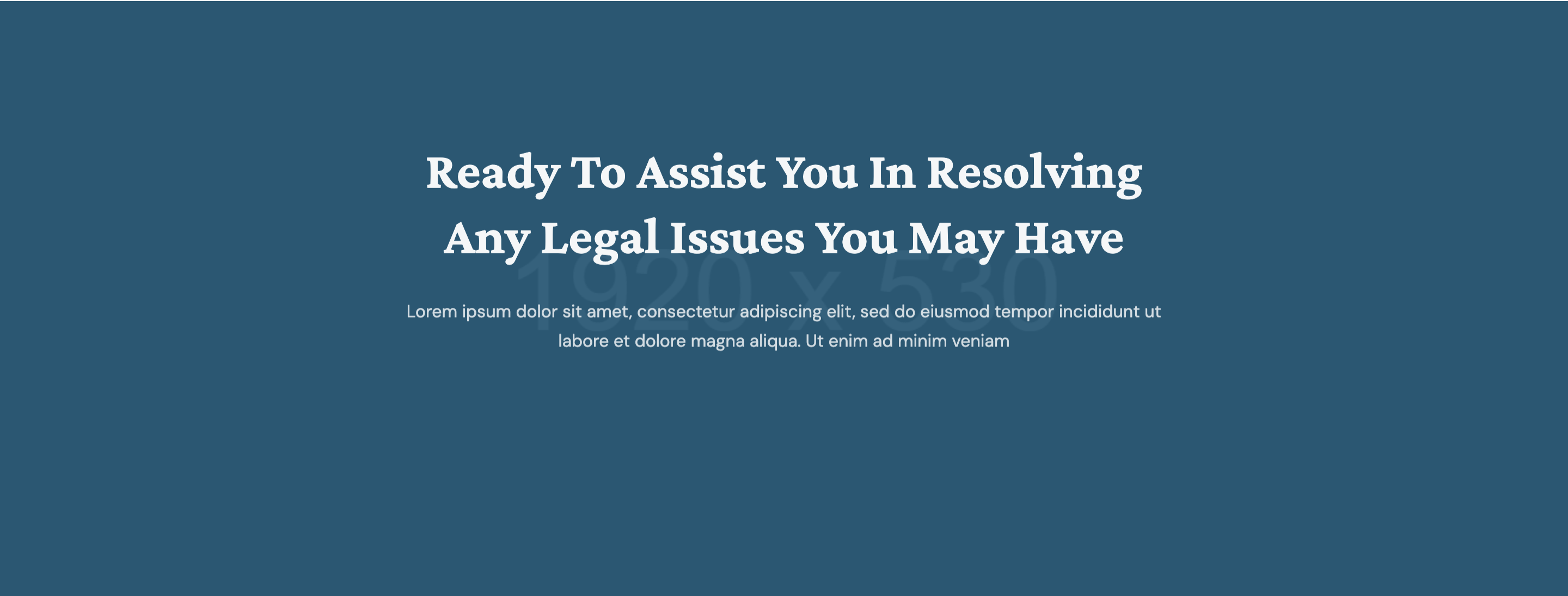
Centered call-to-action band on a wide photographic banner with a crimson tonal overlay, holding a single white-on-photo headline, paragraph, and "Make an Appointment" theme button.
HTML structure (minimal)
<section class="cta_wrapper cta-1 section-padding bg-cover bg-center overflow-hidden" style="background-image: url(banner_1920x530.jpg)">
  <div class="row">
    <div class="col-12 col-md-8 offset-md-2 col-lg-6 offset-lg-3 text-center">
      <h2 class="text-white wow fadeInUp" data-wow-duration="1s">
        Ready to assist you in resolving any legal issues you may have
      </h2>
      <p class="text-white wow fadeInUp" data-wow-duration="1.5s">Lorem ipsum…</p>
      <a href="#" class="theme-btn border-0 wow fadeInLeft" data-wow-duration="1s" data-wow-delay="0.8s">
        Make an Appointment <i class="far fa-long-arrow-alt-right"></i>
      </a>
    </div>
  </div>
</section>
Key SCSS tokens
.cta_wrapper.cta-1 {
  position: relative;
  &::before {
    content: ''; position: absolute; inset: 0;
    background: rgba(200,36,47,0.78);
    z-index: 0;
  }
  > .row { position: relative; z-index: 1; }
  h2 { font-family: 'Crimson Pro', serif; font-size: 40px; line-height: 1.25; color: #fff; }
  p  { color: rgba(255,255,255,0.85); margin-top: 14px; }
  .theme-btn {
    margin-top: 28px;
    background: #fff;
    color: #c8242f;
    padding: 14px 26px;
    &:hover { background: #222127; color: #fff; }
  }
}
Animation logic
new WOW().init(); // fadeInUp on h2 (1s), p (1.5s); fadeInLeft on button (1s + 0.8s delay)
Notable details
- Crimson overlay locks the banner to the brand colour even when the underlying photo changes — a swap-in/swap-out pattern that keeps multi-page CTAs consistent.
- Single button instead of dual CTA — the section is intentionally one decision.
- WOW stagger between headline, paragraph, and button gives the band a small "rise" rhythm even though it's a single content block.
Use when
- End-of-section conversion strip between blog/team and footer.
- Brand needs a punchy crimson break against neutral neighbouring sections.
- Designs that want one big choice rather than primary + secondary CTA.
Caveats
- Inline
style="background-image:url(./assets/img/banner_1920x530.jpg););"has a stray);in the source — cosmetic, harmless, but you should clean it on integration. - Without the crimson overlay the white text loses contrast on lighter photos.