services-carousel
Картка послуги·Шаблон: AIFusionX (WP theme — analyzed via live demo)·Складність анімації: subtle·Адаптивний: Так
Файли-джерела
- https://aifusionx.vamtam.com/
[data-id="3f61570"]
Бібліотеки
swiper
Summary
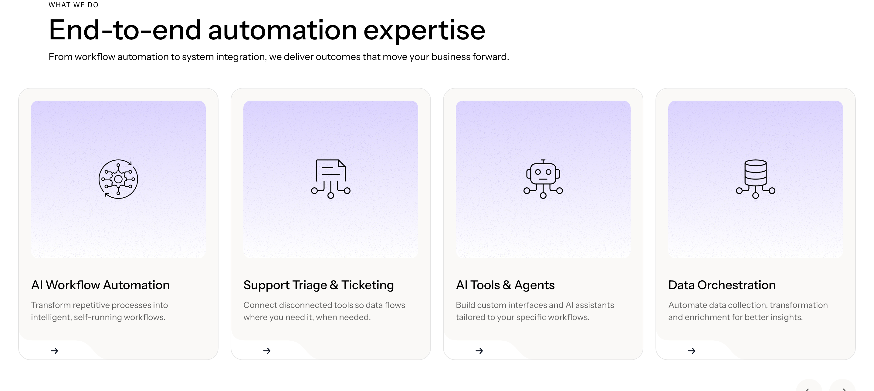
"What we do" — an Elementor nested-carousel of services. Each slide is a vertical card with a small line icon, an H3 service name, a 2–3 line paragraph, and a tiny arrow link. Three cards visible at once on desktop; swipe / drag to cycle. Dot pagination underneath.
HTML structure (minimal)
<section class="services">
  <header class="services__head">
    <p class="eyebrow">What we do</p>
    <h2 class="services__title">Embed AI into the workflows that matter.</h2>
  </header>
  <div class="swiper services__swiper">
    <div class="swiper-wrapper">
      <article class="swiper-slide service">
        <i class="service__icon i-bolt"></i>
        <h3 class="service__name">Sales automation</h3>
        <p class="service__lede">Lead routing, enrichment and follow-ups that don't drop on a Friday.</p>
        <a class="service__link" href="#">Learn more →</a>
      </article>
      <!-- repeat slides -->
    </div>
    <div class="swiper-pagination"></div>
  </div>
</section>
Key SCSS tokens
.services {
  padding: 96px 32px;
  background: #ffffff;
  font-family: "Instrument Sans", system-ui, sans-serif;
}
.services__title {
  font-size: 60px;
  font-weight: 500;
  letter-spacing: -1px;
  line-height: 1.1;
  max-width: 720px;
}
.service {
  border: 0.5px solid rgba(0,0,0,0.08);
  border-radius: 24px;
  padding: 32px;
  background: #ffffff;
  display: flex;
  flex-direction: column;
  gap: 16px;
  min-height: 320px;
}
.service__icon { width: 28px; height: 28px; }
.service__name { font-size: 24px; font-weight: 500; }
.service__lede { font-size: 14px; line-height: 1.4; color: #000; }
.service__link {
  margin-top: auto;
  font-size: 14px;
  text-decoration: none;
  color: #000;
}
Animation logic
import Swiper from 'swiper';
import { Pagination } from 'swiper/modules';

new Swiper('.services__swiper', {
  modules: [Pagination],
  slidesPerView: 1.2,
  spaceBetween: 24,
  pagination: { el: '.swiper-pagination', clickable: true },
  breakpoints: {
    768:  { slidesPerView: 2 },
    1100: { slidesPerView: 3 },
  },
});
Notable details
- Cards never get filled — they live as 0.5px outlines on white. The hairline border keeps the page feeling drafted rather than designed.
- Icon + heading + body + link is the same micro-template repeated, so the "design" of each card is purely the wording.
- 24px border-radius on cards, 60px on buttons — two consistent radius tiers across the whole theme.
- Service link uses an arrow glyph, not a chevron — a tiny editorial choice that ladders up.
Use when
- You have 4 to 8 services and want a horizontal pacing rather than a 2×3 grid.
- The service copy is short and similar in length per card — length variance breaks the rhythm.
- You want swipe affordance on mobile without coding a custom slider.
Caveats
- Requires Swiper 8 (already in the theme); if you're outside Elementor you wire it up yourself.
- Nested-carousel inside Elementor has its own breakpoint quirks — the desktop "3 visible" easily becomes "2.1" at narrow desktops without explicit breakpoint config.
- Card min-height is required to keep the row level when copy varies; otherwise the carousel ends up jagged.