services-swiper-carousel
Картка послуги·Шаблон: Webfolio - Creative Agency & Portfolio Next.js Template·Складність анімації: subtle·Адаптивний: Так
Файли-джерела
- out/home-main/index.html
section.services
Бібліотеки
swiper
Summary
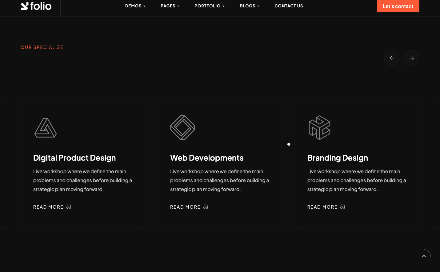
Three-up Swiper carousel of service cards. Each slide stacks a 60px service icon (50% opacity), an h5 title, a short paragraph and a "Read More" arrow link. Custom .swiper-button-prev / .swiper-button-next icons sit to the right of the section header instead of overlaying the slides.
HTML structure (minimal)
<section class="services section-padding">
  <div class="container">
    <div class="sec-head mb-80">
      <div class="d-flex align-items-center">
        <div>
          <span class="sub-title main-color mb-5">Our Specialize</span>
          <h3 class="fw-600 fz-50 text-u d-rotate wow">
            <span class="rotate-text">Featured <span class="fw-200">Services.</span></span>
          </h3>
        </div>
        <div class="ml-auto">
          <div class="swiper-arrow-control">
            <div class="swiper-button-prev"><span class="ti-arrow-left"></span></div>
            <div class="swiper-button-next"><span class="ti-arrow-right"></span></div>
          </div>
        </div>
      </div>
    </div>
    <div class="serv-swiper">
      <Swiper className="swiper-container">
        <SwiperSlide>
          <div class="item-box">
            <div class="icon mb-40 opacity-5"><img src="/assets/imgs/serv-icon/1.png" alt="" /></div>
            <h5 class="mb-15">Brand Identity</h5>
            <p>Driven professional dedicated to making a lasting impact…</p>
            <a href="/page-services-details" class="rmore mt-30">
              <span class="sub-title">Read More</span>
              <img src="/assets/imgs/arrow-right.png" alt="" class="icon-img-20 ml-5" />
            </a>
          </div>
        </SwiperSlide>
      </Swiper>
    </div>
  </div>
</section>
Key SCSS tokens
.services {
  .sec-head .d-rotate { overflow: hidden; }
  .sec-head .rotate-text { display: inline-block; transform: translateY(100%); }
  .item-box {
    padding: 40px 30px;
    border: 1px solid rgba(255, 255, 255, .08);
    border-radius: 12px;
    background: rgba(255, 255, 255, .015);
    transition: border-color .3s, transform .3s;
  }
  .item-box:hover { border-color: rgba(253, 91, 56, .35); transform: translateY(-6px); }
  .item-box .icon img { width: 60px; }
}
.swiper-arrow-control {
  display: flex; gap: 10px;
  .swiper-button-prev, .swiper-button-next {
    width: 50px; height: 50px;
    border: 1px solid rgba(255, 255, 255, .15);
    border-radius: 50%;
    display: flex; align-items: center; justify-content: center;
  }
}
Animation logic
// components/home-main/Services.jsx
const swiperOptions = {
  modules: [Navigation],
  loop: true,
  spaceBetween: 40,
  slidesPerView: 3,
  breakpoints: {
    0:    { slidesPerView: 1 },
    768:  { slidesPerView: 2 },
    1024: { slidesPerView: 3 },
  },
  navigation: {
    nextEl: '.services .swiper-button-next',
    prevEl: '.services .swiper-button-prev',
  },
};
Notable details
data-rotate/rotate-textpattern for the section title is a "split-line" flourish driven by awowclass entrance — the line slides up from 100% translateY when it scrolls into view.- Custom navigation buttons are out of the slider container, scoped via
.services .swiper-button-prev. Lets you keep the slides edge-to-edge without overlay arrows. slidesPerView: 3 → 2 → 1breakpoints make this a clean drop-in for any service section without media queries.
Use when
- Agency sites that need 4+ services and don't want a static grid.
- When you've already loaded Swiper for the portfolio carousel and want to reuse it.
Caveats
- Swiper 8 is shipped (peerDeps drop in Swiper 9+) — bumping Swiper requires module-name changes (
Navigation, Pagination→ import fromswiper/modules). loop: truewithslidesPerView: 3on small datasets duplicates slides; needs at least 6 entries for a clean loop.