contact-info-strip
Можливості·Шаблон: Medcity - Medical Healthcare HTML5 Template·Складність анімації: none·Адаптивний: Так
Файли-джерела
- index.html
section.contact-info .boxes-wrapper
Бібліотеки
bootstrap
Summary
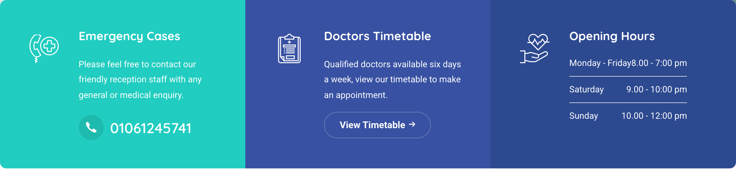
Three-column contact panel directly under the hero: emergency cases card with phone CTA, doctors-timetable card with outlined button, and an opening-hours table. Each card sits in a coloured tile, rendered as a single edge-to-edge band.
HTML structure (minimal)
<section class="contact-info py-0">
  <div class="container">
    <div class="row row-no-gutter boxes-wrapper">
      <div class="col-md-4">
        <div class="contact-box d-flex">
          <div class="contact__icon"><i class="icon-call3"></i></div>
          <div class="contact__content">
            <h2 class="contact__title">Emergency Cases</h2>
            <p class="contact__desc">Please feel free to contact our friendly reception staff…</p>
            <a href="tel:+201061245741" class="phone__number">
              <i class="icon-phone"></i><span>01061245741</span>
            </a>
          </div>
        </div>
      </div>
      <div class="col-md-4">
        <div class="contact-box d-flex">
          <div class="contact__icon"><i class="icon-health-report"></i></div>
          <div class="contact__content">
            <h2 class="contact__title">Doctors Timetable</h2>
            <p class="contact__desc">Qualified doctors available six days a week…</p>
            <a href="doctors-timetable.html" class="btn btn__white btn__outlined btn__rounded">
              <span>View Timetable</span><i class="icon-arrow-right"></i>
            </a>
          </div>
        </div>
      </div>
      <div class="col-md-4">
        <div class="contact-box d-flex">
          <div class="contact__icon"><i class="icon-heart2"></i></div>
          <div class="contact__content">
            <h2 class="contact__title">Opening Hours</h2>
            <ul class="time__list list-unstyled">
              <li><span>Monday - Friday</span><span>8.00 - 7:00 pm</span></li>
              <li><span>Saturday</span><span>9.00 - 10:00 pm</span></li>
              <li><span>Sunday</span><span>10.00 - 12:00 pm</span></li>
            </ul>
          </div>
        </div>
      </div>
    </div>
  </div>
</section>
Key SCSS tokens
.contact-info {
  .contact-box {
    padding: 40px;
    background-color: $color-primary; // teal accent on first card
    color: $color-white;
    .contact__icon { font-size: 60px; margin-right: 20px; }
    .contact__title { font-size: 22px; font-weight: 700; margin-bottom: 12px; }
  }
  .col-md-4:nth-child(2) .contact-box { background-color: $color-secondary; } // navy
  .col-md-4:nth-child(3) .contact-box { background-color: $color-heading; }   // ink-blue
  .time__list li { display: flex; justify-content: space-between; padding: 6px 0; }
}
Notable details
row-no-gutteris the trick that lets the three coloured tiles butt up edge-to-edge with no white seams between them.- Each tile gets a different palette role (teal / deep navy / ink blue) so the band reads as a single tri-coloured ribbon — handy on healthcare brands that want to lean on accent layering rather than dividers.
- The third tile swaps copy + CTA for a small definition-style hours list, demonstrating the same shell can carry different content.
Use when
- Beneath any hero where a clinic, dealership, or local services site needs to surface emergency contact, hours, and a primary CTA at once.
- When you want the visual weight of a "footer band" but at the top of the page.
Caveats
- Hard-coded three columns; on tablets the third tile (hours) wraps under the others and looks lonely if you don't restyle.