features-grid-overlay
Можливості·Шаблон: Medcity - Medical Healthcare HTML5 Template·Складність анімації: subtle·Адаптивний: Так
Файли-джерела
- index.html
section.features-layout2
Бібліотеки
bootstrap
Summary
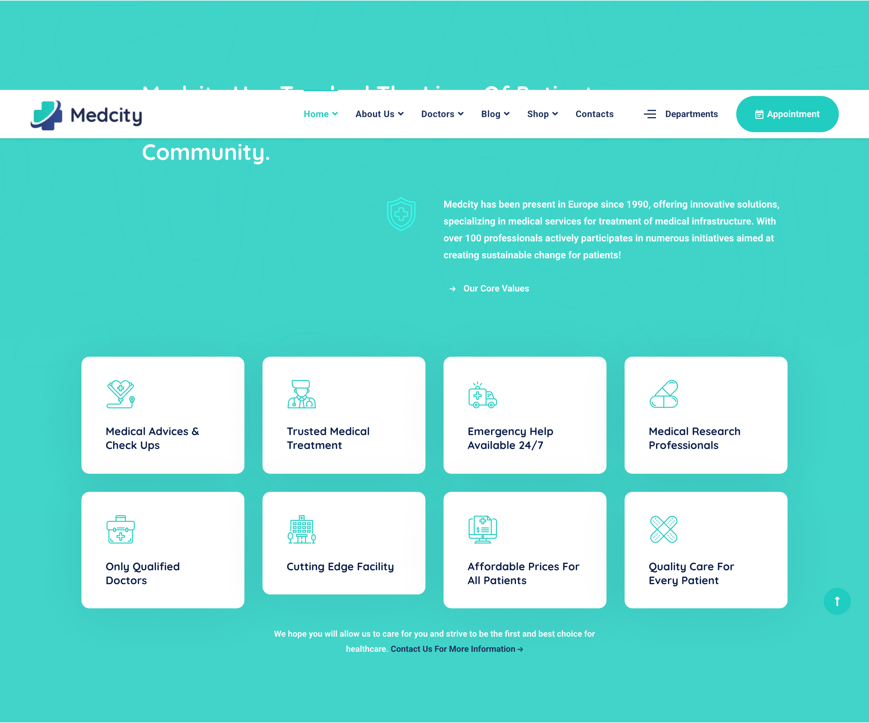
Eight-tile feature grid sitting on a teal-overlaid photo background. Each tile combines a small thumbnail, an icon glyph, a title and an outlined arrow-link affordance. A heading row with a primary-icon column and lead paragraph anchors the section above the grid.
HTML structure (minimal)
<section class="features-layout2 pt-130 bg-overlay bg-overlay-primary">
<div class="bg-img"><img src="assets/images/backgrounds/2.jpg" alt="background"></div>
<div class="container">
<div class="row">
<div class="col-lg-8 offset-lg-1">
<div class="heading__layout2 mb-50">
<h3 class="heading__title color-white">Medcity Has Touched The Lives Of Patients & Providing Care…</h3>
</div>
</div>
</div>
<div class="row mb-100">
<div class="col-lg-1 offset-lg-5">
<div class="heading__icon"><i class="icon-insurance"></i></div>
</div>
<div class="col-lg-6">
<p class="heading__desc font-weight-bold color-white mb-30">Medcity has been present in Europe since 1990…</p>
<a href="#" class="btn btn__white btn__link">
<i class="icon-arrow-right icon-filled"></i><span>Our Core Values</span>
</a>
</div>
</div>
<div class="row">
<div class="col-md-6 col-lg-3">
<div class="feature-item">
<div class="feature__img"><img src="assets/images/services/1.jpg" alt="service" loading="lazy"></div>
<div class="feature__content">
<div class="feature__icon"><i class="icon-heart"></i></div>
<h4 class="feature__title">Medical Advices & Check Ups</h4>
</div>
<a href="#" class="btn__link"><i class="icon-arrow-right icon-outlined"></i></a>
</div>
</div>
<!-- 7 more feature-items -->
</div>
<div class="row">
<div class="col-md-12 col-lg-6 offset-lg-3 text-center">
<p class="font-weight-bold color-gray mb-0">We hope you will allow us to care for you…
<a href="#" class="color-secondary"><span>Contact Us For More Information</span><i class="icon-arrow-right"></i></a>
</p>
</div>
</div>
</div>
</section>
Key SCSS tokens
.bg-overlay-primary::before { background: rgba($color-primary, .9); }
.features-layout2 .feature-item {
  position: relative; padding: 30px; background: $color-white; border-radius: 6px;
  margin-bottom: 30px;
  .feature__img { border-radius: 4px; overflow: hidden; margin-bottom: 20px; }
  .feature__icon { color: $color-primary; font-size: 36px; margin-bottom: 12px; }
  .feature__title { font-size: 18px; font-weight: 700; color: $color-heading; }
  .btn__link { position: absolute; right: 20px; bottom: 20px; }
}
Notable details
- The whole section uses a teal-tinted overlay over a photographic background, so each white card pops as a punched-out element — gives the grid a "stickers on a billboard" feel that hides photo blandness.
- Eight tiles in a 4×2 layout create a wall of micro-features without the typical "three icon columns" cliche; works because each tile carries a real photo rather than just a glyph.
- The arrow-link affordance is a separate absolutely-positioned outlined circle in the bottom-right — turns each card into a clickable affordance without an explicit "Learn more" label.
Use when
- Healthcare / corporate / education sections that need a dense capability wall (8+ items) with photo support.
- Layouts where you want a strong color overlay on a photo background to unify a busy grid.
Caveats
- 4×2 grid only shines from
lgbreakpoint up; on tablets it collapses to a 2-column grid that loses the wall effect. - Bottom arrow link uses absolute positioning — if you change the card padding you must re-tune the offsets.