recent-blog-pair
Картка блогу·Шаблон: Addina - Multipurpose eCommerce HTML Template·Складність анімації: none·Адаптивний: Так
Файли-джерела
- index.html
section.blog-area
Бібліотеки
bootstrap
Summary
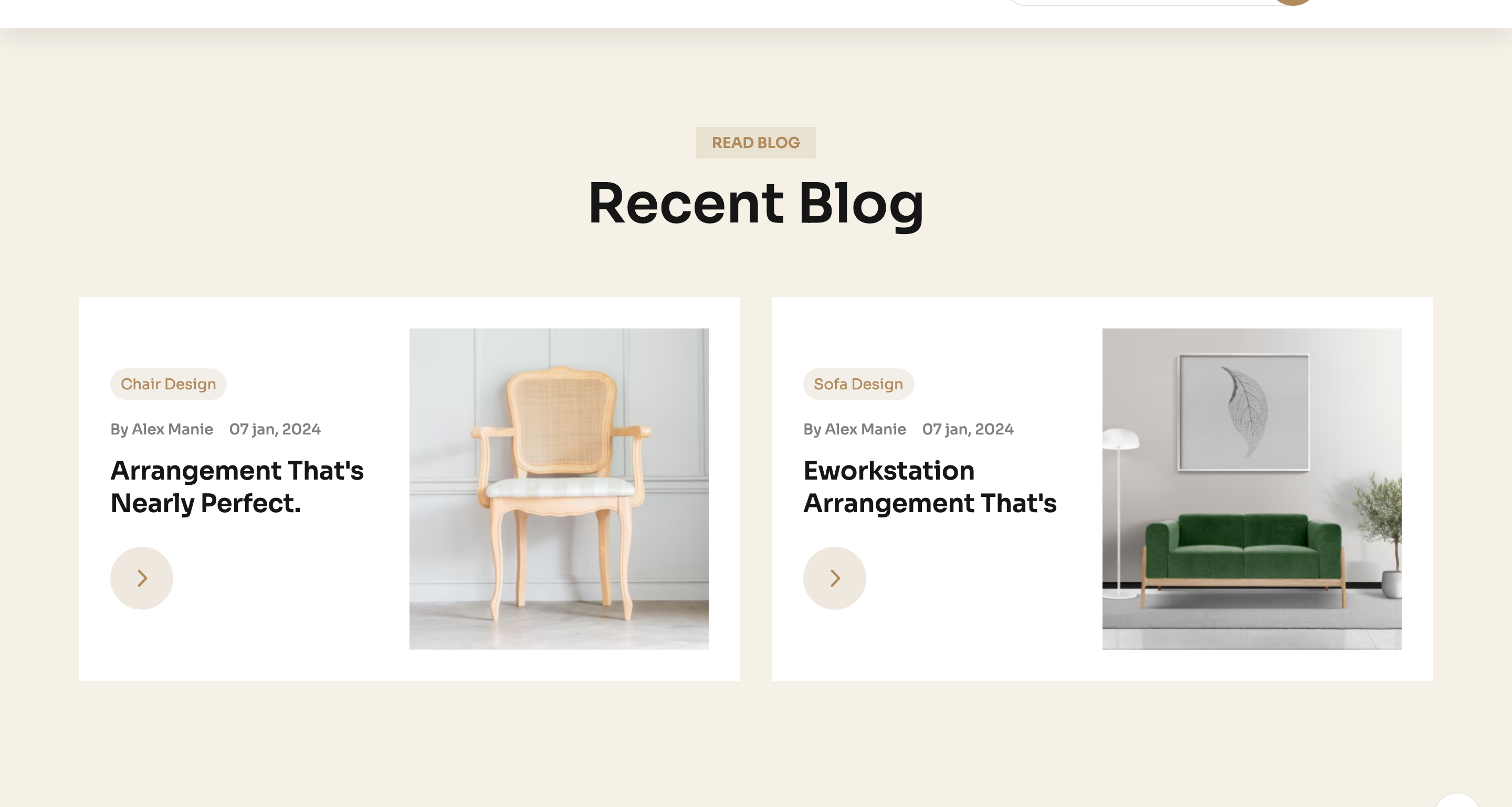
Two oversized blog cards on a cream slab. Each card reserves the left half for tagged copy (category chip, byline, date, headline, arrow link) and the right half for a wide photograph with a hover lift.
HTML structure (minimal)
<section class="blog-area theme-bg-2 section-space">
  <div class="container">
    <div class="row justify-content-center">
      <div class="col-xxl-4 col-xl-4 col-lg-4">
        <div class="section-title-wrapper-4 text-center section-title-space">
          <span class="section-subtitle-4 mb-10">Read blog</span>
          <h2 class="section-title-4">Recent Blog</h2>
        </div>
      </div>
    </div>
    <div class="row gy-5">
      <div class="col-xxl-6 col-xl-6 col-lg-6">
        <div class="blog-item-4 furniture__blog-item">
          <div class="blog-content-4">
            <div class="blog-tag-wrapper mb-15">
              <a class="blog-tag" href="#">Chair Design</a>
            </div>
            <div class="postbox__meta mb-15">
              <span><a href="#">By Alex Manie</a></span>
              <span>07 jan, 2024</span>
            </div>
            <h4 class="blog-title">
              <a href="#" class="text-capitalize">arrangement that's nearly perfect.</a>
            </h4>
            <a class="round-link" href="#"><i class="fa-regular fa-angle-right"></i></a>
          </div>
          <div class="blog-item-thumb w-img">
            <a href="#"><img src="blog-image1.jpg" alt=""></a>
          </div>
        </div>
      </div>
      <!-- second card -->
    </div>
  </div>
</section>
Key SCSS tokens
.theme-bg-2 {
  background-color: var(--clr-bg-1);
}
.furniture__blog-item {
  display: flex;
  align-items: center;
  gap: 30px;
  background: #fff;
  border-radius: 12px;
  overflow: hidden;
  .blog-content-4 {
    flex: 1;
    padding: 32px;
  }
  .blog-tag {
    background: var(--clr-theme-primary);
    color: #fff;
    padding: 4px 14px;
    border-radius: 20px;
    font-size: 13px;
    text-transform: uppercase;
  }
  .blog-title a:hover { color: var(--clr-theme-primary); }
  .round-link {
    width: 48px; height: 48px;
    display: inline-grid; place-items: center;
    border: 1px solid var(--clr-border-2);
    border-radius: 50%;
    transition: all .3s ease;
    &:hover { background: var(--clr-theme-primary); color: #fff; border-color: var(--clr-theme-primary); }
  }
}
Notable details
- The card itself is the full column — there's no inner sub-card. This makes the section feel "magazine spread" rather than "blog list".
- The arrow link is a circular icon button that mirrors the back-to-top widget — the same shape recurs across the template as a secondary CTA pattern.
- The category chip's bronze fill is the only colour pop on an otherwise tonal cream/grey card.
Use when
- Blog summary modules on home pages where you want only two highlighted posts.
- Product-storytelling sections that pair a long headline with a wide hero photo.
- Editorial newsletters or campaign pages that need a 50/50 image-text split.
Caveats
- The 50/50 split needs roughly 16:9 imagery to look balanced — portrait photos cause awkward whitespace on the right.
- No animation on hover beyond colour swaps; if you want a tilt or reveal, add
transformrules tofurniture__blog-item:hover.