portfolio-carousel
Картка проєкту·Шаблон: Potu - Personal Portfolio HTML Template·Складність анімації: medium·Адаптивний: Так
Файли-джерела
- index.html
section.portfolio-section
Бібліотеки
jquerygsapsplittext
Summary
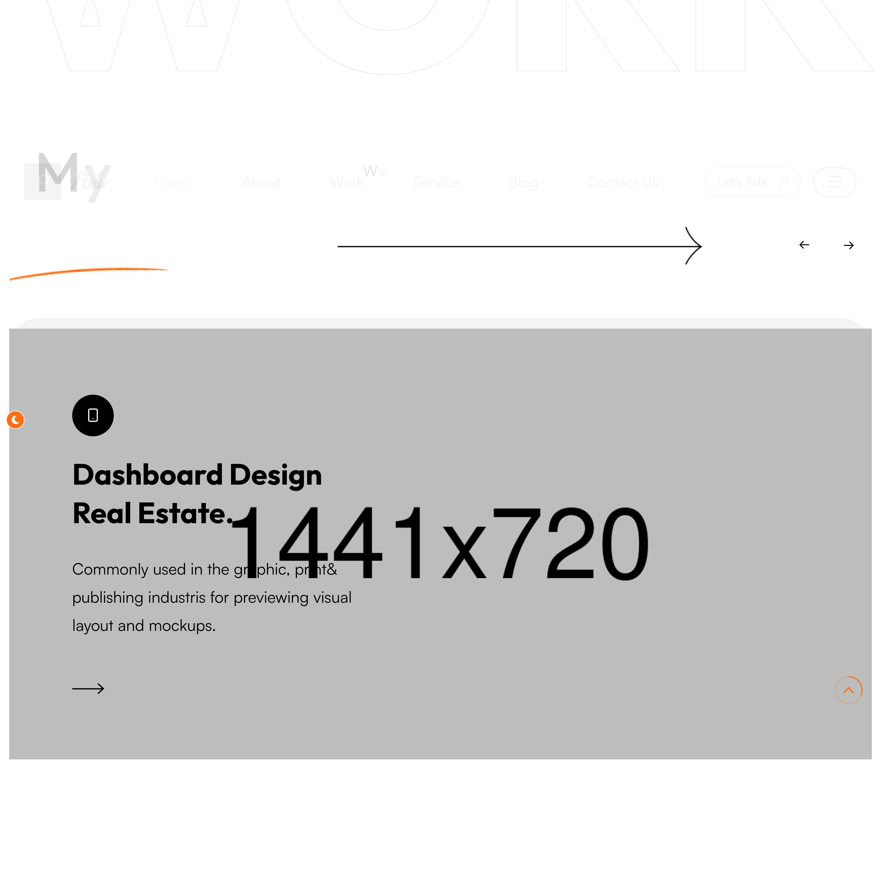
Owl-carousel of large project cards. Each card stacks an icon badge, a project title, a one-line summary and an arrow link, with two layered shape graphics floating behind. A pale "Work" watermark sits behind the rail.
HTML structure (minimal)
<section class="portfolio-section">
<span class="big-text">Work</span>
<div class="large-container">
<div class="upper-box sec-title-animation animation-style2">
<div class="sec-title"><h2 class="title-animation">My Latest <span>Work.</span></h2></div>
<p class="title-animation">We've done it carefully and simply…</p>
</div>
<div class="portfolio-carousel owl-carousel owl-theme owl-dots-none nav-style-one">
<div class="portfolio-block-one">
<div class="inner-box">
<div class="shape">
<div class="shape-1" style="background-image: url(shape-13.png);"></div>
<div class="shape-2" style="background-image: url(shape-14.png);"></div>
</div>
<div class="content-box">
<div class="icon-box"><i class="icon-9"></i></div>
<h2><a href="#">Mobile Application Design.</a></h2>
<p>Commonly used in the graphic, print & publishing industries…</p>
<div class="link"><a href="#"><i class="icon-10"></i></a></div>
</div>
<figure class="image-box"><img src="portfolio-1.png"></figure>
</div>
</div>
<!-- repeat -->
</div>
</div>
</section>
Key SCSS tokens
.portfolio-section .big-text {
  position: absolute; right: 0; top: 80px;
  font-size: 200px; opacity: 0.04; font-weight: 700;
}
.portfolio-block-one .inner-box {
  position: relative; display: flex; flex-direction: column;
  border-radius: 20px; overflow: hidden;
  background: #fff; box-shadow: 0 30px 60px rgba(0,0,0,0.06);
}
.portfolio-block-one .image-box img { width: 100%; display: block; transition: transform .6s; }
.portfolio-block-one:hover .image-box img { transform: scale(1.05); }
.portfolio-carousel .owl-nav button { width: 60px; height: 60px; border-radius: 50%; border: 1px solid; }
Animation logic
// Owl carousel init lives in plugins.js
$('.portfolio-carousel').owlCarousel({
  loop: true, margin: 30, nav: true, dots: false,
  responsive: { 0: {items:1}, 768:{items:2}, 1200:{items:3} }
});
Notable details
- Each card carries TWO shape PNGs that float behind the content box — gives depth without WebGL or CSS gradients.
nav-style-oneis the template's own variant of the Owl arrows: round buttons with the brand orange on hover.- The big-text "Work" watermark intentionally gets clipped at the section edge — leans into the editorial overflow trick.
Use when
- Portfolio shelves where you need 3+ projects but want a hero-card feel rather than a tight grid.
- Sections where keyboard-arrow navigation matters (Owl handles it).
Caveats
- Owl Carousel is jQuery-only and unmaintained — for new builds prefer Swiper or Splide.
- The shape PNGs are decorative; failure to load won't break layout but does flatten the look. Inline as SVG if performance matters.