testimonials-pair
Файли-джерела
- index.html
div.testimonials-section div.testimonials-grid
Бібліотеки
jquery
Summary
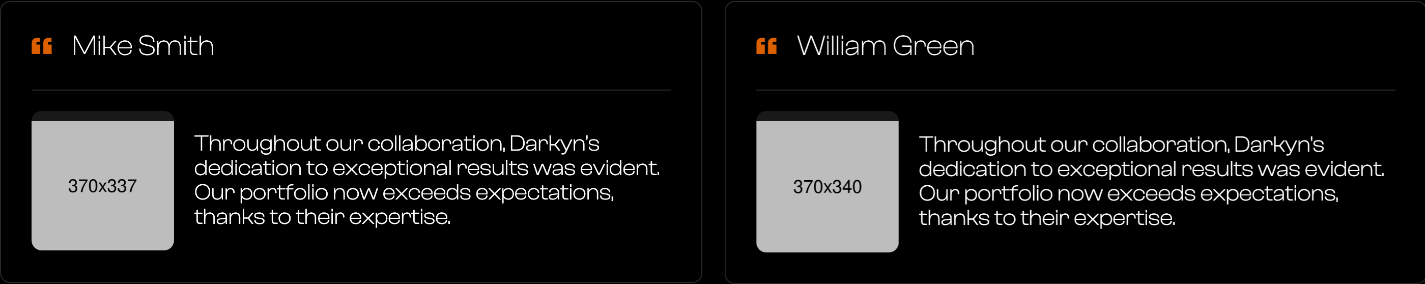
Two-up testimonial cards side by side. Each card has a top row with a quote glyph and the author's name (separated by a hairline), then a row with a circular author photo and the testimonial paragraph.
HTML structure (minimal)
<div class="testimonials-section">
  <div class="main-container">
    <h2 class="main-title">testimonials</h2>
    <div class="testimonials-grid">
      <div class="trstimonials-item">
        <div class="testimonial-item-box">
          <img src="images/quote.png" class="testimonials-quote" alt="">
          <h4 class="testimonial-heading">Mike Smith</h4>
        </div>
        <div class="testimonials-img-txt">
          <img src="images/testimonials-photo1.png" class="testimonial-img" alt="">
          <p class="testimonials-txt">Throughout our collaboration...</p>
        </div>
      </div>
      <div class="trstimonials-item">
        <div class="testimonial-item-box">
          <img src="images/quote.png" class="testimonials-quote" alt="">
          <h4 class="testimonial-heading">William Green</h4>
        </div>
        <div class="testimonials-img-txt">
          <img src="images/testimonials-photo2.png" class="testimonial-img" alt="">
          <p class="testimonials-txt">Throughout our collaboration...</p>
        </div>
      </div>
    </div>
  </div>
</div>
Key SCSS tokens
.testimonials-grid {
  display: grid;
  grid-template-columns: 1fr 1fr;
  grid-column-gap: 20px;
  grid-row-gap: 20px;
}
.trstimonials-item {
  border: 1px solid var(--border-color);
  border-radius: 10px;
  padding: 30px;
}
.testimonial-item-box {
  border-bottom: 1px solid var(--border-color);
  padding-bottom: 30px;
  margin-bottom: 20px;
  display: flex;
  align-items: center;
}
.testimonials-quote        { width: 20px; }
.testimonial-heading {
  font-size: 28px;
  font-weight: 200;
  line-height: 26px;
  margin: 0 0 0 20px;
  text-transform: capitalize;
}
.testimonials-img-txt      { display: flex; align-items: center; }
.testimonial-img {
  background-color: #191919;
  border-radius: 10px;
  width: 140px;
  padding-top: 10px;
}
.testimonials-txt          { font-size: 22px; line-height: 24px; margin-left: 20px; }
Animation logic
// IX2 entrance fades each card via data-w-id="darkyn07" / "darkyn29".
// Reproduce with IntersectionObserver + opacity/translateY transition.
Notable details
- The author's photo is intentionally chunky (140px, rounded square, dark bg) rather than a tiny circle — gives each quote a face-card feeling without resorting to a real photograph cutout.
- Splitting "name + quote-icon" from the body with a hairline is a trick to make a single 30px-padded card read like two stacked cards.
- The class is misspelled (
trstimonials-item) — keep the typo when porting or the IX2 binding by selector will break.
Use when
- Sites with 2–6 testimonials where you want each one to feel substantial rather than a slider tile.
- Layouts where you want the social proof to not shout — the muted greys keep the section calm.
Caveats
- Class name
trstimonials-itemis misspelled in the source CSS and HTML — preserve the typo or rename in both.