feature-templates-swiper
Картка проєкту·Шаблон: Davies - Personal Portfolio HTML Template·Складність анімації: medium·Адаптивний: Так
Файли-джерела
- index.html
section.section-feature
Бібліотеки
swipergsap
Summary
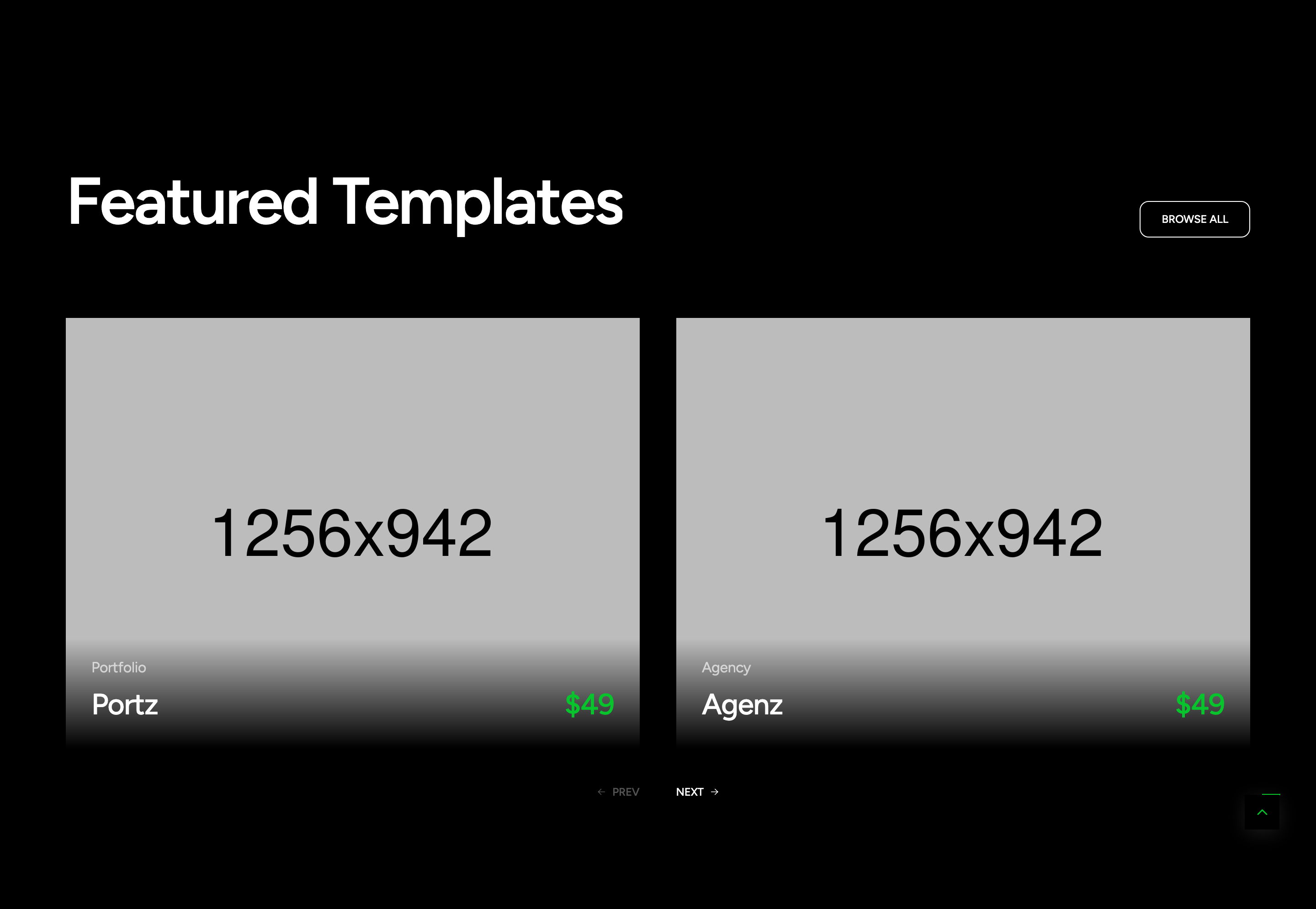
A two-up Swiper carousel of "Featured Templates" cards. Each card has a 4:3 cover image, a tag (Portfolio/Agency), a name, and a primary-coloured price. As the cursor enters a card, a .tf-mouse arrow follows it inside the card and acts as the action button.
HTML structure (minimal)
<section class="section-feature flat-spacing tf-btn-swiper-main">
  <div class="container">
    <div class="s-header">
      <h2 class="text-display-2 fw-semibold effectFade fadeUp">Featured Templates</h2>
      <a href="#" class="tf-btn">BROWSE ALL</a>
    </div>
    <div dir="ltr" class="swiper tf-swiper swiper-feature"
         data-preview="2" data-tablet="2" data-mobile-sm="1" data-mobile="1"
         data-space-lg="40" data-space-md="30" data-space="15"
         data-pagination-lg="2">
      <div class="swiper-wrapper">
        <div class="swiper-slide">
          <div class="wg-feature-v01 hover-img main-mouse-hover">
            <a href="#" class="feature-image img-style">
              <img src="assets/images/section/feature-1.jpg" alt="">
            </a>
            <div class="feature-content">
              <div class="info">
                <p class="tag text-white-64">Portfolio</p>
                <h5 class="name"><a href="#" class="link">Portz</a></h5>
              </div>
              <h5 class="price text-primary">$49</h5>
            </div>
            <div class="tf-mouse">
              <a href="#" class="action tf-btn-2"><i class="icon icon-arrow-long-right"></i></a>
            </div>
          </div>
        </div>
        <!-- two more slides -->
      </div>
      <div class="group-btn-slider">
        <div class="btn-nav-swiper nav-prev-swiper"><i class="icon icon-arrow-long-left"></i> PREV</div>
        <div class="btn-nav-swiper nav-next-swiper">NEXT <i class="icon icon-arrow-long-right"></i></div>
      </div>
    </div>
  </div>
</section>
Key SCSS tokens
.wg-feature-v01 {
  position: relative;
  overflow: hidden;

  .feature-image img {
    transition: transform 0.6s ease;
  }
  &:hover .feature-image img { transform: scale(1.04); }

  .feature-content {
    display: flex;
    justify-content: space-between;
    align-items: end;
    padding-top: 16px;
  }

  .tf-mouse {
    position: absolute;
    width: 64px; height: 64px;
    border-radius: 50%;
    background: var(--primary);
    display: flex; align-items: center; justify-content: center;
    pointer-events: none;
    opacity: 0;
    transition: opacity 0.3s;
  }
  &.main-mouse-hover:hover .tf-mouse { opacity: 1; }
}
Animation logic
// assets/js/gsapAnimation.js — mouseHover()
$('.main-mouse-hover').each(function () {
  const $container = $(this);
  const $mouseEl = $container.find('.tf-mouse');
  let currentX, currentY, targetX, targetY, animationFrame;
  $container.on('mousemove', function (e) {
    const rect = this.getBoundingClientRect();
    targetX = e.clientX - rect.left;
    targetY = e.clientY - rect.top;
    if (!animationFrame) animate();
  });
  function animate() {
    currentX += (targetX - currentX) * 0.1;
    currentY += (targetY - currentY) * 0.1;
    $mouseEl.css({ left: currentX + 'px', top: currentY + 'px' });
    if (Math.abs(targetX - currentX) > 0.5 || Math.abs(targetY - currentY) > 0.5)
      animationFrame = requestAnimationFrame(animate);
    else animationFrame = null;
  }
});
Notable details
- The
.tf-mousearrow is shared with several other components (section-service-2 .action, swiper nav arrows) — themouseHover()function delegates to anything matching.main-mouse-hover. - Swiper config is data-attribute driven (
data-preview,data-pagination-lg) — the carousel.js initialiser reads these so the markup is the API. - Card uses
letter-space--2(-0.02em) on the title to mirror display-headline density.
Use when
- Project / template grids where you want each card to behave like its own "tap target" with an animated action affordance.
- Two-column responsive carousels with consistent crop ratios.
Caveats
- The arrow lerp is gated by
.main-mouse-hover— if you forget that class, hover state and animation both die silently. - The arrow is absolutely positioned to the card; on cards smaller than 64px it would clip.