footer-multi-column
Футер·Шаблон: AIFusionX (WP theme — analyzed via live demo)·Складність анімації: none·Адаптивний: Так
Файли-джерела
- https://aifusionx.vamtam.com/
footer.main-footer
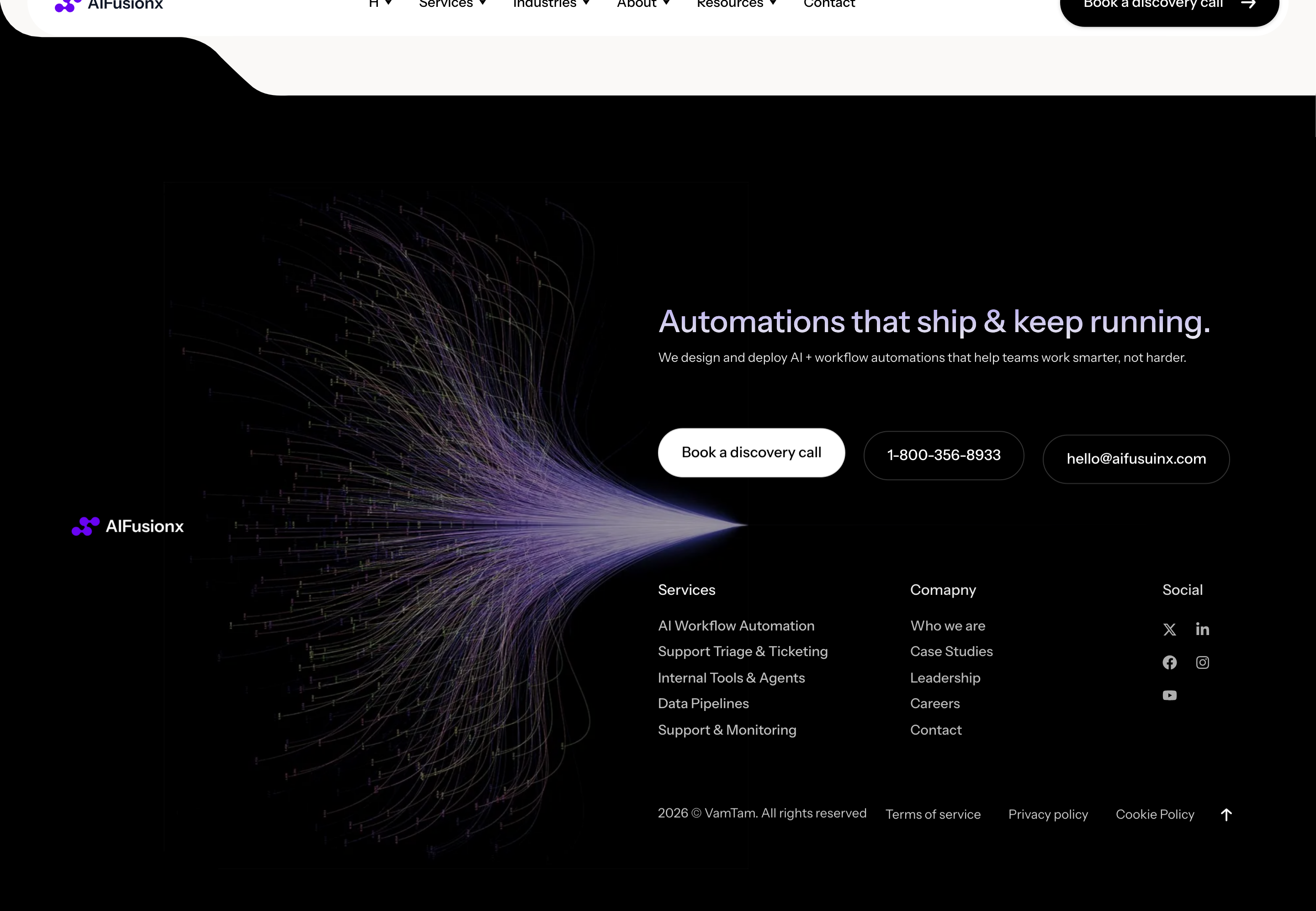
Summary
Multi-column site footer. Left column has the brand mark and a one-line tagline. Three middle columns hold nav groups (Services, Company, Resources). Right column has contact info (email, address, social links). A thin centered copyright row sits at the very bottom under a hairline divider.
HTML structure (minimal)
<footer class="main-footer">
  <div class="main-footer__top">
    <div class="main-footer__brand">
      <a class="logo" href="/">AIFusionX</a>
      <p>AI integration for teams that actually ship.</p>
    </div>

    <nav class="main-footer__nav">
      <div class="col">
        <h6>Services</h6>
        <a href="#">Sales automation</a>
        <a href="#">Ops automation</a>
        <a href="#">Custom agents</a>
      </div>
      <div class="col">
        <h6>Company</h6>
        <a href="#">About</a>
        <a href="#">Case studies</a>
        <a href="#">Contact</a>
      </div>
      <div class="col">
        <h6>Resources</h6>
        <a href="#">Blog</a>
        <a href="#">FAQ</a>
        <a href="#">Newsletter</a>
      </div>
    </nav>

    <div class="main-footer__contact">
      <h6>Contact</h6>
      <a href="mailto:hello@…">hello@aifusionx.com</a>
      <p>Berlin · Lisbon</p>
      <ul class="socials">
        <li><a href="#" aria-label="LinkedIn">in</a></li>
        <li><a href="#" aria-label="X">x</a></li>
        <li><a href="#" aria-label="GitHub">gh</a></li>
      </ul>
    </div>
  </div>

  <div class="main-footer__bottom">
    <small>© 2026 AIFusionX — All rights reserved.</small>
  </div>
</footer>
Key SCSS tokens
.main-footer {
  background: #ffffff;
  color: #000;
  padding: 80px 32px 32px;
  border-top: 0.5px solid rgba(0, 0, 0, 0.12);
  font-family: "Instrument Sans", system-ui, sans-serif;
  font-size: 14px;
}
.main-footer__top {
  display: grid;
  grid-template-columns: 1.2fr 3fr 1.4fr;
  gap: 48px;
  max-width: 1200px;
  margin: 0 auto;
}
.main-footer__nav {
  display: grid;
  grid-template-columns: repeat(3, 1fr);
  gap: 32px;
}
.main-footer__nav h6,
.main-footer__contact h6 {
  font-size: 14px;
  font-weight: 500;
  margin: 0 0 16px;
}
.main-footer__nav a,
.main-footer__contact a {
  display: block;
  color: #000;
  text-decoration: none;
  margin-bottom: 8px;
}
.main-footer__bottom {
  margin-top: 48px;
  padding-top: 24px;
  border-top: 0.5px solid rgba(0, 0, 0, 0.12);
  text-align: center;
  font-size: 12px;
}
Notable details
- Single typeface continues into the footer — even the legal small print is Instrument Sans.
- White footer on white page (separated only by a hairline) — most sites jump to dark or grey footers; this one stays in the editorial register.
- Column groups (Services / Company / Resources) named in the same H6 weight as the contact label — keeps the footer's IA flat and scannable.
- Centered copyright with hairline above is a magazine masthead convention — gives the footer a definitive ending.
Use when
- Editorial / agency sites that want the footer to feel like the colophon of a publication, not a "site map" appendage.
- Brands committed enough to a single typeface that they don't want a "Helvetica footer" exception.
- Multi-section IA where 3 nav columns naturally fit (Services / Company / Resources).
Caveats
- White-on-white with only a hairline divider can feel weak on low-contrast monitors or in print/PDF exports — bump the divider to 1px / 20% opacity if you need extra separation.
- Three nav columns is a tight fit on tablet; design the breakpoint behavior explicitly (probably 2-column wrap then single column).
- No newsletter signup in the footer here — if you need email capture, this pattern needs a fourth column or a row above the copyright.