case-studies-stack
Можливості·Шаблон: AIFusionX (WP theme — analyzed via live demo)·Складність анімації: none·Адаптивний: Так
Файли-джерела
- https://aifusionx.vamtam.com/
[data-id="250c1c6"]
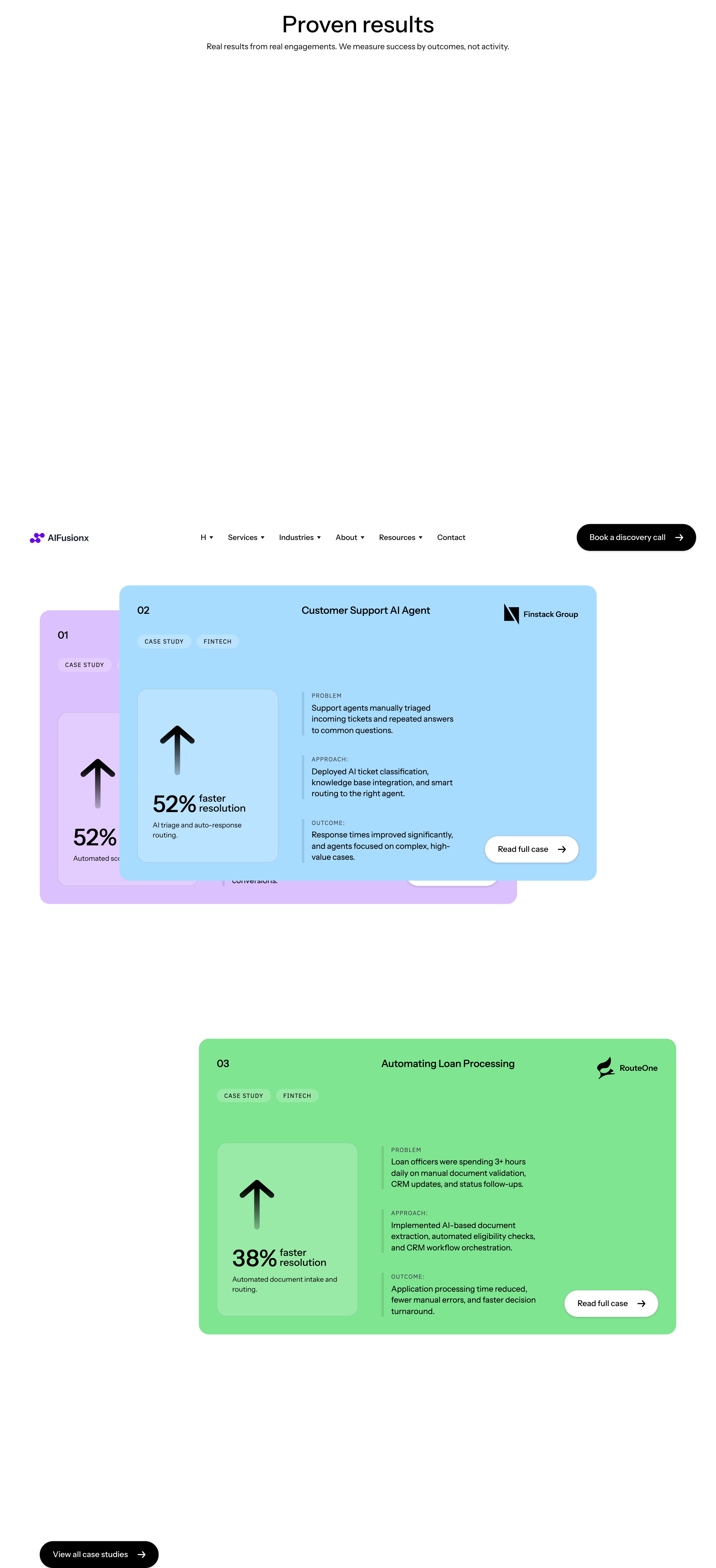
Summary
"Proof & credibility" — three case studies stacked vertically (01 / 02 / 03). Each row pairs a UI screenshot on one side with a heading, paragraph and 2–3 metric callouts on the other. Side alternates between rows for visual rhythm. No carousel — the stack itself is the device.
HTML structure (minimal)
<section class="cases">
<header class="cases__head">
<p class="eyebrow">Proof & credibility</p>
<h2 class="cases__title">Recent engagements.</h2>
</header>
<article class="case case--media-left">
<span class="case__num">01</span>
<figure class="case__media"><img src="/img/case-1.jpg" alt=""></figure>
<div class="case__body">
<h3>Sales pipeline rebuild for a B2B SaaS</h3>
<p>We replaced 14 manual handoffs with a single agent-driven flow.</p>
<dl class="case__metrics">
<div><dt>Leads/week</dt><dd>+212%</dd></div>
<div><dt>Hours saved</dt><dd>38h</dd></div>
<div><dt>Win rate</dt><dd>+9pt</dd></div>
</dl>
</div>
</article>
<article class="case case--media-right">
<span class="case__num">02</span>
<figure class="case__media"><img src="/img/case-2.jpg" alt=""></figure>
<div class="case__body">…</div>
</article>
<article class="case case--media-left">
<span class="case__num">03</span>
<figure class="case__media"><img src="/img/case-3.jpg" alt=""></figure>
<div class="case__body">…</div>
</article>
</section>
Key SCSS tokens
.case {
  display: grid;
  grid-template-columns: 80px 1.1fr 1fr;
  gap: 48px;
  padding: 64px 0;
  border-top: 0.5px solid rgba(0, 0, 0, 0.12);
  align-items: center;
  font-family: "Instrument Sans", system-ui, sans-serif;
}
.case--media-right { grid-template-columns: 80px 1fr 1.1fr; }
.case--media-right .case__media { order: 3; }
.case--media-right .case__body  { order: 2; }

.case__num {
  font-size: 14px;
  font-weight: 500;
}
.case__media img {
  width: 100%;
  border-radius: 16px;
}
.case__body h3 {
  font-size: 32px;
  font-weight: 500;
  letter-spacing: -0.5px;
  line-height: 1.15;
  margin-bottom: 16px;
}
.case__metrics {
  display: grid;
  grid-template-columns: repeat(3, 1fr);
  gap: 24px;
  margin-top: 24px;
  border-top: 0.5px solid rgba(0, 0, 0, 0.08);
  padding-top: 24px;
}
.case__metrics dt { font-size: 12px; color: #000; opacity: 0.6; }
.case__metrics dd { font-size: 28px; font-weight: 500; margin: 4px 0 0; }
Notable details
- Alternating media side (left/right) creates rhythm without animation — the eye zigzags down the page.
- 3-column metric strip inside each case study is the only place the design lets numbers be loud (28px) — saves the "metric typography" beat for the right moment.
dt/ddsemantic markup keeps it accessible and lets you style "label / value" without extra divs.- Hairline top-borders on each
.casecreate a magazine-section divider effect.
Use when
- You have exactly 3 strong case studies and want them to share equal visual weight.
- Each case has both a screenshot and quantitative metrics — without metrics this pattern looks empty.
- You want the case study section to read as content, not as marketing.
Caveats
- Demands real screenshots of real product UI — placeholder mockups crater the credibility.
- Without strict metric counts (3 per case), the metric strip becomes uneven and visually noisy.
- The "alternating side" pattern collapses to a stack on mobile; design that mobile fallback explicitly.