featured-product-slider
Галерея·Шаблон: Addina - Multipurpose eCommerce HTML Template·Складність анімації: subtle·Адаптивний: Так
Файли-джерела
- index.html
section.discount-area
Бібліотеки
swiperjquery
Summary
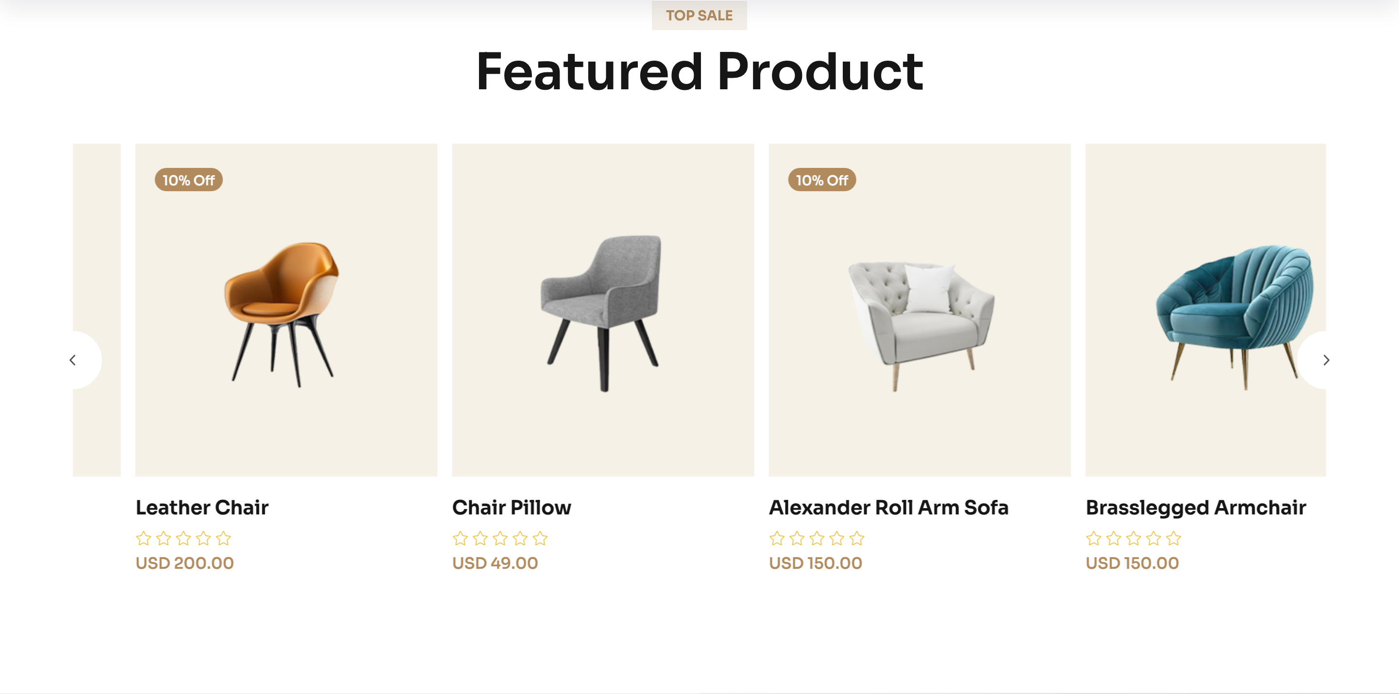
A "Top Sale → Featured Product" Swiper carousel of product cards. Each card has a discount badge, a square product photo on a cream backdrop, hover-revealed action icons (cart, quick view, wishlist) and external prev/next navigation buttons.
HTML structure (minimal)
<section class="discount-area p-relative section-space pt-0">
  <div class="container">
    <div class="section-title-wrapper-4 mb-40 text-center">
      <span class="section-subtitle-4 mb-10">top sale</span>
      <h2 class="section-title-4">Featured Product</h2>
    </div>
    <div class="discount-main p-relative">
      <div class="discount-slider-navigation furniture__navigation">
        <button class="discount-slider-button-prev"><i class="fa-regular fa-angle-left"></i></button>
        <button class="discount-slider-button-next"><i class="fa-regular fa-angle-right"></i></button>
      </div>
      <div class="swiper furuniture-active">
        <div class="swiper-wrapper">
          <div class="swiper-slide">
            <div class="product-item furniture__product">
              <div class="product-badge"><span class="product-trending">10% off</span></div>
              <div class="product-thumb theme-bg-2">
                <a href="#"><img src="product1.png" alt=""></a>
                <div class="product-action-item">
                  <button class="product-action-btn">…cart svg…</button>
                  <button class="product-action-btn" data-bs-toggle="modal" data-bs-target="#producQuickViewModal">…eye svg…</button>
                  <button class="product-action-btn">…heart svg…</button>
                </div>
              </div>
              <div class="product-content">
                <h6><a href="#">Stylish Lounge Chair</a></h6>
                <span>USD 99.00</span>
              </div>
            </div>
          </div>
          <!-- more slides -->
        </div>
      </div>
    </div>
  </div>
</section>
Key SCSS tokens
.furniture__product {
  border: none;
  text-align: center;
  .product-thumb {
    background-color: var(--clr-bg-2);
    border-radius: 6px;
    position: relative;
    overflow: hidden;
  }
  .product-action-item {
    position: absolute;
    inset: auto 0 -60px 0;
    display: flex;
    justify-content: center;
    gap: 10px;
    transition: bottom .35s ease;
  }
  &:hover .product-action-item {
    bottom: 20px;
  }
}
.section-title-4 {
  font-size: 50px;
  font-weight: 600;
}
Animation logic
var product = new Swiper(".furuniture-active", {
  slidesPerView: 4,
  spaceBetween: 30,
  loop: true,
  navigation: {
    nextEl: ".discount-slider-button-next",
    prevEl: ".discount-slider-button-prev",
  },
  breakpoints: {
    0:    { slidesPerView: 1 },
    576:  { slidesPerView: 2 },
    768:  { slidesPerView: 3 },
    1200: { slidesPerView: 4 },
  },
});
Notable details
- Action buttons live below the visible thumb and slide up on hover via a single
bottomtransition — no opacity flicker, just a clean reveal. - The prev/next buttons are pulled out of the slider into
discount-slider-navigationso they float on top of the section title rather than the slides themselves. - Quick-view button uses Bootstrap's
data-bs-toggle="modal"to open a shared product modal — the same modal services every product card on the page.
Use when
- E-commerce homes that need a horizontally scrolling product strip with hover affordances.
- Category pages where you want a "Top sellers" rail above the full grid.
- Lookbooks with controlled navigation outside the slide track.
Caveats
- Quick-view depends on a single
#producQuickViewModaldefined elsewhere on the page — copy that block too or the button is a no-op. - Swiper
loop: trueclones slides; if you wire up cart events, delegate from the parent or rebind onslideChange.