service-list
Можливості·Шаблон: Potu - Personal Portfolio HTML Template·Складність анімації: medium·Адаптивний: Так
Файли-джерела
- index.html
section.service-section
Бібліотеки
aosgsapsplittext
Summary
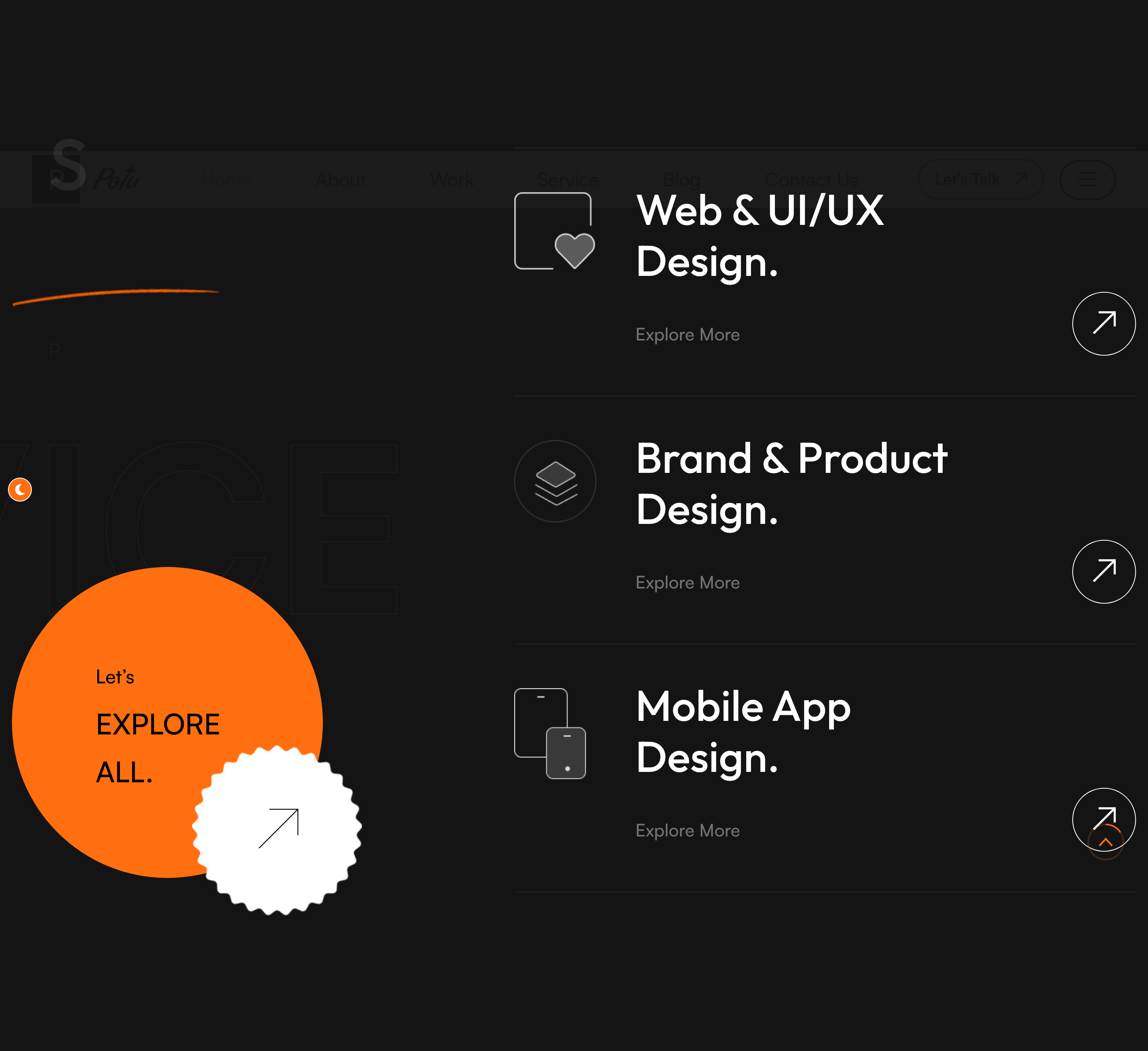
Asymmetric services panel — the left column carries the section title, intro paragraph and an oversized "EXPLORE ALL" stamp with a circular bounce-arrow link; the right column stacks three service tiles with icon, title, "Explore More" caption and arrow link.
HTML structure (minimal)
<section class="service-section">
<span class="big-text">service</span>
<div class="large-container">
<div class="row">
<div class="col-lg-5 left-column">
<div class="left-content sec-title-animation animation-style2">
<div class="sec-title light"><h2 class="title-animation">Service That <span>I Offer.</span></h2></div>
<p class="title-animation">Providing design services for last 8 years…</p>
<div class="inner-box">
<div class="text"><h3><span>Let's</span> EXPLORE ALL.</h3></div>
<div class="link bounce-slide"><a href="#"><i class="icon-6"></i></a></div>
</div>
</div>
</div>
<div class="col-lg-7 right-column">
<div class="right-content" data-aos="fade-left">
<div class="single-item">
<div class="icon-box"><img src="icon-2.png"></div>
<h2><a href="#">Web & UI/UX Design.</a></h2>
<span>Explore More</span>
<div class="link"><a href="#"><i class="icon-1"></i></a></div>
</div>
<!-- repeat -->
</div>
</div>
</div>
</div>
</section>
Key SCSS tokens
.service-section { position: relative; padding: 160px 0; }
.service-section .big-text {
  position: absolute; left: 0; bottom: 0;
  font-size: 240px; line-height: 1; font-weight: 700;
  color: rgba(0,0,0,0.04);
  pointer-events: none;
}
.service-section .single-item {
  display: flex; align-items: center; justify-content: space-between;
  padding: 50px 0; border-bottom: 1px solid rgba(0,0,0,0.10);
}
.service-section .single-item h2 a:hover { color: var(--theme-color); }
.bounce-slide a { animation: bounce-slide 2s ease infinite; }
Animation logic
// Section title splits into chars and slides in (style2 = x-offset)
// Handled globally by title_animation() in script.js
// AOS handles the right column's fade-left entrance via data-aos="fade-left"
Notable details
- Big-text watermark behind the section is the editorial signature of this template — same pattern repeats in portfolio, instagram, contact.
- The bounce-slide arrow is a CSS keyframe loop, not a JS interaction, so it animates even before the user reaches the section.
- AOS-driven entrance combines with the GSAP-driven title reveal — two libraries do two non-overlapping jobs, kept simple.
Use when
- Service or capability sections that need an editorial hierarchy rather than an even grid.
- Pages where the left column doubles as a CTA panel ("Explore all") rather than a separate section.
Caveats
- AOS entries fire only on first scroll; if the section is in the first viewport, the items appear pre-animated. Use
data-aos-once="false"if reset is wanted. - The bottom-aligned big-text overflows on narrow viewports; the responsive.css clamps it, but custom layouts may need to lower its font-size.