best-sellers-grid
Галерея·Шаблон: Addina - Multipurpose eCommerce HTML Template·Складність анімації: none·Адаптивний: Так
Файли-джерела
- index.html
section.furniture-seller
Бібліотеки
bootstrap
Summary
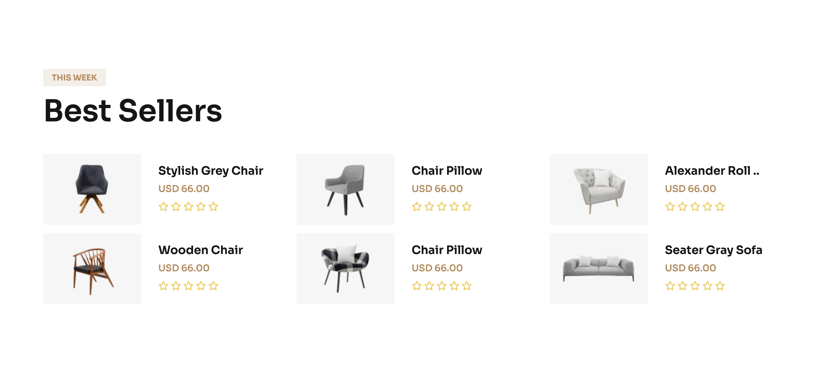
A 3×2 grid of horizontal best-seller cards. Each card lays a square product image alongside title, price and a five-star outline rating, framed by Bootstrap's col-xl-4 col-lg-6 col-md-6 breakpoints.
HTML structure (minimal)
<section class="furniture-seller section-space">
  <div class="container">
    <div class="section-title-wrapper-4 mb-40">
      <span class="section-subtitle-4 mb-10">THIS Week</span>
      <h2 class="section-title-4">Best Sellers</h2>
    </div>
    <div class="row g-4">
      <div class="col-xl-4 col-lg-6 col-md-6">
        <div class="furniture-seller__item">
          <div class="fs-image">
            <img src="fs-01.png" alt="">
          </div>
          <div class="fs-content">
            <h5><a href="#" class="text-capitalize">stylish grey chair</a></h5>
            <span>USD 66.00</span>
            <div class="fs-rating">
              <i class="far fa-star"></i><i class="far fa-star"></i>
              <i class="far fa-star"></i><i class="far fa-star"></i>
              <i class="far fa-star"></i>
            </div>
          </div>
        </div>
      </div>
      <!-- five more identical cards -->
    </div>
  </div>
</section>
Key SCSS tokens
.furniture-seller__item {
  display: flex;
  align-items: center;
  gap: 20px;
  padding: 16px;
  background: var(--clr-bg-1);
  border-radius: 8px;
  .fs-image {
    flex: 0 0 110px;
    img { width: 100%; height: 100%; object-fit: cover; border-radius: 6px; }
  }
  .fs-content h5 a {
    font-weight: 600;
    color: var(--clr-common-heading);
    transition: color .3s ease;
    &:hover { color: var(--clr-theme-primary); }
  }
}
Notable details
- All six cards share the cream
bg-1background — the section feels like a single continuous swatch rather than six discrete tiles. - The card layout is horizontal (image left, copy right), which uses vertical space more economically than the typical product-grid square card.
- Star rating is outline-only (
far fa-star) because the items are presented as best-sellers, not rated by individual reviewers.
Use when
- "Best sellers" or "Popular" rails where you want compact cards rather than full product tiles.
- Sidebars on product or article pages.
- Email-style summaries where the layout still has to be responsive.
Caveats
farFont Awesome icons assume Pro; swap tofa-regularsolids for the free CDN.flex: 0 0 110pxon the image keeps a fixed thumb width — if you scale the card, retune that basis or it dwarfs the copy.