project-accordion
Картка проєкту·Шаблон: Runok - Web Agency HTML5 Template·Складність анімації: medium·Адаптивний: Так
Файли-джерела
- index.html
section.project-section
Бібліотеки
bootstrapgsap
Summary
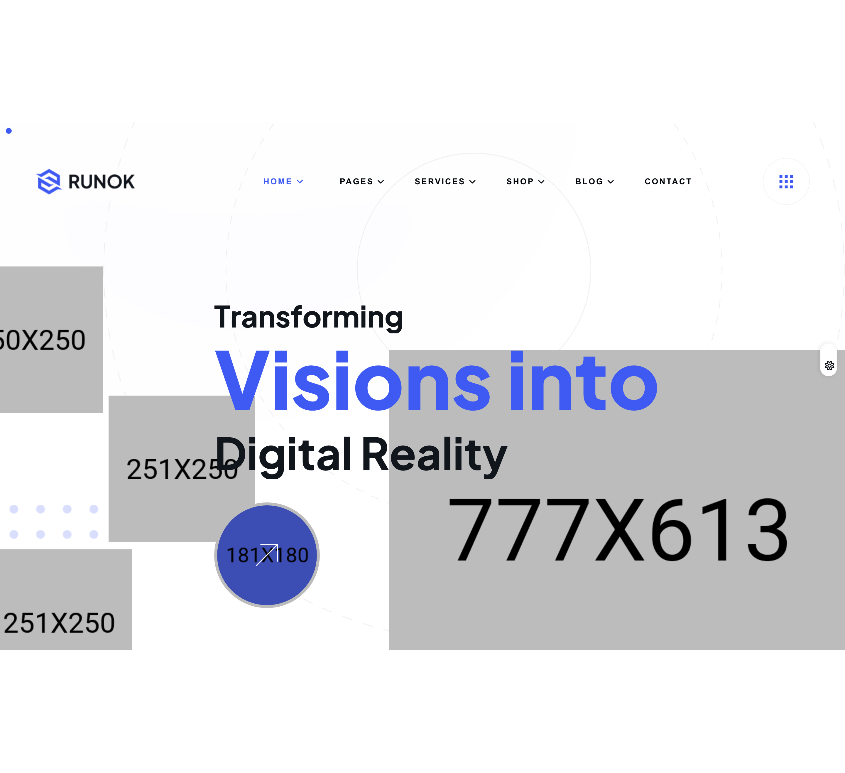
Vertical project showcase implemented as a Bootstrap 5 accordion. Each row carries a circular number badge (01–04), an uppercase category, and a project title; the active row paints the badge in cobalt and opens a body that places a description on the left and a project thumbnail on the right.
HTML structure (minimal)
<section class="project-section pt-130 pb-130">
  <div class="container">
    <div class="project-top heading-space align-items-end fade-wrapper">
      <div class="section-heading mb-0">
        <h4 class="sub-heading after-none">Project Showcase</h4>
        <h2 class="section-title">Let's Look Our Recent <br> Project Gallery</h2>
      </div>
      <div class="project-top-btn fade-top">
        <a href="project.html" class="rr-primary-btn">View More Project<i class="fa-regular fa-arrow-right"></i></a>
      </div>
    </div>
    <div class="project-accordion fade-wrapper">
      <div class="accordion" id="projectAccordion">
        <div class="accordion-item project-item fade-top">
          <h2 class="accordion-header" id="headingOne">
            <button class="accordion-button" type="button" data-bs-toggle="collapse"
                    data-bs-target="#collapseOne" aria-expanded="true" aria-controls="collapseOne">
              <span class="project-content">
                <span class="number">01</span>
                <span class="project-right">
                  <span class="category">UI/UX Design</span>
                  <span class="title">Marketing Solution For Brand</span>
                </span>
              </span>
            </button>
          </h2>
          <div id="collapseOne" class="accordion-collapse collapse show"
               aria-labelledby="headingOne" data-bs-parent="#projectAccordion">
            <div class="accordion-body">
              <div class="hover-content">
                <div class="content-left">
                  <p>Conubia elementum sodales molestie tempus gravida massa porta…</p>
                  <a href="project-details.html" class="rr-primary-btn">View Details<i class="fa-regular fa-arrow-right"></i></a>
                </div>
                <div class="content-right">
                  <div class="project-thumb"><img src="assets/img/project/project-1.png" alt=""></div>
                </div>
              </div>
            </div>
          </div>
        </div>
        <!-- 3 more accordion items 02..04 -->
      </div>
    </div>
  </div>
</section>
Key SCSS tokens
.project-item {
  border-bottom: 1px solid var(--rr-color-border-1);
  .project-content {
    display: grid; grid-template-columns: 65px 1fr; align-items: start; grid-gap: 15px;
    .number {
      background-color: #11151c; color: var(--rr-color-common-white);
      font-size: 20px; font-weight: 700; height: 65px; width: 65px;
      display: flex; align-items: center; justify-content: center;
      border-radius: 50%; border: 1px solid var(--rr-color-border-1);
    }
    .project-right {
      .category { font-size: 14px; color: var(--rr-color-theme-primary);
        font-weight: 700; text-transform: uppercase; margin-bottom: 15px; }
      .title    { color: var(--rr-color-common-white); font-size: 30px; font-weight: 700; }
    }
  }
}
.project-accordion .accordion-item {
  padding: 40px 0; border: none; border-bottom: 1px solid var(--rr-color-border-1);
  &:first-of-type { border-top: 1px solid var(--rr-color-border-1); }
  .accordion-button {
    background: transparent; border: 0; box-shadow: none; padding: 0;
    &::after { display: none; }
    &:not(.collapsed) .project-content .number {
      background-color: var(--rr-color-theme-primary);
    }
  }
  .accordion-body {
    padding: 35px 0 55px 80px;
    .hover-content { display: flex; align-items: start; justify-content: space-between; }
  }
}
Animation logic
// Bootstrap 5 collapse handles open/close; fade-top + ScrollTrigger orchestrate
// the in-view stagger of accordion rows.
Notable details
- The default Bootstrap chevron is removed (
&::after { display: none }); the visual signal of "active" is purely the number badge swapping from#11151cto cobalt. - The accordion body uses an 80 px left padding to align the thumbnail+description column with the start of the project title (right of the number badge), creating an indented inner column.
.project-contentis a CSS grid (65px 1fr) so the badge stays a fixed size and the right column flows; on mobile the SCSS collapses it to1frso the badge sits above the title.
Use when
- Studio sites with 3–6 deep case studies that each warrant a paragraph + image but don't justify their own page tile.
- Long-form portfolios where readers can scan numbered titles and dive into details inline.
Caveats
- The first item ships with
.collapse showandaria-expanded="true"; if you reorder the accordion you must also move theshowclass to keep the visual default consistent. - Single open accordion only (
data-bs-parent="#projectAccordion"); switch to standalone collapse if you need multi-open behaviour.