video-hero
Файли-джерела
- index.html
div.section-hero-v1
Бібліотеки
gsapjquery
Summary
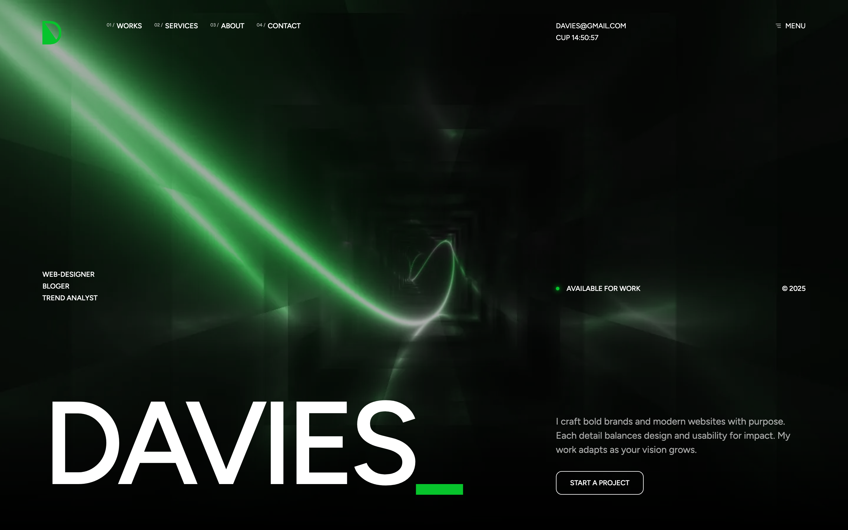
Full-bleed hero with a looping background video tinted to brand-green via mix-blend-mode: hue. Foreground composition pairs a vertical role list and an oversized "DAVIES" wordmark on the left with an availability dot, year tag, intro copy, and "START A PROJECT" CTA on the right.
HTML structure (minimal)
<div class="section-hero-v1">
  <div class="overlay"></div>
  <div class="bg-video">
    <video muted autoplay loop playsinline>
      <source src="assets/images/video/corridor.webm" type="video/mp4">
    </video>
    <div class="video-overlay"></div>
    <div class="video-overlay-2"></div>
  </div>
  <div class="content-wrap">
    <div class="container">
      <div class="row">
        <div class="col-md-8">
          <div class="col-left">
            <ul class="tf-list vertical text-caption">
              <li><a href="#" class="link effectFade fadeUp">WEB-DESIGNER</a></li>
              <li><a href="#" class="link effectFade fadeUp">BLOGER</a></li>
              <li><a href="#" class="link effectFade fadeUp">TREND ANALYST</a></li>
            </ul>
            <div class="davies-large">
              <div class="effectFade fadeRotateX">DAVIES<span class="text-primary">_</span></div>
            </div>
          </div>
        </div>
        <div class="col-md-4">
          <div class="col-right">
            <div class="top">
              <p class="title text-has-dot"><span class="br-dot"></span>AVAILABLE FOR WORK</p>
              <span>© 2025</span>
            </div>
            <div class="bot">
              <p class="desc text-white-64 effectFade fadeRight view-visible">I craft bold brands and modern websites…</p>
              <a href="#contactScroll" class="tf-btn">START A PROJECT</a>
            </div>
          </div>
        </div>
      </div>
    </div>
  </div>
</div>
Key SCSS tokens
.section-hero-v1 {
  min-height: 900px;
  position: relative;
  display: flex;
  align-items: end;

  .davies-large {
    font-size: clamp(80px, 16vw, 200px);
    line-height: clamp(96px, 14vw, 176px);
    font-weight: 550;
    letter-spacing: -0.06em;
  }

  .bg-video {
    position: absolute;
    inset: 0;
    z-index: -1;

    .video-overlay {
      position: absolute;
      inset: 0;
      background-color: var(--primary);
      mix-blend-mode: hue;
    }

    .video-overlay-2 {
      position: absolute;
      inset: 0;
      background-color: #000;
      opacity: 0.18;
    }
  }

  .overlay {
    position: absolute;
    bottom: -1px;
    left: 0; right: 0;
    height: 200px;
    background: linear-gradient(180deg, rgba(0,0,0,0) 0%, #000 100%);
  }
}
Animation logic
// effectFade entries fade up / rotateX-in once visible (assets/js/gsapAnimation.js scrollEffectFade)
// Pulsing "AVAILABLE FOR WORK" dot is handled with CSS @keyframes (.text-has-dot .br-dot)
Notable details
mix-blend-mode: hueover a desaturated corridor video locks the colour to--primary— flipping the data attribute tocolor-primary-2re-tints the entire hero without re-encoding the video.- The bottom 200px gradient (
section-hero-v1 .overlay) feathers the video into the next section's pure black so seams disappear without an explicit background match. - The "DAVIES" headline uses
effectFade fadeRotateX, which the SCSS animations file rotates around X with perspective for an architectural reveal — paired withclamp(80px, 16vw, 200px)it stays one line down to mobile.
Use when
- Agency / portfolio heroes that need brand-coloured video without re-grading footage.
- Single-screen narrative sites where the hero must telegraph "we make motion work" before the user scrolls.
Caveats
- The
<source type>is wrong —corridor.webmis declared astype="video/mp4". Most browsers ignore the type if the file is decodable, but strict mobile browsers may refuse. - Autoplay relies on
muted+playsinline; iOS Low Power Mode still suspends it. - 900px min-height pushes content below the fold on short displays — verify on 1280×720 laptops.