skills-experience
Таймлайн·Шаблон: Potu - Personal Portfolio HTML Template·Складність анімації: medium·Адаптивний: Так
Файли-джерела
- index.html
section.skills-section
Бібліотеки
aosgsapsplittext
Summary
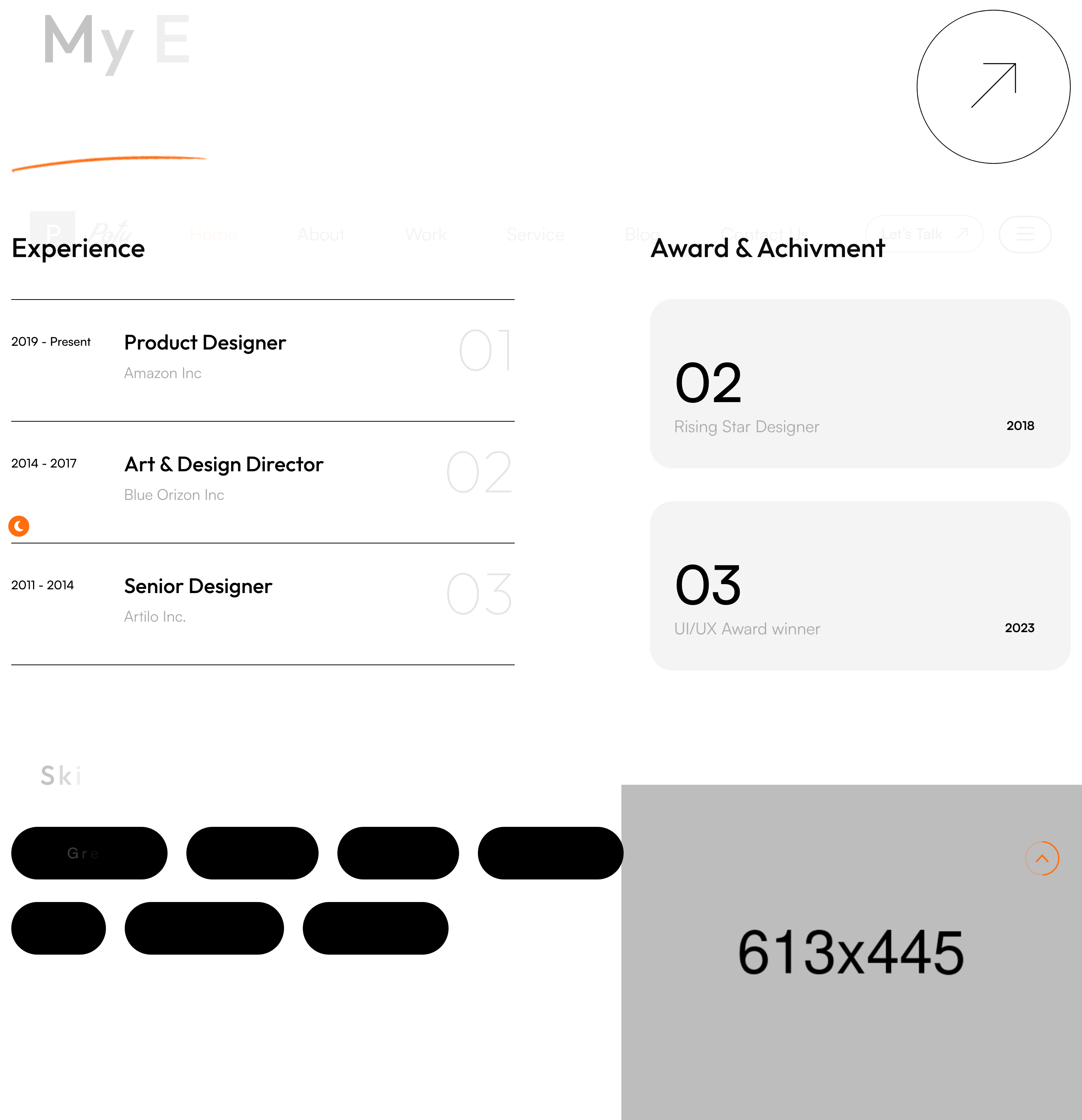
Two-column résumé block. The left lists job entries with date range, role, company and a numbered counter; the right lists awards in the same shape. Below, a "Skills" cloud renders pill-shaped chips you can hover to highlight.
HTML structure (minimal)
<section class="skills-section pb_190">
<figure class="image-layer" data-aos="fade-up"><img src="skills-1.png"></figure>
<div class="large-container">
<div class="upper-box">
<div class="sec-title sec-title-animation animation-style2">
<h2 class="title-animation">My Experience <span>& Skills.</span></h2>
</div>
<div class="link" data-aos="zoom-in"><a href="#"><i class="icon-6"></i></a></div>
</div>
<div class="row">
<div class="col-lg-6 left-column">
<div class="left-content" data-aos="fade-up">
<h2>Experience</h2>
<div class="single-item">
<div class="year">2019 - Present</div>
<div class="text-box">
<h3>Product Designer</h3><span>Amazon Inc</span>
</div>
<span class="count-text">01</span>
</div>
<!-- repeat -->
</div>
</div>
<div class="col-lg-6 right-column">
<div class="right-content" data-aos="fade-up">
<h2>Award & Achievement</h2>
<div class="single-item">
<h2>02</h2>
<div class="text-box"><span class="text">Rising Star Designer</span><span class="year">2018</span></div>
</div>
</div>
</div>
</div>
<div class="lower-box pt_120">
<div class="skills-content sec-title-animation animation-style2">
<h2 class="title-animation">Skills</h2>
<ul class="skills-list">
<li><a href="#">Great Interface</a></li>
<li><a href="#">UI/UX Design</a></li>
<li><button>& more…</button></li>
</ul>
</div>
</div>
</div>
</section>
Key SCSS tokens
.skills-section .single-item {
  display: grid; grid-template-columns: 140px 1fr 60px;
  gap: 30px; align-items: center;
  padding: 30px 0; border-bottom: 1px solid rgba(0,0,0,0.10);
}
.skills-section .single-item .count-text {
  font-size: 80px; font-weight: 700; color: rgba(0,0,0,0.04);
}
.skills-list li a {
  display: inline-block; padding: 10px 24px;
  border: 1px solid rgba(0,0,0,0.20); border-radius: 30px;
  transition: .3s;
}
.skills-list li a:hover {
  background: var(--theme-color); color: #fff; border-color: var(--theme-color);
}
Animation logic
// AOS handles fade-up of each column; title_animation() reveals the heading char by char.
Notable details
- The big counter (01, 02, 03) sits in the SAME row as the role using
flex/grid— feels editorial and avoids vertical sprawl. - Skills chips intentionally include a "& more…" button, which is a button (not link) so screen readers announce it as interactive without navigating.
pb_190is the template's spacing utility; the codebase usesmt_30 / pt_120 / mb_50 / ml_30extensively — easy to retrofit a Tailwind-style spacing scale.
Use when
- Personal résumé blocks where you want both jobs and awards visible in the first viewport of the section.
- Anywhere a skills cloud should feel decorative, not searchable.
Caveats
- The skills chips are
<a>and<button>— mixed semantics. Decide which fits before shipping. - The illustration
skills-1.pngis decorative; missing it leaves a gap in the right margin.