cta-with-form
Файли-джерела
- https://aifusionx.vamtam.com/
[data-id="6068080"]
Summary
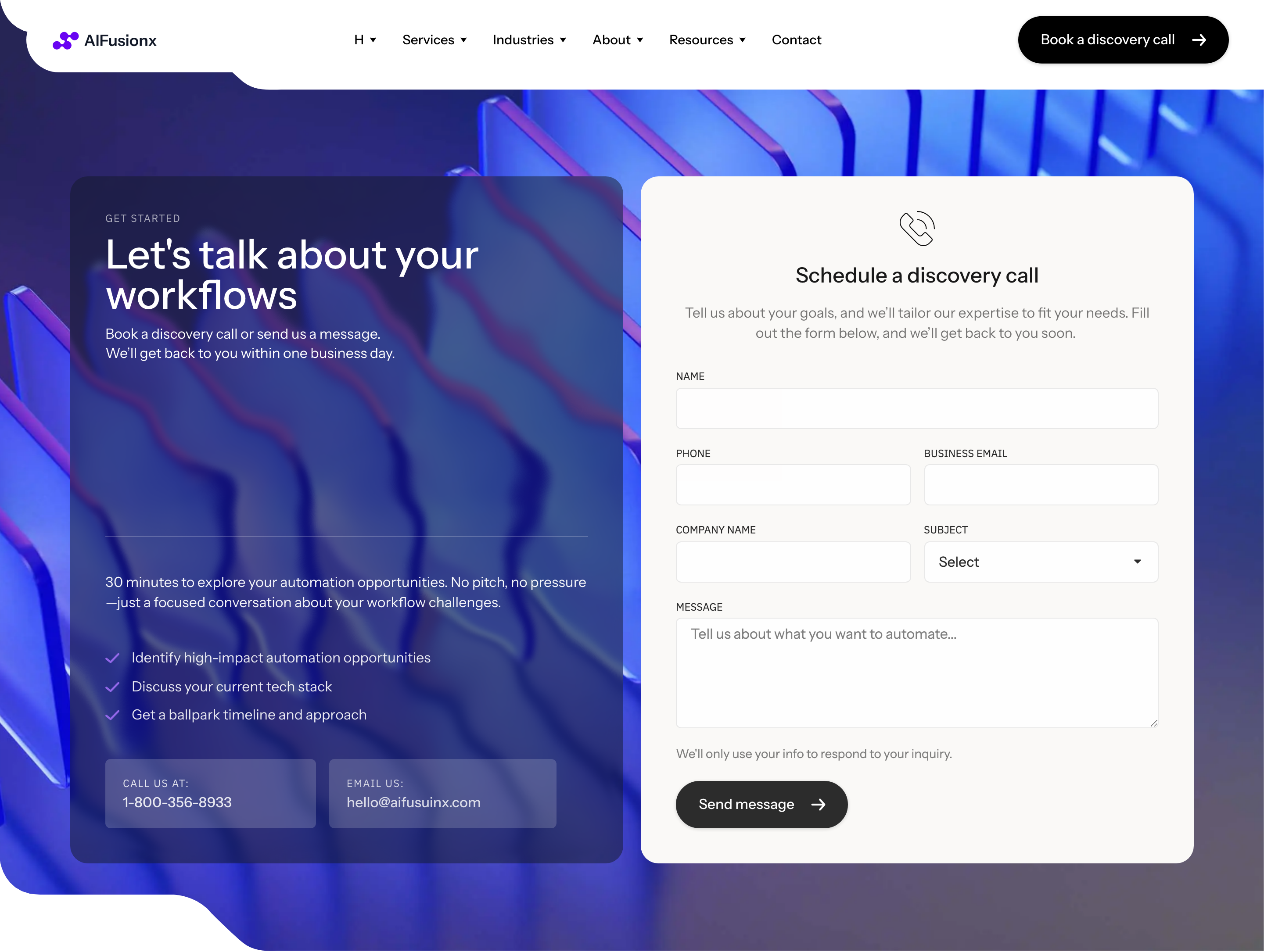
"Get started" — a split CTA section. Left column: oversized headline, short paragraph, and an icon-list of the three things the user gets ("Reply within a day", "First call free", "No commitment"). Right column: an embedded contact form on a soft surface card (name / company / email / message + a pill submit button).
HTML structure (minimal)
<section class="getstarted">
  <div class="getstarted__col getstarted__col--copy">
    <p class="eyebrow">Get started</p>
    <h2 class="getstarted__title">Tell us where AI could help.</h2>
    <p class="getstarted__lede">We'll reply within a day with a short take and a no-pressure call.</p>
    <ul class="getstarted__bullets">
      <li><i class="i-clock"></i> Reply within a day</li>
      <li><i class="i-phone"></i> First call free</li>
      <li><i class="i-shield"></i> No commitment</li>
    </ul>
  </div>

  <form class="getstarted__form">
    <div class="row">
      <label>Name<input type="text" required></label>
      <label>Company<input type="text"></label>
    </div>
    <label>Email<input type="email" required></label>
    <label>Message<textarea rows="5" required></textarea></label>
    <button class="btn btn--pill btn--dark" type="submit">Send</button>
  </form>
</section>
Key SCSS tokens
.getstarted {
  display: grid;
  grid-template-columns: 1fr 1fr;
  gap: 64px;
  padding: 96px 32px;
  background: #faf9f7; /* warm off-white surface */
  font-family: "Instrument Sans", system-ui, sans-serif;
}
.getstarted__title {
  font-size: 60px;
  font-weight: 500;
  letter-spacing: -1px;
  line-height: 1.1;
  margin-bottom: 24px;
}
.getstarted__bullets {
  list-style: none;
  padding: 0;
  margin-top: 32px;
  display: grid;
  gap: 12px;
  font-size: 14px;
}
.getstarted__form {
  display: flex;
  flex-direction: column;
  gap: 16px;
  background: #ffffff;
  padding: 32px;
  border-radius: 24px;
  border: 0.5px solid rgba(0, 0, 0, 0.08);
}
.getstarted__form .row {
  display: grid;
  grid-template-columns: 1fr 1fr;
  gap: 16px;
}
.getstarted__form input,
.getstarted__form textarea {
  width: 100%;
  padding: 14px 16px;
  font: 500 14px/1.4 "Instrument Sans", system-ui, sans-serif;
  border: 0.5px solid rgba(0, 0, 0, 0.2);
  border-radius: 12px;
  background: #ffffff;
}
.getstarted__form button {
  align-self: flex-start;
  margin-top: 8px;
  padding: 17px 25px;
  border-radius: 60px;
  background: #000;
  color: #fff;
  border: 0;
  font: 500 14px/1 "Instrument Sans", system-ui, sans-serif;
}
Notable details
- Split layout (copy left, form right) is the cleanest way to keep the headline visible while presenting a real form, instead of demoting it to a tiny "Contact us" link.
- Form sits on
#faf9f7warm off-white outer surface but its own card is pure#ffffff— a two-tier surface pattern that signals "this is the active element". - Bullets next to the form are not features, they're commitments ("we reply within a day"). Reduces friction at the moment of decision.
- Pill submit button mirrors the hero CTA pill — same geometry, same weight, same radius (60px). Keeps the brand's button language consistent.
Use when
- High-intent pages where you can ask for a real form fill rather than a "schedule call" button.
- Agencies / consultants where the value is "let's talk" and you want to remove the extra page-jump to a contact route.
- The brand's surface palette has a soft off-white you can use to demarcate the section without a hard line.
Caveats
- Form submission is wired to Elementor's form widget on the live demo — outside that you're on your own (Formspree, Netlify Forms, custom backend).
- Two-column form bullets need a real mobile fallback (single column, bullets above form).
- The bullets are NOT validation — make sure the form actually has client-side and server-side checks before going live.