hero-editorial
Hero·Шаблон: AIFusionX (WP theme — analyzed via live demo)·Складність анімації: none·Адаптивний: Так
Файли-джерела
- https://aifusionx.vamtam.com/
[data-id="6c3a20a"]
Summary
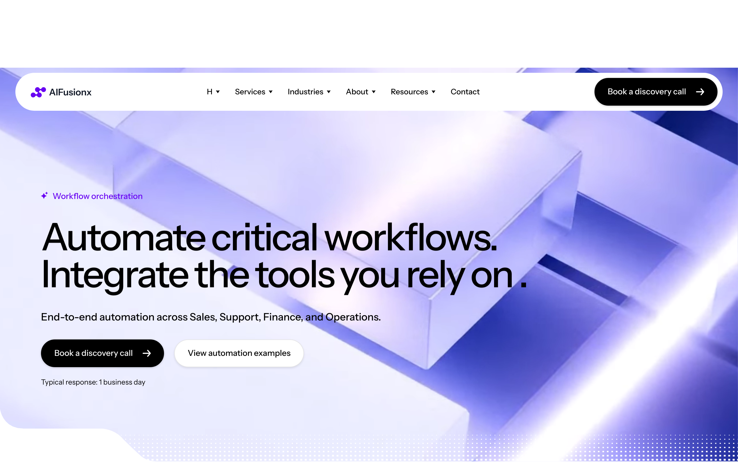
Editorial-magazine hero: full-bleed photographic background of real people working, a small icon-list overlay above the headline, an oversized H1 ("Automate critical workflows.") at 74px / weight 500 with -3px letter-spacing, a short paragraph, and two pill buttons. Static — no entrance animation, no parallax.
HTML structure (minimal)
<section class="hero">
  <picture class="hero__bg">
    <img src="/img/hero.jpg" alt="">
  </picture>
  <div class="hero__inner">
    <ul class="hero__chips">
      <li><i class="i-bolt"></i> Faster delivery</li>
      <li><i class="i-shield"></i> Reliable</li>
      <li><i class="i-chart"></i> Measurable</li>
    </ul>
    <h1 class="hero__title">Automate critical workflows.</h1>
    <p class="hero__lede">We integrate AI into your sales, ops and finance — without rebuilding what already works.</p>
    <div class="hero__cta">
      <a class="btn btn--pill btn--dark"  href="#contact">Get started</a>
      <a class="btn btn--pill btn--ghost" href="#services">See services</a>
    </div>
  </div>
</section>
Key SCSS tokens
.hero {
  position: relative;
  min-height: 86vh;
  color: #fff;
  font-family: "Instrument Sans", system-ui, sans-serif;
}
.hero__bg img {
  position: absolute; inset: 0;
  width: 100%; height: 100%;
  object-fit: cover;
}
.hero__inner {
  position: relative;
  max-width: 1200px;
  margin: 0 auto;
  padding: 96px 32px 48px;
}
.hero__title {
  font-size: 74px;
  font-weight: 500;
  letter-spacing: -3px;
  line-height: 1.1;
  margin: 16px 0 24px;
}
.hero__lede {
  font-size: 14px;
  line-height: 1.4;
  max-width: 520px;
}
.hero__chips {
  display: flex; gap: 20px;
  font-size: 14px;
  list-style: none; padding: 0; margin: 0 0 16px;
}
.btn--pill {
  display: inline-flex; align-items: center;
  padding: 17px 25px;
  border-radius: 60px;
  border: 0.5px solid currentColor;
}
.btn--dark  { background: #000; color: #fff; border-color: #000; }
.btn--ghost { background: transparent; color: #fff; }
Notable details
- 74px / weight 500 / -3px tracking is the editorial signature — it reads as a magazine cover, not a SaaS headline.
- Photograph carries the entire visual mood; CSS adds zero gradient, glow or particle.
- Chips above the headline (small icon + label trio) replace the more familiar "trusted by" pre-headline. They tell the reader what the brand does, not who knows it.
- Two CTAs: dark filled (primary) + ghost outline (secondary). Same pill geometry, different fills.
- 17px / 25px padding (vertical / horizontal) is wider than typical 12/20 — gives the buttons editorial weight.
Use when
- Service businesses where you can afford bespoke or licensed photography of real humans.
- Pages where the headline is short enough (3–6 words) to support a 74px display size.
- You want the hero to set a "premium operator" tone, not a "futuristic visionary" one.
Caveats
- Hero photo licensing / cost is the practical bottleneck — generic stock kills the effect; commission a shoot or use top-tier Getty.
- 74px / -3px breaks down on long words; H1 copy must be curated, not user-generated.
- The 86vh min-height combined with full-bleed photo means above-the-fold is photo-dominant; ensure the headline contrast survives the image's busiest quadrant.