process-stack-cards
Процес·Шаблон: Davies - Personal Portfolio HTML Template·Складність анімації: subtle·Адаптивний: Так
Файли-джерела
- index.html
section.section-process
Бібліотеки
swipergsap
Summary
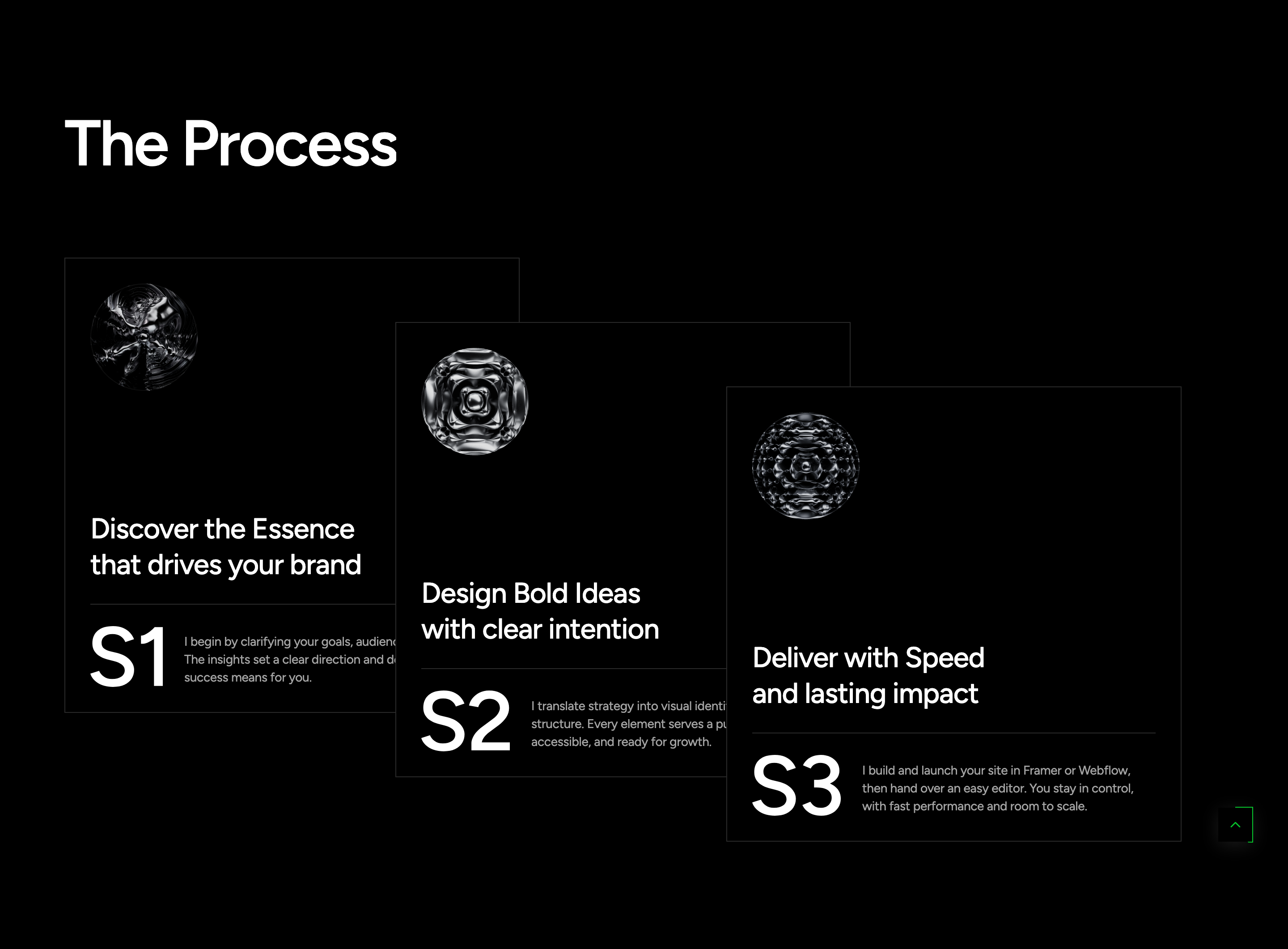
The Process section explains the studio workflow through three numbered cards staggered diagonally on desktop (each card sits 72px lower and ~5% to the left of the previous). On mobile and tablet the same cards become a Swiper carousel with dot pagination. Each card shows a 3D-style icon, a two-line title, a divider, a small ornament SVG, and a body paragraph.
HTML structure (minimal)
<section class="section-process flat-spacing">
  <div class="container">
    <div class="s-header"><h2 class="title text-display-2 effectFade fadeUp">The Process</h2></div>
    <div class="process-list">
      <div dir="ltr" class="swiper swiper-process">
        <div class="swiper-wrapper">
          <div class="swiper-slide effectFade fadeUp no-div">
            <div class="wg-process">
              <div class="bg-img"><img src="assets/images/item/bg-1.jpg" alt=""></div>
              <div class="content position-relative z-5">
                <div class="img-icon"><img src="assets/images/item/process-1.png" alt=""></div>
                <div>
                  <h5 class="title"><a href="#" class="link">Discover the Essence<br>that drives your brand</a></h5>
                  <div class="br-line"></div>
                  <div class="bot">
                    <div class="img-item"><img src="assets/images/item/S1.svg" alt=""></div>
                    <p class="desc text-body-3 text-white-64">…</p>
                  </div>
                </div>
              </div>
            </div>
          </div>
          <!-- two more slides -->
        </div>
        <div class="sw-dot-default tf-pag-nav justify-content-center d-xl-none"></div>
      </div>
    </div>
  </div>
</section>
Key SCSS tokens
.section-process {
  @include res(xl, min) {
    .swiper-process { overflow: visible; padding-left: 100px; }
    .swiper-wrapper { display: flex; > * { flex: 1; } }

    .swiper-slide {
      z-index: 1;
      &:not(:first-child) { left: -5%; }
      &:nth-child(2) { margin-top: 72px; left: -5%; }
      &:nth-child(3) { margin-top: calc(72px * 2); left: calc(-5% * 2); }
      &:hover { z-index: 2; }
    }

    .wg-process {
      max-width: 509px;
      &:hover { transform: translateY(-10px); }
    }
  }
}
Animation logic
// scrollEffectFade() applies fadeUp entrances per slide via ScrollTrigger.
// Below xl, Swiper takes over and the diagonal CSS layout is overridden.
Notable details
- The same markup serves two layouts: a Swiper carousel with dots on mobile and a static diagonal stack on desktop. Swiper's flexbox is overridden with
> * { flex: 1; }so each slide takes equal width without slide-mode initialised. - Cards lift 10px on hover and bring themselves to the front via
z-index: 2— overlaps are intentional, not accidental. - The little S1/S2/S3 SVG ornaments are a nice "issue-number" detail under each title.
Use when
- Three-step process explanations where you want a magazine-style stagger on desktop and a swiper on mobile from the same markup.
- When overlapping cards should feel like a physical stack you can hover into.
Caveats
- The diagonal offsets are coded for exactly three cards — adding a fourth requires extending the
:nth-childrules. - Swiper instance is initialised globally; if you fork the markup, watch the
swiper-processselector.