team-slider
Команда·Шаблон: Consulo Creative Business Consulting Template·Складність анімації: subtle·Адаптивний: Так
Файли-джерела
- index.html
team-slider.team-slider.mt-100
Бібліотеки
swiperaos
Summary
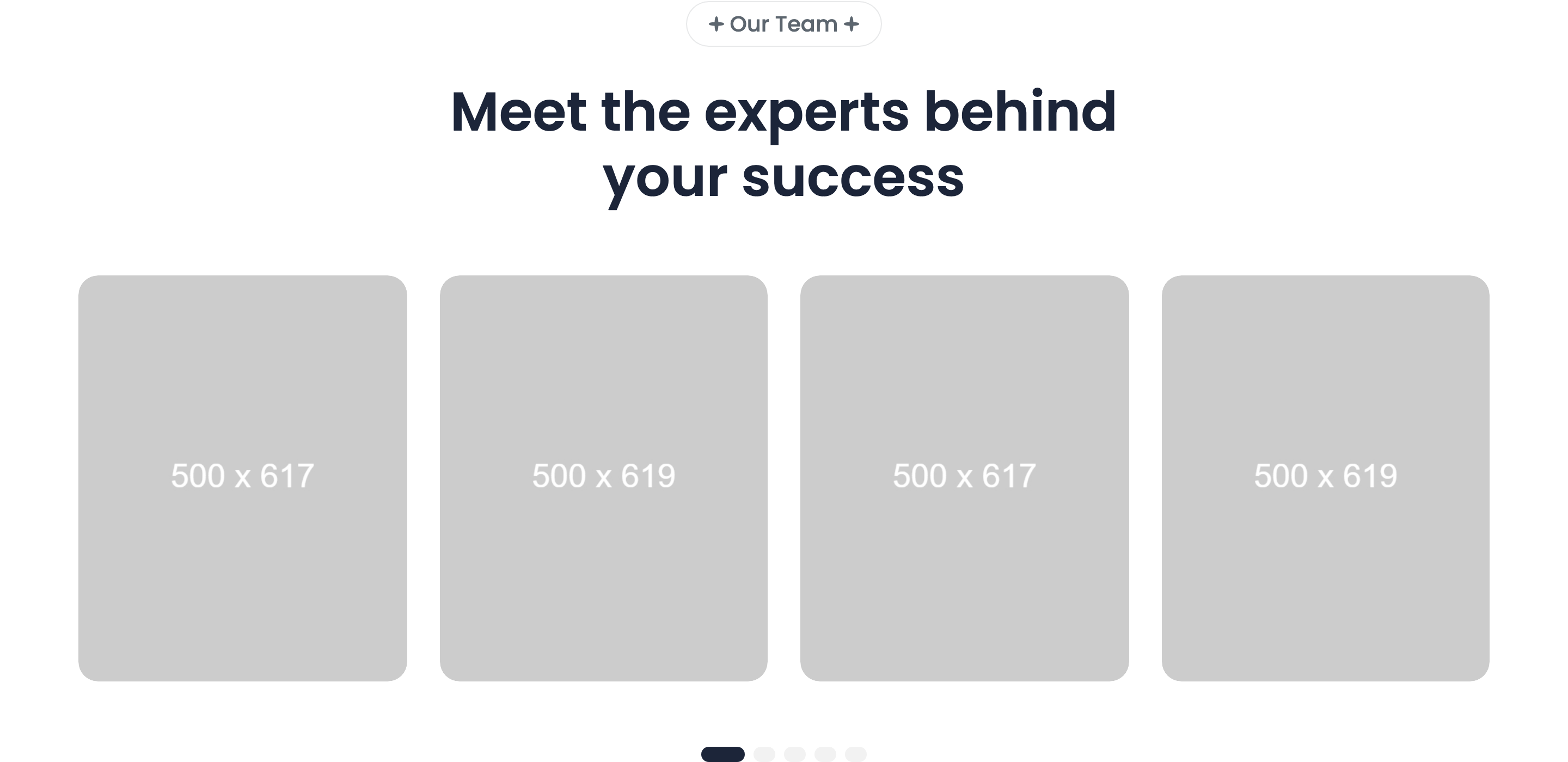
Centered Swiper team carousel with 18px-radius portrait cards. Each card carries the photo, an absolutely-positioned name + role overlay pinned bottom-left, and a three-icon LinkedIn / Twitter / Instagram social row. Swiper config: 1.2 → 2 → 3 → 4 slides per view across breakpoints, with clickable pagination bullets.
HTML structure (minimal)
<team-slider class="team-slider mt-100">
  <div class="container">
    <div class="section-headings headings-width text-center">
      <div class="subheading text-20 subheading-bg"><span>Our Team</span></div>
      <h2 class="heading text-50">Meet the experts behind your success</h2>
    </div>
  </div>
  <div class="section-content">
    <div class="container">
      <div class="swiper">
        <div class="swiper-wrapper">
          <div class="swiper-slide">
            <div class="card-team radius18">
              <img src="team/1.jpg" width="500" height="619" />
              <div class="card-team-content-absolute">
                <div class="card-team-content">
                  <a class="heading text-22 fw-600" href="team-details.html">Ronald Richards</a>
                  <p class="text text-18">Finance Advisor</p>
                </div>
              </div>
              <div class="social-list">
                <a href="#" class="svg-wrapper"><svg>linkedin</svg></a>
                <a href="#" class="svg-wrapper"><svg>twitter</svg></a>
                <a href="#" class="svg-wrapper"><svg>instagram</svg></a>
              </div>
            </div>
          </div>
          <!-- more swiper-slides -->
        </div>
        <div class="swiper-pagination"></div>
      </div>
    </div>
  </div>
</team-slider>
Key SCSS tokens
.card-team {
  position: relative;
  border-radius: 18px;
  overflow: hidden;
}
.card-team img {
  width: 100%;
  height: auto;
  object-fit: cover;
}
.card-team-content-absolute {
  position: absolute;
  bottom: 24px; left: 24px; right: 24px;
  background: rgba(255,255,255,0.9);
  backdrop-filter: blur(8px);
  padding: 16px 20px;
  border-radius: 12px;
}
.social-list {
  position: absolute;
  top: 24px; right: 24px;
  display: flex;
  flex-direction: column;
  gap: 8px;
  opacity: 0;
  transition: opacity 0.3s;
}
.card-team:hover .social-list { opacity: 1; }
Animation logic
class TeamSlider extends HTMLElement {
  connectedCallback() {
    this.slider = new Swiper(this.querySelector(".swiper"), {
      pagination: { el: this.querySelector(".swiper-pagination"), clickable: true },
      breakpoints: {
        0:    { spaceBetween: 20, slidesPerView: 1.2 },
        575:  { spaceBetween: 20, slidesPerView: 2 },
        992:  { spaceBetween: 20, slidesPerView: 3 },
        1280: { spaceBetween: 30, slidesPerView: 4 },
      },
    });
  }
}
customElements.define("team-slider", TeamSlider);
Notable details
slidesPerView: 1.2on mobile peeks the next card to telegraph "this is a slider" — much better discoverability than fixed1.- The headings live inside
.containerwhile.section-contentcontaining the slider can extend past it (used by other variants in the template that useteam-slider2for a wider track). - Social icons fade in only on card hover (
opacity 0 -> 1) so the resting card is photo-led; the name overlay is glassmorphic viabackdrop-filter: blur(8px).
Use when
- 6-12 team members where you want a horizontal browse experience instead of a 4-up grid.
- Photo-led leadership pages where the social icons should be discoverable but not distracting at rest.
- Templates that need to scale from mobile (1.2 cards) to desktop (4 cards) cleanly.
Caveats
- Pagination bullets use Swiper's defaults — restyle
--swiper-pagination-colorif you change the surface color. <team-slider>and<team-slider2>are two separate custom elements inmain.js— picking the wrong one in a new page silently shows nothing.