minimal-testimonials-slider
Відгуки·Шаблон: Webfolio - Creative Agency & Portfolio Next.js Template·Складність анімації: subtle·Адаптивний: Так
Файли-джерела
- out/home-main/index.html
section.testimonials
Бібліотеки
swiper
Summary
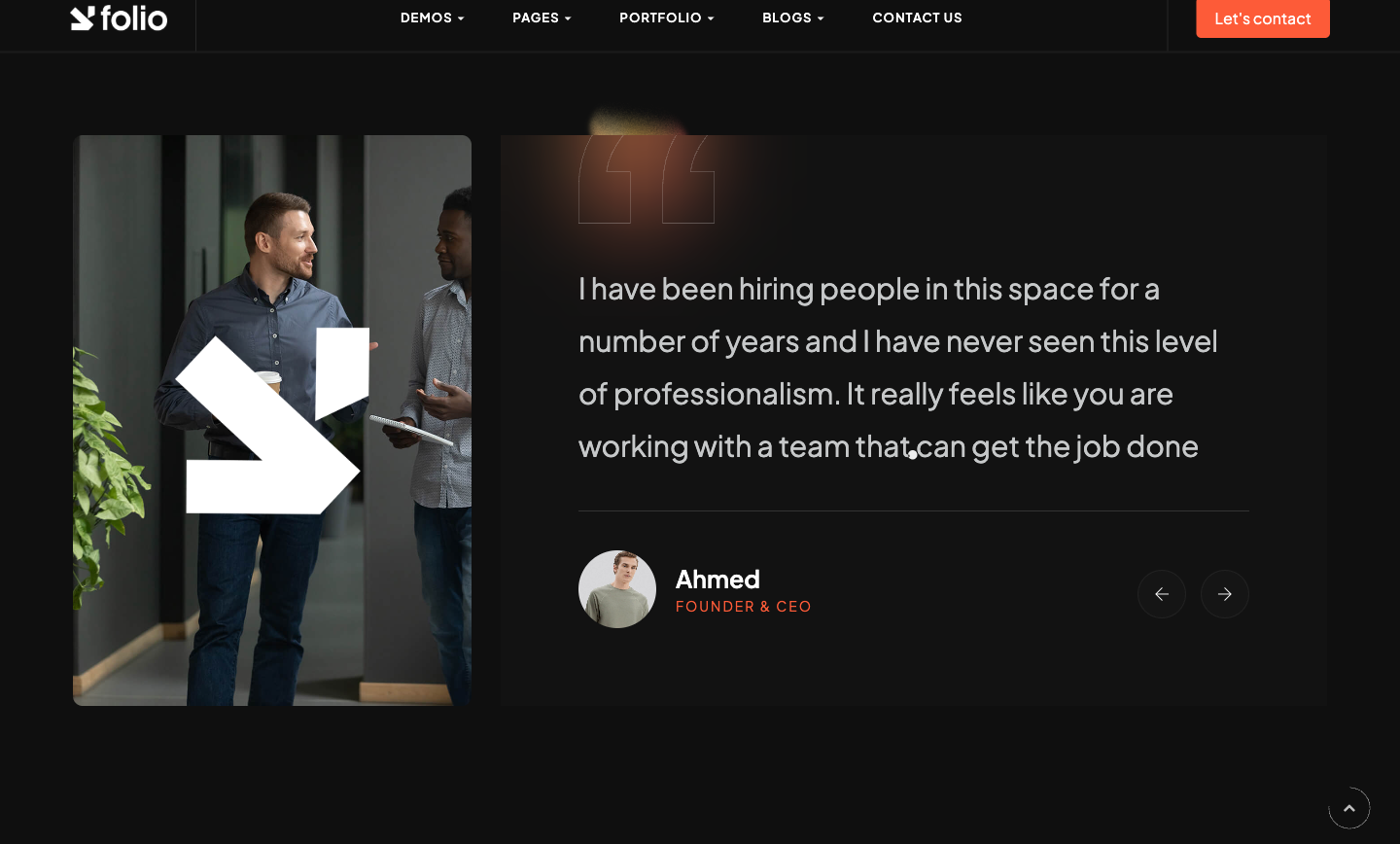
Two-column testimonial section. Left col: tall portrait + a small absolute arrow accent. Right col: a Swiper of quote slides where each slide has an oversized 30px quote, a bord-thin-top divider and a portrait+name pair. A semi-transparent SVG quotation glyph sits behind. Custom prev/next buttons live below; a .circle-blur glow sits behind for atmosphere.
HTML structure (minimal)
<section class="testimonials">
  <div class="container section-padding bord-top-grd">
    <div class="row">
      <div class="col-lg-4">
        <div class="img-full">
          <div class="fit-img"><img src="/assets/imgs/testim/bg.jpg" alt="" /></div>
          <div class="fix-img"><img src="/assets/imgs/arw1.png" alt="" /></div>
        </div>
      </div>
      <div class="col-lg-8">
        <div class="cont-full">
          <div class="testim-swiper">
            <Swiper>
              <SwiperSlide>
                <div class="item">
                  <div class="content">
                    <div class="text"><p class="fz-30">Working with this team was…</p></div>
                    <div class="info d-flex align-items-center pt-40 mt-40 bord-thin-top">
                      <div><div class="fit-img circle"><img src="/assets/imgs/clients/1.jpg" alt="" /></div></div>
                      <div class="ml-20">
                        <h5>Jane Doe</h5>
                        <span class="sub-title main-color">Product Lead, Acme</span>
                      </div>
                    </div>
                  </div>
                </div>
              </SwiperSlide>
            </Swiper>
            <svg class="qout-svg" viewBox="0 0 256.721 208.227"><!-- two-quote outline --></svg>
          </div>
          <div class="swiper-arrow-control control-abslout">
            <div class="swiper-button-prev"><span class="ti-arrow-left"></span></div>
            <div class="swiper-button-next"><span class="ti-arrow-right"></span></div>
          </div>
          <div class="circle-blur"><img src="/assets/imgs/patterns/blur1.png" alt="" /></div>
        </div>
      </div>
    </div>
  </div>
</section>
Key SCSS tokens
.testimonials {
  .img-full {
    position: relative;
    .fit-img img { width: 100%; height: 600px; object-fit: cover; border-radius: 12px; }
    .fix-img {
      position: absolute;
      right: -40px; bottom: -40px;
      width: 80px;
    }
  }
  .testim-swiper {
    position: relative;
    .qout-svg {
      position: absolute;
      top: -20px; left: -20px;
      opacity: .3;
      pointer-events: none;
    }
    .item .text p { font-size: 30px; line-height: 1.4; font-weight: 400; }
    .item .info .fit-img.circle img {
      width: 60px; height: 60px;
      border-radius: 50%;
      object-fit: cover;
    }
  }
  .swiper-arrow-control.control-abslout {
    position: absolute;
    bottom: 40px; right: 40px;
  }
}
Animation logic
const swiperOptions = {
  modules: [Pagination, Navigation],
  spaceBetween: 30,
  loop: true,
  pagination: { el: '.testimonials-minim .swiper-pagination', clickable: true },
  navigation: {
    nextEl: '.testimonials-minim .swiper-button-next',
    prevEl: '.testimonials-minim .swiper-button-prev',
  },
};
Notable details
- The decorative quote SVG is hand-coded as a single path with
strokeonly and ~32% opacity — gives the slider an editorial mark without overpowering the text. - Quote font-size at 30px (vs body 16px) lets the testimonial be the hero of its section.
- Slides are always one-up (no
slidesPerView), butloop: truemakes the cycle feel infinite.
Use when
- Testimonial sections with longer quotes (2–4 sentences) where the layout needs to give the words room to breathe.
- Pages where you have a single anchor portrait you want to reuse alongside multiple voices.
Caveats
.testimonials-minimselector in the swiperOptions doesn't exist in the actual markup; the navigation falls back to the in-section default — verify after porting if you change classnames.- Only the first two entries from
data/testimonials.jsonare rendered (.slice(0, 2)); change to all if you import the data wholesale.