testimonials-carousel
Відгуки·Шаблон: Addina - Multipurpose eCommerce HTML Template·Складність анімації: subtle·Адаптивний: Так
Файли-джерела
- index.html
section.furniture-testimonial
Бібліотеки
swiperjquery
Summary
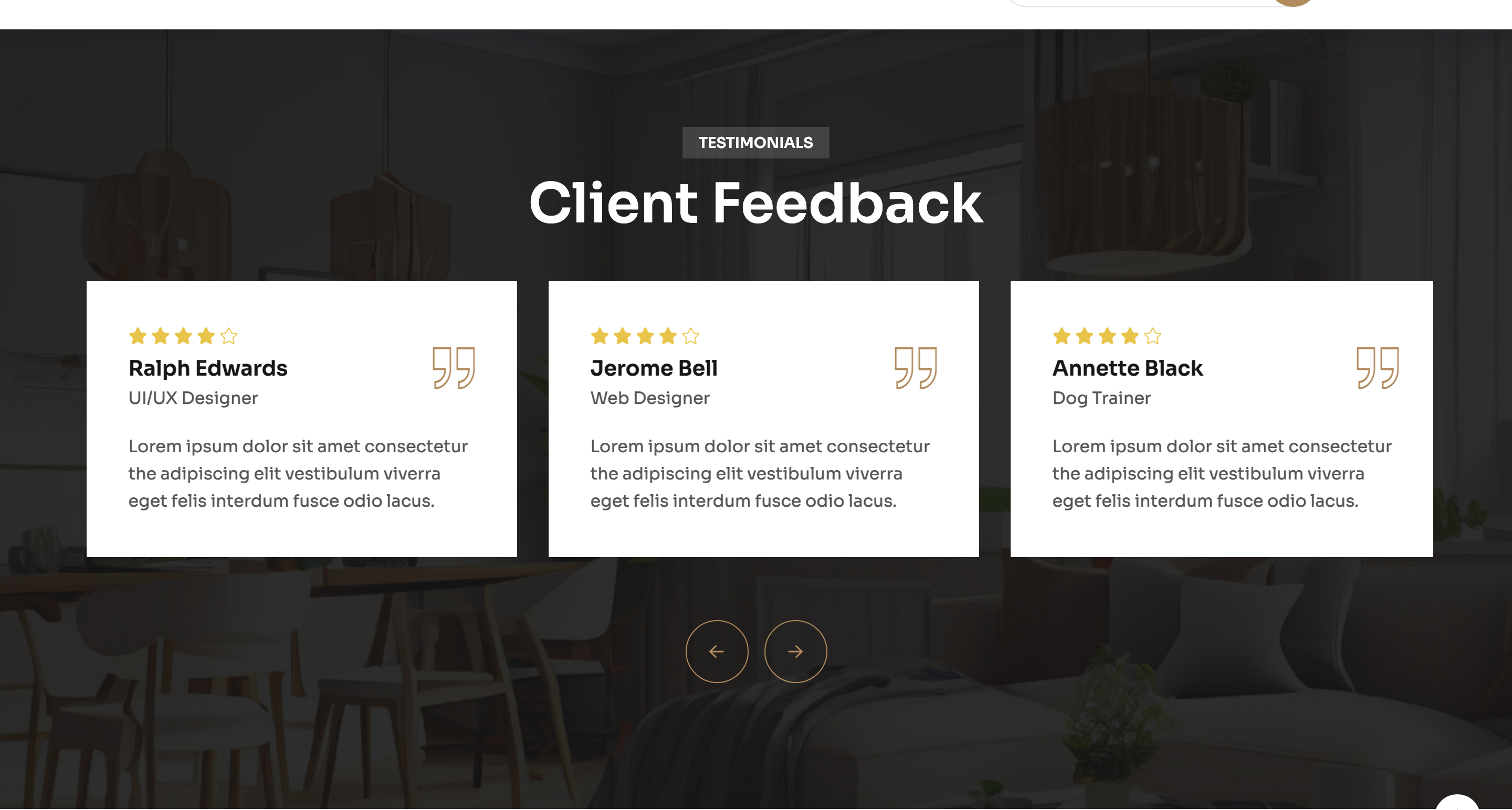
A photo-backed Swiper carousel of star-rated client cards. Each slide shows a five-star row, a name, a role, a bronze double-quote glyph and a short paragraph. External left/right buttons sit centred under the slider.
HTML structure (minimal)
<section class="furniture-testimonial section-space bg-image"
         data-background="assets/imgs/furniture/testimonial/bg.jpg">
  <div class="container">
    <div class="section-title-wrapper-4 is-white mb-40 text-center">
      <span class="section-subtitle-4 mb-10">Testimonials</span>
      <h2 class="section-title-4">Client Feedback</h2>
    </div>
    <div class="swiper testimonial-active-3">
      <div class="swiper-wrapper">
        <div class="swiper-slide">
          <div class="furniture-testimonial__item">
            <div class="ft-head">
              <div class="ft-info">
                <div class="fs-rating">
                  <i class="fas fa-star"></i><i class="fas fa-star"></i>
                  <i class="fas fa-star"></i><i class="fas fa-star"></i>
                  <i class="fal fa-star"></i>
                </div>
                <h5>Annette Black</h5>
                <span>Dog Trainer</span>
              </div>
              <svg width="40" height="40"><!-- bronze double-quote --></svg>
            </div>
            <p>Lorem ipsum dolor sit amet…</p>
          </div>
        </div>
        <!-- more slides -->
      </div>
    </div>
    <div class="navigation__wrapprer text-center">
      <div class="common-slider-navigation">
        <button class="testimonial-button-prev"><i class="fa-regular fa-arrow-left"></i></button>
        <button class="testimonial-button-next"><i class="fa-regular fa-arrow-right"></i></button>
      </div>
    </div>
  </div>
</section>
Key SCSS tokens
.furniture-testimonial {
  background-position: center;
  background-size: cover;
  &__item {
    background: rgba(255,255,255,0.06);
    border-radius: 8px;
    padding: 40px;
    color: #fff;
    .ft-head {
      display: flex;
      justify-content: space-between;
      align-items: flex-start;
      margin-bottom: 30px;
    }
  }
}
.fs-rating i {
  color: #e8c54a;
}
Animation logic
new Swiper(".testimonial-active-3", {
  slidesPerView: 3,
  spaceBetween: 30,
  loop: true,
  navigation: {
    nextEl: ".testimonial-button-next",
    prevEl: ".testimonial-button-prev",
  },
  pagination: { el: ".bd-swiper-dot", clickable: true },
  breakpoints: {
    0:    { slidesPerView: 1 },
    768:  { slidesPerView: 2 },
    1200: { slidesPerView: 3 },
  },
});
Notable details
- The whole section sits on a
data-backgroundphoto with no overlay, relying on the high-contrast white type and translucent card to stay readable. - Star rating mixes
fas fa-star(filled) withfal fa-star(light) to communicate fractional ratings without a JS library. - The double-quote glyph is an inline SVG using the same bronze accent as the rest of the page — quick to retheme.
Use when
- Editorial homes where you want testimonials to feel cinematic rather than card-flat.
- Service pages that need social proof above the CTA.
- B2B landing pages with named-customer quotes.
Caveats
- Light Font Awesome icons (
fal) require Font Awesome 6 Pro (paid) — solid alternatives need to be substituted in a free build. - Background photo dictates text contrast — pick darker stills if you swap, otherwise add a
:beforeoverlay.