instagram-carousel
Файли-джерела
- index.html
section.instagram-section
Бібліотеки
jquerygsapsplittext
Summary
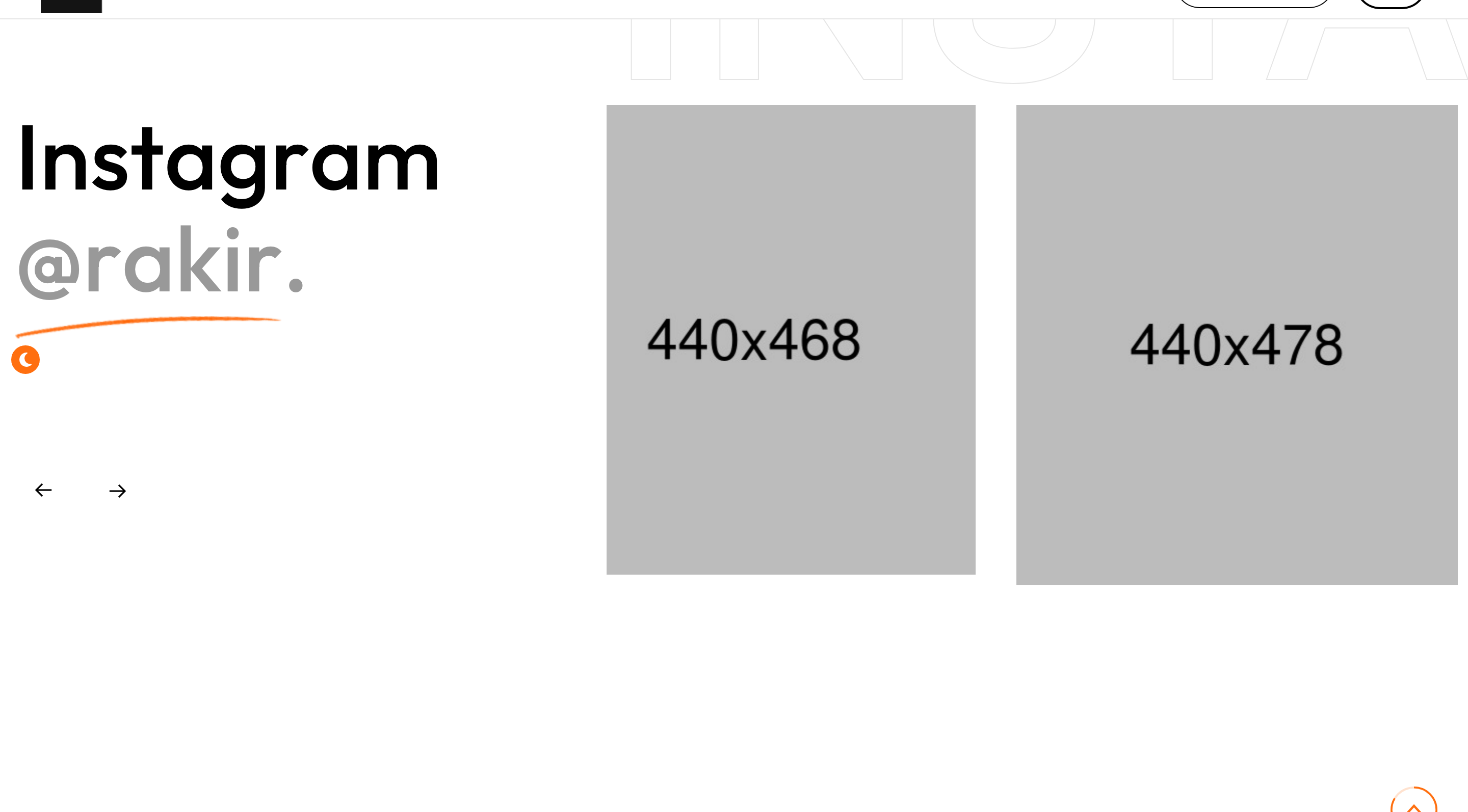
Off-balance Instagram peek section. The left column carries a section title ("Instagram @rakir."), the right carries a multi-image Owl carousel with a giant pale "instagram" watermark behind.
HTML structure (minimal)
<section class="instagram-section">
  <div class="large-container">
    <div class="row">
      <div class="col-lg-4 title-column">
        <div class="sec-title sec-title-animation animation-style2">
          <h2 class="title-animation">Instagram <span>@rakir.</span></h2>
        </div>
      </div>
      <div class="col-lg-8 content-column">
        <div class="content-box">
          <span class="big-text">instagram</span>
          <div class="instagram-carousel owl-carousel owl-theme owl-dots-none nav-style-one">
            <div class="instagram-block-one">
              <figure class="image-box"><a href="#"><img src="instagram-1.jpg"></a></figure>
            </div>
            <!-- repeat -->
          </div>
        </div>
      </div>
    </div>
  </div>
</section>
Key SCSS tokens
.instagram-section .content-box { position: relative; }
.instagram-section .big-text {
  position: absolute; left: -40px; top: 0;
  font-size: 180px; font-weight: 700;
  color: rgba(0,0,0,0.04); pointer-events: none;
  white-space: nowrap;
}
.instagram-block-one .image-box {
  border-radius: 20px; overflow: hidden;
}
.instagram-block-one .image-box img {
  display: block; width: 100%;
  transition: transform .8s;
}
.instagram-block-one:hover .image-box img { transform: scale(1.06); }
Animation logic
$('.instagram-carousel').owlCarousel({
  loop: true, margin: 30, nav: true, dots: false,
  responsive: { 0: {items:1}, 768:{items:2}, 1200:{items:3} }
});
Notable details
- Title-on-the-left, content-on-the-right is the template's house pattern — repeats in services, contact, instagram.
- The watermark word starts off-canvas at -40 px so it bleeds out of the column gracefully.
- Instagram cards are square images only (no caption), keeping the section dense and rhythm fast.
Use when
- Personal portfolios that want a social-feed teaser without the cost of an Instagram API integration.
- Studio sites where a photo carousel should sit visually below the more important blog/work feeds.
Caveats
- Hard-coded images: there is no integration with Instagram's Basic Display API. To go live, plug into a third-party feed proxy.
- The big-text watermark assumes an LTR locale; in RTL it needs
right: -40pxinstead.