footer-contact-form
Форма·Шаблон: Consulo Creative Business Consulting Template·Складність анімації: subtle·Адаптивний: Так
Файли-джерела
- index.html
footer .footer-contact
Бібліотеки
aosbootstrap
Summary
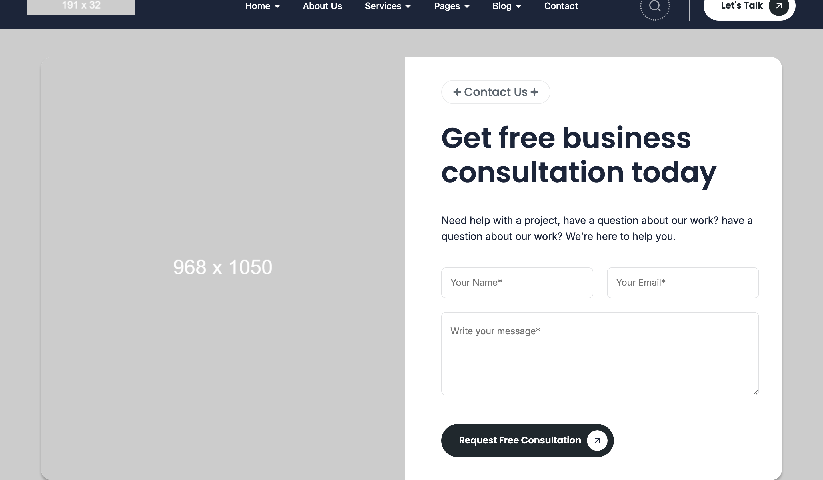
Photo-and-form contact card sitting between the main page and the dark footer. Left half is a tall portrait photo, right half is a contact form with name / email / message inputs and a primary-button submit; the whole card is 18px-rounded and overlays a photographic background.
HTML structure (minimal)
<footer>
  <div class="footer-contact bg-contain"
       style="background-image: url(contact-bg.jpg)">
    <div class="container">
      <div class="contact-box radius18">
        <div class="row">
          <div class="col-12 col-lg-6">
            <div class="contact-media" data-aos="fade-right" data-aos-anchor=".contact-box">
              <img src="contact.jpg" width="1290" height="1400" />
            </div>
          </div>
          <div class="col-12 col-lg-6">
            <div class="contact-form-wrap">
              <div class="contact-box-headings section-headings">
                <div class="subheading text-20 subheading-bg"><span>Contact Us</span></div>
                <h2 class="heading text-50">Let's Discuss Your Project</h2>
              </div>
              <form class="contact-form">
                <div class="form-group">
                  <input type="text" placeholder="Your Name*" required>
                </div>
                <div class="form-group">
                  <input type="email" placeholder="Your Email*" required>
                </div>
                <div class="form-group">
                  <textarea placeholder="Write your message*" rows="4"></textarea>
                </div>
                <button class="button button--primary" type="submit">Send Message →</button>
              </form>
            </div>
          </div>
        </div>
      </div>
    </div>
  </div>
</footer>
Key SCSS tokens
.footer-contact {
  background-size: cover;
  background-position: center;
  padding: 100px 0;
}
.footer-contact .contact-box {
  background: var(--color-background);
  border-radius: 18px;
  overflow: hidden;
  padding: 32px;
}
.contact-form .form-group {
  margin-block-end: 16px;
}
.contact-form input,
.contact-form textarea {
  width: 100%;
  padding: 14px 18px;
  border-radius: var(--style-border-radius-inputs);
  border: var(--style-border-width-inputs) solid var(--color-input-border);
}
.contact-form input:focus,
.contact-form textarea:focus {
  border-color: var(--color-input-hover-border);
  outline: none;
}
Animation logic
// AOS only — data-aos-anchor=".contact-box" makes the photo and the form
// trigger their fade together when the contact card itself crosses the viewport,
// not when each half does individually.
Notable details
data-aos-anchor=".contact-box"is the clever trick: both the photo and the form copy reference the same anchor, so they animate as one unit even though they're 50% apart in the DOM tree.bg-containhere actually paints abackground-imagevia inline style — the parent stays a real<div>rather than a<picture>so it can be a fixed bg via CSS if needed.- The form has no JS handler in
main.js— it's a pure presentational form. You'll need to wire your backend.
Use when
- Pre-footer "Let's talk" CTAs where the contact block should feel like a polished card sitting on imagery, not a boxed-in section.
- Pages where the contact form should appear above the main footer without a separate
/contactredirect. - Anywhere you want the photo + form pair to animate as a single unit on AOS.
Caveats
- No backend integration — the form submits via default HTML POST and will fail without a server endpoint. Replace with
<form action="/api/contact" method="POST">or hook a fetch handler. - No client-side validation beyond
requiredattributes; layer with HTMLpatternor JS if you need richer validation.