project-swiper-carousel
Картка проєкту·Шаблон: Softec - Data Analytics & Software Technology HTML Template·Складність анімації: medium·Адаптивний: Так
Файли-джерела
- index.html
div.tp-project__area
Бібліотеки
swipergsap
Summary
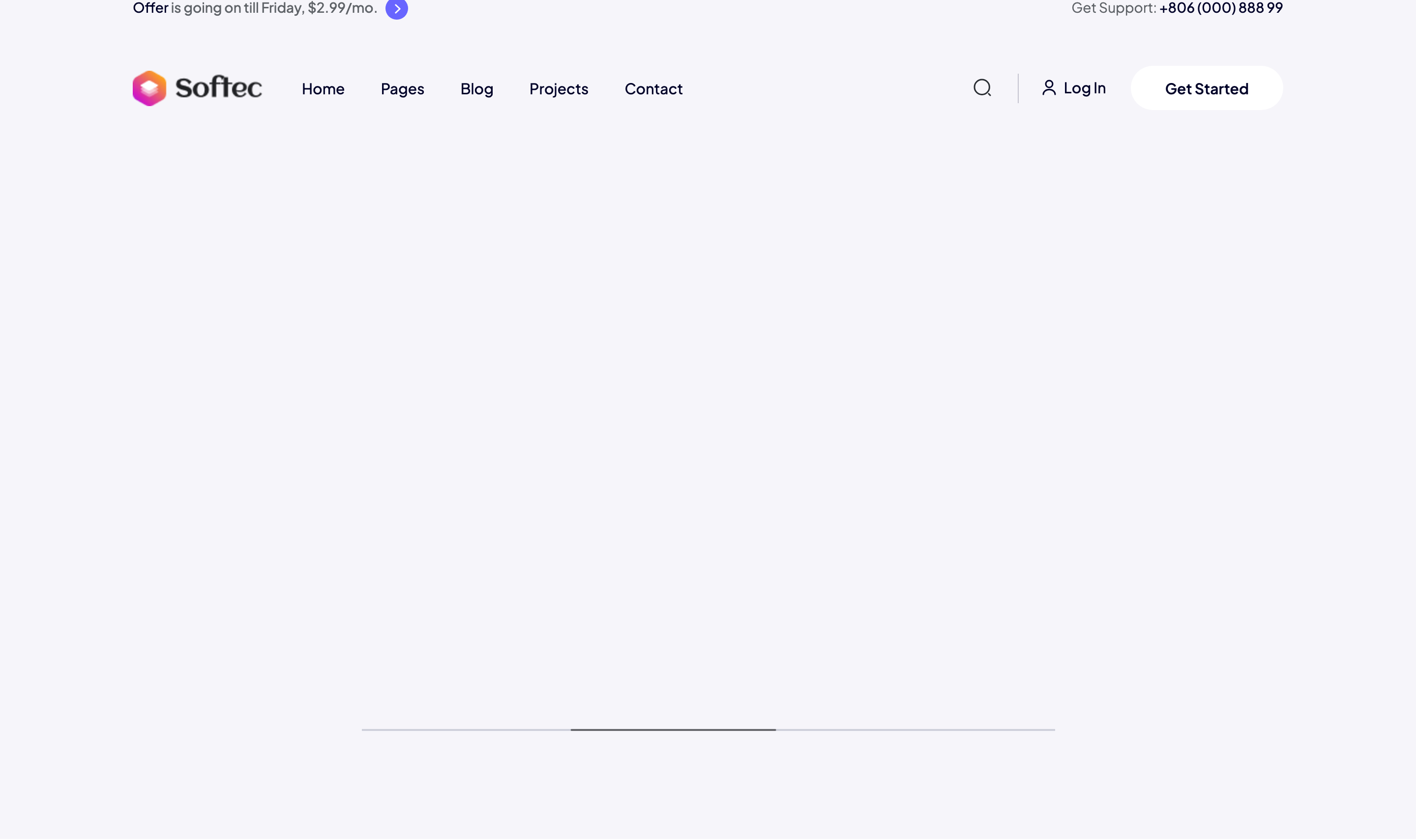
Edge-bleeding Swiper carousel showing 3 project cards at a time. Each card splits into a left image and a right content block with the brand icon, title, paragraph, and a meta row containing client name, budget, and an arrow CTA. A draggable thin scrollbar lives below the deck.
HTML structure (minimal)
<div class="tp-project__area grey-bg pt-50 pb-110 fix">
  <div class="container">
    <div class="row">
      <div class="col-xl-6">
        <div class="tp-project__section-box wow tpfadeLeft">
          <h3 class="tp-section-title">Check Some Of Our Recent Work.</h3>
        </div>
      </div>
    </div>
  </div>
  <div class="container-fluid gx-0">
    <div class="row gx-0"><div class="col-xl-12">
      <div class="tp-project__slider-section">
        <div class="swiper-container tp-project__slider-active">
          <div class="swiper-wrapper">
            <div class="swiper-slide wow tpfadeUp">
              <div class="tp-project__slider-wrapper">
                <div class="tp-project__item d-flex align-items-center">
                  <div class="tp-project__thumb"><img src="project-img-2.jpg"></div>
                  <div class="tp-project__content">
                    <div class="tp-project__brand-icon"><img src="project-brand-1.png"></div>
                    <div class="tp-project__title-box">
                      <h4 class="tp-project__title-sm"><a>Muckup Design</a></h4>
                      <p>Excepteur sint occaecat cupidatat officia non proident…</p>
                    </div>
                    <div class="tp-project__meta d-flex align-items-center">
                      <div class="tp-project__author-info"><span>Client Name</span><h4>Phillip Anthropy</h4></div>
                      <div class="tp-project__budget"><span>Budget</span><h4>$200-250k</h4></div>
                      <div class="tp-project__link"><a><svg>→</svg></a></div>
                    </div>
                  </div>
                </div>
              </div>
            </div>
            <!-- repeat .swiper-slide for each project -->
          </div>
        </div>
        <div class="tp-scrollbar"></div>
      </div>
    </div></div>
  </div>
</div>
Key SCSS tokens
.tp-project {
  &__item {
    background: var(--tp-common-white);
    border-radius: 20px;
    overflow: hidden;
    min-height: 320px;
    box-shadow: 0 30px 60px rgba(1, 16, 61, 0.05);
  }
  &__thumb { flex: 0 0 50%; }
  &__thumb img { width: 100%; height: 100%; object-fit: cover; }
  &__content { padding: 35px; flex: 1 1 auto; }
  &__title-sm a { font-weight: 700; font-size: 24px; color: var(--tp-common-black); }
  &__meta { gap: 24px; margin-top: 25px; }
  &__author-info span,
  &__budget span { font-size: 12px; color: var(--tp-text-body); text-transform: uppercase; }
}
.tp-scrollbar {
  height: 4px; background: var(--tp-border-2); border-radius: 4px;
  margin-top: 50px; max-width: 60%; margin-inline: auto;
}
Animation logic
const serviceswiper = new Swiper('.tp-project__slider-active', {
  loop: true,
  slidesPerView: 3,
  spaceBetween: 30,
  breakpoints: {
    1200: { slidesPerView: 3 },
    992:  { slidesPerView: 1 },
    768:  { slidesPerView: 1 },
    576:  { slidesPerView: 1 },
    0:    { slidesPerView: 1 }
  },
  scrollbar: { el: '.tp-scrollbar', clickable: true }
});
Notable details
- Carousel sits inside
.container-fluidso slides bleed to the viewport edges, but the section title above is constrained to a regular.container— establishes a magazine-style layout split. - Each card is a flex row with image on the left taking 50% width — gives a heavier visual presence than typical 3-column thumbnail grids.
- Swiper is configured with a
loop: trueinfinite track plus a clickable thin scrollbar (tp-scrollbar) instead of dots, keeping the chrome minimal.
Use when
- Portfolio or case-study sections where each item needs richer meta (client, budget) than a thumbnail caption.
- Marketing pages that want carousel interactivity but a magazine-style edge bleed.
- B2B pages emphasizing budget/scope per case study.
Caveats
- Cards have a fixed image-left layout; for portrait-heavy imagery you'll want a separate breakpoint.
loop: trueclones slides; if you bind analytics events to slide nodes, scope by slide id, not DOM index.