services-list
Файли-джерела
- index.html
div.services-section div.services-wrapp
Бібліотеки
jquery
Summary
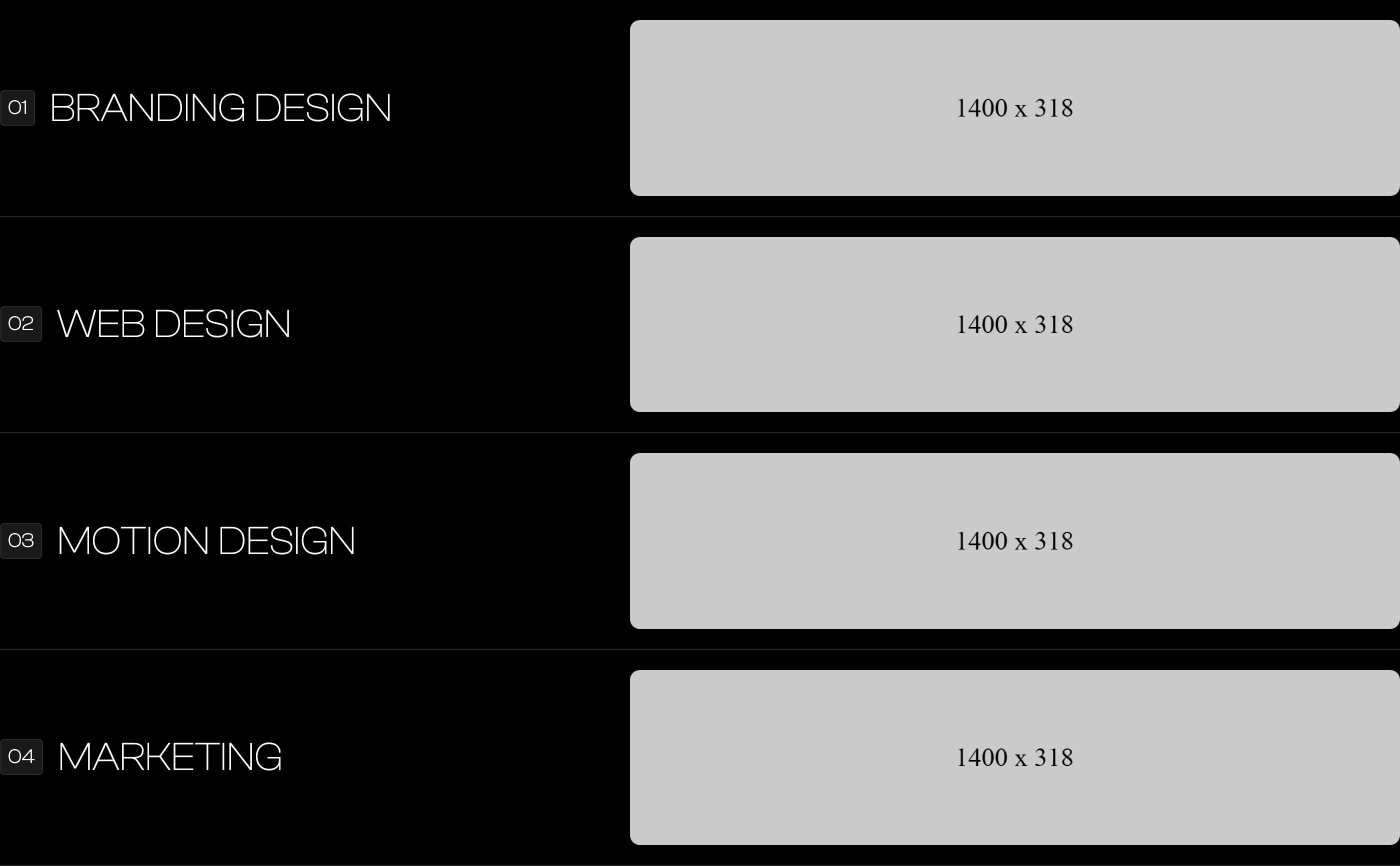
A vertical list of services where each row is a horizontal band: a 01-04 chip on the left, an oversized service name next to it, and a 600px-wide rounded photograph pushed to the far right. Reads like a print contents page rather than icon cards.
HTML structure (minimal)
<div class="services-section">
  <div class="main-container">
    <h2 class="main-title">services</h2>
    <div class="services-wrapp">
      <div class="services-item">
        <div class="service-nunmber">01</div>
        <div class="service-text">Branding Design</div>
        <img src="images/branding.jpg" class="service-img" alt="">
      </div>
      <div class="services-item">
        <div class="service-nunmber">02</div>
        <div class="service-text">Web Design</div>
        <img src="images/motion.jpg" class="service-img" alt="">
      </div>
      <div class="services-item">
        <div class="service-nunmber">03</div>
        <div class="service-text">Motion Design</div>
        <img src="images/webdesign.jpg" class="service-img" alt="">
      </div>
      <div class="services-item">
        <div class="service-nunmber">04</div>
        <div class="service-text">Marketing</div>
        <img src="images/marketing.jpg" class="service-img" alt="">
      </div>
    </div>
  </div>
</div>
Key SCSS tokens
.main-title {
  border-bottom: 1px solid var(--default);  // orange rule under section title
  text-transform: uppercase;
  font-size: 80px;
  font-weight: 600;
  line-height: 50px;
  margin-bottom: 50px;
}
.services-item {
  border-bottom: 1px solid var(--border-color);   // hairline between rows
  padding: 20px 0;
  display: flex;
  align-items: center;
}
.service-nunmber {
  border: 1px solid var(--border-color);
  background-color: #191919;
  border-radius: 4px;
  padding: 7px;
}
.service-text {
  text-transform: uppercase;
  font-size: 40px;
  font-weight: 200;
  line-height: 30px;
  margin-left: 15px;
  flex: none;
}
.service-img {
  border-radius: 10px;
  width: 600px;
  margin-left: auto;       // pushes image to the right edge
  flex: none;
}
Animation logic
// Per-row Webflow IX2 timelines (data-w-id="darkyn10".."darkyn13") fade
// each row in from opacity:0. To rebuild:
//   IntersectionObserver on .services-item; on enter, transition
//   opacity 0→1 and translateY(40px)→0 with a 120ms stagger.
Notable details
- Image
flex: none; margin-left: auto;is the key — it stops the image from collapsing and pins it to the right of any width. - The 80px section title with a 1px orange underline is a design primitive used across the whole template (also used on "who we are", "work", "testimonials", "insights"). Treat
.main-titleas a global section heading. - Text and image live on the same flex row — there is no internal grid — which is why a single rule (
margin-left:auto) is enough to switch between left text + right image.
Use when
- Studios where each service deserves its own hero-class image but you don't want a separate page or a bento grid.
- Long-scroll editorial layouts where readability is more important than visual density.
Caveats
- The 600px fixed image width means the layout breaks below ~991px (image and text wrap); media queries in
style.csshandle this — keep them when porting.