featured-blog-grid
Картка блогу·Шаблон: Consulo Creative Business Consulting Template·Складність анімації: subtle·Адаптивний: Так
Файли-джерела
- index.html
main .featured-blog.section-padding
Бібліотеки
aosbootstrap
Summary
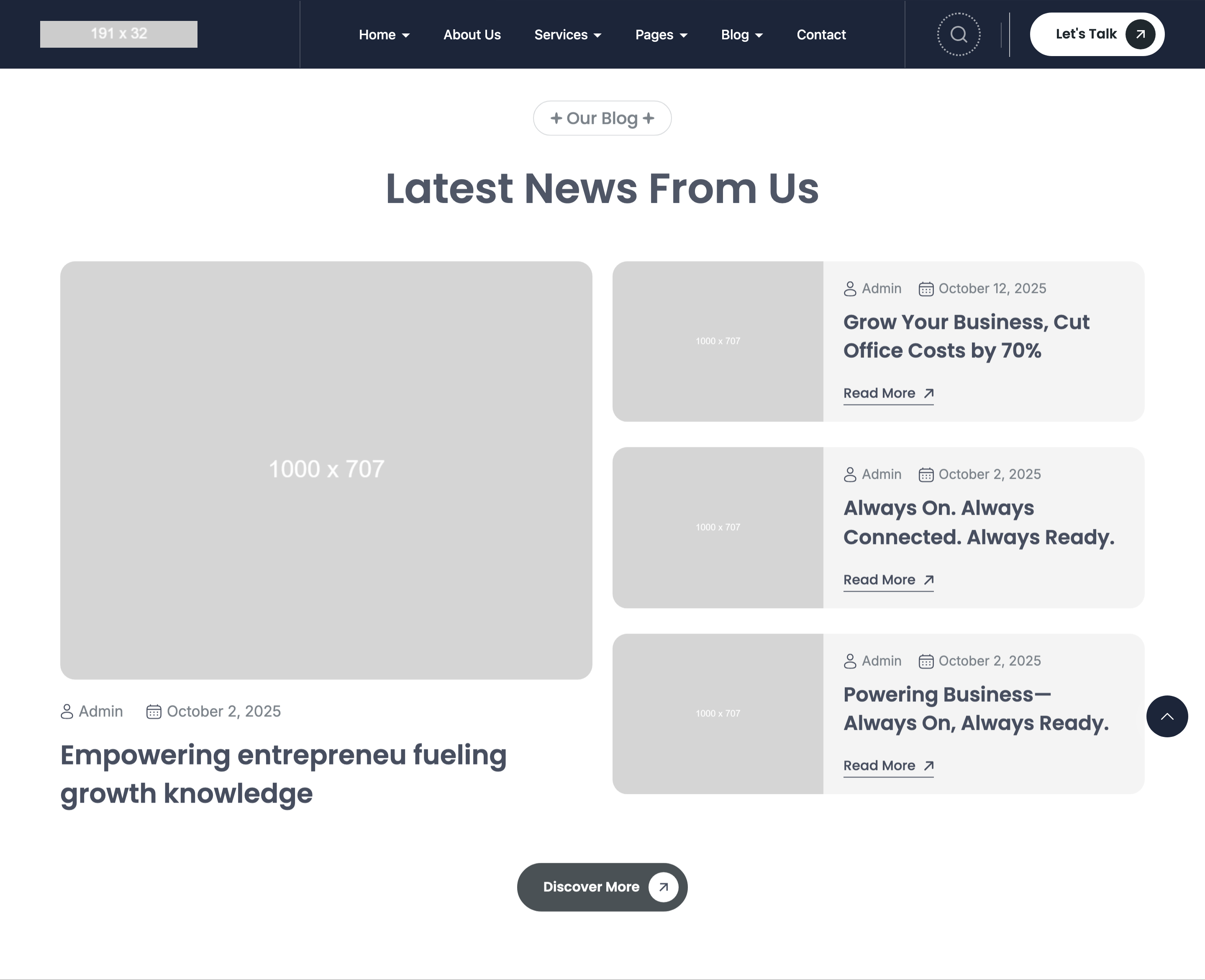
Featured blog band combining one large vertical card on the left (image + meta + title) and two stacked horizontal cards on the right (image-left, content-right with meta + title + CTA arrow). All three share a 18px-radius media frame and identical author/date meta-icon row.
HTML structure (minimal)
<div class="featured-blog bg-transparent section-padding">
  <div class="container">
    <div class="section-headings text-center">
      <div class="subheading subheading-bg text-20"><span>Our Blog</span></div>
      <h2 class="heading text-50">Latest News From Us</h2>
    </div>
    <div class="section-content">
      <div class="row product-grid">
        <div class="col-12 col-xl-6">
          <div class="card-blog-list" data-aos="fade-up">
            <div class="card-blog-list-media radius18">
              <img src="blog/9.jpg" width="1000" height="707" />
            </div>
            <div class="card-blog-meta">
              <div class="card-blog-meta-item text text-18"><svg>👤</svg>Admin</div>
              <div class="card-blog-meta-item text text-18"><svg>📅</svg>October 2, 2025</div>
            </div>
            <h2 class="card-blog-heading heading text-32">
              <a href="blog-details.html">Empowering entrepreneurs fueling growth knowledge</a>
            </h2>
          </div>
        </div>
        <div class="col-12 col-xl-6">
          <div class="horizontal-blogs">
            <div class="card-blog-list-horizontal radius18" data-aos="fade-up">
              <div class="card-blog-list-media"><img src="blog/2.jpg" /></div>
              <div class="card-blog-content">
                <div class="card-blog-meta">…</div>
                <h2 class="card-blog-heading heading text-24">
                  <a href="blog-details.html">Grow Your Business, Cut Office Costs by 70%</a>
                </h2>
                <a class="button--cta" href="blog-details.html">Read More →</a>
              </div>
            </div>
            <!-- second horizontal card -->
          </div>
        </div>
      </div>
    </div>
  </div>
</div>
Key SCSS tokens
.card-blog-list-media.radius18 {
  border-radius: 18px;
  overflow: hidden;
  aspect-ratio: 1000 / 707;
}
.card-blog-meta {
  display: flex;
  gap: 24px;
  margin-block-start: 24px;
}
.card-blog-meta-item {
  display: inline-flex;
  align-items: center;
  gap: 8px;
}
.card-blog-list-horizontal {
  display: grid;
  grid-template-columns: minmax(180px, 35%) 1fr;
  gap: 24px;
  align-items: center;
  padding: 16px;
  margin-block-end: 24px;
}
.button--cta {
  text-decoration: underline;
  text-underline-offset: var(--style-cta-underline-offset);
  text-decoration-thickness: var(--style-cta-underline-thickness);
}
Notable details
- The 6/6 split lets one large editorial card balance two smaller posts without resorting to a 3x1 row of equal-width cards — common pattern but executed cleanly here.
aspect-ratio: 1000 / 707mirrors the source image dimensions, so even if the actual image fails to load, the layout doesn't shift.- The horizontal card's grid template uses
minmax(180px, 35%)for the image so it never collapses below readable size on narrow screens. .button--ctais a global underline-style CTA with custom-property control over offset and thickness — used everywhere the template needs a "Read More" link.
Use when
- Blog landings that want one hero post plus two recent posts in a single "Latest News" band.
- Inner pages where you need a list of related articles in compact horizontal cards.
- Any 1-large-+-2-small editorial split.
Caveats
- The horizontal cards don't have a hover state defined — add
:hover { background: rgba(0,0,0,0.04) }if you want feedback. - Meta-icons are inlined SVGs in HTML rather than from a sprite — long-term maintainers should consider extracting a
<symbol>sheet if they expand the blog template.