recent-projects-mosaic
Картка проєкту·Шаблон: Consulo Creative Business Consulting Template·Складність анімації: subtle·Адаптивний: Так
Файли-джерела
- index.html
main .recent-project.mt-100
Бібліотеки
aosbootstrap
Summary
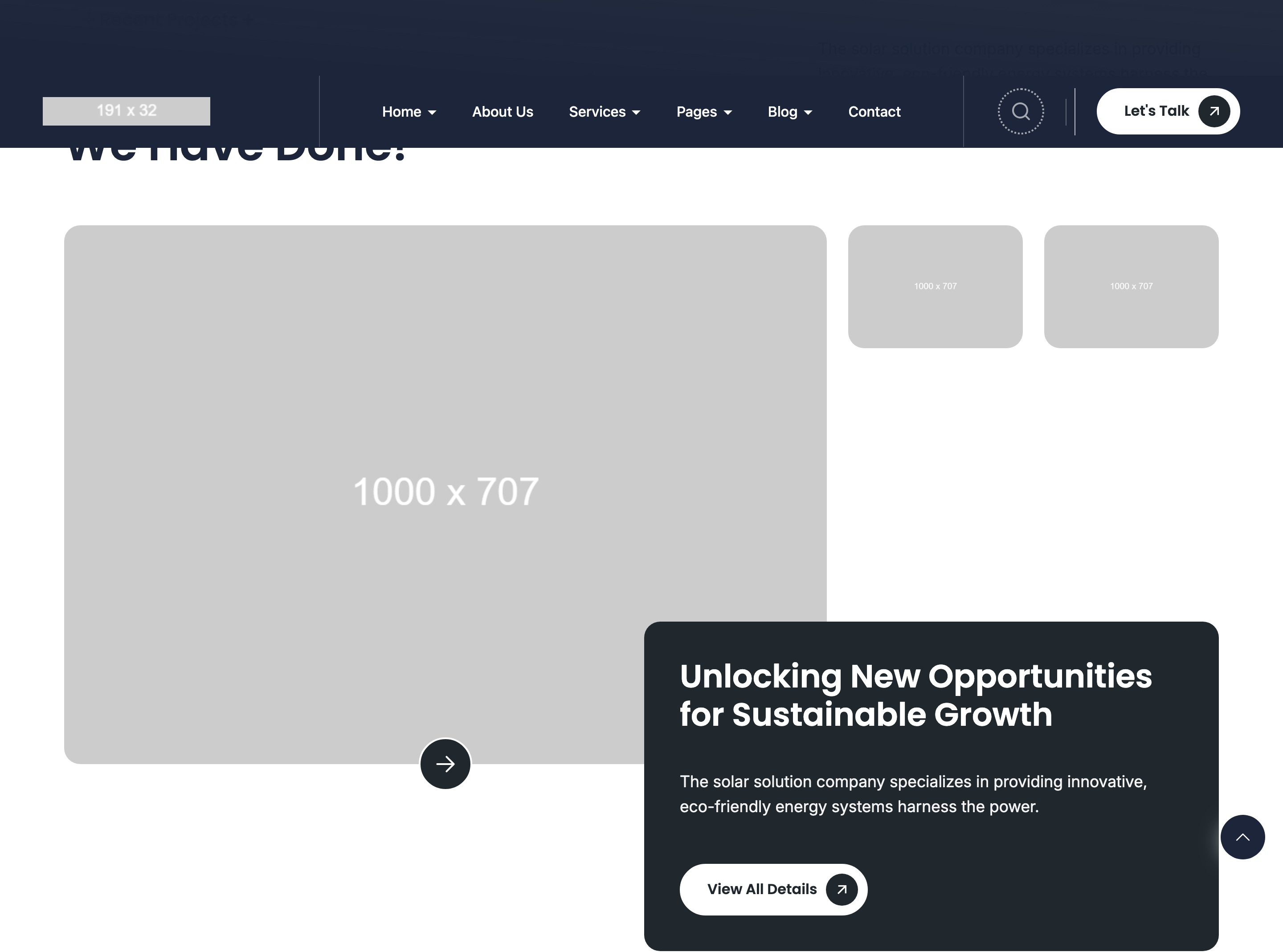
Asymmetric magazine-style project layout with one 8/12 hero image plus two 6/6 stacked thumbnails on the right (4/12), an arrow-CTA pinned to the hero, and a rounded summary card below carrying headline + paragraph + CTA. Headings use the section-headings-horizontal split layout.
HTML structure (minimal)
<div class="recent-project mt-100">
  <div class="container">
    <div class="section-headings section-headings-horizontal">
      <div class="section-headings-left">
        <div class="subheading text-20 subheading-bg"><span>Recent Projects</span></div>
        <h2 class="heading text-50">Explore the Recent Works We Have Done!</h2>
      </div>
      <div class="section-headings-right text text-18">
        Solar solutions copy describing the work…
      </div>
    </div>
    <div class="project-media">
      <div class="row">
        <div class="col-lg-8 col-12">
          <div class="project-img-large">
            <div class="project-img radius18" data-aos="zoom-in-up">
              <img src="project/1.jpg" />
            </div>
            <a href="project.html" class="project-media-button button button--primary"
               data-aos="zoom-in-up"><svg>→</svg></a>
          </div>
        </div>
        <div class="col-lg-4 col-12">
          <div class="row project-img-small">
            <div class="col-6">
              <div class="project-img radius18" data-aos="fade-left">
                <img src="project/2.jpg" />
              </div>
            </div>
            <div class="col-6">
              <div class="project-img radius18" data-aos="fade-left" data-aos-delay="200">
                <img src="project/3.jpg" />
              </div>
            </div>
          </div>
        </div>
      </div>
    </div>
    <div class="project-content radius18 section-headings" data-aos="fade-up">
      <h2 class="heading text-36">Unlocking New Opportunities for Sustainable Growth</h2>
      <div class="text text-18">Solar solutions paragraph…</div>
      <div class="project-button buttons">
        <a href="project.html" class="button button--secondary">View All Details</a>
      </div>
    </div>
  </div>
</div>
Key SCSS tokens
.section-headings-horizontal {
  display: flex;
  justify-content: space-between;
  align-items: end;
  gap: 32px;
}
.project-img.radius18 {
  border-radius: 18px;
  overflow: hidden;
}
.project-img-large {
  position: relative;
}
.project-media-button {
  position: absolute;
  bottom: 24px; right: 24px;
  z-index: 5;
}
.project-content.radius18 {
  background: var(--color-background);
  border-radius: 18px;
  padding: 48px;
  margin-block-start: 32px;
}
Animation logic
// Pure AOS — different attributes per tile create the mosaic rhythm.
// The hero tile fades in with zoom-in-up, both thumbnails with fade-left;
// the second thumbnail uses data-aos-delay="200" so it reads after the first.
Notable details
- The 8/4 + 6/6 nested grid produces a "one big + two small" layout that breaks the usual 3x2 portfolio grid without needing a bento library.
- The arrow CTA is
position: absoluteover the hero tile — pinning it bottom-right turns the image itself into the click target while keeping the button visually distinct. radius18is a custom 18px-radius utility used template-wide for cards and image tiles, giving every section a consistent corner geometry.
Use when
- Portfolio reels where you want one signature project front-and-center with secondary work tucked beside it.
- Case-study landings that need a hero + supporting visuals + summary stack in a single section.
- Replace a 3x2 portfolio grid for a more editorial feel without writing custom layout CSS.
Caveats
- The two thumbnails share
col-6inside acol-lg-4, which makes them tiny on tablet — verify image legibility onlgbreakpoint or simplify the right column. - The
.project-contentcard overlaps the bottom of the project-media row only via vertical margin, not negative offset. If you want it to "float" over the images, addmargin-block-start: -60pxand a higherz-index.