blog-list
Файли-джерела
- index.html
div.blog-section div.blog-list
Бібліотеки
jquery
Summary
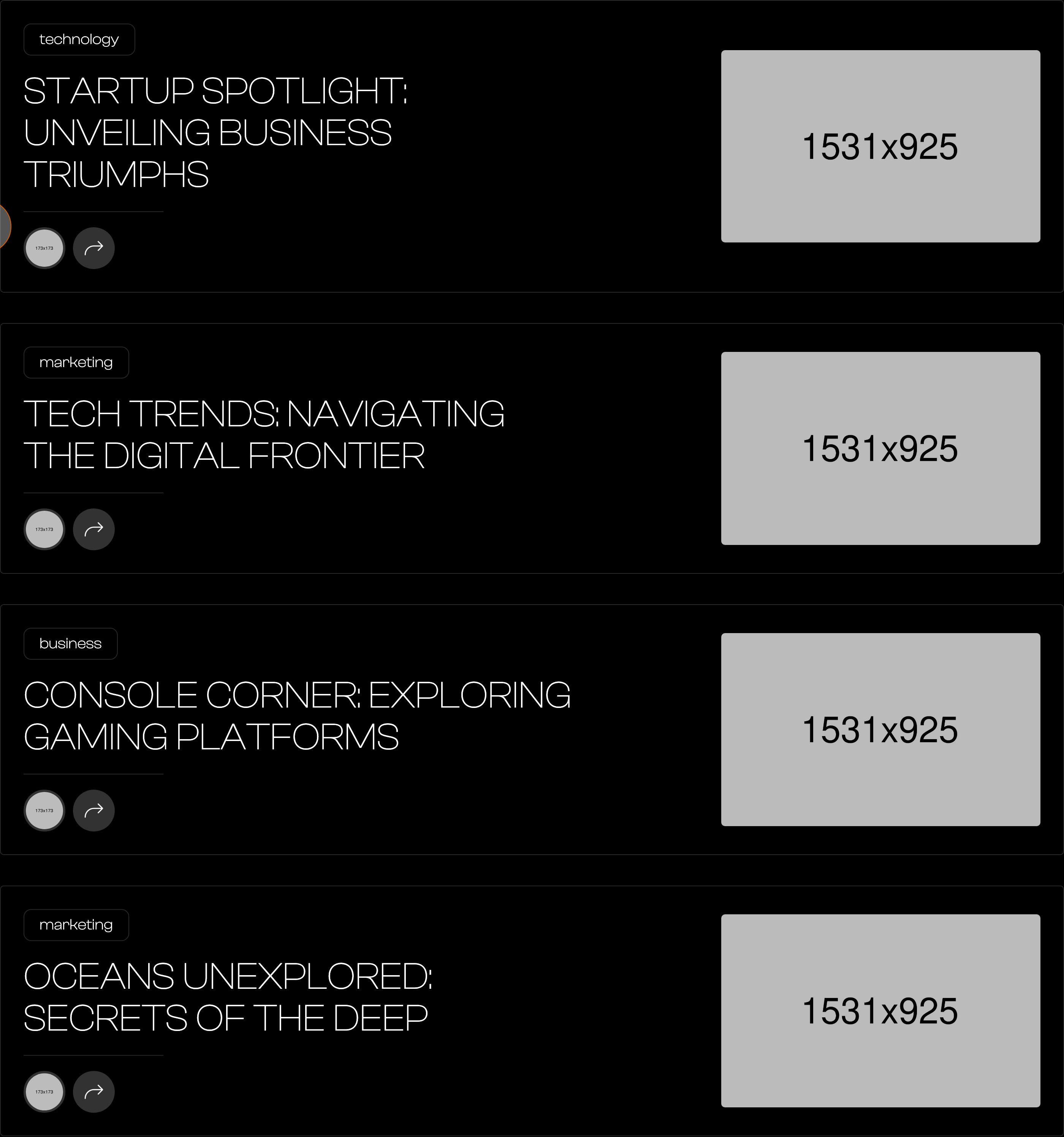
A vertical stack of blog rows under the "insights" heading. Each row is a single bordered, rounded card with: category chip, large uppercase title, an author avatar + circular arrow button on the left side; and a 390px right-aligned thumbnail.
HTML structure (minimal)
<div class="blog-section">
  <div class="main-container">
    <h2 class="main-title">insights</h2>
    <div class="blog-list-wrapper">
      <div class="blog-list">

        <a href="singleblog.html" class="blog-item">
          <div class="blog-left">
            <div class="blog-category">technology</div>
            <h2 class="blog-heading">Startup Spotlight: Unveiling Business Triumphs</h2>
            <div class="blog-author-and-arrow">
              <img src="images/author2.png" class="blog-author" alt="">
              <div class="blog-arrow">
                <img src="images/bend-up-right-light.png" class="blog-arrow-icon" alt="">
              </div>
            </div>
          </div>
          <img src="images/post1.jpg" class="blog-image" alt="">
        </a>

        <a href="singleblog.html" class="blog-item">
          <div class="blog-left">
            <div class="blog-category">marketing</div>
            <h2 class="blog-heading">Tech Trends: Navigating the Digital Frontier</h2>
            <div class="blog-author-and-arrow">
              <img src="images/author3.png" class="blog-author" alt="">
              <div class="blog-arrow"><img src="images/bend-up-right-light.png" class="blog-arrow-icon" alt=""></div>
            </div>
          </div>
          <img src="images/post2.jpg" class="blog-image" alt="">
        </a>

      </div>
    </div>
  </div>
</div>
Key SCSS tokens
.blog-list {
  display: grid;
  grid-template-columns: 1fr;
  grid-row-gap: 40px;
}
.blog-item {
  border: 1px solid var(--border-color);
  border-radius: 5px;
  padding: 30px;
  display: flex;
  align-items: center;
  text-decoration: none;
  cursor: pointer;
}
.blog-left { flex: 1; padding: 0; }
.blog-category {
  border: 1px solid var(--border-color);
  color: var(--white);
  border-radius: 10px;
  padding: 10px 20px;
  display: inline-block;
}
.blog-heading {
  text-transform: uppercase;
  font-size: 40px;
  font-weight: 200;
  line-height: 44px;
  width: 80%;
  margin-bottom: 0;
}
.blog-author-and-arrow {
  border-top: 1px solid var(--border-color);
  width: 20%;
  margin-top: 20px;
  padding-top: 20px;
  display: flex;
}
.blog-author {
  width: 55px;
  height: 55px;
  border-radius: 50%;
  border: 3px solid #333;
  object-fit: cover;
}
.blog-arrow {
  width: 55px;
  height: 55px;
  border-radius: 50%;
  background-color: #333;
  margin-left: 10px;
  display: flex;
  align-items: center;
  justify-content: center;
}
.blog-arrow-icon { width: 25px; }
.blog-image {
  width: 390px;
  border-radius: 5px;
  margin-left: auto;
}
Animation logic
// Each row uses data-w-id="darkyn01" for the row entrance and "darkyn44"
// for the image's vertical-scale reveal (the third/fourth rows have
// scale3d(1, 0, 1) inline — Webflow IX2 then animates scaleY 0→1).
// Equivalent: clip-path or scaleY transform driven by IntersectionObserver.
Notable details
- The card is one big
<a>— clicking anywhere navigates to the article. The "arrow" is decorative, not a separate link. - Author + arrow live in a 20%-wide column with a hairline above them, separating "meta" from the title visually without a second card.
- The image is vertically clipped on the third/fourth rows by default (scale3d(1, 0, 1)) and IX2 reveals it by scaling Y to 1 — a polished entrance you can copy with
clip-path: inset(50% 0)→0.
Use when
- Editorial / agency blogs where the headline deserves to be 40px and the image is a supporting actor.
- Pages where you want fewer, larger entries rather than a 3-up card grid.
Caveats
- The 80% / 20% column split inside
.blog-leftassumes long-ish titles and a small author/arrow column — short titles will leave dead space; very long titles will wrap to 4+ lines.