award-hover-thumb
Статистика·Шаблон: Liko - Creative Agency & Portfolio Next.js Template·Складність анімації: medium·Адаптивний: Так
Файли-джерела
- out/index.html
div.tp-award-area .tp-award-list-wrap
Бібліотеки
gsapsplittext
Summary
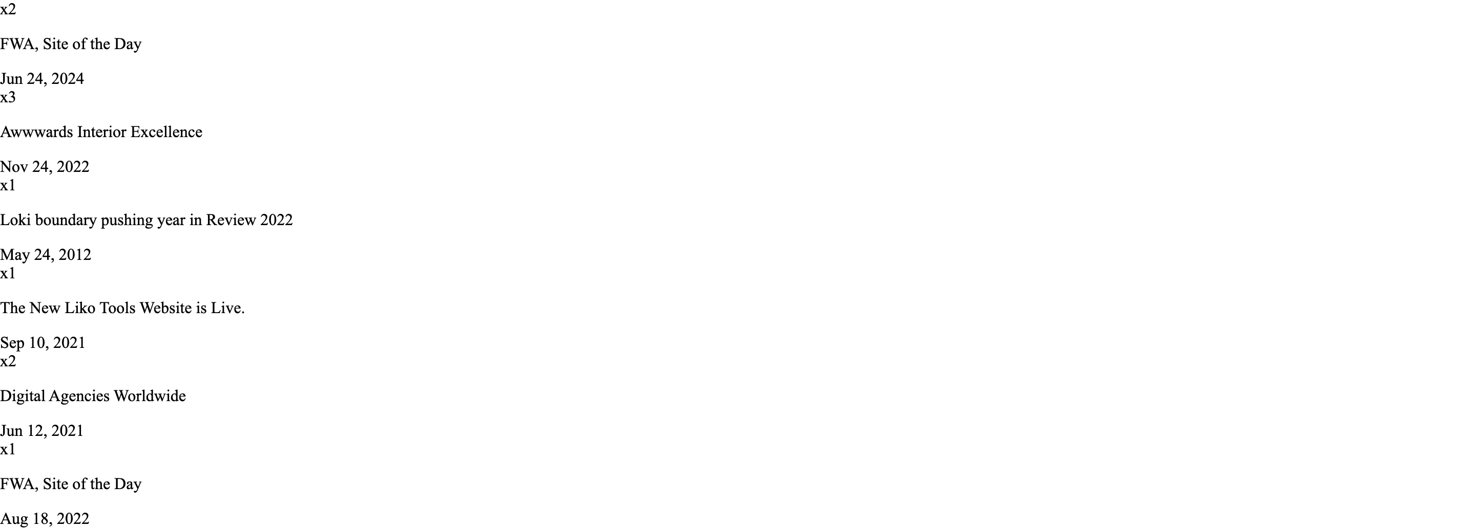
An awards/recognition list where each row's onMouseEnter flips React state to make the corresponding image visible in a sticky left column. The list itself shows count badge ("x2"), title and date, separated by hairline dividers.
HTML structure (minimal)
<div class="tp-award-area pt-125 pb-125">
  <div class="container container-1630">
    <div class="row">
      <div class="col-xxl-6 col-xl-7">
        <div class="tp-award-title-box">
          <h4 class="tp-section-title tp-char-animation">Awards <br><span>& Recognitions</span></h4>
        </div>
      </div>
    </div>
    <div class="row">
      <div class="col-xl-4">
        <div class="tp-award-list-thumb-wrap p-relative">
          <div id="tp-award-thumb" class="tp-award-list-thumb-1">
            <img class="tp-award-list-thumb-1" src="/award-1.png" alt="">
            <!-- one image per award -->
          </div>
        </div>
      </div>
      <div class="col-xl-8">
        <div class="tp-award-list-wrap">
          <div class="tp-award-list-item d-flex align-items-center justify-content-between tp_fade_bottom" rel="tp-award-list-thumb-1">
            <div class="tp-award-list-content-left d-flex align-items-center">
              <span>x2</span><p>FWA, Site of the Day</p>
            </div>
            <div class="tp-award-list-content-right"><span>Jun 24, 2024</span></div>
          </div>
          <!-- more rows -->
        </div>
      </div>
    </div>
  </div>
</div>
Key SCSS tokens
.tp-award-list-item {
  padding-block: 40px;
  border-bottom: 1px solid var(--tp-border-1);
  cursor: pointer;
  transition: padding-left .4s ease;
  &:hover { padding-left: 16px; }
}
.tp-award-list-content-left span { font-size: 14px; color: var(--tp-common-orange); margin-right: 24px; }
.tp-award-list-content-left p { font-size: 24px; }
#tp-award-thumb { position: relative; height: 360px; }
#tp-award-thumb img { position: absolute; inset: 0; opacity: 0; transition: opacity .4s ease; }
#tp-award-thumb.tp-award-list-thumb-1 .tp-award-list-thumb-1 { opacity: 1; }
#tp-award-thumb.tp-award-list-thumb-2 .tp-award-list-thumb-2 { opacity: 1; }
// …one rule per award index
Animation logic
const [activeThumb, setActiveThumb] = React.useState(1);
// On row hover:
onMouseEnter={() => setActiveThumb(item.id)}
// Container className interpolates: `tp-award-list-thumb-${activeThumb}` → CSS shows
// only the matching image via opacity rules above.
Notable details
- React
useStatedoes the swap, not CSS sibling tricks — survives SSR, focus events and keyboard nav can be added easily. - Padding-left transition on hover gives the row a subtle "click-in" affordance without animating colour.
- The label/date columns share
justify-content-between, so adding a longer description just stretches the middle.
Use when
- Press / awards / case-study indexes where the right-side text is the primary content but a visual reinforcement helps memorability.
- Bibliography or publication lists with covers.
Caveats
- Requires one
tp-award-list-thumb-NSCSS rule per row — code-gen if you go beyond 6–8 entries.