feature-cards
Можливості·Шаблон: Lawgist – Attorney & Lawyers HTML Template·Складність анімації: subtle·Адаптивний: Так
Файли-джерела
- index.html
section.feature_wrapper
Бібліотеки
bootstrapjquery
Summary
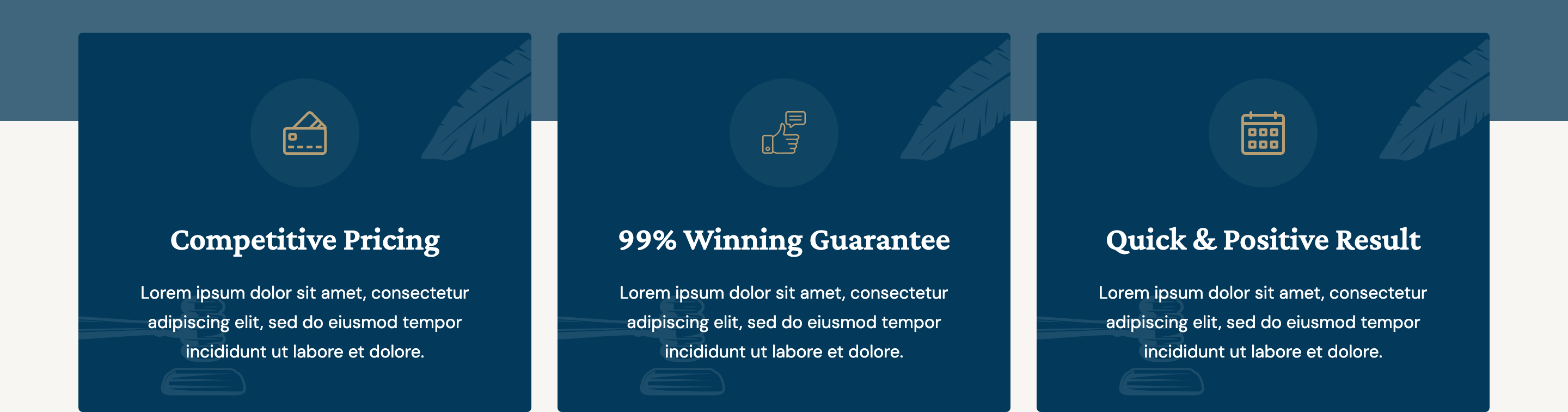
Three icon-led white feature cards designed to overlap the bottom of the hero section, each with a leaf and gavel SVG flourish anchored at opposite corners so the otherwise generic three-up grid reads as theme-specific.
HTML structure (minimal)
<section class="feature_wrapper">
  <div class="container">
    <div class="row">
      <div class="col-lg-4 mt-30">
        <div class="single_feature_item wow fadeInUp" data-wow-duration="1s">
          <div class="single_feature_widget">
            <div class="single_icon"><img src="icons/card.svg" alt=""></div>
            <div class="single_content">
              <h4>Competitive Pricing</h4>
              <p>Lorem ipsum dolor sit amet, consectetur adipiscing elit.</p>
            </div>
          </div>
          <div class="law_element_1"><img src="leaf.svg" alt=""></div>
          <div class="law_element_2"><img src="law_hamer.svg" alt=""></div>
        </div>
      </div>
      <!-- Card 2: 99% Winning Guarantee, data-wow-duration="1.5s" -->
      <!-- Card 3: Quick & Positive Result, data-wow-duration="2s" -->
    </div>
  </div>
</section>
Key SCSS tokens
.feature_wrapper {
  position: relative;
  margin-top: -120px; /* lifts the row into hero overlap */
  z-index: 5;

  .single_feature_item {
    position: relative;
    background: #fff;
    padding: 40px 30px;
    border-radius: 4px;
    box-shadow: 0 12px 40px rgba(34,33,39,0.08);
    overflow: hidden;

    h4 { font-family: 'Crimson Pro', serif; color: #222127; }
    .single_icon img { width: 56px; height: 56px; }

    .law_element_1 { position: absolute; top: 14px; right: 18px; opacity: .6; }
    .law_element_2 { position: absolute; bottom: 14px; left: 18px; opacity: .15; }
  }
}
Animation logic
// Wave entrance: durations tuned per card to play as a stagger
// Card 1: 1s,  Card 2: 1.5s,  Card 3: 2s
new WOW().init();
Notable details
- Negative
margin-toplifts the row into the hero's bottom edge — a "card-shelf" pattern that ties the two sections without bespoke clip-paths. - Two decorative SVGs per card (leaf in one corner, gavel in the other) make the same card markup feel niche-themed; swap the SVG pair to retarget the template (medical = stethoscope/cross, agriculture = wheat/hand).
- WOW durations grow per sibling (1s → 1.5s → 2s) so the entrance feels like a wave rather than a sync.
Use when
- You need a "trust badges" row sitting between hero and the first content section.
- Your brand has two recurring icon motifs you can place asymmetrically inside cards.
- Audience expects a traditional, formal layout (law, finance, family services).
Caveats
- The negative
margin-toponly looks right when the hero has bottom padding ≥ ~120px. - Decorative SVGs are not inside the card content flow — make sure your
box-shadowoverflow doesn't clip them on small screens. - All three cards share the same body copy in the source; rewrite per service.