about-experience
Команда·Шаблон: Davies - Personal Portfolio HTML Template·Складність анімації: medium·Адаптивний: Так
Файли-джерела
- index.html
section.section-about-me
Бібліотеки
gsapsplittext
Summary
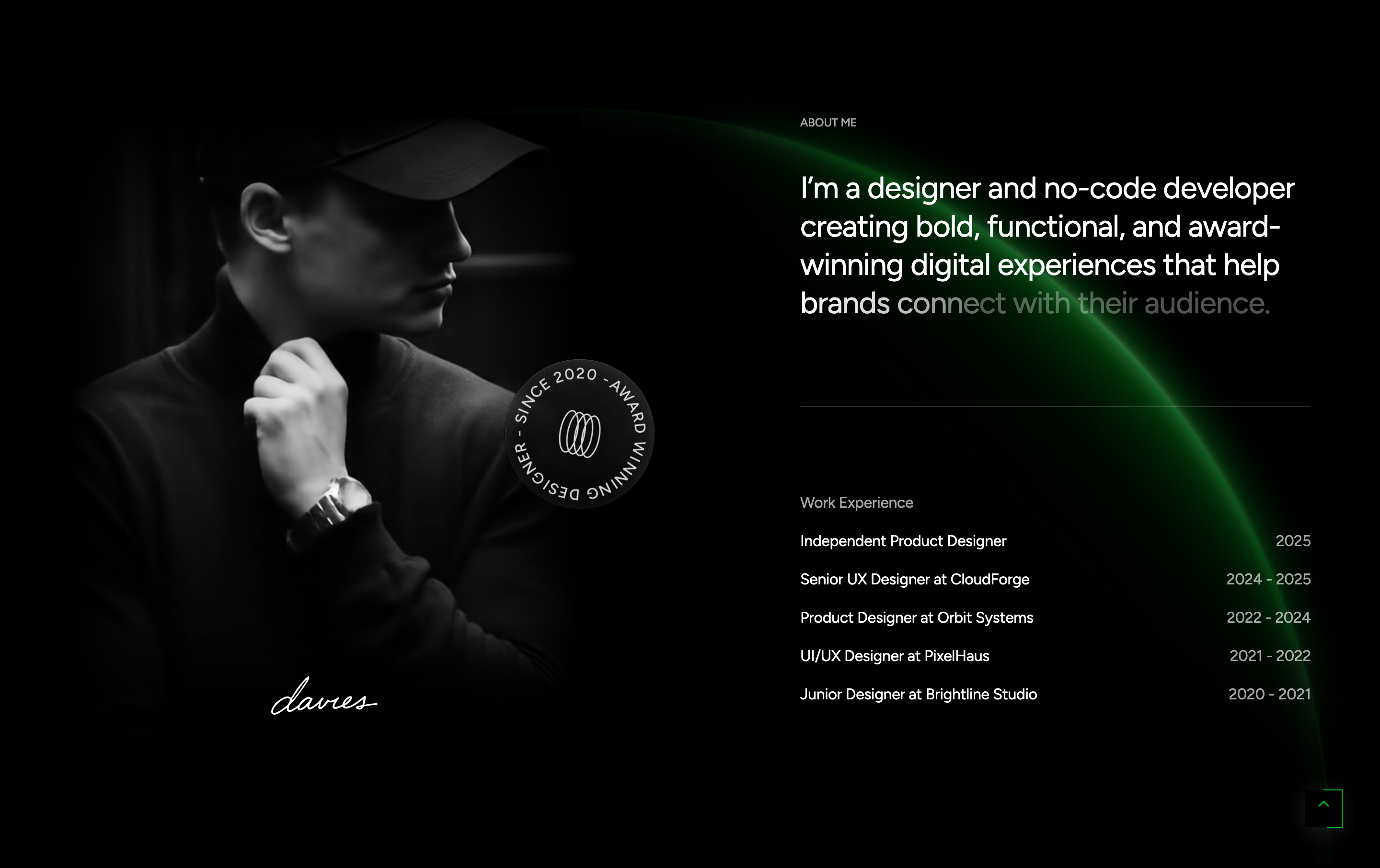
A two-column "About Me" section: on the left, a portrait video plays on loop with two corner overlays, an "agency-design" badge, and a signature SVG. On the right, a SplitText paragraph lights up character by character on scroll, followed by a fade-up work-experience timeline.
HTML structure (minimal)
<section class="section-about-me flat-spacing" id="aboutScroll">
  <div class="s-img-bg"><img src="assets/images/section/bg-about.jpg" alt="Background"></div>
  <div class="container position-relative z-5">
    <div class="row">
      <div class="col-lg-5">
        <div class="col-left">
          <div class="davies-video">
            <video class="video" muted autoplay loop playsinline>
              <source src="assets/images/video/davies-video.mp4" type="video/mp4">
            </video>
            <div class="overlay v1"></div>
            <div class="overlay mark-1"></div>
            <div class="overlay mark-2"></div>
          </div>
          <div class="signature"><img src="assets/images/logo/davies-small.svg" alt=""></div>
          <div class="badget"><img src="assets/images/item/badge-design.png" alt=""></div>
        </div>
      </div>
      <div class="offset-lg-1 col-lg-6 offset-xl-2 col-xl-5">
        <div class="col-right">
          <h6 class="mini-title text-caption text-white-64">ABOUT ME</h6>
          <div class="text-color-change">
            <h5 class="desc fw-normal">I'm a designer and no-code developer creating bold, functional, and award-winning digital experiences…</h5>
          </div>
          <div class="br-line"></div>
          <ul class="experience-list">
            <li>Work Experience</li>
            <li class="effectFade fadeRight"><p class="exp_name">Independent Product Designer</p><p class="exp_year">2025</p></li>
            <li class="effectFade fadeRight"><p class="exp_name">Senior UX Designer at CloudForge</p><p class="exp_year">2024 - 2025</p></li>
            <!-- … -->
          </ul>
        </div>
      </div>
    </div>
  </div>
</section>
Key SCSS tokens
.section-about-me {
  position: relative;

  .davies-video {
    position: relative;
    border-radius: 16px;
    overflow: hidden;
    aspect-ratio: 4 / 5;

    .video { width: 100%; height: 100%; object-fit: cover; }
    .overlay { position: absolute; inset: 0; }
    .overlay.v1 { background: linear-gradient(180deg, rgba(0,0,0,0) 60%, rgba(0,0,0,0.4) 100%); }
  }

  .badget {
    position: absolute;
    right: 0;
    bottom: 0;
    transform: translate(20%, 20%);
    animation: spin 12s linear infinite;
  }

  .experience-list {
    li { display: flex; justify-content: space-between; padding: 16px 0; border-bottom: 1px solid var(--white-16); }
  }
}
Animation logic
// assets/js/gsapAnimation.js — changetext()
$el.wordSplit = new SplitText($el, { type: 'words', wordsClass: 'word-wrapper' });
$el.charSplit = new SplitText($el.wordSplit.words, { type: 'chars', charsClass: 'char-wrapper' });
gsap.set($el.charSplit.chars, { color: '#FFFFFF52' });
gsap.to($el.charSplit.chars, {
  color: '#ffffff',
  stagger: { each: 0.03, from: 'start' },
  ease: 'power2.out',
  scrollTrigger: { trigger: $el, start: 'top 70%', end: 'bottom 20%', scrub: true, toggleActions: 'play none none reverse' },
});
Notable details
text-color-changeis a generic SplitText hook — applied here on the bio paragraph but reusable on any heading-like block.- The badge spins forever via a CSS
@keyframes spin— paired with the static signature SVG it gives the corner a "design-studio" garnish. - Experience rows fade in from the right one by one as the column scrolls into view (the
fadeRightentries ineffectFade).
Use when
- About sections where the headline copy is long and you want it to read as a typed reveal.
- Pages that need a "studio personality" detail like a spinning badge or signature mark.
Caveats
- SplitText is a paid GSAP plugin (Club GreenSock). Verify your licence before shipping.
- The portrait video file is ~MB-scale; for performance, swap to a poster + lazy
<video>on mobile.