trendy-collection-tabs
Сортування/фільтр·Шаблон: Addina - Multipurpose eCommerce HTML Template·Складність анімації: subtle·Адаптивний: Так
Файли-джерела
- index.html
section.fruniture-trendy
Бібліотеки
bootstrapswiperjquery
Summary
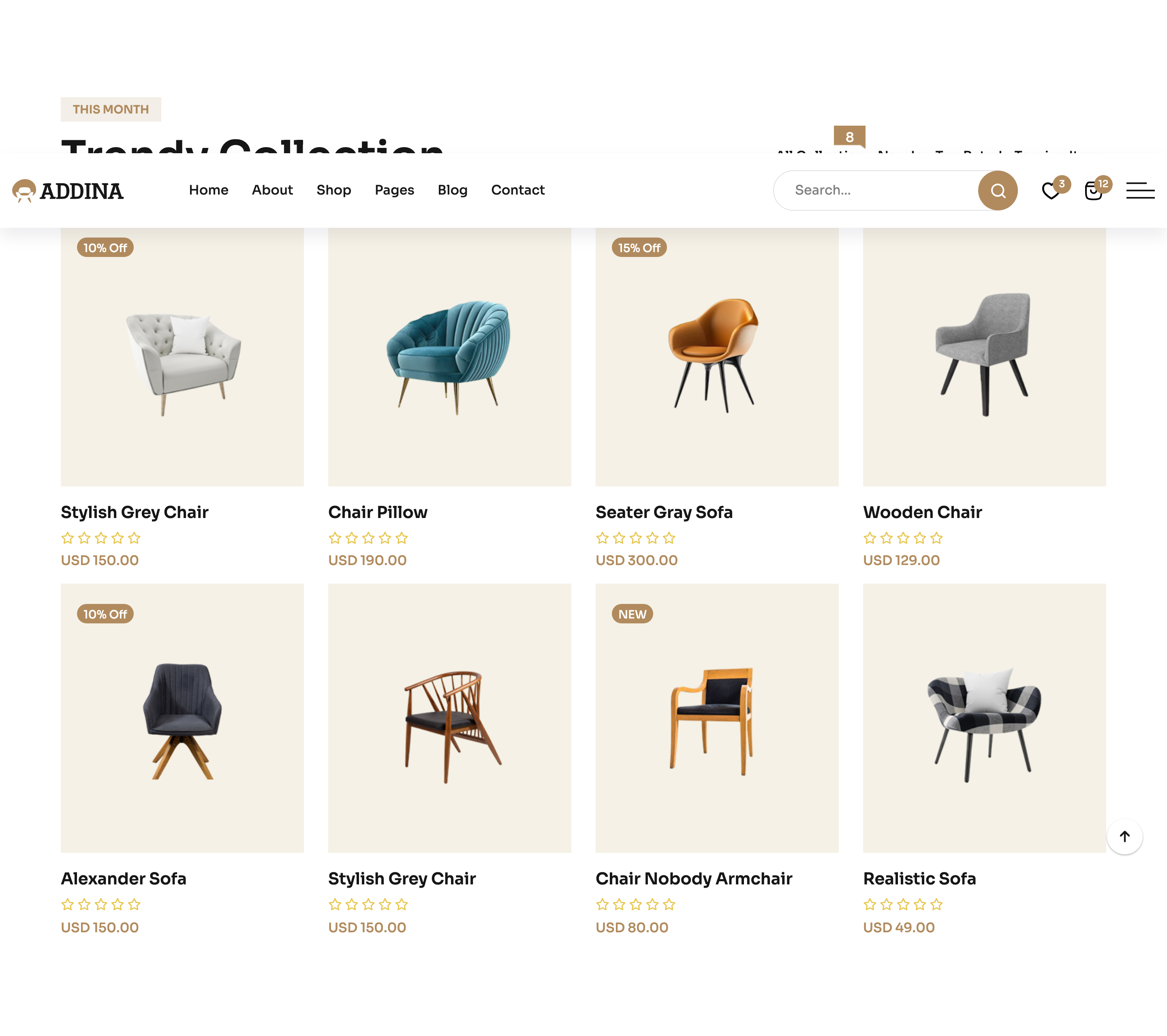
Section header pairs a "THIS MONTH / Trendy Collection" title with a Bootstrap nav-tabs filter (All Collection, New In, Top, Trendy) above a Swiper-driven product grid where each tab pane keeps its own slider state.
HTML structure (minimal)
<section class="fruniture-trendy section-space">
  <div class="container">
    <div class="furniture-trendy__header">
      <div class="section-title-wrapper-4 mb-40">
        <span class="section-subtitle-4 mb-10">THIS MONTH</span>
        <h2 class="section-title-4">Trendy Collection</h2>
      </div>
      <div class="bd-product__filter-style furniture-trendy__tab nav nav-tabs" role="tablist">
        <button class="nav-link active" data-bs-toggle="tab" data-bs-target="#collection" type="button" role="tab">All Collection</button>
        <button class="nav-link" data-bs-toggle="tab" data-bs-target="#new" type="button" role="tab">New In</button>
        <button class="nav-link" data-bs-toggle="tab" data-bs-target="#top" type="button" role="tab">Top</button>
        <button class="nav-link" data-bs-toggle="tab" data-bs-target="#trendy" type="button" role="tab">Trendy</button>
      </div>
    </div>
    <div class="tab-content">
      <div class="tab-pane fade show active" id="collection" role="tabpanel">
        <div class="row g-4">
          <!-- product cards -->
        </div>
      </div>
      <div class="tab-pane fade" id="new" role="tabpanel">…</div>
      <div class="tab-pane fade" id="top" role="tabpanel">…</div>
      <div class="tab-pane fade" id="trendy" role="tabpanel">…</div>
    </div>
  </div>
</section>
Key SCSS tokens
.furniture-trendy__header {
  display: flex;
  justify-content: space-between;
  align-items: flex-end;
  flex-wrap: wrap;
  gap: 20px;
}
.bd-product__filter-style {
  border: none;
  gap: 6px;
  .nav-link {
    border: 1px solid rgba(85,85,85,.2);
    border-radius: 30px;
    padding: 10px 22px;
    color: var(--clr-text-body);
    background: transparent;
    &.active {
      background: var(--clr-theme-primary);
      color: var(--clr-common-white);
      border-color: var(--clr-theme-primary);
    }
  }
}
Animation logic
// Bootstrap handles tab switching; Swiper instances live inside each tab-pane
// and are re-initialised once the pane becomes visible.
new Swiper(".trendy-active", {
  slidesPerView: 4,
  spaceBetween: 30,
  navigation: { nextEl: ".trendy-button-next", prevEl: ".trendy-button-prev" },
  breakpoints: {
    0:    { slidesPerView: 1 },
    768:  { slidesPerView: 2 },
    1024: { slidesPerView: 3 },
    1400: { slidesPerView: 4 },
  },
});
Notable details
- The filter sits inline with the title rather than centred above the grid, which feels more like an editor tool than a marketing chip row.
- Pill-shaped tabs use a 1px hairline border that flips to solid bronze on the active state — a single
border-colorchange handles the visual switch. - Each tab pane houses its own Swiper, so navigation state and current slide index don't leak between filter views.
Use when
- Catalogues with light client-side filtering and horizontal browsing.
- Home pages where you want both "explore all" and curated chips.
- Lookbook or new-arrivals modules that need a tab affordance without a full PLP.
Caveats
- Swiper instances inside hidden tabs sometimes mis-measure widths; if you swap the data, call
swiper.update()onshown.bs.tab. - The header is
flex-wrap: wrap, but on narrow tablets the tab row can collide with the title — test at ~900px.