process-steps
Процес·Шаблон: AIFusionX (WP theme — analyzed via live demo)·Складність анімації: none·Адаптивний: Так
Файли-джерела
- https://aifusionx.vamtam.com/
[data-id="5763913"]
Summary
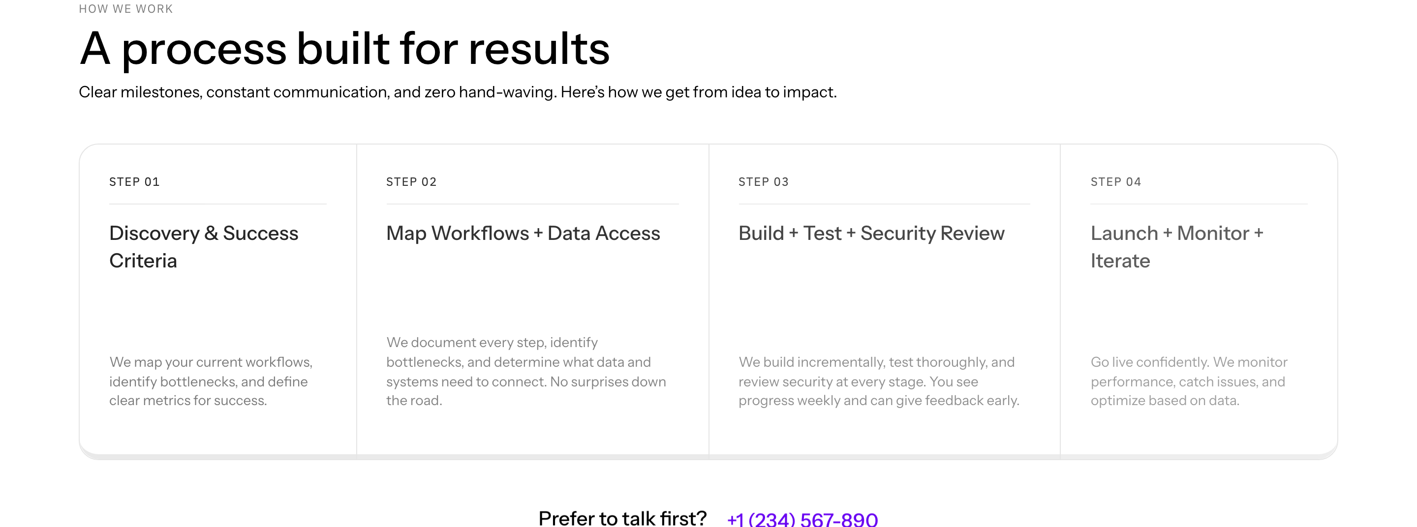
"How we work" — a vertical list of numbered steps separated by hairline dividers. Each step has a small index number, a step name, and a short paragraph. No icons, no illustrations, no progress connectors — emphasis is purely typographic.
HTML structure (minimal)
<section class="process">
  <header class="process__head">
    <p class="eyebrow">How we work</p>
    <h2 class="process__title">A short, repeatable engagement.</h2>
  </header>
  <ol class="process__list">
    <li class="step">
      <span class="step__num">01</span>
      <h3 class="step__name">Discovery</h3>
      <p class="step__lede">We map the workflows you'd benefit from automating, in plain language.</p>
    </li>
    <li class="step">
      <span class="step__num">02</span>
      <h3 class="step__name">Pilot</h3>
      <p class="step__lede">Two-week pilot on the highest-leverage workflow. You see results before signing a longer scope.</p>
    </li>
    <li class="step">
      <span class="step__num">03</span>
      <h3 class="step__name">Scale</h3>
      <p class="step__lede">We expand to adjacent workflows and hand over runbooks and dashboards.</p>
    </li>
    <li class="step">
      <span class="step__num">04</span>
      <h3 class="step__name">Maintain</h3>
      <p class="step__lede">Optional retainer — we keep the integrations alive as your tools change.</p>
    </li>
  </ol>
</section>
Key SCSS tokens
.process {
  padding: 96px 32px;
  font-family: "Instrument Sans", system-ui, sans-serif;
}
.process__title {
  font-size: 60px;
  font-weight: 500;
  letter-spacing: -1px;
  line-height: 1.1;
  max-width: 720px;
  margin-bottom: 56px;
}
.process__list {
  list-style: none;
  padding: 0;
  margin: 0;
  border-top: 0.5px solid rgba(0, 0, 0, 0.12);
}
.step {
  display: grid;
  grid-template-columns: 80px 1fr 2fr;
  gap: 32px;
  padding: 32px 0;
  border-bottom: 0.5px solid rgba(0, 0, 0, 0.12);
  align-items: baseline;
}
.step__num {
  font-size: 14px;
  font-weight: 500;
  color: #000;
}
.step__name {
  font-size: 24px;
  font-weight: 500;
  margin: 0;
}
.step__lede {
  font-size: 14px;
  line-height: 1.4;
  color: #000;
  max-width: 56ch;
}
Notable details
- 3-column grid (number / name / paragraph) inside each
<li>reads like a print contents page. - Numbers stay small (14px) rather than oversized — the typographic emphasis is on the step name, not the count. Refreshing inversion of the usual "huge 01, 02, 03" pattern.
- No connector line, no progress indicator, no icons — every visual weight comes from the divider rule and the type ladder.
Use when
- B2B services where the engagement is genuinely 3–5 steps and benefits from being legible at a glance.
- You want to communicate process maturity without resorting to flowchart graphics.
- The page already has carousels / photos elsewhere — this section serves as a calm reading break.
Caveats
- Layout collapses ungracefully on mobile; needs explicit single-column rules with the number above the name.
- Works only for 3–5 steps; beyond that the rhythm thins out.
- No animation means this section won't carry a "wow" moment — it earns trust, not attention.