pricing-tabs
Тарифи·Шаблон: Davies - Personal Portfolio HTML Template·Складність анімації: subtle·Адаптивний: Так
Файли-джерела
- index.html
section.section-pricing
Бібліотеки
bootstrap
Summary
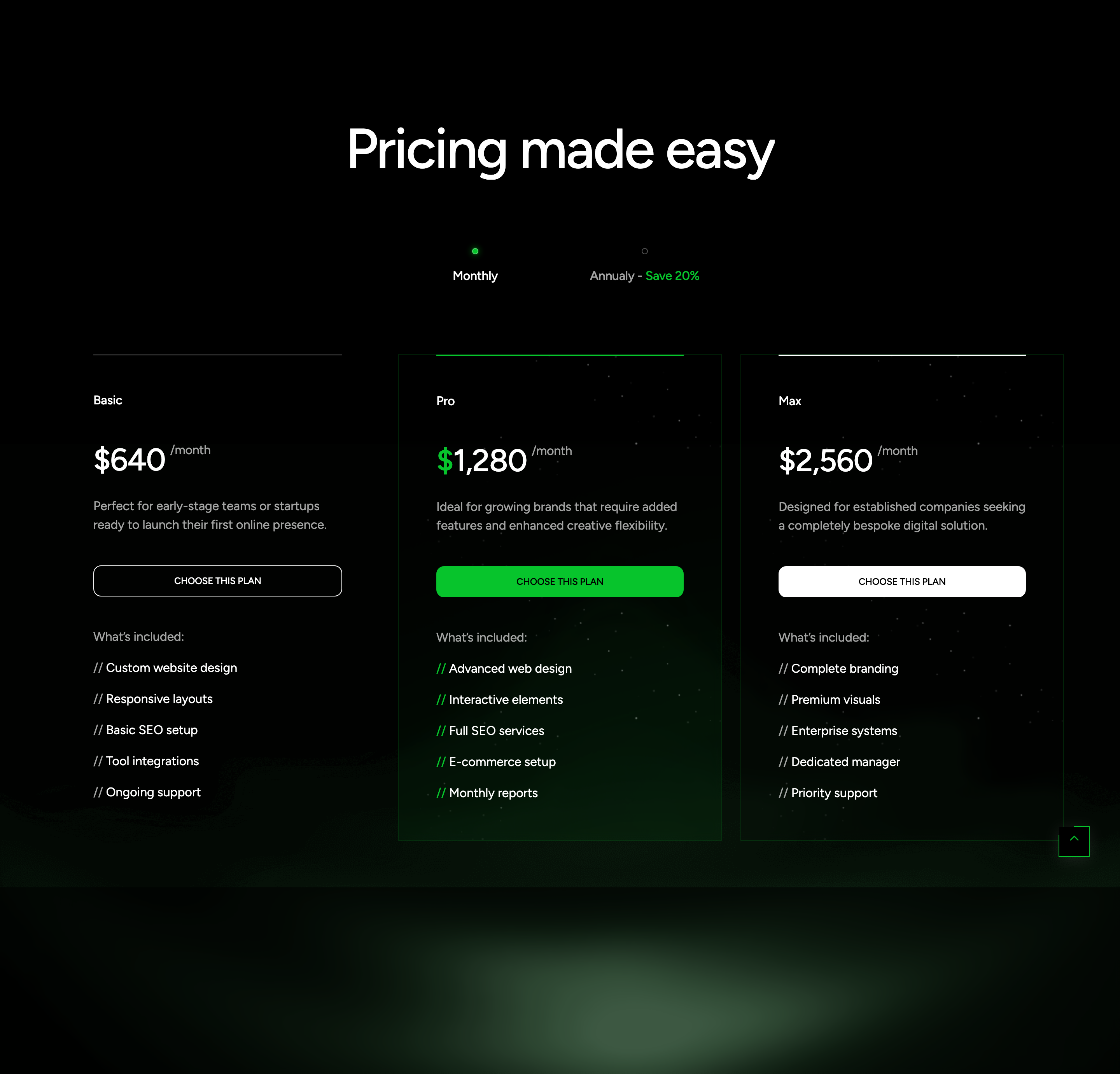
Three-tier pricing block (Basic, Pro, Max) under a "Pricing made easy" heading, with a Monthly / Annually toggle that reveals a parallel set of cards via Bootstrap tabs. The Pro card is highlighted with a primary-coloured top divider, an extra background panel, and a portrait fragment image.
HTML structure (minimal)
<section class="section-pricing flat-spacing flat-animate-tab">
  <div class="bg-img"><img src="assets/images/item/bg-4.png" alt=""></div>
  <div class="container">
    <div class="s-header justify-content-center">
      <h2 class="text-display-2 effectFade fadeUp">Pricing made easy</h2>
    </div>
    <ul class="pricing-tab_btn" role="tablist">
      <li class="nav-tab-item"><a href="#monthly" data-bs-toggle="tab" class="tf-btn-tab active"><span class="dot-active"></span> Monthly</a></li>
      <li class="nav-tab-item"><a href="#annual" data-bs-toggle="tab" class="tf-btn-tab"><span class="dot-active"></span> Annualy - <span class="text-primary">Save 20%</span></a></li>
    </ul>
    <div class="tab-content">
      <div class="tab-pane active show" id="monthly" role="tabpanel">
        <div class="tf-grid-layout md-col-2 lg-col-3">
          <div class="wg-plan">
            <div class="br-line"></div>
            <p class="plan-name">Basic</p>
            <h4 class="plan-price">$640 <span class="text-body-2 text-white-64">/month</span></h4>
            <p class="plan-desc text-white-64">Perfect for early-stage teams…</p>
            <a href="#contactScroll" class="btn-action tf-btn style-troke w-100"><span class="text-caption">CHOOSE THIS PLAN</span></a>
            <ul class="benefit-list tf-list vertical">
              <li class="benefit_title">What's included:</li>
              <li><span>//</span> Custom website design</li>
              <!-- … -->
            </ul>
          </div>
          <div class="wg-plan style-2">
            <div class="bg-img bg-img_1"></div>
            <div class="bg-img bg-img_2"><img src="assets/images/item/bg-2.png" alt=""></div>
            <div class="br-line bg-primary"></div>
            <p class="plan-name">Pro</p>
            <h4 class="plan-price"><span><span class="text-primary">$</span>1,280</span> <span class="text-body-2 text-white-64">/month</span></h4>
            <!-- … -->
          </div>
          <div class="wg-plan style-2"><!-- Max --></div>
        </div>
      </div>
      <div class="tab-pane" id="annual" role="tabpanel"><!-- mirrored, ×10 --></div>
    </div>
  </div>
</section>
Key SCSS tokens
.section-pricing {
  position: relative;
  .bg-img { position: absolute; inset: 0; opacity: 0.5; pointer-events: none; }

  .pricing-tab_btn {
    display: inline-flex;
    gap: 4px;
    padding: 4px;
    border-radius: 999px;
    border: 1px solid var(--white-16);
    .tf-btn-tab {
      padding: 12px 24px;
      border-radius: 999px;
      &.active { background: var(--white); color: var(--black); }
    }
  }

  .wg-plan {
    position: relative;
    padding: 40px;
    border: 1px solid var(--white-16);
    border-radius: 16px;

    .br-line { position: absolute; top: -1px; left: 0; right: 0; height: 1px; background: var(--white); }
    &.style-2 .br-line.bg-primary { background: var(--primary); }
  }
}
Animation logic
// Bootstrap 5 tab API drives data-bs-toggle="tab" — no custom JS in this template.
// .effectFade fadeUp on the heading is handled by scrollEffectFade().
Notable details
- The Pro card uses two stacked
bg-imglayers (bg-img_1solid,bg-img_2with a portrait fragment) for an editorial poster feel without a separate hero image. - The
dot-activespan next to each tab label is purely decorative — it picks up the primary colour when the tab is active. - The annual tab repeats the same three cards with prices ×10 and
/annualsuffix — copy-paste pattern, easy to swap for a multiplier-driven JS version.
Use when
- Pricing pages where the "highlighted" plan needs more than a coloured border — here it gets a background poster.
- Product pages that benefit from a styled segmented-control toggle rather than a generic switch.
Caveats
- Two full sets of cards in the DOM doubles the markup; consider replacing with a single set + JS price multiplier if you have many tiers.
- Bootstrap 5 dependency is non-negotiable for the tab logic; removing Bootstrap requires re-implementing tabs.