hot-deal-banner
Файли-джерела
- index.html
section.furniture-rating
Summary
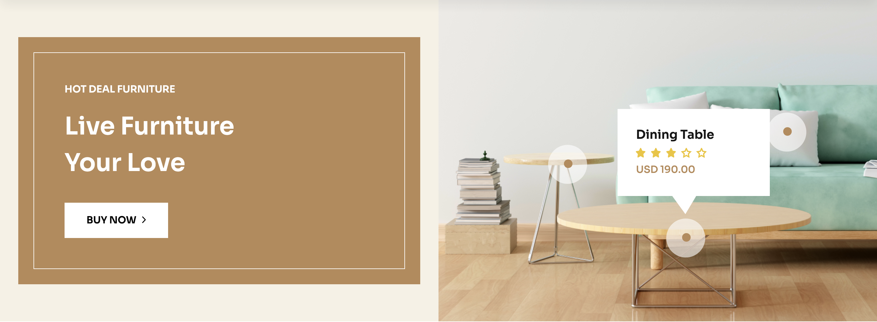
A 50/50 split banner: a bronze block on the left with a "HOT DEAL FURNITURE" kicker and a "Live Furniture Your Love" headline plus white "Buy Now" CTA, paired with a full-bleed interior photograph on the right that has three star-rated price hotspots overlaid on the furniture.
HTML structure (minimal)
<section class="furniture-rating overflow-hidden theme-bg-2">
  <div class="row g-0 align-items-center">
    <div class="col-xl-6">
      <div class="furniture-rating__left-item">
        <div class="furniture-ad__item frl-item bg-furniture">
          <div class="fad-content">
            <h6 class="text-white mb-20 text-uppercase">HOT DEAL furniture</h6>
            <h2 class="text-capitalize text-white">Live Furniture <br> Your Love</h2>
            <a class="border__btn-f mt-35 bg-white text-black" href="#">Buy Now<span><i class="fa-regular fa-angle-right"></i></span></a>
          </div>
        </div>
      </div>
    </div>
    <div class="col-xl-6">
      <div class="furniture-rating__right-item">
        <img class="w-100" src="bg-image.png" alt="">
        <div class="rating-dot">
          <svg><!-- ringed dot --></svg>
          <ul>
            <li><h6>Chair Pillow</h6></li>
            <li><svg><!-- 5-star row --></svg></li>
            <li><span>USD 190.00</span></li>
          </ul>
        </div>
        <div class="rating-dot dot-two">…</div>
        <div class="rating-dot dot-three">…</div>
      </div>
    </div>
  </div>
</section>
Key SCSS tokens
.furniture-rating {
  background-color: var(--clr-bg-2);
}
.bg-furniture {
  background-color: var(--clr-theme-primary) !important;
}
.furniture-rating__right-item {
  position: relative;
  .rating-dot {
    position: absolute;
    display: flex;
    align-items: center;
    gap: 12px;
    ul { list-style: none; }
    &.dot-two   { top: 30%; left: 25%; }
    &.dot-three { bottom: 20%; left: 60%; }
  }
}
Notable details
- The hotspots sit absolutely positioned over a static photograph rather than being baked into the image — designers can re-anchor them with
top/leftpercentages without re-exporting. - Each hotspot uses the same SVG dot as a visual anchor, then a small
<ul>mimics the structure of a product card (title, rating row, price) — accessible and easy to convert into clickable links later. - The left-side bronze block is a
theme-bg-2cream slab containing abg-furniture(warm bronze) inner card, giving a layered tonal effect rather than a flat split.
Use when
- Lifestyle or shoppable-image moments where multiple SKUs come from one editorial shot.
- Promotions that need both a clear CTA and product context in the same row.
- Editorial shop pages that mimic Pinterest-style hotspots without a JS library.
Caveats
- Dot positioning is hard-coded in CSS — swapping the photograph means re-tuning each hotspot's coordinates.
- No click handlers on the dots in the template; you'll need to wrap them in
<a>if you want them to navigate.