furniture-hero-slider
Hero·Шаблон: Addina - Multipurpose eCommerce HTML Template·Складність анімації: subtle·Адаптивний: Так
Файли-джерела
- index.html
section.furniture-banner-area
Бібліотеки
swiperjquery
Summary
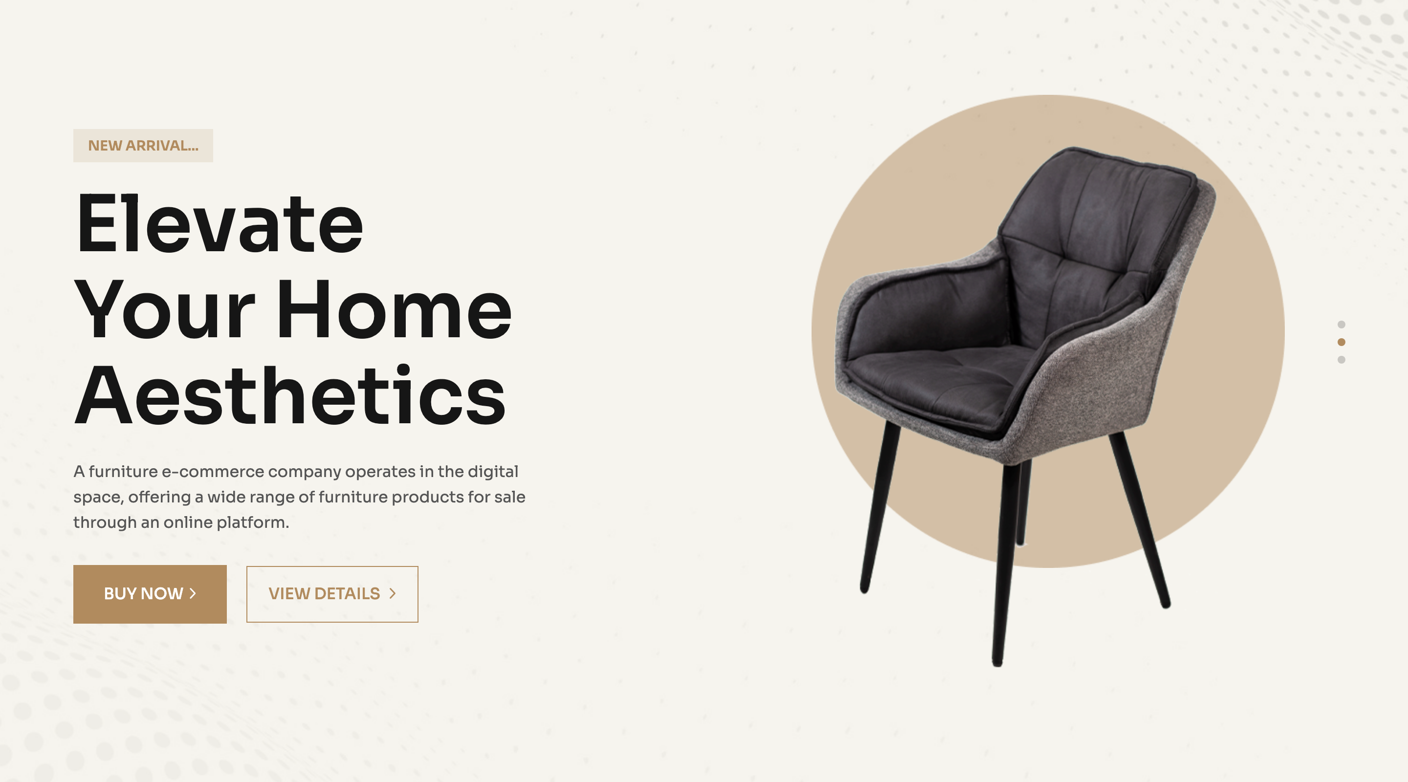
A three-slide Swiper hero that pairs an oversize "Elevate / Your Home Aesthetics" headline with a chair render and a circular backdrop on a cream-paper field. A small "New Arrival..." kicker sits above the title and two CTAs (solid + outline) sit below.
HTML structure (minimal)
<section class="banner-4 p-relative furniture-banner-area fix bg-image pb-100"
         data-background="assets/imgs/furniture/banner/bg.png"
         data-bg-color="#F5F1E6">
  <div class="swiper banner-active">
    <div class="swiper-wrapper">
      <div class="swiper-slide">
        <div class="banner-item-4 d-flex align-items-end">
          <div class="container">
            <div class="row g-5 align-self-end">
              <div class="col-xxl-6 col-lg-6">
                <div class="banner-content-4 furniture__content">
                  <span>New Arrival...</span>
                  <h2 class="banner-title-4">Elevate <br> Your Home Aesthetics</h2>
                  <p>Short subhead about the storefront.</p>
                  <div class="banner-btn-wrapper furniture__btn-group">
                    <a class="solid-btn" href="#">Buy Now<span><i class="fa-regular fa-angle-right"></i></span></a>
                    <a class="border__btn-banner" href="#">view details<span><i class="fa-regular fa-angle-right"></i></span></a>
                  </div>
                </div>
              </div>
              <div class="col-xxl-6 col-lg-6">
                <div class="banner-thumb-wrapper-4 p-relative">
                  <div class="banner-thumb-4 p-relative z-index-1">
                    <img src="chair.png" alt="">
                  </div>
                  <div class="furniture-circle d-none d-lg-block">
                    <img src="circle.png" alt="">
                  </div>
                </div>
              </div>
            </div>
          </div>
        </div>
      </div>
      <!-- two more swiper-slide blocks -->
    </div>
  </div>
</section>
Key SCSS tokens
.furniture-banner-area {
  background-color: #F5F1E6;
  padding-bottom: 100px;
}
.banner-title-4 {
  font-size: 80px;
  font-weight: 600;
  text-transform: capitalize;
  line-height: 1.1;
}
.furniture-circle {
  position: absolute;
  left: 15%;
  bottom: 21%;
  z-index: 0;
}
.furniture__btn-group .solid-btn {
  background-color: var(--clr-theme-primary);
  border: 1px solid var(--clr-theme-primary);
  text-transform: uppercase;
}
Animation logic
// Swiper init for the hero slider
var banner = new Swiper(".banner-active", {
  slidesPerView: 1,
  loop: true,
  autoplay: { delay: 5000 },
  pagination: { el: ".banner-dot", clickable: true },
});

// Cream paper background is applied from data-bg-color
$("[data-bg-color]").each(function () {
  $(this).css("background-color", $(this).attr("data-bg-color"));
});
Notable details
- The headline lives on a 6-col grid, the chair on the other 6, and a separate decorative circle PNG is absolutely positioned behind the chair to avoid baking it into the product image.
- Background colour is set via a
data-bg-colorattribute and applied at runtime — handy when you want to swap palettes without touching CSS. - The same slide is duplicated three times in the markup so the autoplay loop has visible movement even when content is identical.
Use when
- A storefront hero where you want to feature one product with editorial framing.
- Multi-product launches where each slide highlights a different SKU.
- Vertical-store templates that need the same shell but different colour theming per slide.
Caveats
- The hero is full-bleed but the chair PNG has its own offset; replacing imagery requires re-tuning
furniture-circleleft/bottom percentages. data-bg-coloris read by jQuery, so if you migrate to React/Next.js you have to translate it to inline style or CSS variables.