hero-data-platform
Hero·Шаблон: Softec - Data Analytics & Software Technology HTML Template·Складність анімації: heavy·Адаптивний: Так
Файли-джерела
- index.html
div.tp-hero__area
Бібліотеки
gsapscrolltriggersplittext
Summary
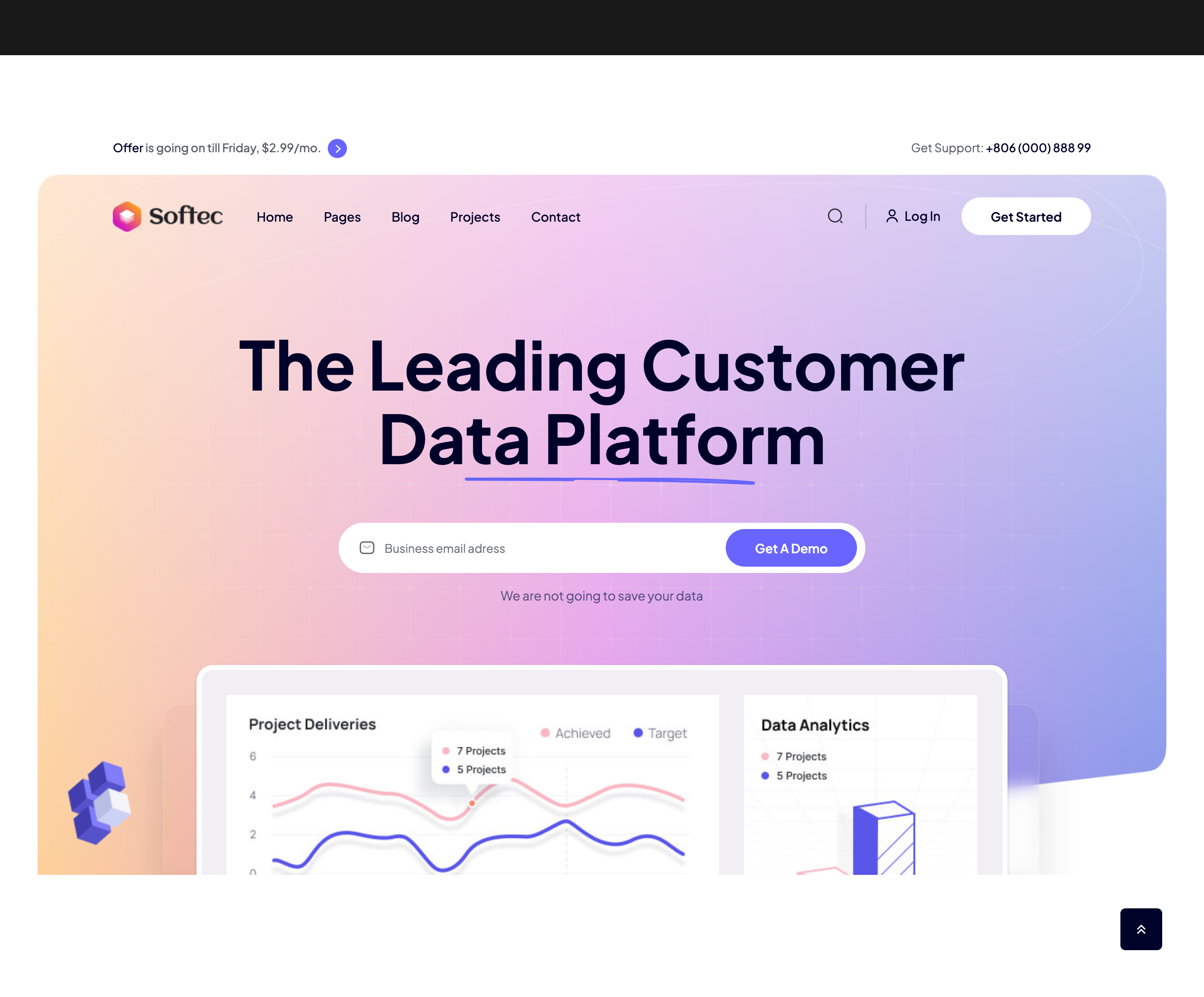
Centered hero with a two-line H1, a hand-drawn SVG underline that strokes itself in, an inline email-capture input with embedded mail icon and a pill "Get A Demo" button, plus a multi-cell image collage at the bottom layered over decorative shape PNGs.
HTML structure (minimal)
<div class="tp-hero__area tp-hero__pl-pr">
  <div class="tp-hero__bg p-relative">
    <div class="tp-hero-bg tp-hero-bg-single">
      <img src="hero-frame.png" alt="">
    </div>
    <div class="tp-hero-shape">
      <img class="tp-hero-shape-1" src="hero-line-shape.png">
      <img class="tp-hero-shape-2" src="hero-line-shape-2.png">
    </div>
    <div class="container">
      <div class="tp-hero__content-box text-center z-index-3">
        <div class="tp-hero__title-box p-relative">
          <h2 class="tp-hero__hero-title tp-title-anim">
            The Leading Customer<br>Data Platform
          </h2>
          <div class="tp-hero__title-shape d-none d-sm-block">
            <svg viewBox="0 0 491 26"><path class="line1" d="…squiggle path…" fill="none" stroke="none"/></svg>
          </div>
        </div>
        <div class="tp-hero__input wow tpfadeUp">
          <form>
            <div class="p-relative">
              <input type="text" placeholder="Business email adress">
              <svg><!-- mail icon --></svg>
            </div>
            <button class="tp-btn tp-btn-hover alt-color-black"><span>Get A Demo</span><b></b></button>
          </form>
        </div>
        <p class="wow tpfadeUp">We are not going to save your data</p>
      </div>
    </div>
  </div>
  <div class="tp-hero__bottom">
    <div class="tp-hero__thumb-wrapper-main p-relative">
      <div class="tp-hero__shape-img-1"><img src="hero-shape-1.png"></div>
      <div class="tp-hero__shape-img-2"><img src="hero-shape-2.png"></div>
      <div class="tp-hero__thumb-wrapper">
        <div class="row">
          <div class="col-8">
            <div class="tp-hero__thumb mb-20"><img src="hero-sm-1.jpg"></div>
            <div class="row">
              <div class="col-md-4"><div class="tp-hero__thumb tp-hero__sm-img"><img src="hero-sm-3.png"></div></div>
              <div class="col-md-8"><div class="tp-hero__thumb"><img src="hero-sm-4.jpg"></div></div>
            </div>
          </div>
          <div class="col-md-4"><div class="tp-hero__thumb"><img src="hero-sm-2.jpg"></div></div>
        </div>
      </div>
    </div>
  </div>
</div>
Key SCSS tokens
.tp-hero {
  &__pl-pr { padding-top: 63px; }
  &__bg {
    padding: 182px 0 400px;
    border-radius: 30px;
    background: var(--tp-grey-7); // soft lilac wash
  }
  &__hero-title {
    font-weight: 700;
    font-size: 80px;
    line-height: 1.1;
    padding-bottom: 50px;
    overflow: hidden;
  }
  &__title-shape {
    position: absolute; bottom: 22px; left: 0; right: 0;
    & svg path.line1 {
      stroke-width: 2.7px;
      stroke: var(--tp-theme-1);
      stroke-dasharray: 2300;
      stroke-dashoffset: 3200;
      animation: dash 2s linear both;
    }
  }
  &__input input {
    height: 60px; width: 100%; border-radius: 40px;
    padding: 0 180px 0 55px;
    background: var(--tp-common-white);
    border: none;
  }
  &__input button {
    position: absolute; top: 50%; right: 10px;
    transform: translateY(-50%);
  }
}
@keyframes dash { to { stroke-dashoffset: 0; } }
Animation logic
// Hero background scales in on load
gsap.from('.tp-hero-bg-single', { scale: 1.2, duration: 1.5 });

// SplitText line reveal on the H1 (rotated falling cards)
const tl = gsap.timeline({ scrollTrigger: { trigger: '.tp-hero__hero-title', start: 'top 90%' } });
const split = new SplitText('.tp-hero__hero-title', { type: 'words, lines' });
split.split({ type: 'lines' });
tl.from(split.lines, { duration: 1, delay: 0.3, opacity: 0, rotationX: -60,
  force3D: true, transformOrigin: 'top center -50', stagger: 0.2 });
Notable details
- The squiggly underline is a single SVG path with
stroke-dasharray: 2300andstroke-dashoffset: 3200, animated by a@keyframes dashto draw itself once on load — no JS needed. tp-hero__bgusesborder-radius: 30pxso the hero panel sits as a rounded card rather than a full-bleed band.- Image collage uses Bootstrap nested rows so the proportions stay locked across breakpoints, with shape PNGs absolutely positioned for depth.
- The CTA button hover is driven by
<b>element acting as a sliding fill mask (see_buttons.scss).
Use when
- SaaS landings that need a clear single-CTA hero with email capture.
- Pages that benefit from a kinetic but readable headline reveal.
- Hero designs that pair real product imagery with abstract decorative shapes.
Caveats
- The H1 SplitText reveal requires GSAP SplitText (Club GreenSock paid plugin); without it the H1 still renders normally.
- The
border-radius: 30pxon the hero panel collapses on<smwidths — verify on small phones.