services-carousel
Картка послуги·Шаблон: Medcity - Medical Healthcare HTML5 Template·Складність анімації: subtle·Адаптивний: Так
Файли-джерела
- index.html
section.services-carousel
Бібліотеки
jquerybootstrap
Summary
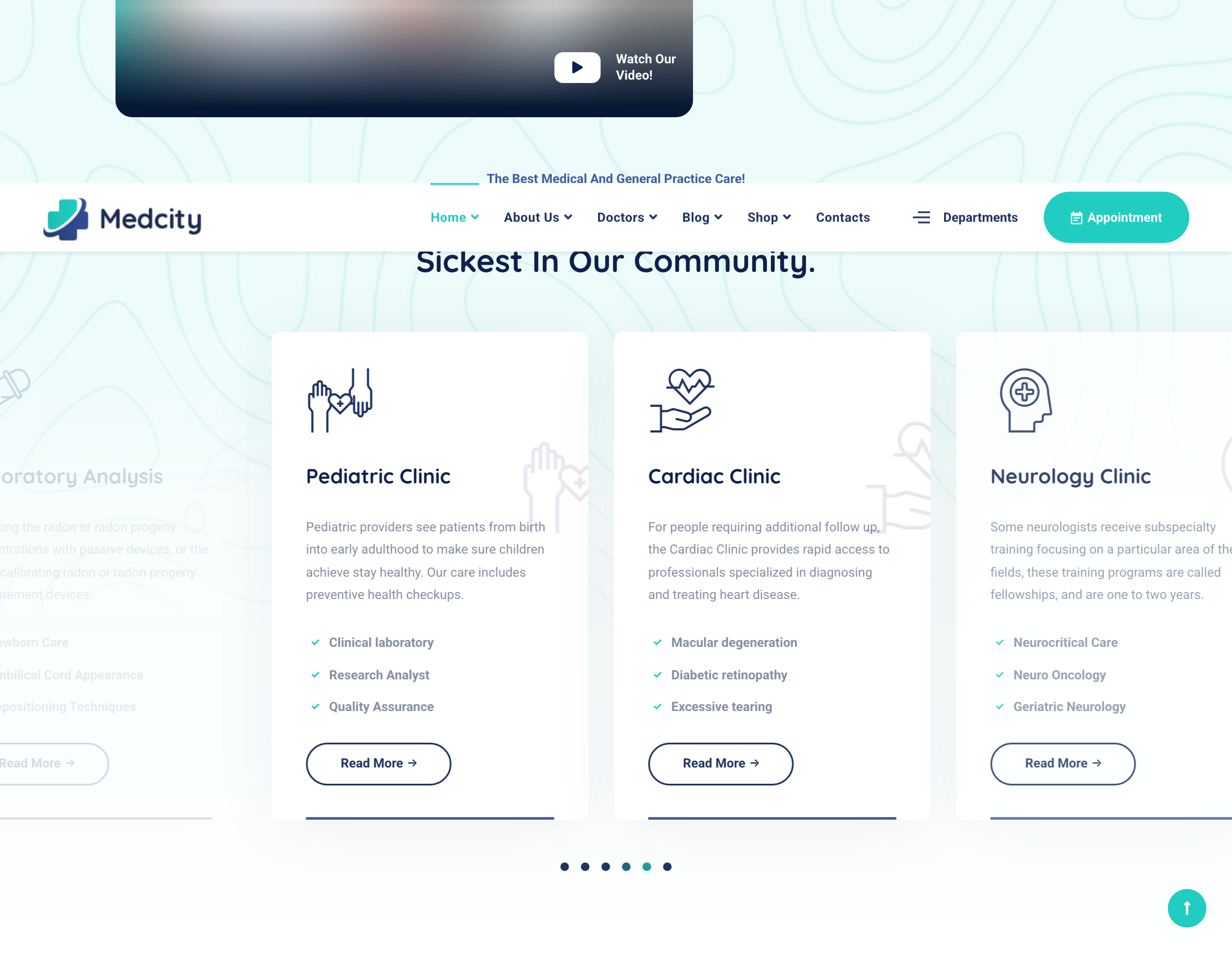
Auto-playing Slick carousel of clinic-service cards (3-up at desktop). Each card has a duplicated icon decoration (one inline at top-left, one giant ghost at bottom-right), title, description, list of sub-specialties, and a Read More pill. Six services ship in the demo.
HTML structure (minimal)
<section class="services-layout1 services-carousel">
  <div class="bg-img"><img src="assets/images/backgrounds/2.jpg" alt="background"></div>
  <div class="container">
    <div class="row">
      <div class="col-lg-6 offset-lg-3">
        <div class="heading text-center mb-60">
          <h2 class="heading__subtitle">The Best Medical And General Practice Care!</h2>
          <h3 class="heading__title">Providing Medical Care For The Sickest In Our Community.</h3>
        </div>
      </div>
    </div>
    <div class="row">
      <div class="col-12">
        <div class="slick-carousel"
             data-slick='{"slidesToShow":3,"slidesToScroll":1,"autoplay":true,"arrows":false,"dots":true,"responsive":[{"breakpoint":992,"settings":{"slidesToShow":2}},{"breakpoint":767,"settings":{"slidesToShow":1}}]}'>
          <div class="service-item">
            <div class="service__icon">
              <i class="icon-head"></i>
              <i class="icon-head"></i>
            </div>
            <div class="service__content">
              <h4 class="service__title">Neurology Clinic</h4>
              <p class="service__desc">Some neurologists receive subspecialty training…</p>
              <ul class="list-items list-items-layout1 list-unstyled">
                <li>Neurocritical Care</li>
                <li>Neuro Oncology</li>
                <li>Geriatric Neurology</li>
              </ul>
              <a href="services-single.html" class="btn btn__secondary btn__outlined btn__rounded">
                <span>Read More</span><i class="icon-arrow-right"></i>
              </a>
            </div>
          </div>
          <!-- Cardiology / Pathology / Laboratory / Pediatric / Cardiac -->
        </div>
      </div>
    </div>
  </div>
</section>
Key SCSS tokens
.service-item {
  position: relative; overflow: hidden; border-radius: 10px;
  background: $color-white; box-shadow: 0 5px 83px rgba(9,29,62,.05);
  transition: all .4s ease;

  &:before {
    content: ''; position: absolute; bottom: 0; left: 40px; right: 40px;
    height: 3px; background: #435ba1; transition: all .4s linear;
  }
  .service__content { padding: 40px; }
  .service__icon {
    color: $color-secondary; font-size: 80px; line-height: 1; margin-bottom: 25px;
    i:nth-of-type(2) {
      position: absolute; right: -60px; top: 100px;
      font-size: 140px; opacity: .1;
    }
  }
  &:hover { z-index: 5; box-shadow: 0 5px 83px rgba(40,40,40,.12);
    &:before { background: $color-primary; }
  }
}
Animation logic
// Slick init via plugin bundle. Card hover swaps the bottom underline color (CSS only).
// Slidesgroups respond to breakpoints declared in the data-slick JSON above.
Notable details
- The duplicated
<i>inside.service__iconis the trick: the second instance is absolutely positioned off the bottom-right corner at 140px / opacity 0.1 — turns each icon font into its own watermark with zero extra assets. - The 3-px primary-color underline at
:beforeonly switches color on hover; it never animates width — quiet but distinctive. - The carousel disables arrows but enables dots, which keeps the photo background uncluttered.
Use when
- Service / specialty grids where you want each card to feel illustrated even though all you have is an icon font.
- Carousels of equally-weighted offerings (clinics, departments, plans, packages) that should auto-rotate.
Caveats
- Relies on a custom icomoon icon font shipped with the template (
/assets/fonts/icomoon) — replacing icons means rebuilding or replacing the font. - Slick.js is unmaintained; plan a Swiper migration if you fork this for new work.