team-portrait-grid
Команда·Шаблон: Webfolio - Creative Agency & Portfolio Next.js Template·Складність анімації: subtle·Адаптивний: Так
Файли-джерела
- out/home-main/index.html
section.team
Summary
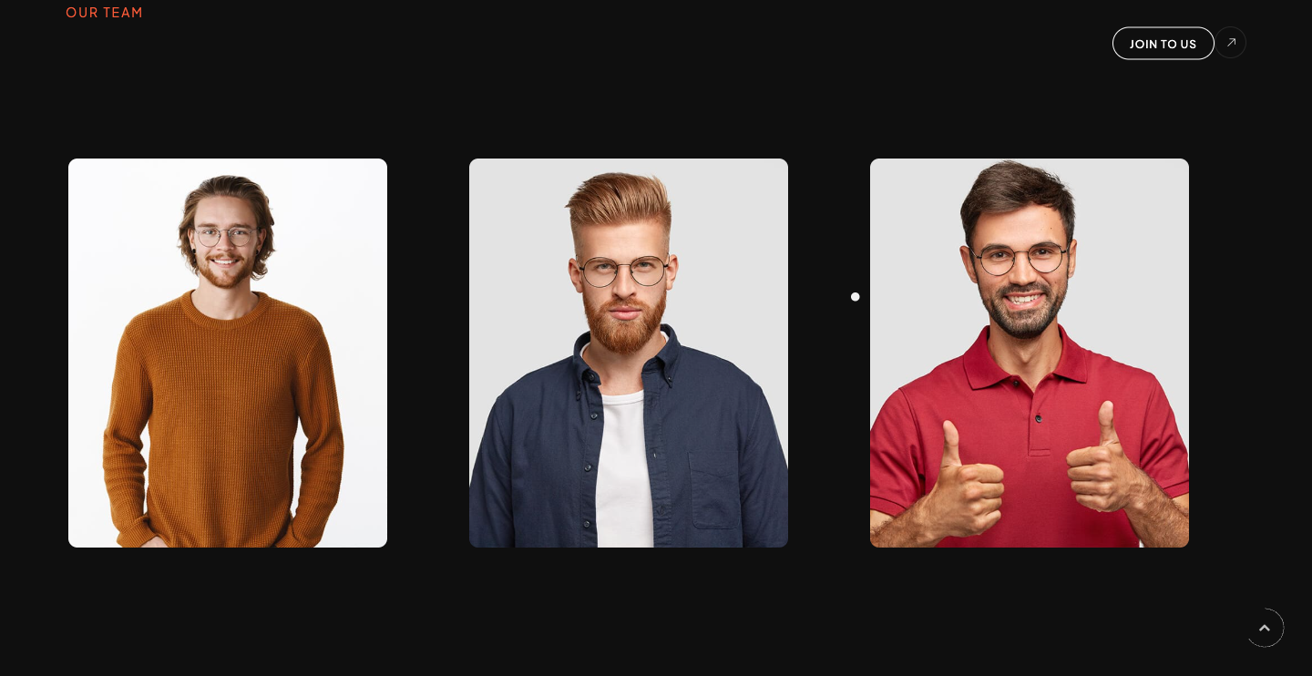
Three-column team grid. Each card is a tall portrait with a sliding .info caption (sub-title + name) anchored bottom-left, plus a hidden .social column of three round social icons that reveals on hover. Section header reuses the d-rotate / rotate-text split-line treatment ("Meet our legends.").
HTML structure (minimal)
<section class="team section-padding pt-0">
<div class="container">
<div class="sec-head mb-80">
<div class="d-flex align-items-center">
<div>
<span class="sub-title main-color mb-5">Our Team</span>
<h3 class="fw-600 fz-50 text-u d-rotate wow">
<span class="rotate-text">Meet our <span class="fw-200">legends.</span></span>
</h3>
</div>
<div class="ml-auto vi-more">
<a href="/page-team" class="butn butn-sm butn-bord radius-30"><span>Join to us</span></a>
<span class="icon ti-arrow-top-right"></span>
</div>
</div>
</div>
<div class="row">
<div class="col-lg-4">
<div class="item md-mb50">
<div class="img">
<img src="/assets/imgs/team/1.jpg" alt="" />
<div class="info">
<span class="fz-12">CEO & Founder</span>
<h6 class="fz-18">Albert Cooper</h6>
</div>
</div>
<div class="social">
<div class="links">
<a href="#0"><i class="fab fa-facebook-f"></i></a>
<a href="#0"><i class="fab fa-behance"></i></a>
<a href="#0"><i class="fab fa-instagram"></i></a>
</div>
</div>
</div>
</div>
<!-- 2 more team cards -->
</div>
</div>
</section>
Key SCSS tokens
.team {
  .item {
    position: relative;
    .img {
      position: relative;
      overflow: hidden;
      img { transition: transform .6s ease; }
      .info {
        position: absolute;
        left: 20px; bottom: 20px;
        background: rgba(0, 0, 0, .6);
        padding: 12px 16px;
        border-radius: 8px;
      }
    }
    &:hover .img img { transform: scale(1.04); }
    .social {
      position: absolute;
      top: 20px; right: -50px;
      opacity: 0;
      transition: opacity .3s, right .3s;
    }
    &:hover .social { right: 20px; opacity: 1; }
    .social .links a {
      display: flex; width: 40px; height: 40px;
      align-items: center; justify-content: center;
      background: $main_color;
      border-radius: 50%;
      margin-bottom: 10px;
    }
  }
}
Notable details
- Social column slides in from the right (
-50px → 20px) on hover instead of fading down — feels less generic than an opacity-only reveal. - Caption uses a translucent black pill anchored to the bottom-left, never overlapping the face.
- Font Awesome 5 brand icons (Facebook, Behance, Instagram) — make sure that family is loaded if you change icons.
Use when
- Team / "About" sections with 3–6 portraits where you want a hover affordance without ripping the card open.
- Sites that already use Font Awesome.
Caveats
- Hover-only reveal means social links are inaccessible on touch devices — provide a tap-toggle or always-visible version for mobile.
- Three demo team members come from
data/team.json; swap the file or the markup expects exactly three.