automation-examples
Можливості·Шаблон: AIFusionX (WP theme — analyzed via live demo)·Складність анімації: none·Адаптивний: Так
Файли-джерела
- https://aifusionx.vamtam.com/
[data-id="4c975aa"]
Summary
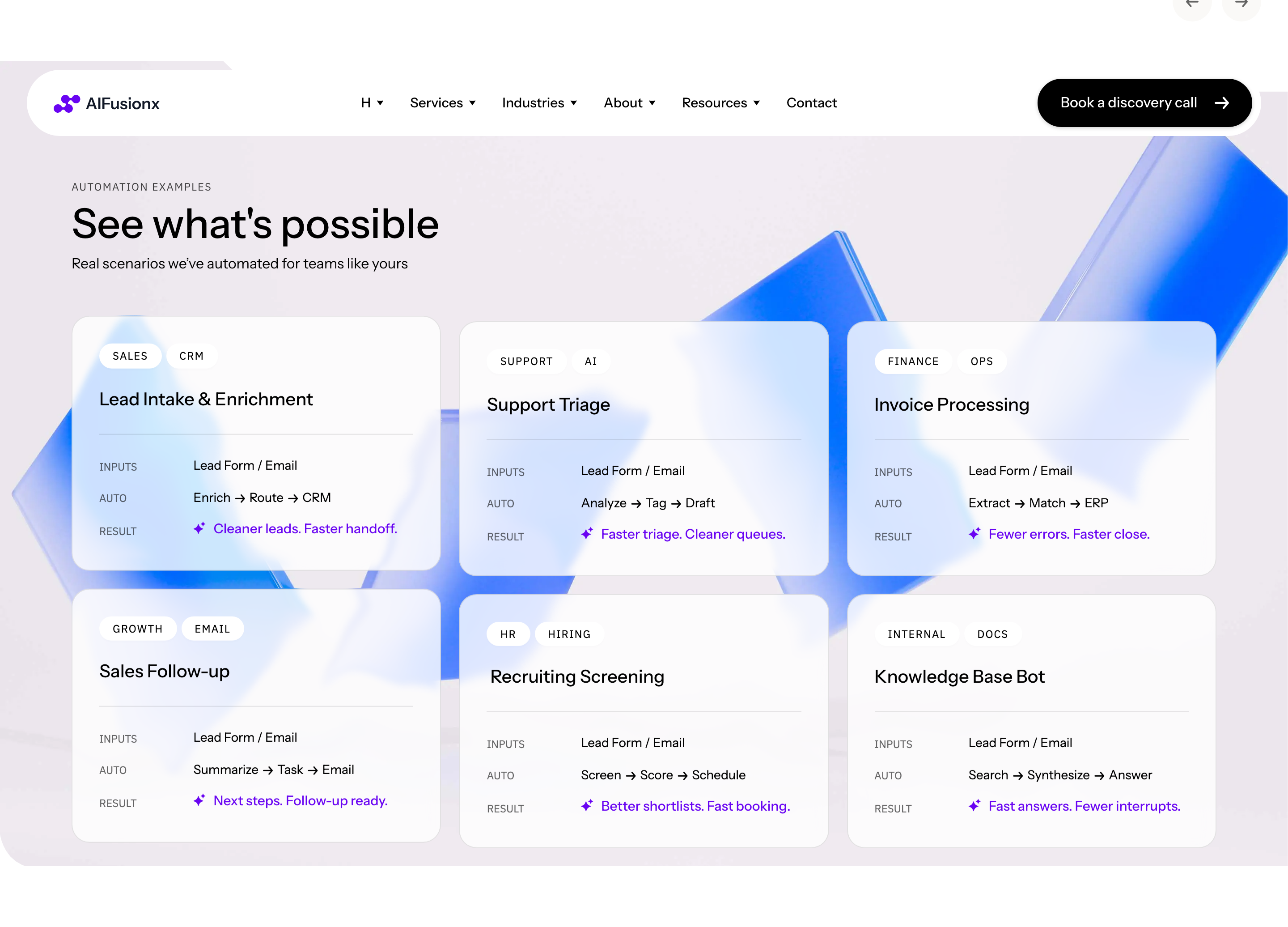
"Automation examples" — an anchored grid divided into three vertical groups (Sales, Ops, Finance). Each group has a split typographic heading and a bullet list of 3–5 example automations. No icons, no colored chips, no decoration — pure text columns with hairline dividers between groups.
HTML structure (minimal)
<section class="examples">
  <header class="examples__head">
    <p class="eyebrow">Automation examples</p>
    <h2 class="examples__title">Where AI quietly removes friction.</h2>
  </header>
  <div class="examples__grid">
    <article class="examples__col">
      <h3 class="examples__group">Sales</h3>
      <ul>
        <li>Lead enrichment from raw inbox replies</li>
        <li>CRM hygiene and de-duplication</li>
        <li>Follow-up sequences with context</li>
      </ul>
    </article>
    <article class="examples__col">
      <h3 class="examples__group">Ops</h3>
      <ul>
        <li>Ticket triage with policy lookup</li>
        <li>Incident summarization for handoff</li>
        <li>Vendor onboarding checks</li>
      </ul>
    </article>
    <article class="examples__col">
      <h3 class="examples__group">Finance</h3>
      <ul>
        <li>AP invoice extraction</li>
        <li>Spend categorization</li>
        <li>Variance flagging on close</li>
      </ul>
    </article>
  </div>
</section>
Key SCSS tokens
.examples {
  padding: 96px 32px;
  font-family: "Instrument Sans", system-ui, sans-serif;
  color: #000;
}
.examples__title {
  font-size: 60px;
  font-weight: 500;
  letter-spacing: -1px;
  line-height: 1.1;
  max-width: 800px;
  margin-bottom: 56px;
}
.examples__grid {
  display: grid;
  grid-template-columns: repeat(3, 1fr);
  gap: 0;
}
.examples__col {
  padding: 32px;
  border-left: 0.5px solid rgba(0, 0, 0, 0.12);
}
.examples__col:first-child {
  border-left: none;
  padding-left: 0;
}
.examples__group {
  font-size: 20px;
  font-weight: 500;
  margin-bottom: 24px;
}
.examples__col ul {
  list-style: none;
  padding: 0;
  margin: 0;
  font-size: 14px;
  line-height: 1.6;
}
.examples__col li + li {
  margin-top: 12px;
  padding-top: 12px;
  border-top: 0.5px solid rgba(0, 0, 0, 0.06);
}
Notable details
- Hairline vertical dividers (0.5px @ 12% opacity) between columns substitute for icons or backgrounds.
- The "Sales / Ops / Finance" framing is a powerful copy template — it reads as "we cover your whole stack" without enumerating dozens of services.
- Inter-list-item dividers on each row turn the bullet list into something closer to a print sidebar than an HTML
<ul>. - The H2 carries the entire decorative weight; everything below is body-typography.
Use when
- You want to show breadth (this works in 3 areas) without a 12-card grid.
- Audience is mid-funnel — they already understand the category and want concrete examples, not value-prop poetry.
- B2B / consulting / agency where credibility comes from specificity.
Caveats
- Demands very tight copywriting — uneven column lengths look careless rather than editorial.
- Vertical dividers do not survive a single-column mobile collapse; switch to top-borders on mobile.
- No animation, no illustration: this section will feel "thin" in a deck context, even though it reads strong on the page.